Tiina Booth has a historical look at college series discs -- and some important perspective.
February 25, 2015 by Tiina Booth in Opinion with 18 comments
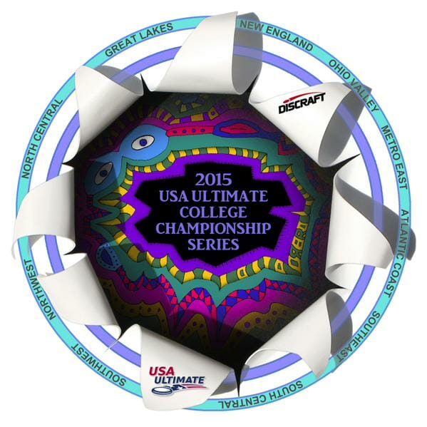 Winter crankiness is upon us full force. I can see it at our practices, in grocery stores, and, of course, in online comments. USA Ultimate unveiled their disc for their College Championships this week and the reaction was damning and nearly universal:
“Maybe okay for Beach Nationals…but this is pretty cringeworthy”
“That’s awful”
“Are you people serious?”
“What is this design? How does it relate to ultimate? It’s terrifying…”
“Ultimate is weird and quirky and all, but this is too much”
“…like something I might have done in MS Paint in 2001”
So I went back down to my basement, my de facto Ultimate Hall of Fame, to see what we could learn from the championship discs of the past — the way, way past. Let’s start with the first disc from the first college national championship in 1984.
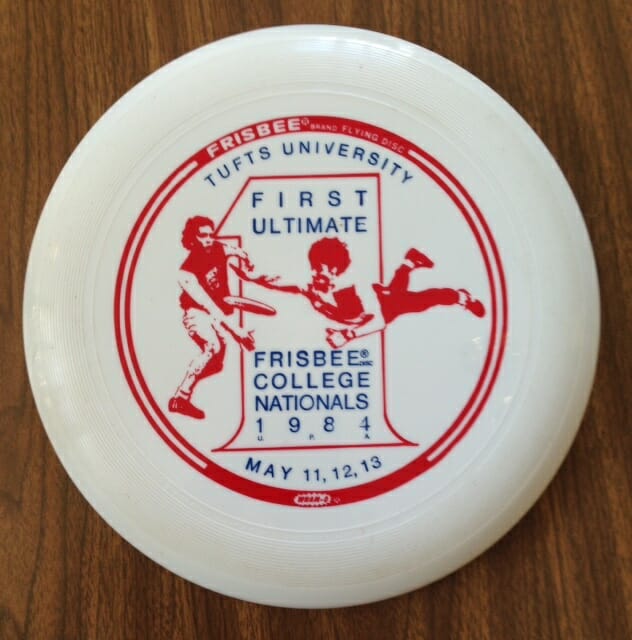
First of all, IT’S A WHAM-O! (An 80E as a matter of fact, which was vastly inferior to the 80 mold and…don’t let your eyes glaze over. I’m not going to go down the boring road of the true disc nerd. Not yet.) It shows the requisite males throwing and/or laying out for the disc; the player laying out looks like he is going to D it with his armpit. This disc is cool because it is the first one and, NO, Tufts alums, I am never going to sell it to you. (I have a matching poster too.)
RELATED: When Wham-O Was King
But if we want to see a truly ugly disc from the 1980s, take a look at this one from when Crown Royal was our sponsor.
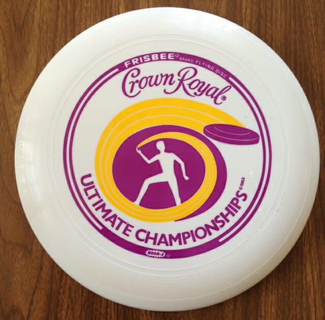
Not only was this eyesore of a logo on the discs, but also on the jackets, hats, and giant coolers that were given to teams. Again, it is a Wham-O 80E and the designer had clearly never seen an ultimate player throw a disc. Maybe this is a high-release forehand blading push pass but, since I’m from the East Coast, I really have no idea what it is.
One commenter mentioned Microsoft Paint from 2001, like it’s a bad thing. First of all, I like MS Paint and remember having fun for hours when I first tried it. And, as a matter of fact, this is what the college championship disc looked like in 2001.
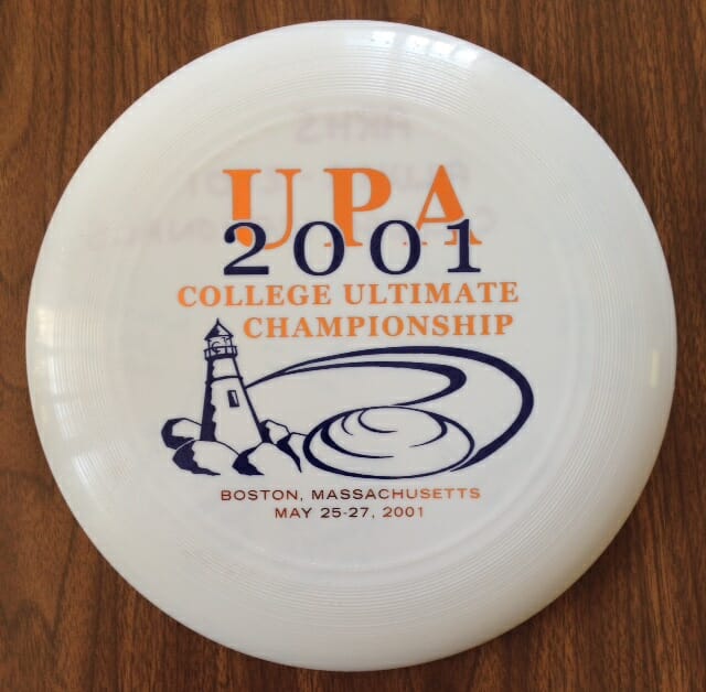
This seems like a fairly typical design: picture of a local landmark, although we were about three hours from a Cape Cod lighthouse. UPA big and bold, from when we used to be a players’ association. And the date, which I remember well.
This was the last time the College Championships were in New England and I was still teaching high school. I can’t remember if I used a personal day to get out of work or if I just called in fake sick on that first Friday of competition. But either way I was on the sideline of the first game, exhilarated to be there and feeling slightly guilty. Guilty until I noticed a small train of players from Amherst Regional High School slowly making its way to the same sideline. As the morning went on, over 20 ARHS ultimate players showed up at the fields, clearly drawn to the huge event that our alums were participating in: Lisa Kanner and Maria Grigoryeva from Carleton, Steven Rouisse from Colorado, Josh Nugent from Brown, and others. I love this disc because of this memory and others from that weekend and I suspect that is the case for many of the discs that players cherish on their disc wall. Discs are valued because they represent events. That would certainly explain the many weird wedding discs that show up in the misprint packages from Discraft.
So now we are looking at our first Supercolor disc. I first heard of its popularity when I interviewed Pad of Discraft at Club Nationals in 2014. I guess we shouldn’t be surprised that this is the direction we are heading. I feel about this disc the way I did about other changes in color and style in the last 30 years:

– We used to wear 100% cotton t-shirts (never the sweat-trapping polyester blends) that we would screen the night before a tournament. Now the options for uniforms involve full sublimation, spot sublimation, the best wicking material, matching socks, gloves, wrist bands, arm sleeves, etc. Of course, we still have teams now that will push the boundaries (see Harper Garvey at right).
– In the early 90’s, teenagers liked to wear their t-shirts big, like wafting in the wind big. I would always order more L and XL shirts. However, ten years or so later, the style changed, or shrunk, dramatically. Now, for tournaments and camp, everyone wants a medium or small jersey, even the boys who would formerly have worn XL. I get it. Athletes work hard for their muscles and they want to show them off. Fashion reflects that.
– I also remember when the colors of choice for tournament shirts were forest green, navy blue, and maroon. The designs were white or off-white. Prep school combinations for sure. Thank goodness I have Adriana from VC in my life. Now every summer she tells me what colors will sell at camp and she has been, unsurprisingly, 100% right. And I still have a lot of XL navy blue cotton Amherst Invitational shirts somewhere in my basement.
 – Almost everyone used to wear black cleats. When the first white ones showed up on the sideline, they were met with ridicule. The prevailing belief was that only hotshots chose white cleats and you had better be able to back up your fashion choice with high-level play. Clearly that has changed.
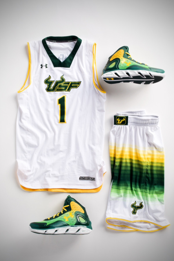
– I’m not sure when we first decided that ultimate shorts had to be neon green and easily stretch across your shoulders plus a small family. But these shorts and their spinoffs appear to be here to stay. And these colors are not only limited to the “quirky” world of ultimate. Check out these uniforms from University of Maryland football and University of South Florida basketball.
The newest college disc just seems a logical outgrowth of where ultimate style has been headed for years. It is expected and inevitable. Aren’t some of the colors on this disc also the cool ones that Patagonia uses? (Patagonia is still at the top of the gear heap, right?)
Why the negative reaction to this disc when ultimate uniforms or tournament attire are often just as outrageous? Don’t Nike, Adidas, Under Armour and other athletic apparel companies have to change things up every year in order to create a demand for new styles? Hasn’t technology allowed everyone to push the boundaries? Why should this be different for ultimate disc or gear companies?
I look at this disc as a souvenir. It will be a reminder of how the season goes, whether it’s good, bad, or in between. After all, they are not going to make us play with this disc, right? Right?