But who really won Nationals, visually?
June 5, 2019 by Daniel Prentice in Opinion with 0 comments
When I wrote this article last year, I didn’t think it would be the most read piece of all of our college Nationals coverage. I guess I’m not the only one who’s a little too into jerseys and silly rankings pieces. You all love your threads and I love you for it. And the identity crisis I suffered while thinking about how much more engagement the rankings got than all the hard work I do for actual coverage of the sport was minor. You all have spoken with your clicks, and the definitive list of the five best and five worst jerseys from the D-I College National Championships is back.
Like last year, there were a few absolute beauts, some horrible mistakes, and a slew of mostly forgettable designs that didn’t leave much of an impression one way or another. Overall, I’d say it was a down year for the world of college ultimate kit design. There were some nice aesthetic efforts, but nothing quite matched the highs of Florida FUEL’s virtually perfect designs from last season, or Pittsburgh En Sabah Nur’s gorgeous throwback basketball jersey warmups. Overall the efforts felt a little uninspired. And more importantly, there wasn’t nearly enough baby blue.1
To be fair, the field (on both ends of the spectrum) was really hurt by the absence of Carleton CUT, whose navy darks were one of the best kits I saw all year, and Mardi Gras whites were one of the worst. Hopefully next year we’ll see a bounce back into form. Maybe designers out there can take some inspiration from these kits that deserved the most recognition, for better or worse, from this year’s Nationals.
Top Five
5. UCLA BLU Whites
You don’t always have to swing for the fences. UCLA kept it simple with these. They took advantage of a color scheme and logo in their blue bruin, and let it speak for itself. What really makes this kit, though, is the shorts. The geometric blue pattern on the sides really pops, and matched with the simplicity of the tops, they’re a unique, understated focal point. More teams need to try to do things like this with their shorts. The top isn’t the only place where creativity is allowed.
4. Washington Sundodgers Darks
I made a mistake last year, alright? Washington’s whites should not have made it into my top five. They were too plain and I was blinded by the usage of purple, which as I said then, is still a perfect accent color. But I’ve learned and grown since then, and I’m a better person, and I feel confident that I won’t regret this opinion in a year’s time. Again they went for a simple, clean look, but that gold trim makes a world of difference.
3. USA Ultimate Event Staff Polos

You may say it’s cheating to include these, but it’s my dumb article and I make the rules. One of my colleagues at D-III Nationals made a comment about the event staff polos easily being the best duds the volunteers had ever worn for a USAU event. They weren’t wrong. These are fresh and super professional. If you’ve ever spoken with me for more than 10 seconds, you probably know how much I love a professional, dryfit polo.
2. California UGMO Darks
These are great. The chest numbers with the yellow lines on either side is fantastic. I also love the Cal Ultimate badge. The Under Armour logo on the the collar bone is a drawback, and the full script “California” on the back feels a little clunky, especially since we already have school branding on the front of the jersey. Those things are what keep Cal from taking the one spot, but these are still really good.
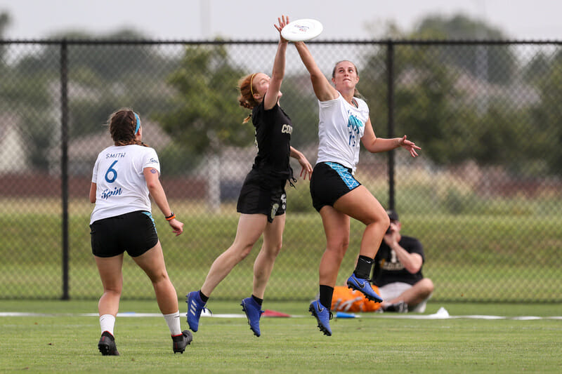
1. North Carolina Pleiades Darks
This was not love at first sight for me. We all know by now that baby blue2 is the best jersey color, and limiting its usage to a gradient corner of the jersey challenged all of my personal values. But they really grew on me over the course of the weekend. The design on the chest is fantastic. I love the PLEIADES font, the gold bar, and seven stars. It’s classic and clean. I do enjoy a good gradient, and this one is well executed.
The back of the jerseys are a home run, too. Any time a team uses their state outline as a badge or logo, I’m all for it, and I also really appreciate that they used player names. More teams, please follow suit; it’s much better than putting the school or team name back there. I’m still a little sad there isn’t more blue in there, but I totally get wanting to mix up your dark jersey design from year to year and they really did a nice job with these. Clean, crisp, and enough flavor to make it unique and identifiable.
Bottom Five
5. Minnesota Grey Duck Whites
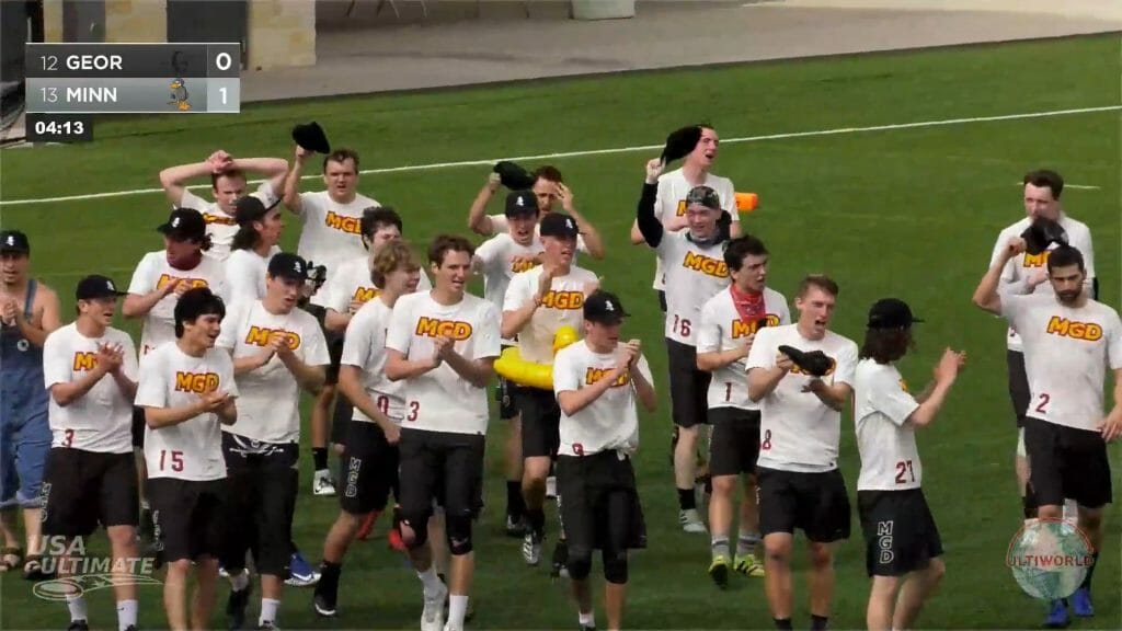
If you’re a premier program and someone as well versed in college ultimate as Mitch Dengler has to ask what the letters on the front of your jersey mean, then it means you tried a little too hard. Yes, after pausing for a moment, I was able to conclude and tell Mitch that “MGD” stands for Minnesota Grey Duck, but that’s not an identifiable anagram. No one has ever referred to Minnesota as MGD in any context. So obviously I don’t agree with the general concept. But the design itself is also really gaudy. I can appreciate trying to mix things up while staying true to program identity, but this did not work.
4. UC San Diego Pyschos Whites
These feel like a generic jersey you would have bought off the wrack in the merch tent as a high school player back in 2010, when over the top sublimation was still new and exciting. They’re way too busy and don’t have any real connection to the team either. I get that San Diego is by the Pacific Ocean, but I’m going to need more than that if you’re gonna fully sublimate an entire Ukiyo-e painting on your jerseys.
3. Dartmouth Ultimate Darks
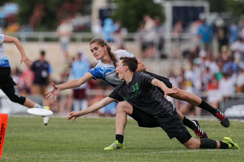
Dartmouth, we went over this last year! To their credit, they did make the green numbers and lettering more in contrast with the primary charcoal of the jersey, but why run this design back at all? The weird, grey argyle pattern just makes it look busy from afar — a difficult feat for a black(ish) jersey — and up close, they’re just confusing. Are they trees? Are they shovels? I honestly don’t know. I usually like when a team maintains an identifiable look from year to year, like the Hodag blues, but this is not the design hill to die on.
2. Brown Brownian Motion Whites
This is exactly what I ragged on Dartmouth for last year. I get that Brown doesn’t have a whole lot to work with as far as school colors go, but light yellow on white? If I can’t read your jersey numbers, you might as well all just be wearing unmatched white shirts. I won’t even speak to the design on these because I can barely see it.
Oh, wait. Oh no. Is there some sort of weird, cosmic connection between wearing unreadable jerseys and winning national championships? Have I doomed myself to more teams trying this by pointing it out? The answer to both questions, surely, is yes.
1. Michigan Magnum Mango Tanks
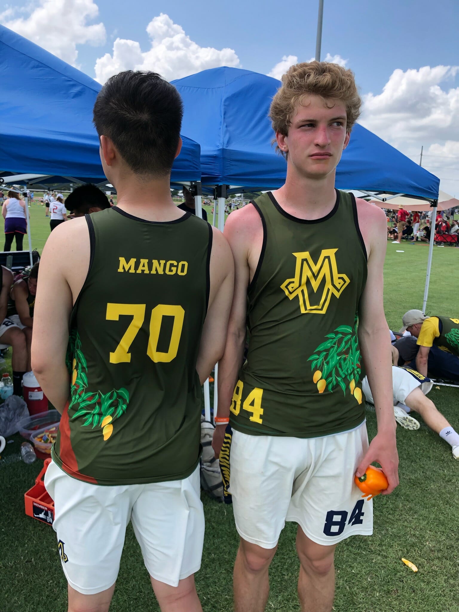
I’m sure there’s some sort of hilarious backstory to these that we would all find just as funny as the people who came up with this design. But…just no. Shout out to these two troopers who were willing to take a photo while the team anxiously watched Texas vs. NC State to see if they would make the bracket or not, though. Much respect to you, and I’m sorry you had to wear these horrible jerseys.
Other Notables
Ohio State Fever Sunhoodies
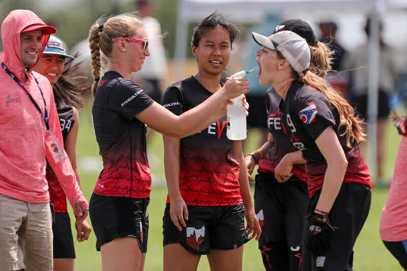
I debated including the full Fever dark kit in my top five, but ultimately I felt like they were just a little bit too busy. Their team sunhoodies, though, were the best team swag I saw on the weekend by miles. I’m surprised more teams didn’t go this route to combat the Texas sun. Some teams get Nationals specific jerseys, but getting something like this makes a lot more sense to me. Simple and identifiable: reminiscent of basketball team warmups. Big fan.
Pittsburgh En Sabah Nur “P” Yellows
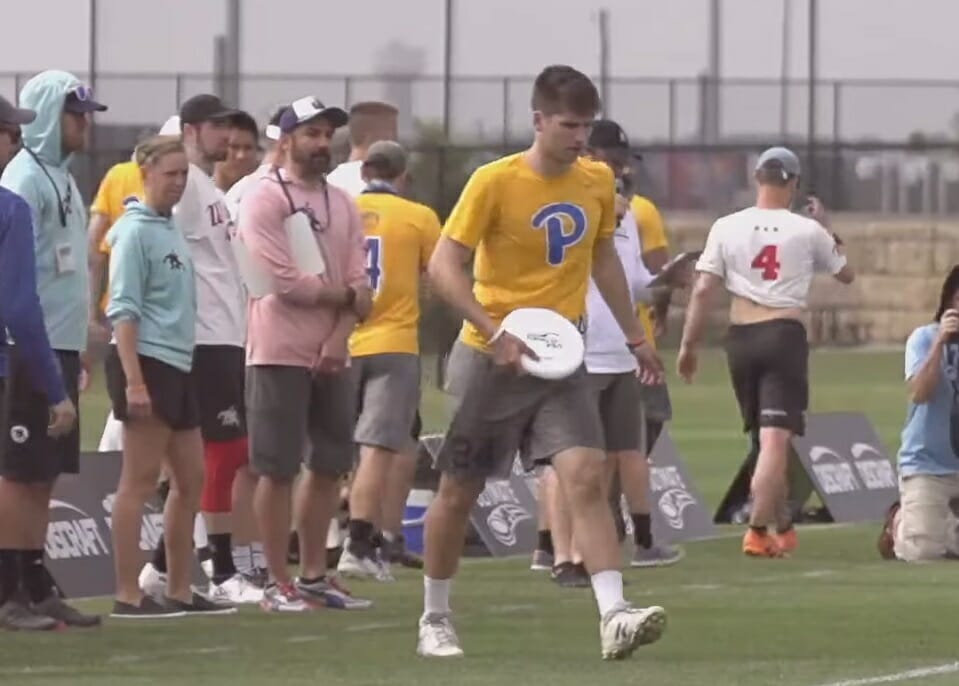
These were a hot topic among the Ultiworld staff, and most of the buzz was negative. I don’t hate them. I definitely don’t love ’em, but I don’t hate ’em. Mostly I appreciate Pitt for continuing to try new things while staying within an identifiable brand. These come nowhere near the basketball jersey warmups from last year, but I still respect and appreciate the effort.
Michigan Magnum Sunset Ripoffs
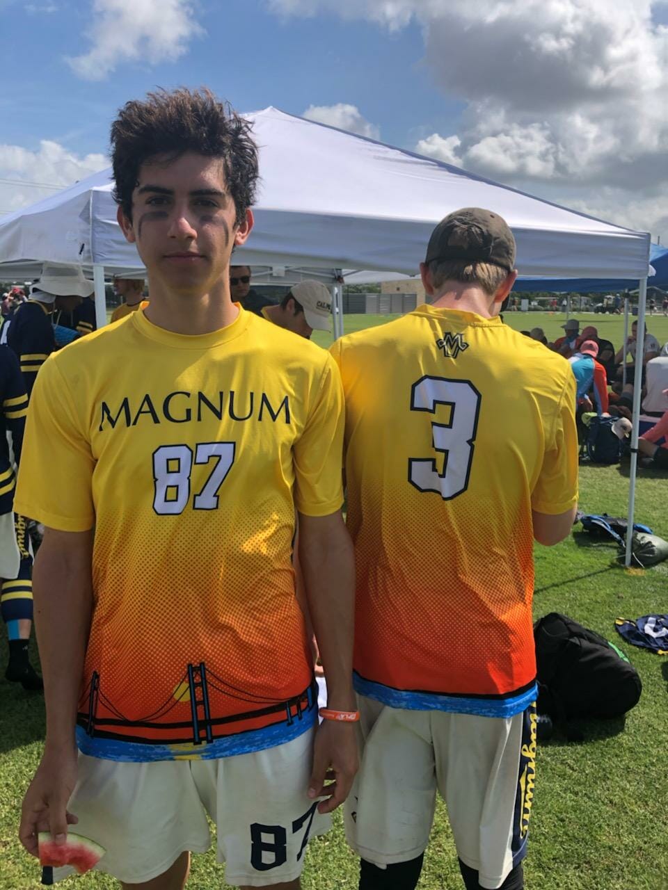
I didn’t want to put Michigan in the bottom five twice, because, on their own, these aren’t horrible. But they’re clear rip offs of what the Michigan women’s team wore to Nationals last year. I do actually like these better than Flywheel’s because they’re more Michigan-y, but originality is key here, fellas.
Ultiworld’s Oak Creek Polos

After years– like, at least three– of asking Charlie for us to get Ultiworld polos, it finally happened. Oak Creek Ultimate gave us the hook up and we looked like actual professionals on our streams for once. No more will I have to dress like a schlub in order to avoid completely melting while working a summer tournament. For those of you who think dreams don’t come true, here’s evidence otherwise.