With bonus D-III picks!
June 7, 2022 by Alex Rubin in Preview with 0 comments
Our coverage of the 2022 College Series is presented by Spin Ultimate. Please support the brands that make Ultiworld possible and shop at Spin Ultimate!
While the action on the field gets all the headlines, we know the real winner of Nationals is the team with the best merch. Ultimate has largely moved away from the headstrong, fully-sublimated thunderstorms of designs that permeated the previous decade, and teams have largely done well to include subtle design elements that bring a unique style and flair to their team kits. A good jersey is easily identifiable to its school/program, has numbers that are easy to read, and avoids making the shirts too busy or cluttered.
Here are the notable shirts we saw in Milwaukee:
Best of the Best
Cal Poly SLO SLOCORE Teals
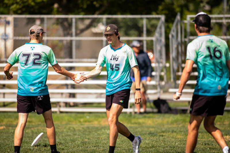
A great use of a unique color. A similarly unusual yet clearly readable number font. The “Cody Mills Analytics” line on the sleeves! What’s not to like? Bonus points for their shorts which also have “Cody Mills Analytics” written on the waistband.
Minnesota Grey Duck Whites
There’s a fair debate about where the line is when adapting another logo or design trope into team jerseys. Grey Duck makes the Pokemon theme work here by adding their grey duck logo behind the Pokemon font. Their TuneSquad theme darks are also a fantastic look, though they don’t stand out quite as much.
Pittsburgh En Sabah Nur Yellows
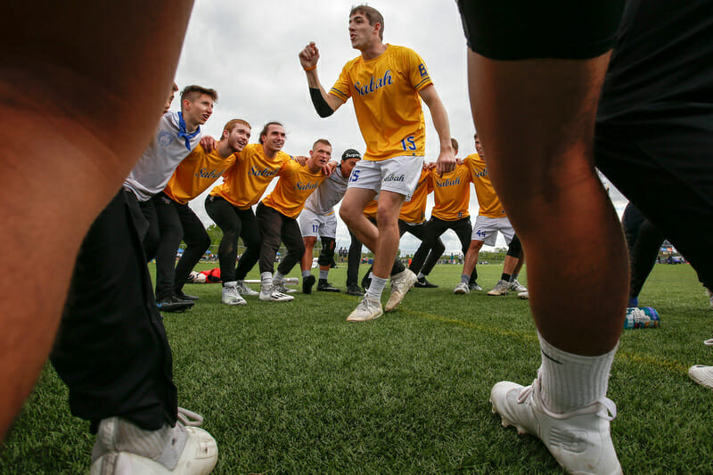
These jerseys are an instant classic. The gold and blue color scheme just screams ‘winner’ and the script font is something other teams should be jealous of.
Pittsburgh Danger Blues
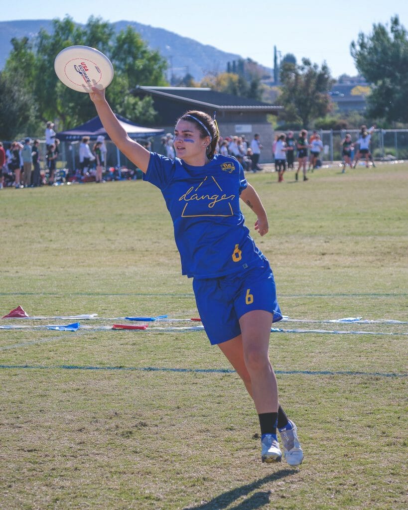
Danger has found a great design here and should keep it going forward. The University of Pittsburgh’s shift to a brighter shade of blue is great for their teams, and I’m glad it’s trickled down to their club sports as well.
Colorado Quandary Whites
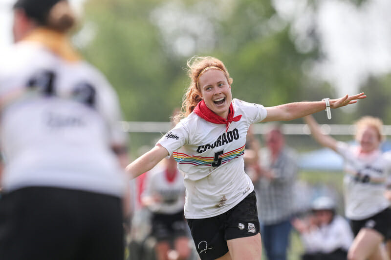
Colorado incorporates the rainbow striping into their jerseys nicely, making a kit with the potential to be boring really pop.
Michigan MagnUM Whites
This is a great example of a team finding places to put good accents without doing too much. A tasteful logo, clear numbers, and subtle side striping makes for a great kit without requiring too much creativity or cribbing off of another existing design.
Colorado State Hell’s Belles Whites
Like Michigan men’s light, this jersey finds the perfect balance between a clean, traditional look and escaping the boring possibilities of just printing a team name and number.
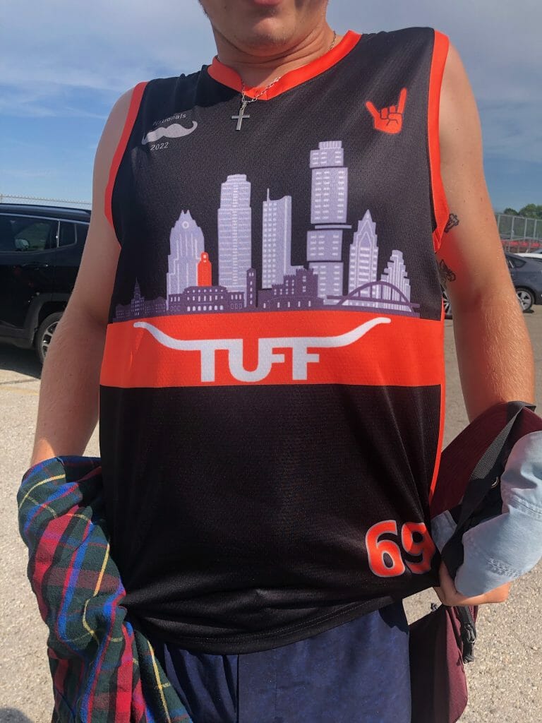
Texas TUFF Trans Awareness
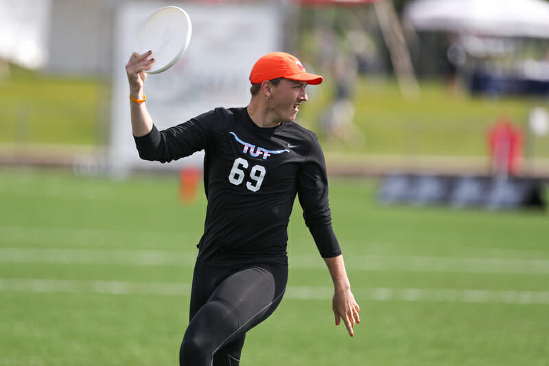
This jersey makes the list less for its literal design and simply because of the inclusive message it is sending. Fans can purchase replicas of the jerseys, which feature the trans* pride flag, with proceeds going to LGBTQ+ charities in Texas, a state which recently passed a spate of anti-trans legislation. Especially given that gender inclusion has been a bigger topic of conversation among women’s division teams in recent years, it is especially encouraging to see a men’s division team make a visible statement like this.
Tufts Ewo Whites
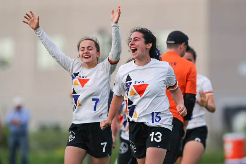
This is a beautiful application of shape and color to give Ewo a design that is neither boring nor busy. Fitting their elephant logo into one of the triangles is a great touch. Hats off to whoever designed this one! It bothers me a bit that the number font for their jerseys and shorts are not the same especially as they are stacked one on top of the other, but the jersey design is so good that I’m willing to overlook that small flaw.
UNC Pleiades Yellow Crew Necks
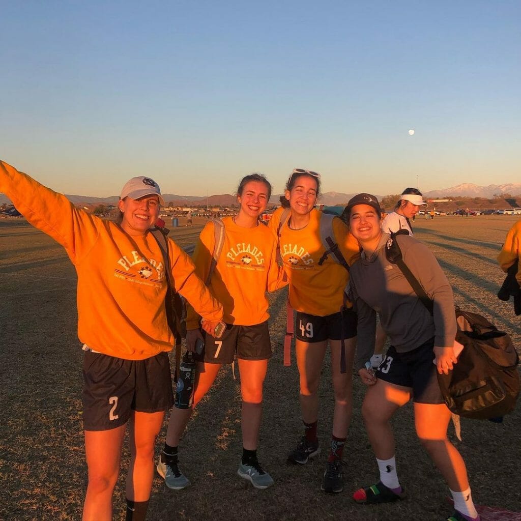
While on-field apparel is of course of the utmost importance, arriving to the fields looking good is important too, especially on chilly mornings. UNC stands out with this distinctive and tasteful look.
UCSB Burning Skirts Sunhoodies
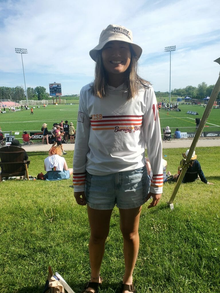
Taking a page from Pittsburgh Parcha with their retro look, the UCSB sunhoodies have been a much sought-after item around the field complex. With a classic color scheme and tasteful striping, the Burning Skirts hit the nail on the head with this one.
The Worst Looks
By and large, the jerseys at this tournament have been great. Usually, college students can be relied upon to produce at least a few ill-advised looks. While there are certainly fewer bad jerseys than good ones this year, the shirts that stand out for the wrong reasons are just a bit too busy or have numbers that are unreadable.
Texas TUFF Basketball Jerseys
Usually teams that mimic the design of their local basketball team have popular jerseys, but these miss the mark. First, they are UT-Austin, but the jerseys clearly draw inspiration from the Dallas Mavericks, who play three hours away. Second, the garish trim and strong contrast zaps the traditionalist charm of the Texas burnt orange. Even a cheeky apropos “horns up” can’t save this.
Washington Sundodgers Blacks
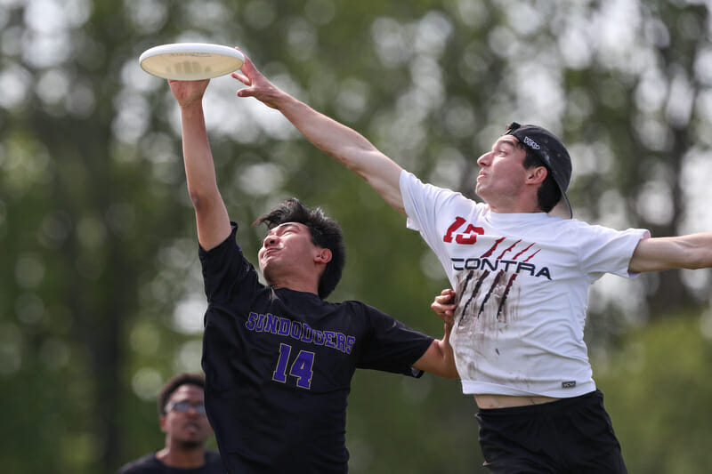
A classic look for a school with purple and black as their primary colors, this jersey would benefit from a better outline on their numbers to help those at a distance read them.
Carleton Syzygy Whites
There is no reason why Syzygy could not have picked a darker color to make their numbers easier to read from a distance.
William & Mary Merry Men Whites
The bold font choice is reminiscent of a middle school baseball team’s practice jerseys. The contrasting sleeves would be a nicer touch if the numbers were thinner and green felt more like an accent color than a main color.
Florida State Seminole Ladies Maroons
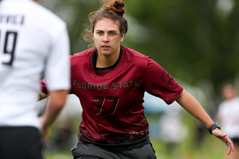
These numbers are simply unreadable. There is no reason why they should not be white.
Auburn Aetos Blues
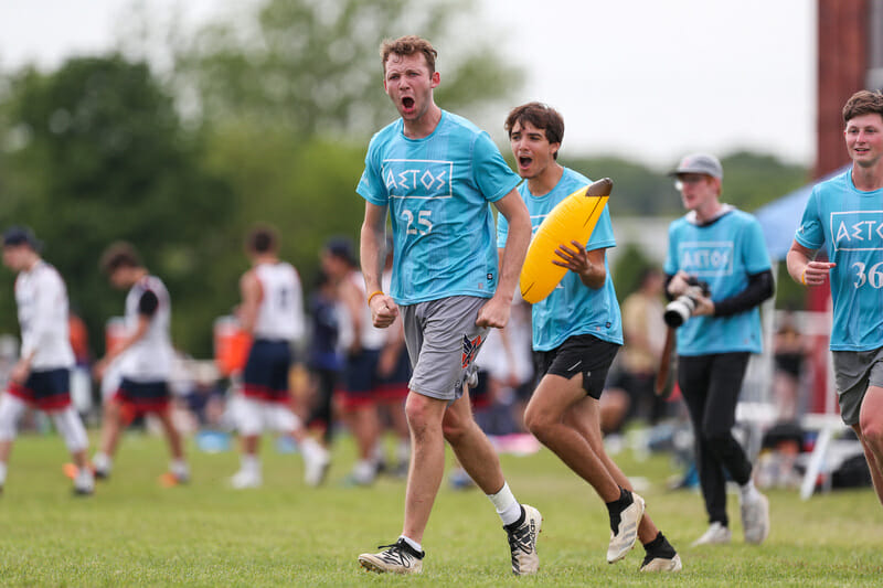
This is a great idea with poor execution. The striping gives this shirt a weird look, and the shirt would look better if it picked one of those shades rather than trying to include both. Also, it’s probably not Auburn’s fault, but the shirts have two manufacturers logos with Five and VII (who have merged as businesses) both tagged in the bottom left corner. Overall, it looks sloppy.
Northeastern Valkyries Blacks
There is nothing wrong with this jersey per se, but they’re quite boring. I wish the team had done more than simply put their team name across the chest. The lettering and numbers are readable, which is great, but I wish there was just one more design element.
UConn Huskies Reversibles
These are just straight up basketball jerseys. It’s likely that the UConn basketball teams would have made the bracket had they been playing instead.
Mismatching Pants
While I am fully on board with players playing in clothing they are comfortable in–be that team shorts, sweatpants, or running tights–it bothers me when players have a look so different from the rest of their team that the bottoms are a distraction. For example, a team that is otherwise wearing black jerseys with grey shorts should not have a player in bright yellow sweatpants. I’m in a nice mood, so I won’t call out the specific players I am thinking about, but it is worth pointing out that jerseys look better when everybody is wearing them, and wearing them in a way that is at least adjacent to uniform.
D-III Bonus Best Picks
Claremont Braineaters Sunhoodies
Claremont toes the line here with the amount of design elements, but the brains coming out of the train engine as puffs of smoke is the perfect final touch. Well done to the men’s division spirit award winners.1
St. Olaf Bezerkers Light Blues
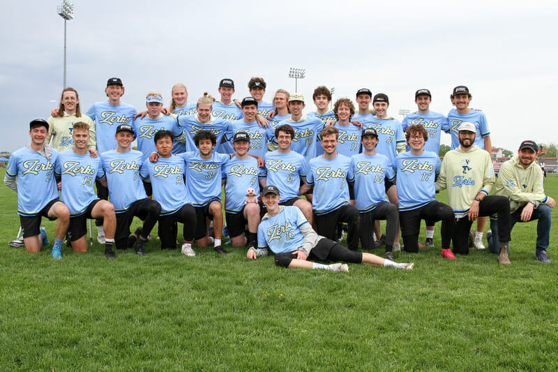
Fantastic use of color, beautiful script font, easy to read numbers. This jersey has everything an aesthetics-inclined follower could ask for.
Knox Alleycats Blacks
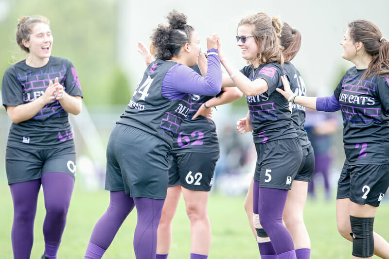
The subtle brick pattern behind the readable numbers is a great use of team colors and the perfect balance between boring and busy.
Haverford-Bryn Mawr Sneetches Greens
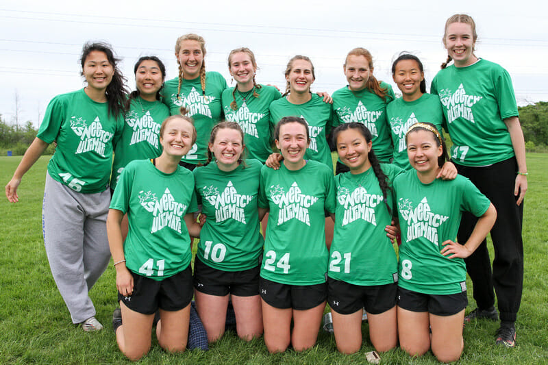
Perhaps no team does a better job translating their team name to their jersey design than the Sneetches. Squeezing the team name into the Dr Seuss-inspired star, the team name is still clearly readable and easily identifiable. It helps that no other team wears that color green, but these jerseys would stand out regardless.
Full disclosure: the author of this article is the head coach of Claremont. ↩