Everyone's favorite: jersey talk!
May 30, 2023 by Alex Rubin in Opinion with 0 comments
Ultiworld’s coverage of the 2023 college ultimate season is presented by Spin Ultimate; all opinions are those of the author(s). Find out how Spin can get you, and your team, looking your best this season
And now the article you’ve all been waiting for. Those of you who enjoy keen analysis and stories of epic comebacks and hard fought games, there’s been plenty of that over the past few days. We’re here to talk about the jerseys from the D-III championships. Overall this was a great year for jerseys. It took some digging to find the candidates for the “worst” list and there were a lot of solid jerseys that may have made the cut in previous years. It seems like most teams are understanding that they need to have good contrast between the numbers and the background, and jersey companies have largely complied with USAU restrictions rather than the whims of college kids who probably haven’t read the guidelines. With that being said, there are a few which stand out:
Best
St. Olaf Berzerkers Set
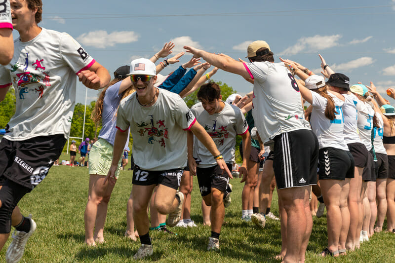
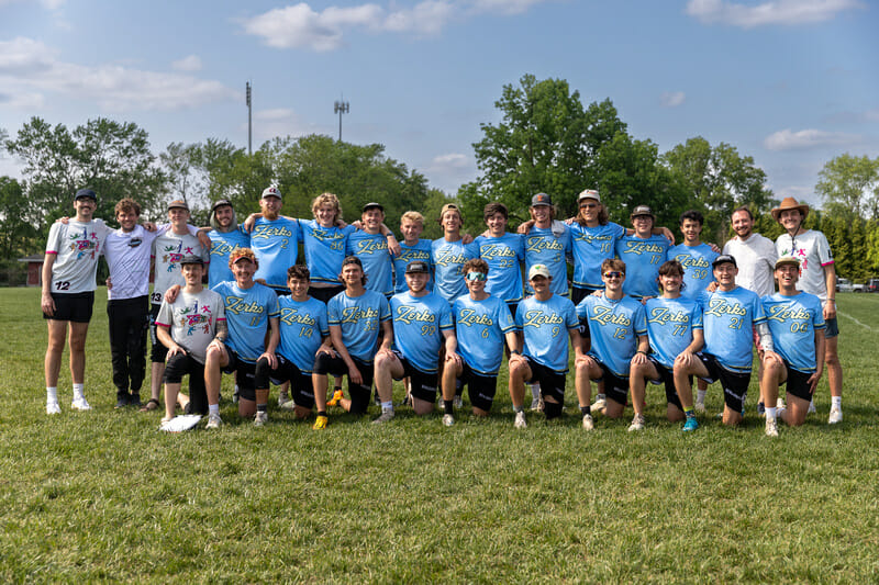
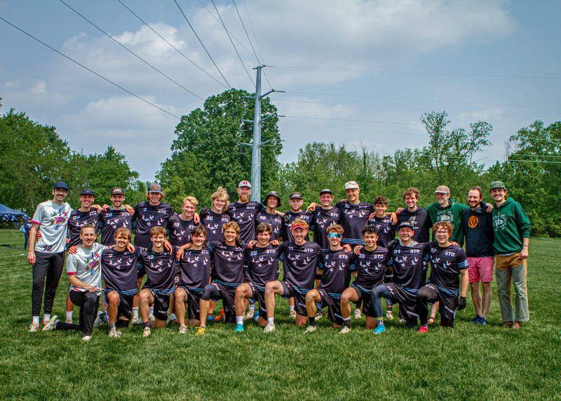
I couldn’t decide which of this bunch I liked better, and I’m making the rules so I don’t have to. The white jerseys are joyfully playful and incorporate great color. The black jerseys have great balance between distinct design elements and are not too busy. The blue jerseys that made this list last season return because of their unique color scheme, and excellent wordmark. There’s nothing not to like here
Berry Bucks White
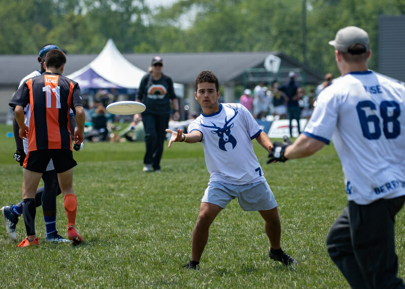
I love the oversized buck here. Maybe there’s something to the horizontal symmetry, which doesn’t appear often without stripes or another framing element, or maybe I just appreciate that it is dark enough to provide contrast on a white shirt without being too overbearing to clash with an opponent.
Wellesley Whiptails Blue
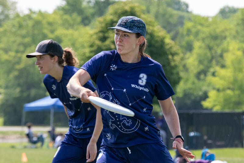
Because the white lines are so thin, this design doesn’t appear to be as busy as it looks when you notice all of the details. Clear numbers help in a two-color jersey with this much design, and it’s impossible not to love the design. The gecko is the highlight, but the other stars and the constellation motif each add their own spark to this design.
Portland UPRoar White
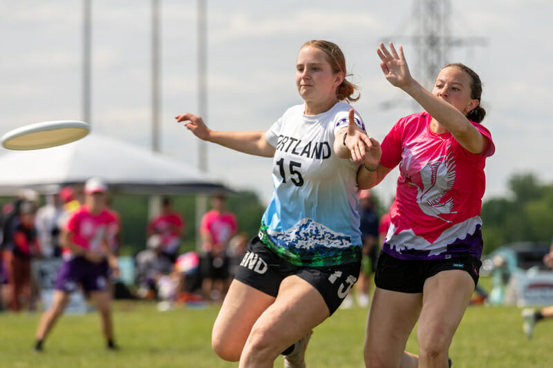
This is a repeat appearance and a deserved one. A local icon, rendered in bright-but-not-too-bright colors, gracing the hemline of the jersey is the perfect balance of playful and fun without being distracting or overbearing.
Colorado College Wasabi White
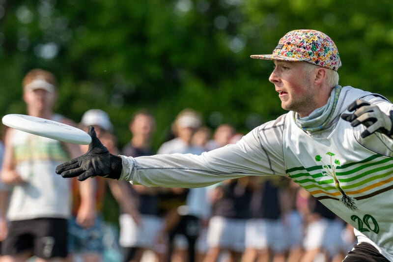
For a team with a logo that was clearly designed in MS Paint, I really appreciate that Colorado College Wasabi used an actual, detailed wasabi plant as part of their design. The unique color scheme also stands out.
Worst
Catholic Nun Betta Black
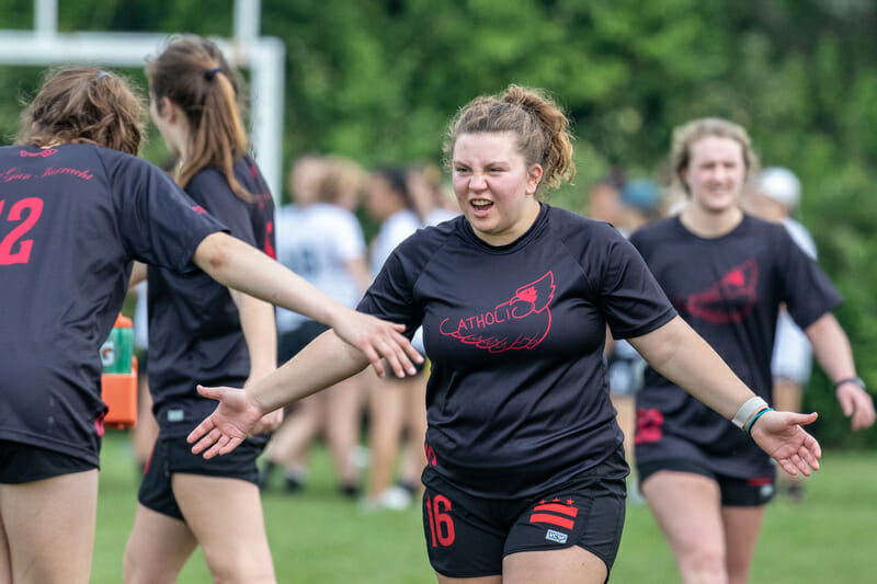
A color-flipped copy of their white design, the red-on-black print is just too dark; it’s hard to actually see the design.
Middlebury Pranksters Mixed-Up Colors (Men’s and Women’s)
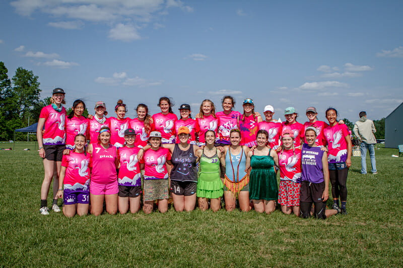
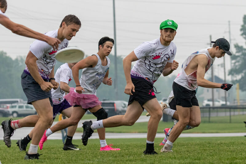
Middlebury does this thing every year where they play in different colored shirts (I hesitate to call what some players were wearing jerseys) and it’s infuriating. At an early season or unsanctioned tournament, teams should be free to wear what they way. But this is nationals and teams should wear matching jerseys. I personally do not care if those jerseys are spray painted cut-offs or the newest tech hoodie or whatever BE Ultimate has to offer. I just care that they’re the same thing for everyone on the team. Year after year, Middlebury has disregarded the concept of Uniform1 in favor of loosely looking like a team that came together at a pickup game. At least that is until they play in a semifinal or final game and Big Frisbee forces them to prove that they had matching uniforms sitting in their bags all along. D-III ultimate tries to strike a balance between playfully reminding everyone of ultimate’s roots as The People’s Division™ and gaining more respect and legitimacy compared to D-I, which has always been more popular. Wearing matching jerseys is the bare minimum to earning that respect and Middlebury should hold itself to a higher standard as a flagship D-III team.
Williams Nova Purple
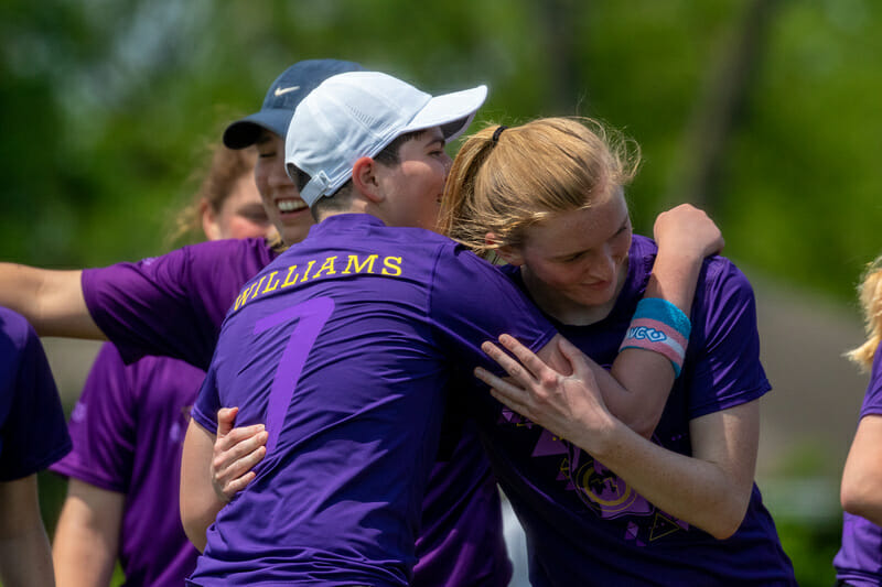
These numbers are simply unreadable.
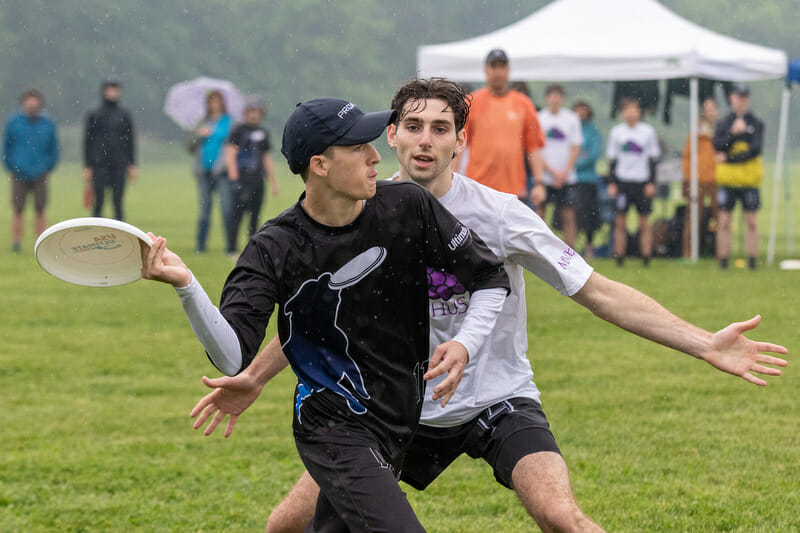
Butler Big Dog Black
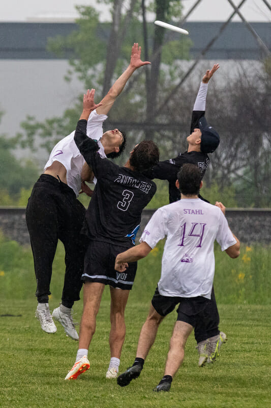
Like Williams, these numbers are too difficult to read to be effective. One the other hand, they do have a cool logo on the front.
Most Interesting
Missouri S&T Miner Threat Green
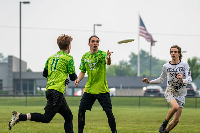
Miner Threat has been wearing these jerseys for a few years and I appreciate a new and unique color being brought to the sport. Some might say they’re a little bright, but this is the kind of fun that should thrive in D-III.
Lewis & Clark Bacchus Hair Style
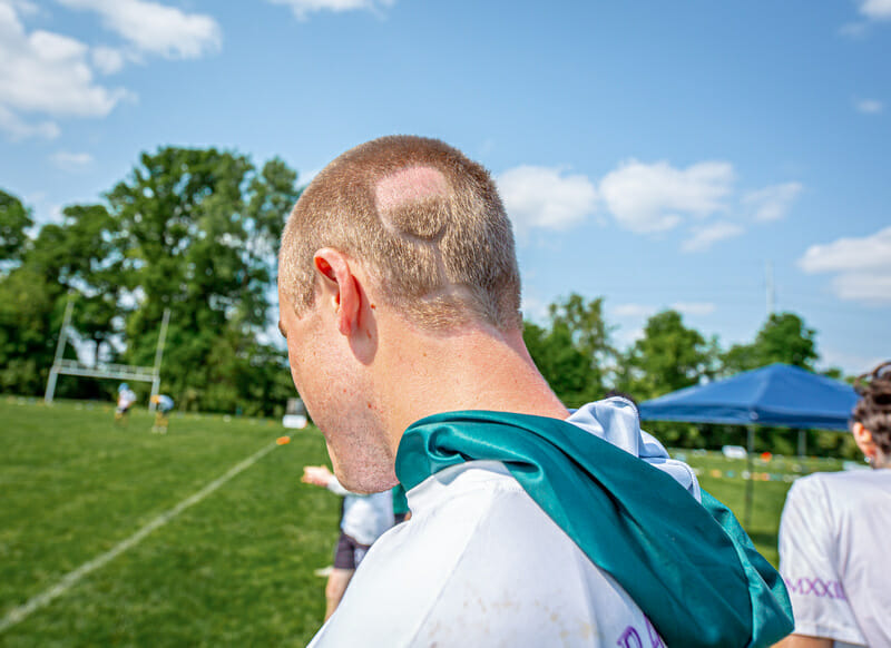
At this point it seems like nearly every team has some sort of hair element. Some teams will dye their hair a team color or go all in on a theme (see the D-I Championships which were filled with players sporting mullets). This particular player on Bacchus went one step further with a creative approach to a team-oriented hair style.
Mount Holyoke Daisy Chain (Both)
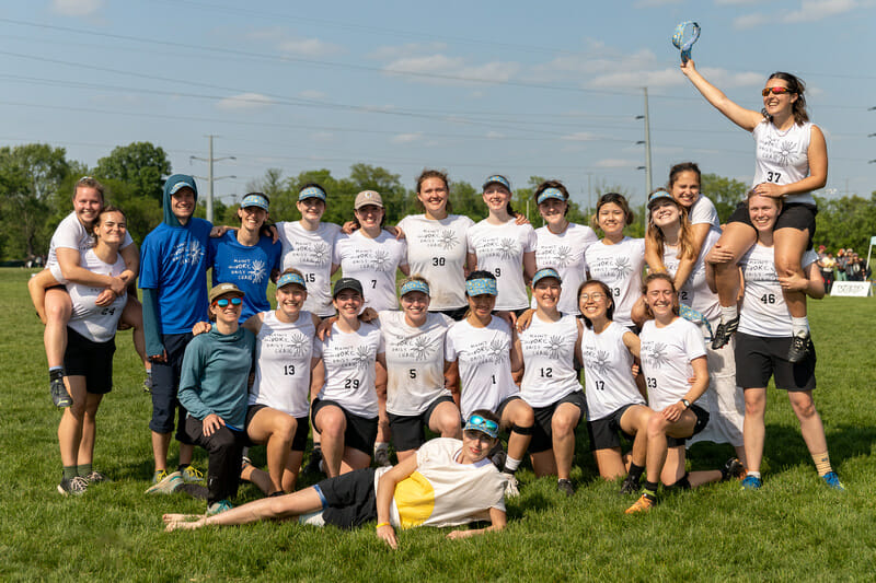
Daisy Chain essentially have the same design just color-flipped on their blue and white jerseys. The design isn’t anything to write home about, but something about the handwriting screams “D-III” and I love it.
Richmond Spidermonkeys Set
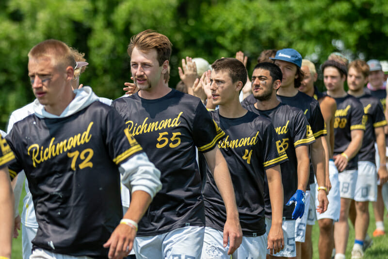
First, I’ve never heard anybody call Richmond the River City, but the all white set looks really sharp and the subtle sublimated background pattern is a nice easter egg. The black and gold Nationals jersey is great, but it would be cooler if they didn’t already have a black jersey in their set. I would’ve liked to see red as one of their primary colors so players aren’t left with two jerseys of the same color.
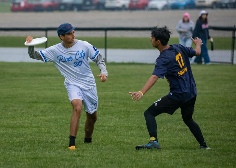
Really the SpiderMonkeys are getting a shout out here because they tagged me in their early season Instagram post revealing the jerseys and I’ll happily reward their self-promotion.
https://www.merriam-webster.com/dictionary/uniform ↩