Our favorite and least favorite D-III kits from this past Nationals.
December 13, 2019 by Michael Ball and Sam Echevarria in Opinion with 0 comments
It’s time to unwrap some presents as we introduce the 12 Days of College Ultimate. Over the next few weeks of December, we will be releasing one gift per day, though don’t count on getting any partridges in pear trees: it’s all college ultimate. From top players to strength bid predictions to highlights, we’ve got a little something for everyone.
Today’s topic: For day three, we go to D-III! Our D-III editors have some fun discussing the kit styles that showed up to Texas for Nationals last year.
Winter break is the time when college programs handle much of their clerical work in preparation for the upcoming season. USAU memberships are updated, bids to tournaments are submitted, budget proposals are approved by universities, etc. [Editor’s note: It’s a last minute chance to dig in the couch for loose change and maybe a fresh rookie or two to be recruited in the dining hall rush.]
Perhaps most important of all, team kits are designed and ordered.
Ultiworld’s swiss army knife, Daniel Prentice [Ed: a prince among reporters who leaped at the chance to go to College Station (or so we’re going to tell ourselves)], has written excellent pieces the last two springs evaluating the uniforms he sees at the D-I Championships. Imitation is the sincerest form of flattery, and I’ve often said I want to be Prentice when I grow up [Ed: Make that two of us.], so I’m going to repurpose his work for the team kits I saw at the 2019 D-III Championships.
A couple of points before we get started: first off, much to the chagrin of some Ultiworld commenters, I am not an actual designer. These are simply the opinions of a man who spends too much of his spare income in team stores.
Second, we’re going to format this piece a bit differently. As most of you reading this probably know, I’m the dumber [Less academically inclined] half of the 7500 Club podcast. My co-host, Sam Echevarria, and I are both big [Ahem, huge] fans of this Players Tribune piece from Darius Miles, which features commentary from his friend and former teammate Quentin Richardson. [After you’re done with this piece, go check that one out. It’s awesome.] I’ve written my version of this piece, then submitted it to Sam for her much wiser commentary [Did he think I wouldn’t have started already? Reporting for duty and keeping Mike honest–I take this job seriously, folks].
Five Kits I Loved
Mount Holyoke Daisy Chain Whites
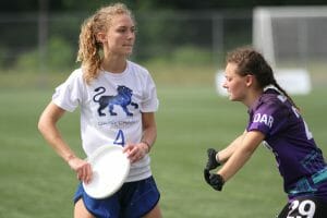
Let’s get started with the best kit I saw all weekend in College Station. Something you’ll notice throughout this piece is that I’m not the biggest fan of full sublimation. I find that teams typically go overboard with it, and it’s easy for a uniform to go from clean to chaos with too much sublimation. [Not to mention burning through a whole week’s worth of the student job paycheck]
That said, I think more teams should be looking to use full sublimation on their shorts, and Daisy Chain have set the gold standard with this kit. I have no idea why they use the Leo constellation for their logo; the best I could surmise is that it’s a play on the homonym of “lyo” in the middle of Holyoke. […I give points for creativity here to both Daisy Chain, and Mike. ‘Homonym,’ really?] What I do know is that it’s an awesome logo, and the spot sublimated whites look incredible with the full sub shorts. [Crisp, clean, and beautiful colors. Bravo, MHC.]
North Georgia Aurea Darks
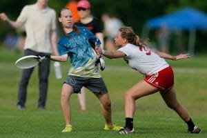
I was a big fan of these jerseys purely based on the aesthetic. The shades of blue are unique and pleasant reprieve from the sea of royal and navy seen across the complex, and the gold pops perfectly against the blue. [That said, the way to an in with Team 7500 Club is very obviously through a pleasing blue jersey.]
What put these over the top from a jersey I like to one that I love was when I learned that “Aurea” is Latin for “golden.” [Learning isn’t just for the college players, folks!] It would have been so easy for North Georgia to make their jerseys primarily gold and lean all the way into their name, but the choice to make blue the primary color and use gold as the accent was an excellent decision. Tasteful incorporation of your team’s name isn’t always easy; [or possible–you know who you are] this one is extremely well done.
Carleton GoP Darks
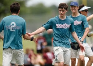
The words “Carleton GoP” and ‘Hawaiian shirts’ have become synonymous at this point in the ultimate community. America’s A-Team team are known for their fun, loose style of play, and they reflect that by wearing Hawaiian shirts all the way up until Nationals. [If you haven’t gotten to see a GOPer lay out, oversized Hawaiian shirt flapping in the breeze as the rest of the team cheers, you have missed out on a key piece of D-III Men’s ultimate and I hope you get the chance to remedy that.]
GoP found a way to pay homage to their regular season attire on their Nationals kits, using pink Hawaiian print against their heathered teal [there it is again, a shade of blue] darks, and they were my favorite darks in College Station. The only criticism I’d give any consideration about these jerseys is that the “Carleton Ultimate” across the back is hard to read, but we’re just picking nits at that point. These are awesome. [Not gonna lie, GoP always has fun jerseys with callbacks and references–I went to Claremont and I own a GoP longsleeve made to look like a plastic bag. Why plastic? Study up on your GoP knowledge.]
Middlebury Pranksters Darks
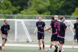
I know I said earlier that I’m not a huge fan of full sublimation on jerseys, but these are a worthy exception to that personal rule. This is an exceptional use of sublimation because it’s used for details rather than to make a statement.
The list of details on this jersey is staggering. The wings on the shoulder pay homage to the flamingo logo used on Middlebury’s white jersey. I’m a big fan of state outlines on jerseys, especially when it’s a unique state like Vermont. [How’s VT getting creativity points if it’s just an upside down New Hampshire? I kid, I kid] The jester hat logo and pink are both classic features of past Pranksters’ kits. My favorite detail is that the horizontal stripes along the bottom of the front of the jersey turn into Mead Chapel, the most recognizable building on Middlebury’s campus, on the back. [It also doesn’t hurt that this jersey looks like it did the electric slide into a pool full of Kool-Aid, then rode in to the tournament on rollerblades while listening to ‘Sunglasses at Night.’]
Middlebury and GoP, two teams who wait as long as they’re allowed to before wearing regulation uniforms, brought the two best darks at Nationals. What a world.
Richmond Spidermonkeys Whites
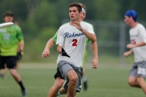
There really isn’t much to say about these jerseys, and that’s exactly why they’re perfect. The cursive “Richmond” on the front is classy and clean. The navy letters and red numbers look great without coming across as patriotic, which isn’t easy to do with that color scheme. [Yeah, but don’t wear this to your Fourth of July BBQ–that sauce will never come out.] The Spidemonkey logo is used on the back above the numbers. I feel like most teams would have gone with the logo on the front and “Richmond” across the back, but the inverse used here looks terrific. [A little too clean for my taste, but I’m happy to give points for good taste on this one.]
Five Kits I…Didn’t Love
St. Olaf Vortex Darks
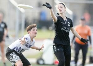
This kit is one of my least favorites because it represents a missed opportunity. Vortex is one of the iconic programs in the division, [never sleep on the North Central!] sustaining a prolonged level of excellence not experienced by many others. The team should have it’s own look, not the same exact kit as other schools.
[Don’t know who’s look came first, but chicken or the egg, the team from Northfield deserves a rad look unique to the powerhouse that is Vortex.]
Puget Sound Clearcut Whites
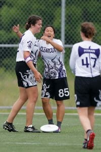
By itself, the jersey is fine. It’s a bit busy for my tastes, but it’s [I can hear the ellipses for dramatic effect] fine. By themselves, the shorts are fine. I’m already on the record above as being a fan of getting creative with shorts. However, this jersey combined with these shorts creates a chaotic mess that is just too much for me.
[I’m going to have to go rogue on this one and disagree. This light kit is all about owning an identity and a theme, and this jersey knows exactly what kind of badass, sea-faring monster it wants to be on the field. I would rock this in a heartbeat, especially in such an awesome shade of purple.]
Oberlin Preying Manti Darks
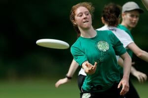
It was so frustrating to watch such an incredible team play beautiful ultimate in jerseys that were the total opposite. The Preying Manti have a cool logo, and they chose to stifle its greatness by going monochromatic with it. If Oberlin had simply gone with black jerseys or flipped the color of the logo to pop against the green, these jerseys would have been exponentially better.
[And readable; as someone who had to read the numbers more often than not from the shorts, squinting from the sweltering broadcasting tent, I would’ve loved a different color. This is why USAU made everyone put numbers on their jerseys and reorder everything a few years ago, friends. Your friendly neighborhood D-III editors thank you in advance.]
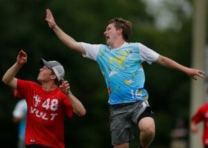
Richmond Spidermonkeys Alternates
I refuse to believe that Richmond actually tried with these. [Oh, someone tried something here. This is full on design mutiny.] They have to be one of those inside jokes that nobody else is in on, or maybe they were intentionally trying to make the worst jersey possible. No analysis is needed for these; the disaster speaks for itself.
[Amen.]
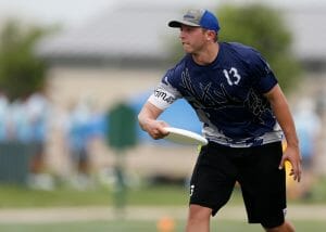
Berry Noble Savages Darks
Berry, I promise we’re not just picking on you all. I would have hated these jerseys no matter what team was wearing them. [Unlucky for y’all.] There’s simply too much going on here, but the biggest problem for me is wearing navy on black. It’s my least favorite color combination in the world; I’ve never seen it work, and that streak definitely doesn’t end with this kit.
[I will throw in a hat tip to the geography portion of this kit–I think this is another outline one that works nicely, and which I can see clearly with the gray against the navy, which is not a bad color combo.]
Random Thoughts and Observations
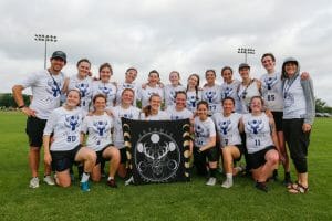
Lewis & Clark Artemis Whites
This logo is maybe the best that I saw at the tournament. [I want to go back in time, buy a flag with this logo on it and put it up in my door room window.] It’s terrific, and it looks fantastic on these whites.
But the shorts ruin it! Navy on black again. Ugh.
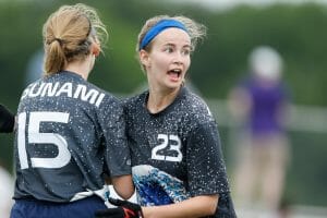
Truman State TSUnami Darks
These jerseys are pretty cool; I like that they lean in to their team name and are bold about it. But why are the letters across the back gigantic?
[The killer for me is the font–sans serif is just not matching the heavy lifting the graphics are bringing.]
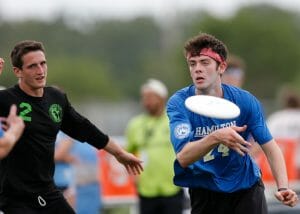
Hamilton Hot Saucers Darks
The basic design here makes me believe that this design might be mandated by the university. [If so, very hard straw to draw.] However, I noticed the sweet logo on the sleeve.
Hot Saucers, if you’re allowed, use that logo this year!
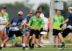
Missouri S&T vs. Berry
I was pleasantly surprised to see so many games at Nationals where both teams wore their darks. That said, this matchup was pure chaos. Just looking at that picture makes my head hurt.
[I feel like I’m watching a case of Mountain Dew falling overboard into a swarm of sharks.]
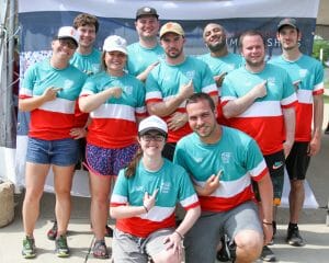
7500 Club Jerseys
Obviously we’re a bit biased, but these were [HANDS DOWN, NO CONTEST] the best jerseys in College Station. It’s always good when your design inspiration comes through so clearly that even BamaSecs understands the reference.
[As they say, game respect game.]