How is USAU doing in translating their content to mobile phones?
January 21, 2016 by Simon Pollock in Review with 0 comments

Back on October 3, USA Ultimate launched a mobile application to deliver event information, news, video, and an optimized version of the USA Ultimate magazine. For those of us who can’t go a day without new ultimate-centric content — or, more importantly, for those of us who need to access USA Ultimate information on our mobile devices to stay on top of schedules and scores — this was something close to a welcome upgrade.
I would love to claim that the following review comes after three months of frequent and thoughtful usage, but you deserve better. It’s more like a little under two hours total. Plus, there isn’t enough USA Ultimate-related content coming out in the late fall to warrant anything close to daily usage.
In the spirit of progress and improvements in a new year, I clicked and perused thoughtfully through the app to gauge its usability and functionality.
The five-point scale worked well for my last review, so we’ll return to that vetted, scientific rubric and dive into my thoughts on the initial release version of USA Ultimate’s mobile app. This review is based off of access with an iPhone, but you can also download the app on your Android device. Or do us one better and leave some thoughts on the Android experience in the comments.
Home Screen: 4.0

Upon launching the USA Ultimate App, the user is greeted by a fairly pleasant home page with the branded blue and white of our national governing body. First impression: good, unified design.
There’s a news carousel at the top that scrolls automatically at first, but I particularly appreciated that I was able to swipe backwards and forwards through each headline. That also appeared to pause the automatic scroll, which moved a little too quickly for me to fully see the various stories passing by.
The bottom third of the screen is dedicated to six static buttons: Events, News, Video, Magazine, Rules, and Settings. Each of the icons is big, simple, and responds quickly. Spoiler: there isn’t much hiding behind the Settings icon, but USAU is welcoming feedback from users and that’s where you’ll find a link to provide it.1
Navigation stays present throughout the rest of the app experience after leaving the home page, but the icons are relegated to a smaller white strip at the bottom of the screen. The sections are still easy to read, and it’s an easy jump from whatever is currently on screen. This is a particularly nice feature, and makes the user experience more streamlined. The app probably would’ve been a quick delete if I had to jump back to the home page every time to switch sections.
The fact that the app launches quickly and the greeting page isn’t complicated or stuffed with too much information is important. We’re in an age where user experience is based on impulsive clicking and good aesthetics, so the app gets good marks on that front. I was enticed enough to stay to explore more.
My one major gripe: this page somehow needs to communicate that we’re talking about ultimate frisbee. There’s always the off chance that someone new to the sport stumbles onto the app, and it seems logical that we should be prepared for that scenario.
Events: 2.5
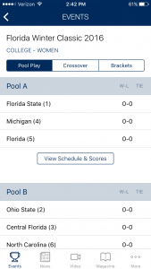
I’d imagine that most users downloading this app will be taking advantage of this section. I could be wrong, but the type of person who deals with events on the full site is typically a team captain, coach, or event organizer. Given the relatively steep learning curve of reading this information on the full USA Ultimate platform — and the critical opinion of the crowd that tends to organize or captain ultimate teams — delivering schedules, brackets, and scores in an easy-to-scan mobile format could single-handedly either drive adoption of the app or scare just about everyone away.
I am happy to report that pool schedules, bracket formats, and scores were all very easy to read here. It took an extra click to get through to the individual games, but that’s not bad at all when considering that the alternative is getting USA Ultimate’s entire scoring platform to load on a smartphone, which continues to be a pain at remote field sites.
There’s a lot of potential for this to be a top-notch feature, and user feedback will hopefully drive positive improvements. How cool would it be if stats were eventually built in, on top of event management and update capabilities?
At least on iOS, however, there is no option to view brackets in landscape mode. That is a huge ding in the easy-to-read category. Having to scroll up, down, and across in portrait mode was a pain compared to the well-formatted pool and crossover schedules. Landscape view is a nearly universal feature across the mobile app experience, and I think in terms of readability that should be a top consideration in the second release.
This section also gets a sizable deduction for not currently supporting data input. A few voices have already called for a score-reporter-esque function, and from a tournament director’s perspective, having a functional mobile solution to update scores from the field site would be a massive improvement.
I can’t emphasize this enough: the Events section will live and die on organizer data input. Like any page on USA Ultimate’s full score platform that doesn’t have up to date information, this section of the app is completely useless if the people in charge of running the event don’t have access to mobile internet. I’m sure it’ll be difficult to add an organizer feature to the app, but that may be the best possible use of USAU funds earmarked for app development in the future.
If USAU wants users to adopt the app, recognize that event organizers are a powerful group. They already spend a lot of time creating opportunities to play, and are the key to any team competing and having fun. Furthermore, if given the opportunity to update scores, field assignments, timing changes, etc. in an app, they will be motivated to both do so and encourage teams to download the app for use rather than deal with a gaggle of captains all desperately begging to find out where and when their next crossover game will happen.
News: 1.0
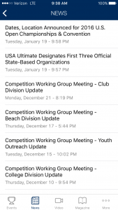
“If you don’t have anything nice to say, don’t say it at all.” I think every grade school teacher or parent enforcing manners with impetuous children says that at some point. That’s unfortunately the phrase that came to mind when taking a look at this section.
News is perhaps the least accessible and aesthetically pleasing section in the app. Like most of the other content, this is just a mobile version of what is available on the website.
That means the robotic USA Ultimate press releases and recaps that appear on the website are reprinted here. Topics are discussed in a publicist’s overly politically correct tone, the format is tiny, and nothing about this section is inviting. Unless you scour USA Ultimate press releases for wonky changes the minute they’re published, you can easily skip this section as a user and wait for someone to synthesize the information in a more entertaining manner.
It’d be great to see a couple major changes to make the most of this section. One: if and when USA Ultimate decides to make their content more interesting outside of special tournaments and the magazine, having a more creative voice share these news stories will make everything about this section more inviting. Two: assuming the stories become entertaining, the app could incorporate news alerts and allow for push notifications, which will play right into the hands of all you news junkies out there who can’t live without your phone buzzing with BBC and NY Times special alerts.
Video: 3.5

There’s nothing revolutionary here, and there is a lot of other video content out there on the web, but this is a simple section that provides quick access to USAU highlights and games. That’s cool, if for no other reason than that it’s a nice collection of high level, ready-to-watch games. Are they all close? Hardly, but it’s great for anyone looking for championship content.
A notable plus from a more geeky standpoint is that the videos play right inside the app. There’s no jump to Youtube or a browser in iOS. That might not bother or mean much to some of you, but it’s a vote of confidence for the app in terms of keeping users inside the experience and not relying on other parties. It’s also one less step to airplay from your phone to an AppleTV — a nice plus for those committed to the Mac ecosystem.2
The first knock is that this is a little limited in terms of content. That should change over time. The much bigger knock is that none of the video is searchable. Looking for a game from more than a year ago? Start scrolling.3
Bottom line: the video section gets a decent grade for a good delivery of limited material.
Magazine: 1.5

I’ll start with the magazine section by saying this about USA Ultimate’s seasonal release: the app is, at this point, more likely to get me to read the content inside the magazine than when they sent it in the mail or emailed me a link.
Beyond that, it’s still fairly unlikely that I elect to read this content over anything else. That’s too bad, as a number of talented bylines grace the pages of this publication in every issue. Unfortunately, it takes a few too many clicks in the app to dig into the content, and the author isn’t listed in the table of contents alongside the piece. That meant I had to start clicking piece-to-piece, issue-to-issue, looking for Keith Raynor’s piece (pictured), and still resulted in a google search on my laptop to go back to my phone to take a screenshot for this review. Not awesome.
The content itself looks good — everything is optimized for the app, scrolls easily, and incorporates interesting graphics. Everything loaded quickly, but with a higher resolution here, this section may get clunky for users with an older device.
In the end though, USA Ultimate’s magazine still reads like a college alumni-focused quarterly, and a lot less like a news source. This section gets a low grade because it seems like a compulsory inclusion of the material as-is, instead of rethinking how the organization engages its members.
The saddest part is, were the app to take off with mobile support for inputting game scores and live updates, USAU could actually pull in a sizable user-base. That would give the governing body a direct, in-app connection to people who care about growing the sport, and allow for the organization to really start to cater important content to users.
If the content draws more interest, whether directly or as a result of users coming to the app for other functions, this section could improve rapidly.
Rules: 2.0
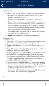
This section is fairly self-explanatory. It’s a clickable and optimized-for-mobile set of PDFs that give access to the latest USA Ultimate Ruleset.4
The content doesn’t look as good as the magazine, events, or video, and it also isn’t searchable. So it’s a digital rulebook, but without the handy find function of a full browser.
That’s going to make it a pain and rule this out as a go-to option when players are looking for in-game or sideline clarity.
It gets a higher rating than the magazine (which looks better), because it’s more useful. Especially to, you guessed it, event organizers.
Final Rating and Verdict: 15.5/30 points
This isn’t a must-download, hot-ticket item, but it’ll come in handy at marquee events when a full set of volunteers and USA Ultimate staff are updating tournament information live. Outside of that, the content here isn’t unique, the videos are searchable on YouTube along with lots of other ultimate that isn’t necessarily from a USAU event, and USAU is still missing a creative, news-focused voice to entice readers.
This app is crying out for its content to be searchable. Events, videos, the magazine, the rules…all of it. Whether that search function becomes its own clickable icon from the home screen, or factors in with a scroll up function as it does in many iOS apps, doesn’t particularly matter. I’m just thinking about nearly every other app that I use to read any kind of content. If USAU is interested in positioning itself as a proprietor of delivering ultimate content before users go straight to Google or YouTube, this is going to be critical.
The feedback function isn’t set up — or fully functioning — yet. I footnoted this earlier on, but it bears attention. It’s a great idea to include this in-app, and I was excited to see a chance to provide some thoughts on the user experience without having to log in through the iOS App Store, click stars, enter my contact information, etc., especially when USA Ultimate is calling for users to share ideas with them for version 2.0. Getting this function up-and-running really needs to be a high priority for USAU.
Overall, the mobile app is still an optimized delivery of the content that exists on the website. The scores won’t update without organizers being logged into the full-version of the site, and the news is nothing different that what’s posted or tweeted weekly elsewhere.
Many existing entities use an app as a chance to engage users in a more personal and unique way — it’s ultimate in your pocket whenever you need it, after all. That’s a huge competitive advantage for USAU right now, and this app isn’t taking advantage of it, yet.
Unfortunately, that feedback button isn’t currently enabled for iOS. I am happy to report that my editor, an Android user, was able to open a direct feedback email via the same button. For now, just write your review in the iTunes or Google Play stores. ↩
If you have a Chromecast and have tried the video function, chime in about it in the comments. ↩
More on searching later. ↩
Still the good old 11th edition. ↩