Which teams will look the best during the upcoming season?
March 20, 2026 by Alex Rubin in News
On St. Patrick’s Day, every UFA team released its new jerseys for the 2026 season. BE Ultimate is still the Association’s official uniform provider, designing and printing jerseys for all 22 teams on their new APX material.
This year’s collection is a mixed bag with some great, some good, and a few not so great looks. Rather than rate every one–especially since some are unchanged and I’ve already shared my opinions on many of them in previous seasons’ columns–this year I’m going to offer awards to the jerseys that stuck out to me when I looked through this season’s collection.
Best New Look: Philadelphia Phoenix
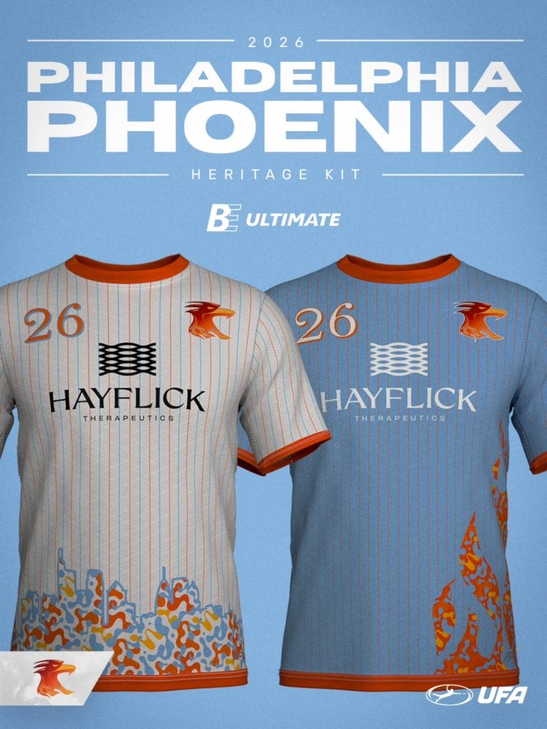
Philadelphia offered another refresh to their jersey set, continuing to iterate with a color scheme that has worked really well the last few seasons. This year, they add back pinstripes, a throwback element to the team’s origins over a decade ago. I particularly like that they use multiple colors in the stripes to add a dynamic look without overwhelming the design. The stylized skyline along the bottom of the white jersey is a great piece of artwork that both matches the city and the team. The flames on the blue jersey are a fun touch, playing on the team name.
Credit, too, to the team for figuring out a way to make their striping look good with the new APX template (see my notes about the template and its effects on the league as a whole below).
Biggest Disappointment: Atlanta Hustle
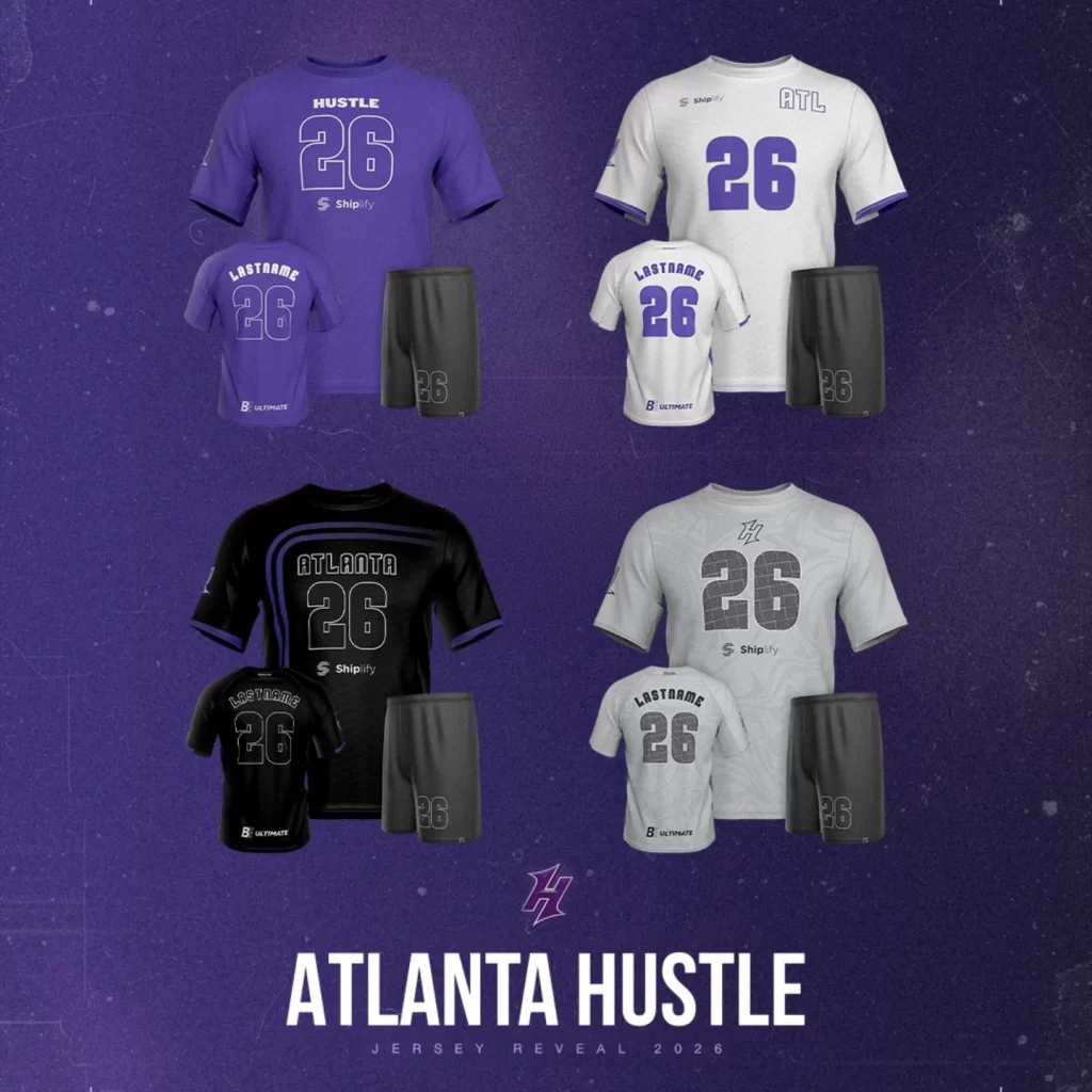
I actually groaned when I saw these. Atlanta has the misfortune of being first on my alphabetical team of jerseys to look at, and let’s just say these put me in a sad mood. They are so boring! There are few design elements at all. The purple stripes on the black jersey are the best idea in this set, but they are too dark to be seen on such a dark jersey. They have gray alternates even though every frisbee player knows gray is the worst color to play in (and shouldn’t sell too many replicas because nobody is wearing that to pickup or league!).
The one thing that many basic designs offer is consistency and simplicity. Atlanta chose the worst of both worlds by not even offering that! Each of their four jerseys features a wordmark and a large number on the front, but the wordmark and number are in different places on each jersey. Atlanta has a lot of potential with their purple color scheme and a history of good-looking uniforms; let’s just say I’ll be hoping for a throwback night.
First Look: Colorado Apex
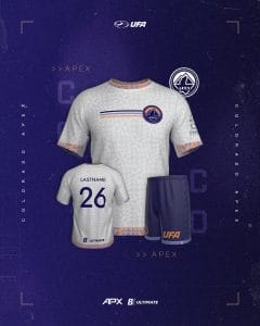
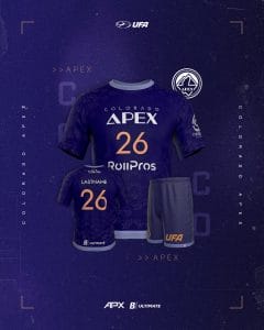
Props to Colorado for creating a new identity after basically being forced by the local NWSL to give up their team name. I like the unique font chosen for both the wordmark and the numbers. The purple jersey is pretty good, but somewhat bland. The white jersey really shines, though. I love the pattern – especially the way it continues into the accented sleeve, hem, and collar stripes. This color scheme is unique in the league, and showing that off with striping across the chest is also a good move. I’m a big fan of these white jerseys.
Most Impacted by the New APX Fabric: Teams with Stripes Along the Jersey’s Sides
One notable thing about the new fabric is that the template includes vents under the sleeves. This impacts striping on the side of the jersey because a stripe cannot go all the way up to the armpit, but rather is cut off by this mesh vent, which seems to be in only one color. See the Austin Sol’s white jersey as an example, and compare to the Taiga offering below it which shows what the side stripe looks like without the vent. Montreal seems to be turning this vent into an accent that continues onto the sleeve and around the back of the shoulder. Good for them for incorporating that as a design element, but, again noting the difference on the Taiga template on their webstore, it seems like this is something that teams will have to work around to incorporate into their designs.
It’s easier to see this area of the jersey on the Oakland Spiders white jersey. If you go to the back view, see how the sleeve stripes don’t perfectly line up–that’s something designers should also look out for with this template, since the inside of the sleeve is a different material than the outside and they need to be sewn together. Pittsburgh is going with a different approach to the sleeve stripes on its white jersey, simply cutting them off so they’re only visible on the outside. I really don’t like the way this looks, and I really don’t like that they’re forced into a design choice like this by the template. Toronto and Salt Lake also do this.
Biggest Logo: Oakland Spiders
Honorable Mention: Salt Lake Shred
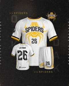
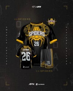
Oakland has done a good job over the years, continuing to add new designs to their jersey history while maintaining the same vibe throughout. I loved last year’s set, and I really like this year’s as well, as the team incorporates the spider from their logo as the main design element. I love the way they built space for the team name in the middle of the spider, and how the spider’s legs frame the number.
Salt Lake, meanwhile, offers a really nice refresh of their white jersey. For those who have followed my design opinions over the last few years, it should come as no surprise that I really like the use of color and shape to make the white jersey interesting without compromising on contrast. Outlining the logo with thin, but distinct, lines is a great way to accomplish that. If I were offering any criticism, it’s that the team probably doesn’t need the full team name on the front of the jersey and also on the sleeve, and I wish that the sleeve stripe was able to extend all the way around the arm (see my note above about the new APX template).
Most Interesting Alternate: Boston Glory
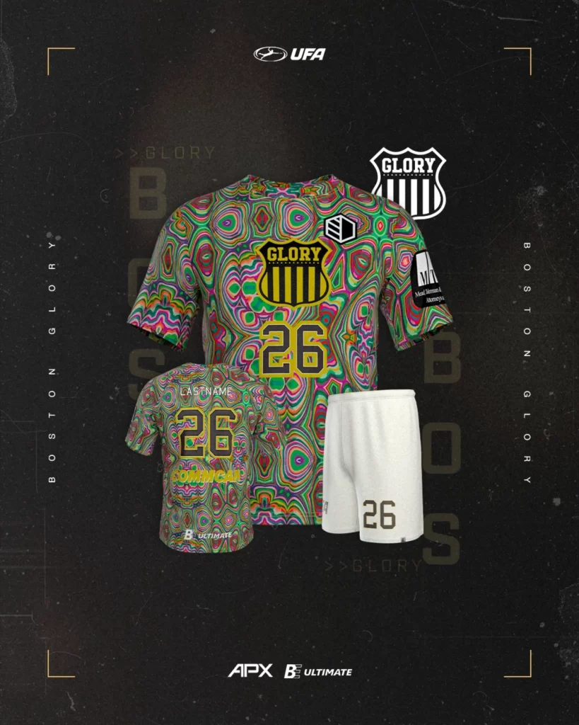
Nobody will say that the Glory did not take advantage of the full range of opportunities sublimation provides. It’s always fun to see a team really stretch for a design, and I could see this one quickly becoming a fan favorite.
Biggest Upgrade: Vegas Bighorns
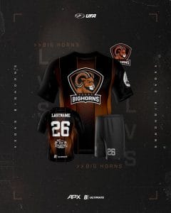
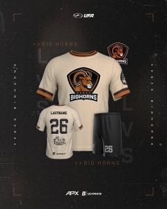
Last year’s jerseys seemed like placeholders, as Vegas was only announced as the design process was likely in full swing for many existing teams. This year, the team is leaning into the Vegas of it all. The black jerseys have a shiny gold motif in the background, evoking the glimmer of the strip. The light jerseys are a dusty off-white, bringing to mind the desert. I love the color of this jersey – it plays really well with the brown of the logo and the round logo on the sleeve to create a Wild West feeling. I’m not sure that this year’s Vegas squad will get a win on the field, but they get a win in my book for making sure the team looks good!
As with any jersey in any sport, I’ll wait to see these on the field before rendering a full judgment. In many cases, the teams that made changes really made tweaks to their designs that don’t really move the needle for me (DC, Boston, New York especially), but I’m willing to be proven wrong once we get to some game action in just over one month.