February 26, 2015 by Charlie Eisenhood in Livewire, News
![]()
The World Flying Disc Federation — the sport’s international governing body — announced a logo refresh today, seen above.
The goal of WFDF was to “[modernize] the look of the organization.” From the press release:
The new logo sought to build upon the strengths of the previous version: bold lettering has been enhanced to convey authority, letters are spaced wider apart and at a less extreme angle for a cleaner and more modern look, and the shape of the disc has been sheared to match the angle of the “WFDF” text and to confer a sense of forward motion.
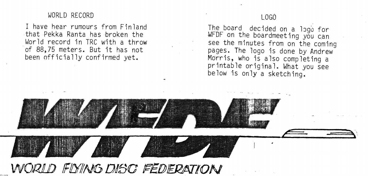
The old logo is below, which, according to designer VC Ultimate’s logo review (pdf), had some significant weaknesses, including readability problems with the disc cutting through the letters and a dated feel due to the sharp slant of the letters.

WFDF President Robert “Nob” Rauch was kind enough to send along a photocopy of the February 1986 WFDF newsletter, where the original logo was officially announced. Now in a February 29 years later we get a new version.