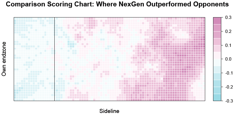
New scoring charts show that the 2012 NexGen team excelled against elite club teams due to their dominance near the endzone. They relied on unconventional, high-risk throws to score, rather than a more traditional dump-and-swing offense. They had significantly more success than their opponents.
February 6, 2013 by Sean Childers, Jeremy Weiss and Kahyee Fong in Analysis with 34 comments
Ultiworld is excited to announce our next move in developing statistical analysis tools: Scoring Charts. These scoring charts, which any team can generate by tracking their own statistics (using our partner Ultiappsprogram), show where on the field a team is strong in possession and, of course, where they are weaker. The scoring charts, even at this early stage of analysis, also support some theories of Ultimate while questioning others.
Best of all, we can compare any single team’s scoring chart to an average of other teams. These comparison scoring charts show much more than where your team was good and bad: they show where your team is better and worse than the average team.
This article goes through our first NexGen and opponent scoring charts, like the comparative one above. Our first NexGen statistical series suggested that NexGen’s elite defense and deep playing style perhaps contributed to their success.
The new scoring charts, however, suggest that the real difference was NexGen’s destruction of the opposition in executing endzone offense. NexGen excelled in the endzone, running their endzone offense precisely as they moved the disc closer to the goal line. Statistically, they outperformed their opponents in those endzone areas and outperformed them more there than anywhere else on the field.
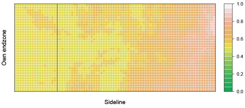
Using our application and analysis software, we can first generate a NexGen-only scoring chart, one that visualizes NexGen’s scoring performance across the field and allows us to empirically test one co-authors’ previous theories.
Technically, this graph shows the probability that NexGen’s current possession ends in a score, conditional on possessing the disc in any given area.1 In lay terms, you would use the graph to answer questions like, “Assuming that NexGen had the disc at their brick, what is the probability they would score on that possession?” The raw data was transformed2 and flipped such that every data point is represented graphically as NexGen attacking the right endzone – and backhand throws might tend to be at the top.3 Practically, we see that NexGen offense (with white and light orange points) scored the disc (on that possession) between 80-100% of the time that they got the disc near their opponent’s endzone.
“I think we were successful in the endzone because, one, we were unconventional and resourceful throwers and, two, we were free to take risks without fear of betraying an established offense,” said Tommy Li, 2012 NexGen handler. Li added that with no coach telling them what to do, the team felt “free to score however we saw fit.”
Video analysis of the NexGen offense supports Li’s recollection. We went back into the video archives4 , looking at how they attacked the endzone area. There was an impressive blend of inside-out forehands, high-release throws on both sides, risky over the top looks, and isolations. One thing we did not see much of: traditional dump-and swing. They scored impatiently:
[youtube 4VJ4SV7gAZk 600 377]
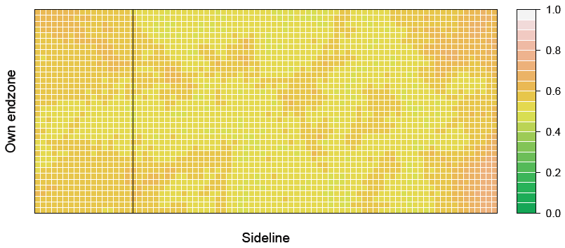
But showing that NexGen was good near the endzone is only half of the how-they-did-it story. Aren’t all elite club teams this good near the endzone? Well, not really, according to the limited data that we have. Below is the scoring chart of all of the NexGen’s opponents combined;5 and, again, we present the comparison scoring chart between NexGen and their opponents.
The comparison chart formally subtracts the opponent plot from the NexGen plot. But practically, it is showing the areas on the field where NexGen outperformed their opponents (purple) and areas on the field where the opponents outperformed Nexgen (blue).
As we can see, the graph is a lot more purple than it is blue, and a lot of it is clustered in the endzone area. The magnitude is also important: Opponents did slightly better in some areas while NexGen more significantly outperformed the elite club teams in the redzone.
Interestingly enough, the endzone advantage appears concentrated on the top (“backhand”) side of the graph. Assuming that most of the points were played force-flick, the graph shows that NexGen didn’t outperform their opposition in every area of the endzone, but instead crushed it when they worked the disc to the break side (top). Li said that the default mode of endzone attack for most teams – the dump swing approach – wasn’t NexGen’s primary weapon. “We [wanted] to get a breakside cut and we’d jam it in the endzone with a quick IO high release,” he explained.
Again, the video backs up Li’s story. Looking at the contrast between NexGen’s endzone attack and their opponents, we see more passes from the opposition in a traditional endzone offensive set — lots of dump and swing. It often didn’t work out.
[youtube M8FrHTbA8sM 600 377]
Collectively, the scoring charts question some conventional Ultimate wisdom. First, both scoring charts show a steady increase in the probability of scoring as the disc moved up the field; there doesn’t appear to be a penalty, especially not for NexGen, for getting “too close” to the endzone.
Instead, the data is consistent with the simplest theory of Ultimate offense, where possession further away from the endzone generally requires completing either more passes or longer ones. It appears, at least preliminarily, that the defensive advantage of only having to cover in-cuts near the goal is more than offset by the offensive advantage of only needing to string together one or two completions in order to score.
Second, a forced turnover near the endzone certainly lingers long in any Ultimate player’s mind, but the combination of stats, quotes, and video from NexGen 2012 perhaps cautions against playing too conservatively. One general aim of sports analytics is to find psychological biases: Is there a possible confirmation bias that leads us to remember risky endzone turnovers more than residual turnovers—those that result from attempting too many easy passes? NexGen is a team of elite throwers and athletes, uniquely positioned to make difficult break throws, and there’s no way to say anything is proven yet. But we’re going to keep an eye on this one.
Next week: A look at NexGen’s endzone defense using more scoring charts.
The deepest debt is owed to Ian Guerin, whose countless hours of work developed the program. It would also not have been possible without immense help from Wesley Cronk and Kahyee Fong, who coded the games.
The maps evaluate the probability that the given possession will end in a score rather than a turnover for NexGen (the only two possible outcomes), rather than the probability that the given point will result in a score for NexGen (which could occur in this possession or a future possession if the teams kept turning the disc). ↩
The figure looked at every single NexGen throw and possession in our database and averages/smooths neighboring points together. ↩
In addition to a left-right continuum in the graph, there’s a bottom-top continuum that suggests NexGen was more successful at the “top” of the graph (backhand side of the field) than the bottom (flick side). For example, there is a backhand hot spot near the endzone where, if NexGen got the disc there, they almost always subsequently scored (near 100%). One explanation is that they played better offense when teams forced backhand than when flick was played (remember that our graph is flipped and always represents NexGen attacking right). We think a better explanation is that most teams force flick and that getting a break into the backhand redzone area was a particularly devastating mode of attack for NexGen. ↩
Special thanks to Kevin Minderhout and NexGen for permission to reproduce video here, and, again, big thanks for producing the high quality video work that made the entire project possible! ↩
This graph essentially treats every one of NexGen’s opponents as the same team– the opposition–and draws the opposition graph. Because each of those opponents has only one game’s worth of data in our database, there isn’t enough data to draw a unique plot for each elite club team – an average opposition graph is the best we can do. ↩


