Who would have won Nationals, visually?
June 10, 2020 by Daniel Prentice in Opinion with 0 comments
The last time I wrote this article I was accused of having “amateurish” opinions. Did that hurt my feelings? Immensely. Will it stop me from ejecting my barely nuanced takes into the cold, vast space of ultimate apparel internet discourse? No way.
This year is obviously a little different as there was no College Nationals. But thankfully teams submitted their jerseys via Twitter and email so that you all wouldn’t have to miss out on Ultiworld’s most important article of the year.
Thanks sincerely to everyone who sent me their teams’ photos and designs; it made me feel much worse about having to put you in my bottom five. Alright, let’s get to it so you all can rip me apart on Reddit again.
Best
5. South Florida Scallywags Whites
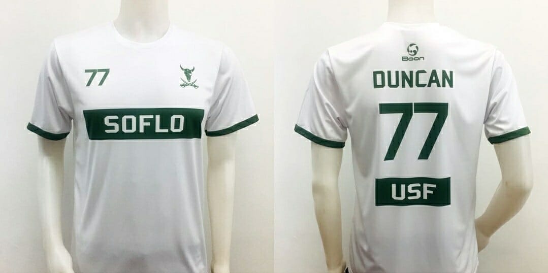
If you’ve read my previous entries of Best/Worst, you know I love a clean, simple jersey: these definitely fit that bill. They’re clearly inspired by a soccer jersey style, to which I am rather partial. Using the team logo as a badge, rather than as a focal point of the jersey, is a great way to feature team iconography without being garish. The USF green really pops against the crisp white, and the sleeve accents go a long way in preventing these from feeling overly bland. I know jerseys like this are where I differ from a lot of ultimate fans, but this is my article and I think they’re great.
4. Tulane Tucks Whites
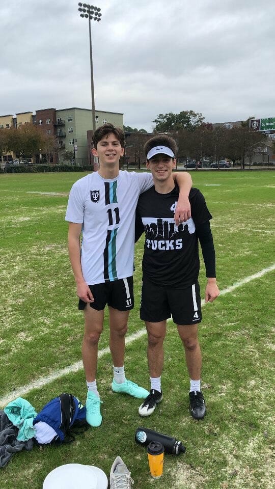
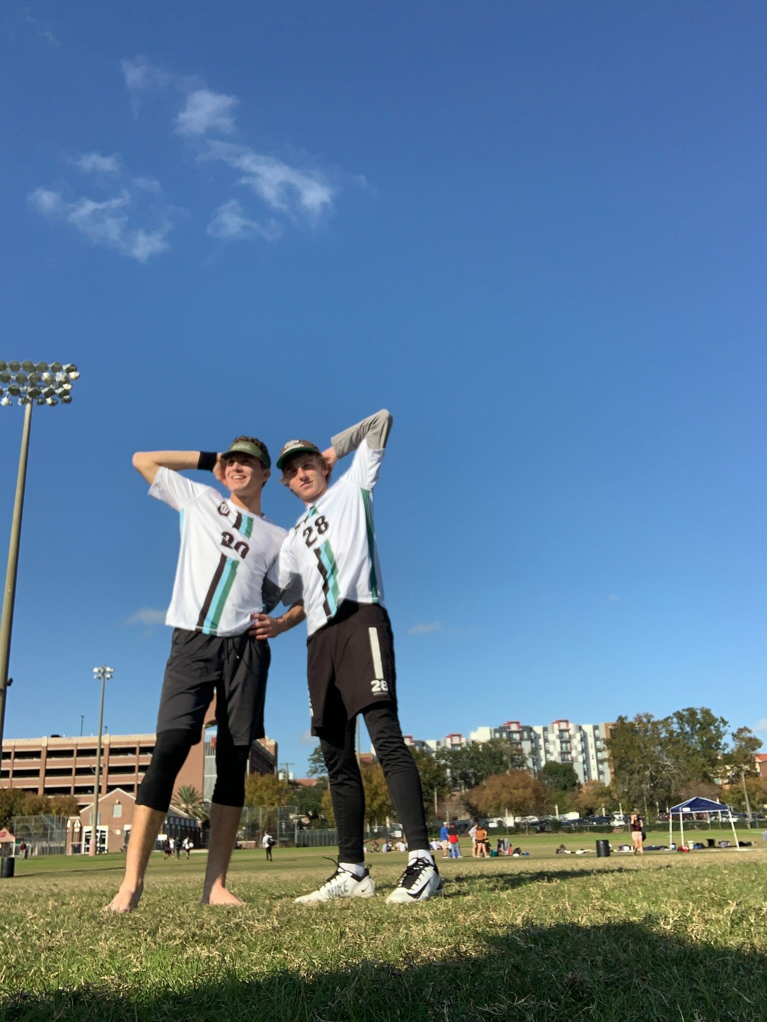
I can’t really recall any jerseys, ultimate or otherwise, looking quite like this. So Tulane gets a lot of points here for originality while remaining understated. It’s rare that you see jersey numbers being the focal point of the front of an ultimate jersey, but it totally works. Tulane has a great, unique color combination and the front and side striping are a great way to implement them. I think I’d prefer the numbers to be green, adding a bit more of the school’s colors to the look, but I otherwise have no fault with these. Great, original design.
3. North Carolina Pleiades Whites
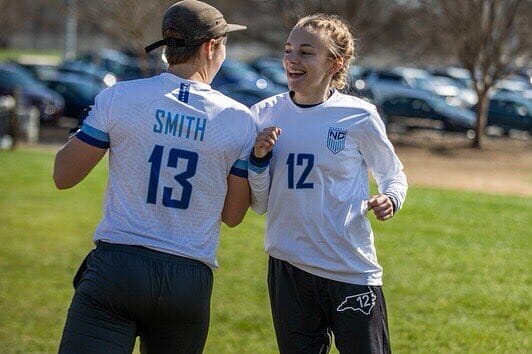
These were very nearly the most popular choice on Twitter, and you can see why. They’re an homage to the USWNT 2019 World Cup jersey, and you obviously can’t go wrong with that. Pleiades is better than anyone at finding subtle ways to implement team imagery, as you see with the seven stars over the USWNT-styled badge.1 The back getting textured with the hometowns of the team’s players is a neat touch as well. This is another very strong entry from a program that consistently has some of the best duds in the game.
2. Cal UGMO Darks
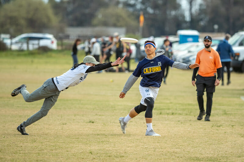
I really liked Cal’s navy jerseys last year, and these are even better. They transported the design of their silver medal-winning darks last year onto their whites with a few tweaks and those are great too. But, once again, I am most drawn to their darks. I don’t have a whole lot to say about these that I didn’t say last year. It’s just a sharp, easily recognizable jersey. It’s everything you want, really.
They heeded reader complaints about last year’s black shorts clashing with their navy jerseys and so they switched to white shorts this season for a better kit combination. They also informed me that the unfortunately placed Under Armour logo — the one major qualm I had with last year’s design — is mandated by a school partnership, so I can’t really fault them for it.
They take second place again, despite being an improvement from last year, but that has far more to do with the strength of who’s number one, because these are just about perfect.
1. Washington Element Whites
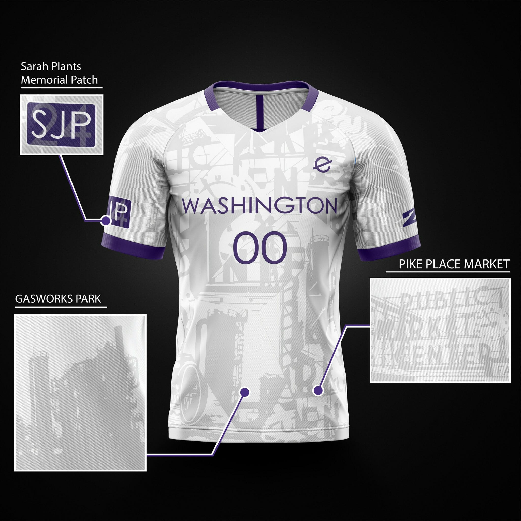
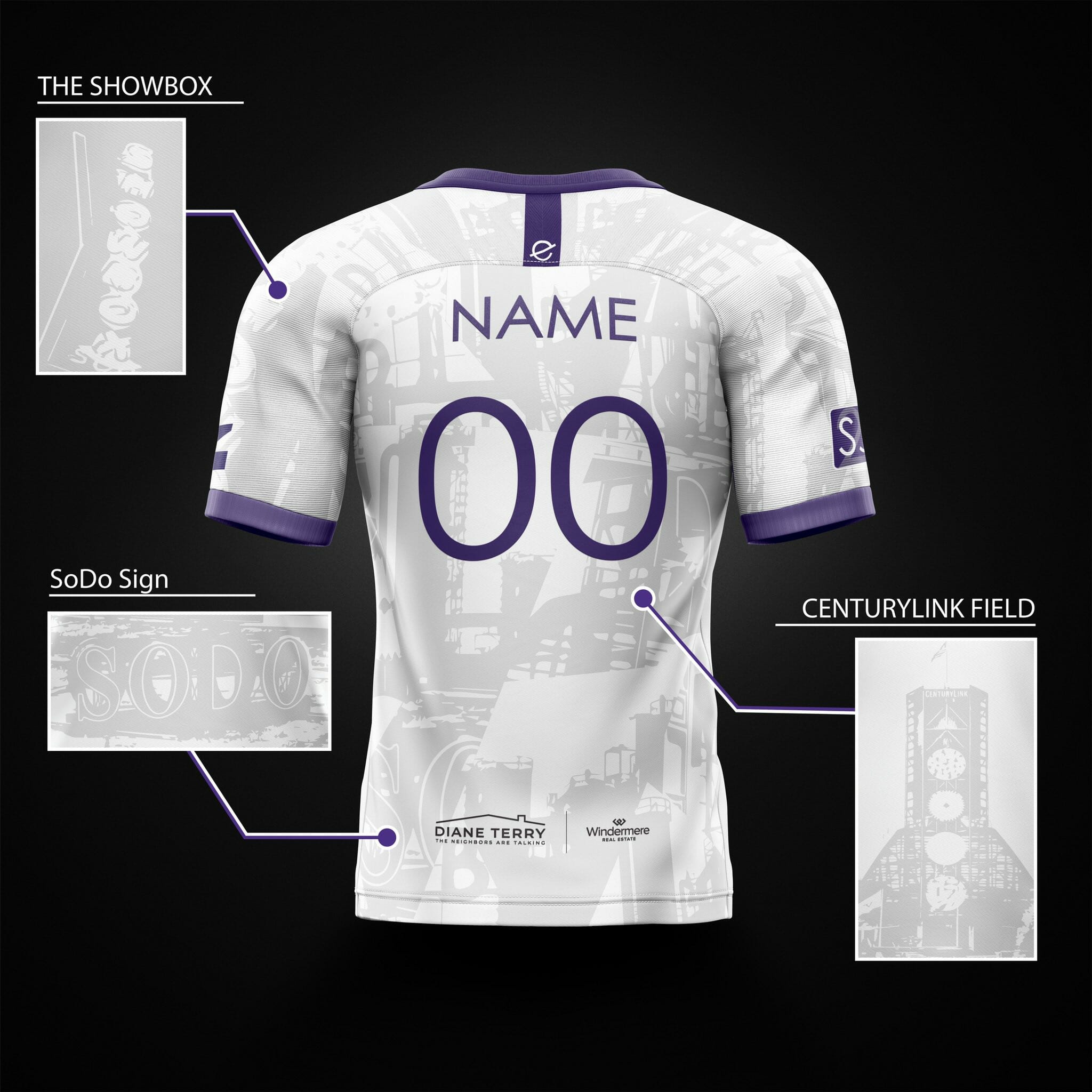
Wait a minute. Do I have a bias for Washington?
This is the third straight year a Washington jersey has made it into my top five, though the previous two entries were both via the men’s team. Admittedly, the 2018 entry was a mistake on my part. You could argue last year’s entry was too plain as well, but I’m too stubborn to admit to more than one mistake in the same article.
But these? These are the best of both worlds.
From a distance, it’s clean aesthetic perfection. I love the multicolor collar and purple sleeve accents, the Element badge on the chest, and the font of the name, numbers, and the “WASHINGTON” on the chest. It’s all extremely professional looking.
And then you also get a nod to the eccentricity and flare of fully sublimated ultimate jerseys hidden in plain sight with all of the neat homages to some of Seattle’s most iconic spots. They’re really a 10/10: a design to make every type of ultimate jersey enthusiast happy.2
Worst
5. Michigan Flywheel Whites
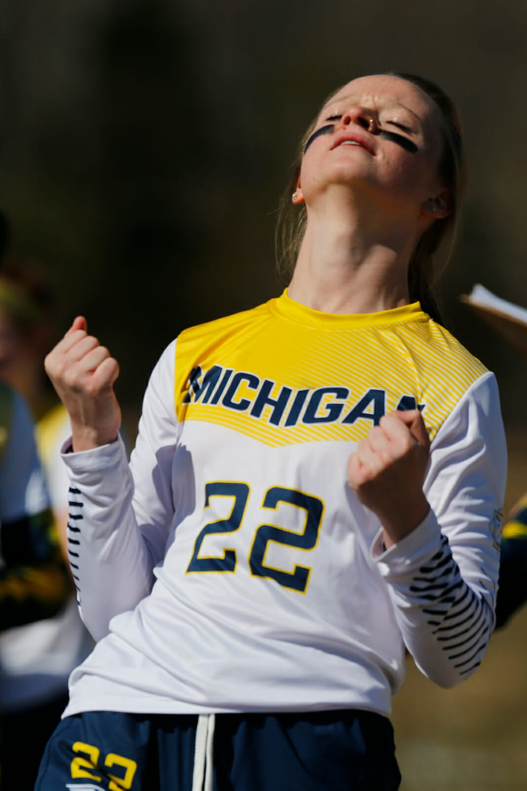
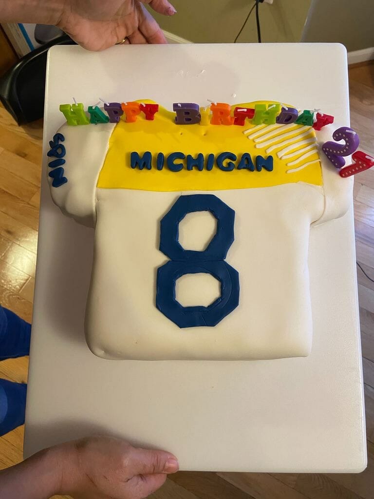
These aren’t terrible by any means, and I think if I were working with the sample size that I usually have at Nationals, they probably wouldn’t have made my bottom five. But the yellow, er maize, yoke does not work for me. It clashes too harshly with the white of the sleeves and the rest of the torso. Maybe if it faded into the white rather than stopping abruptly I’d be a bigger fan. One thing I have to give these jerseys credit for though, is this cake replica. It’s easily number one in my upcoming Best/Worst jersey cakes article.
4. UC Santa Barbara Burning Skirts Darks
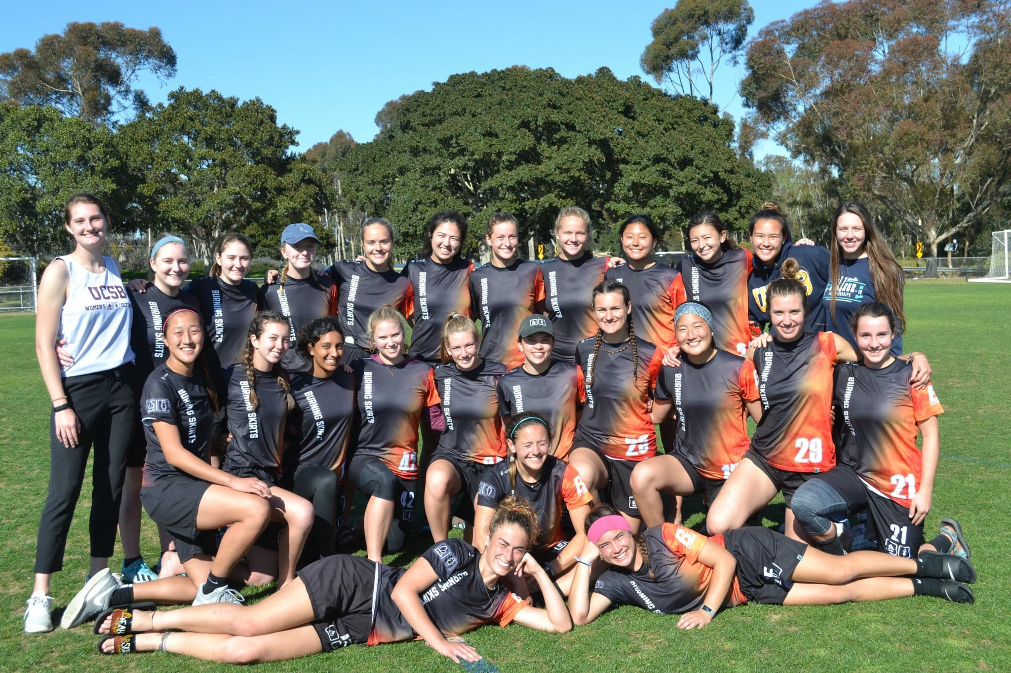
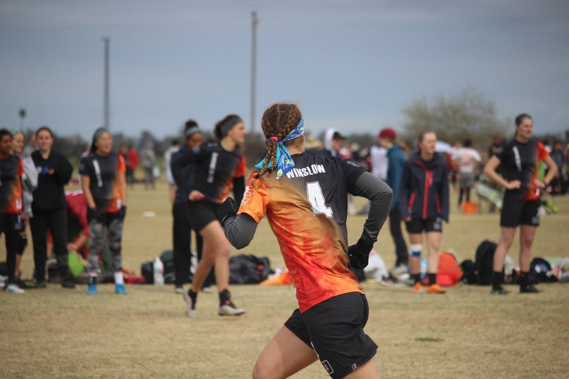
I have a feeling I’ll get a lot of disagreement on this take. I can see what they were going for here and I can see why some would really like them, but for me it’s just too much. It can be hard to find the balance between having a good accent on a black jersey and having a jersey that feels like it’s simply two different colors. This falls into the latter camp. I also think the “BURNING SKIRTS” down the opposite side as the flames makes everything feel a little too asymmetrical and cluttered. I do really like the idea of playing with the Burning Skirts motif, and creating a jersey that makes it look like the players’ shorts are on fire. But the execution of these doesn’t quite hit the desired mark.
3. Wheaton Mastodon Darks
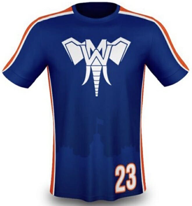
Our first DIII entry into Best and Worst! As with many of the jerseys that end up in my bottom fives, this is a case of trying to do too much. The building on the bottom of the jersey is Wheaton’s Blanchard Hall, which was once part of the Underground Railroad. That is genuinely a tremendous bit of school history to take pride in. But with all the other visuals going on — The Mastodon logo, which I also like on its own, and all of the piping on the shoulders and sleeves — it’s an aesthetic overload. If I were editing, I’d suggest a simpler imagery of the building, like a single line on the chest replicating its skyline, with the Mastodon logo as a badge on the chest.
2. Virginia Night Train Oranges
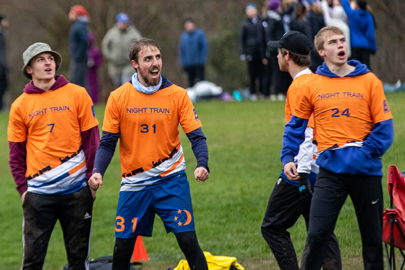
I cheated a bit with these, as they weren’t submitted in response to my request for jerseys on Twitter, but it was discussed earlier this season in the Design channel in the Ultiworld Slack.3 If you’re going to make your jersey orange, then you have to let that stand on its own as your primary statement. And these would be absolutely fine if they were simply solid orange all the way down. I mean, what is even happening in that lower third? I get the train bit, but what is it riding on? Is it a bridge? Why is it sloping down like that? Why is there some random blue in there? I have so many questions. A jersey should never leave me with questions.
1. Utah Spiral Jetty Flamingo Tanks
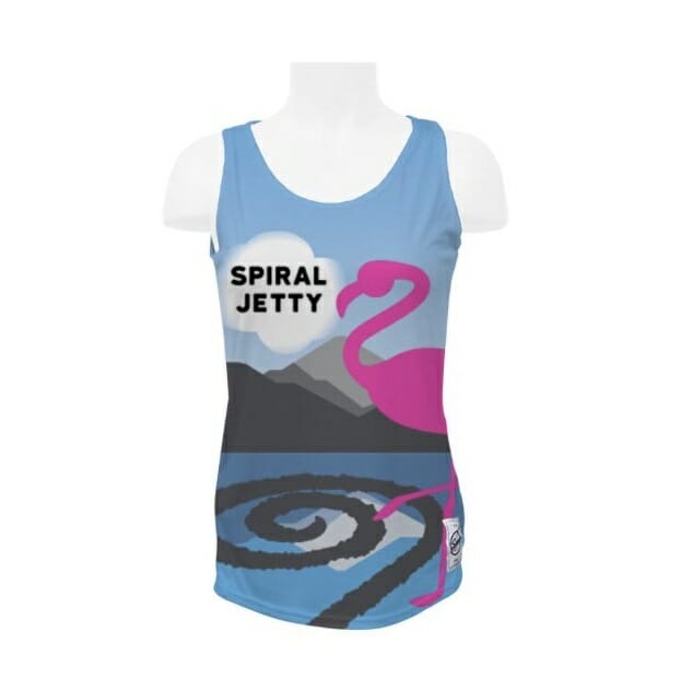
Are there even flamingos in Utah? This range map says no, absolutely not, not even close. So I really just don’t get that part of it. But even disregarding the flamingo bit, these are way too cluttered. There’s just so much going on here and not a single thing on the jersey is a natural focal point, other than maybe the flamingo simply because it’s so garishly pink. But then that just brings us back to why a flamingo? 4
Others of Note
Pittsburgh Danger Darks
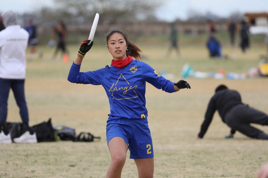
These were massively popular on Twitter, so I know not having them in my top five is gonna upset a lot of people. For a while I couldn’t quite figure out why I wasn’t a huge fan of these. I like Pitt’s retro color scheme a lot. The simplified Danger logo with the cursive script is pretty cool. But there was something about them I didn’t like that I just couldn’t put my finger on. Then I saw this tweet.
I’m not into the shine. It almost makes it feel like a sun hoodie rather than a jersey. It also reminds me of those uber shiny football helmets that were popular in the early 2010s. I have an octogenarian’s soul, and these newfangled bright and shiny garments just aren’t for me. But you won the Twitter and TikTok votes, Pitt, and that’s far more valuable than my opinion anyway.
William & Mary Merry Men
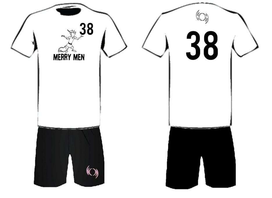
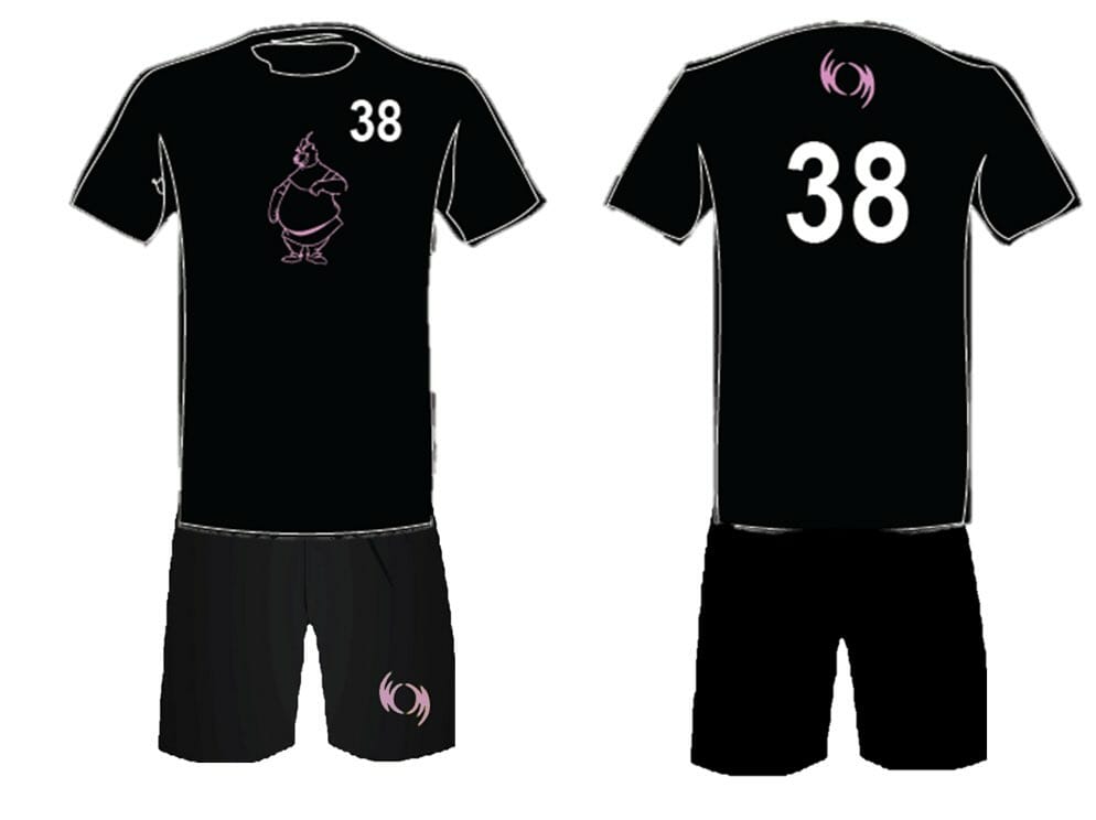
William & Mary was one of several teams to rebrand themselves this season. As such, it was their chance to design jerseys for their new team name, Merry Men. These were a little too simple to justify including in my top five, but I really love these. The team name immediately became one of my favorites in all of college ultimate, and it’s heartening to see that Gen Z still has appreciation for some of the classics.
Utah Spiral Jetty Hat
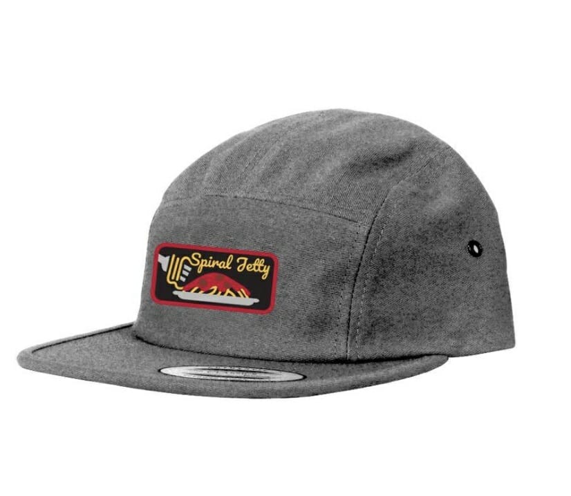
It wasn’t all bad from Spiral Jetty. I think they were the only team that sent me any team gear, but these would be hard to beat. It’s picture poetry on a hat. You gotta love it…and also try your best not to picture how it would clash with those flamingo tanks.
For those that don’t know, it’s tradition to put a star over a national soccer team’s badge for each World Cup they’ve won. Pleiades is a star cluster made up of seven stars. ↩
I have been informed that there were designed by Greg Yu. So if you have aspirations of being in next year’s top five, hit him up! ↩
Yes, this is the type of informative access you get as a Plus subscriber! ↩
An update after publishing: The flamingo is a nod to the flamingo named Pink Floyd which was observed in Salt Lake and became something of a local icon. ↩