Resident fashion consultants Alex Rubin and Ben Murphy break down the best and the rest in women's semi-pro kits
March 21, 2023 by Alex Rubin and Ben Murphy in Other
The Western Ultimate League (WUL) is already underway with two weeks of games in the books. Amidst the great action and highlight plays galore, we heard plenty of talk about what players were wearing on the field. Did you see Arizona’s new teal set, or Oregon’s stunning pink jersey? Meanwhile the Premier Ultimate League (PUL) just completed its annual Sponsor a Player Program and is set to start games in less than a month. With so much focus on apparel, it’s only right that we discuss the jerseys each team will be sporting this season.
WUL
Arizona Sidewinders
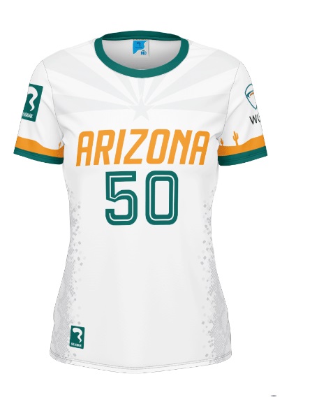
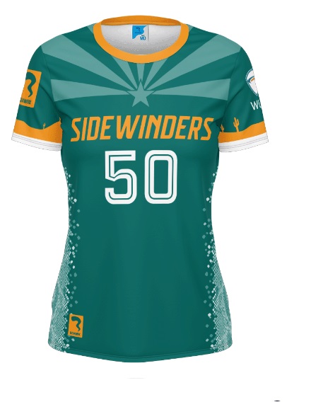
Arizona had nice jerseys last year, but leveled up for 2023. The addition of teal as a jersey color adds a nice zing (and breaks away from the WUL theme of black and white jerseys). The Arizona flag motif along the collar stands out without being too flashy.
Alex: I also like the subtle sleeve stripe with cactuses popping out. Great kit from Arizona here to match their great start to the season. A
Ben: Everything about this kit is great – the colors contrast perfectly, the sublimation has great integration of Arizona themes, like the snakeskin sides, and the space is all used without it being too busy. A+
San Diego Super Bloom
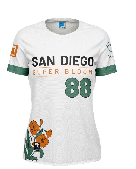

If it ain’t broke, don’t fix it. Super Bloom’s kits are unchanged from 2022 and they’re still among the best in the league. With a unique floral style, color scheme, and font, Super Bloom stand out even in a league where half of the teams have a white/black jersey set.
Alex: A green alternate jersey would certainly do something to spice up the league’s overall color scheme, but I can’t complain about the jerseys we have. A
Ben: Anybody that’s a fan of simplicity should love these jerseys – they’re simple but not boring. I think something that has a little more complexity would be more compelling (see Arizona). While I prefer something busier or flashier, I can respect the aesthetic quality. B+
Los Angeles Astra
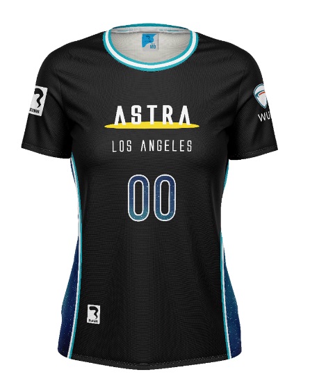
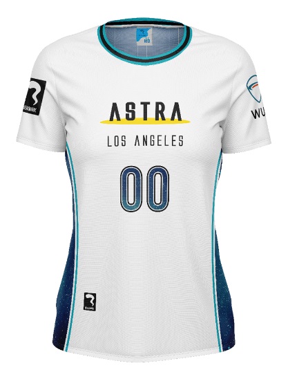
Another black and white set unchanged from 2022, Astra incorporate starry design without going overboard on the sublimation-a tricky line to balance.
Alex: These are good, but they don’t stand out too much from the rest of the bunch. A touch more blue would do Astra a lot. B+
Ben: Simplicity similar to Super Bloom, but with, hard to describe, less pizzazz. I want the “Astra” font to be a little larger, and maybe for the numbers to be a bit larger – it would make them easier to see and also give more space to the starry design. B-
San Francisco Falcons
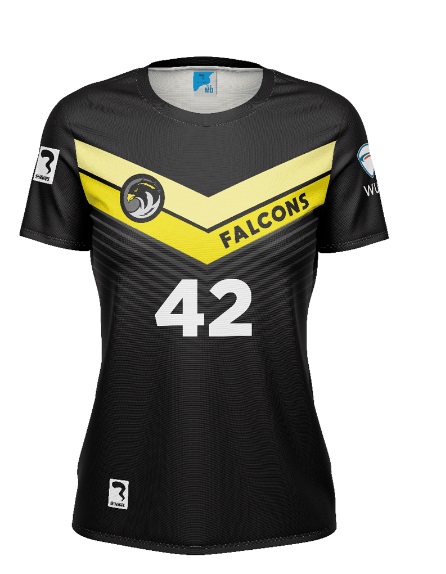
For good measure, here’s one more black and white set unchanged from 2022. The chevron design adds a nice flash of gold to the shirt.
Alex: This feels somewhat uninspired compared to the other designs in the set. I’d like to see something more evocative of the city or mascot. Some wings maybe? C
Ben: Look at all those chevrons! I don’t disagree with Alex – more elements related to the city or mascot would improve it – but I don’t dislike it quite as much. B-
Utah Wild
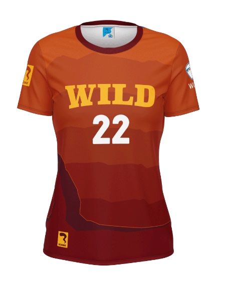
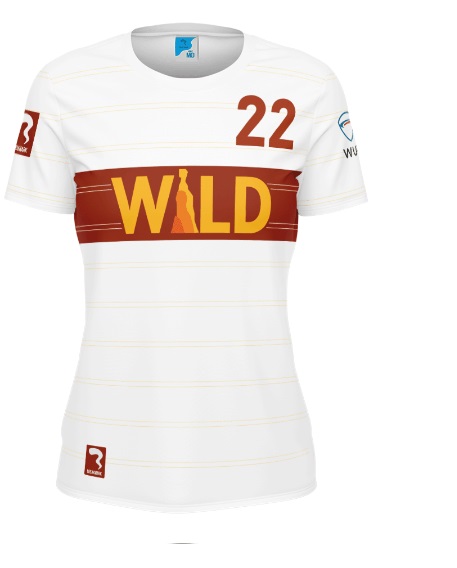
Utah’s classic kit is unchanged from 2022 and is arguably the most popular design in the league.
Alex: I hope they never change the dark kit. Sometimes a team just gets it right on the first try. The colors, font, and imagery all blend together so nicely. A+
Ben: These are excellent. Nothing to add beyond what Alex said. A
Seattle Tempest
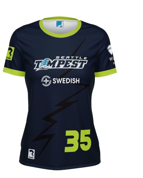

Tweaking their simple design and keeping neon green as an accent color, Tempest are among the most consistent teams in the league with their design and this is another banger.
Alex: I love the lightning bolt design on the white. It’s a subtle design element but really hits home what a tempest (a big storm) really is. A
Ben: The lightning bolt is on the dark, too, but something about the bolt itself is off to me – it’s neither fully realistic nor fully artistic and seems stuck between the two. These feel more inspired by soccer kits than many of the other jerseys, for better or worse. I like that they’re trying to use the whole space but the design aesthetic misses the mark slightly. B+
Oregon Onyx
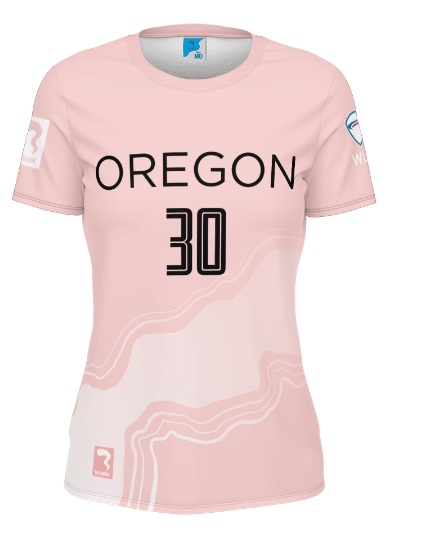
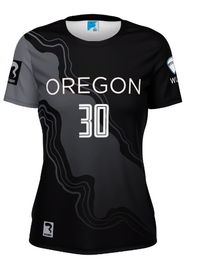
The addition of pink as their light jersey really elevates this set. The contours of the Columbia River wrap around the entire jersey without taking up too much attention from the team name and number.
Alex: This is the correct way to use sublimation. The pink also breaks up what would have been yet another black-white combo and the color variety is much appreciated. A
Ben: Solid but unspectacular. If Alex hadn’t told me about the reference to the Columbia River, I wouldn’t have known that part of the jersey was more than an artistic squiggle. It’s better than a stack of plain lines or chevrons, for sure. B+
Colorado Alpenglow
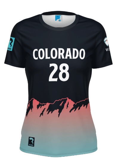
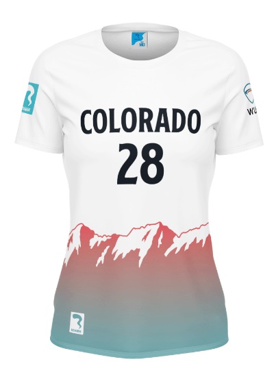
A brand new team with a unique color set and a name evoking a visual phenomenon, Colorado had their work cut out for them setting an organizational tone with this design. The reserved design with a gradient on the hemline-based mountain is perfect. Without doing too much, the kit does not look boring or bland.
Alex: It’s really simple, but effective. In future years, I’d like to see a bit more creativity in design, but this does no harm so to speak. B+
Ben: The color scheme is strong, and I love how well the green/pink mountain elements pop against both the white and the black while still allowing for the strong contrast for visibility in the name and numbers. B+
PUL
Raleigh Radiance
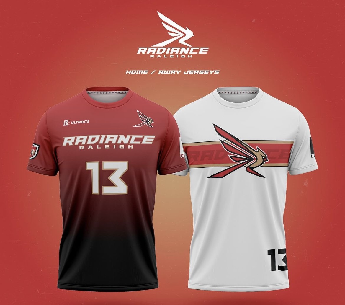
Radiance are the only team to switch from VC to BE ultimate, and the team also developed a new logo and color scheme for the 2023 season, keeping the cardinal red and adding beige as an accent color.
Alex: The new logo has grown on me and stands out on their white jersey. The stripe behind it is just enough to not overpower the logo but to keep the jersey from feeling like a generic t-shirt. One thing I dislike about the red jersey is that the city name sits below the team name, but it is otherwise a strong design. B-
Ben: The color scheme is strong, and I like the logo. The font used for the “Raleigh” on the dark is better than the main font, in my opinion – just a little cleaner and easier to read than the “Radiance” and the numbers. The design itself is otherwise a little plain and I agree with Alex about the placement of the words on the dark. It’s not bad but there’s room for improvement with some kind of Raleigh or North Carolina design elements included in an update. B
Austin Torch
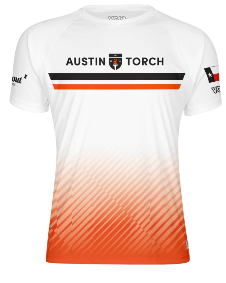
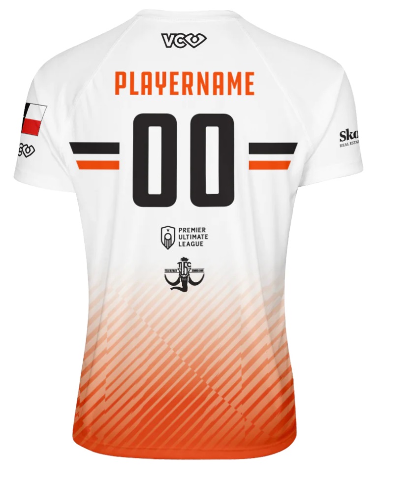
Sticking with a classic design scheme here, Torch add striping to break up what could be a boring kit and balance their main color orange against black and white base colors.
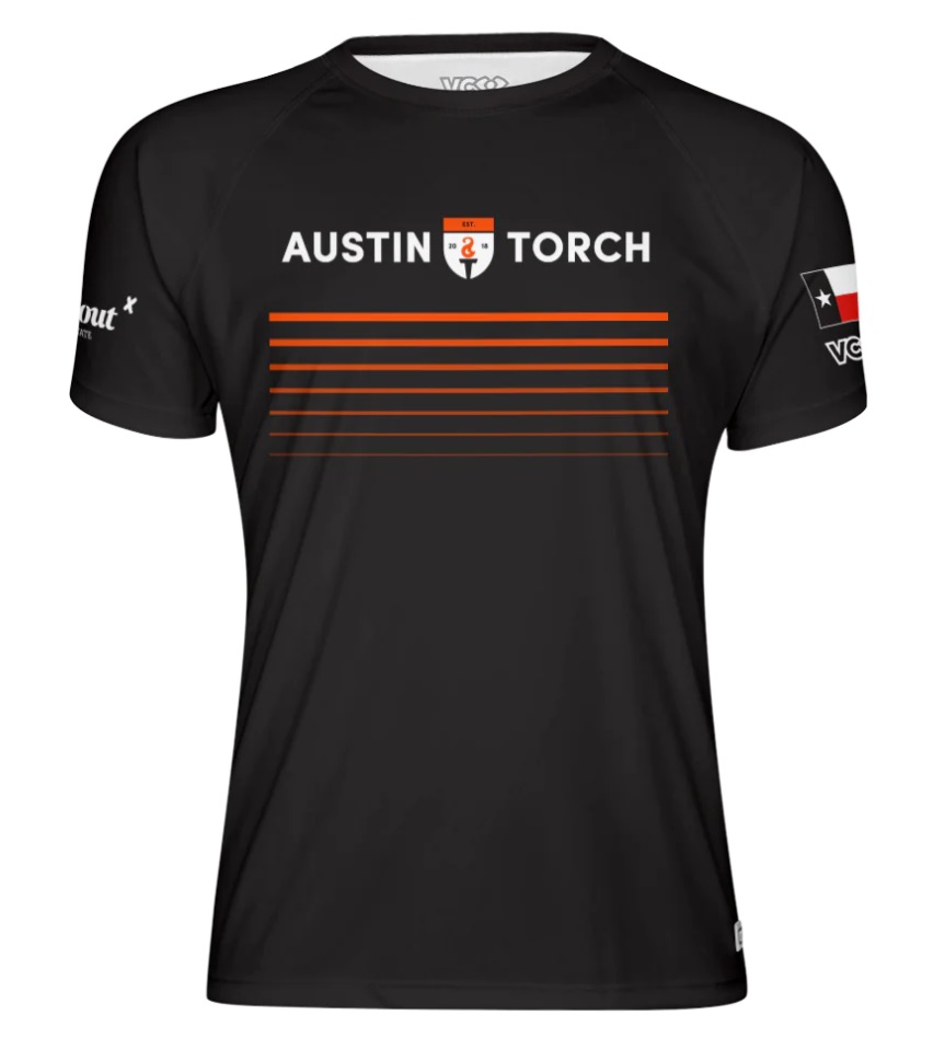
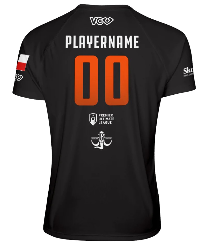
Alex: Nothing too special about the dark kit-it’s worked for years and still looks great. The white jersey is good, but I am confused why the orange striping on the bottom has a slash through it. Something about that just looks a little off. B
Ben: I think it’s a big missed opportunity to have lines all over jerseys for a team that could have used elements of fire instead. The parallel lines on the dark do nothing for me, and the design at the bottom of the white just leaves me wishing the design was less geometric and more abstract. B-
Nashville Nightshade
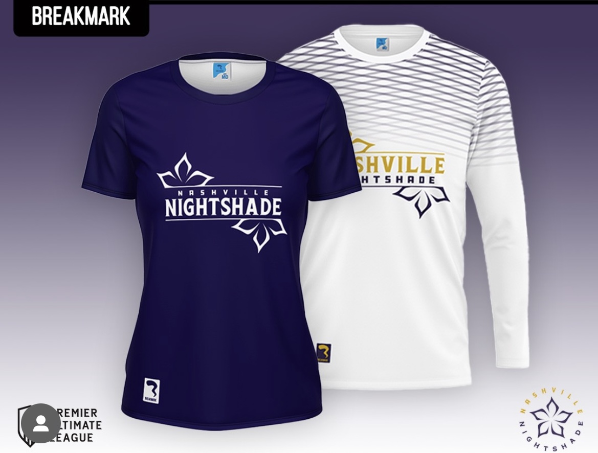
One of the teams switching from VC to Breakmark, Nightshade showcase their primary color purple nicely on both designs.
Alex: The fading lattice motif on their white jersey is great. It adds a touch of color while still maintaining the contrast necessary in a white jersey. Others might disagree, but I like the way the flower is split on either side of the wordmark; it adds nice balance. A
Ben: I really like the logo, like Alex, with the flower on both sides, and I like that the font size is different on the home dark versus the away white. I’m not as big a fan as Alex of the lattice lines on the top of the white – something about Nashville or tied to the flower would have been better. B+
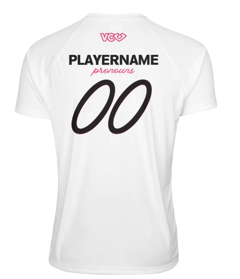
Atlanta Soul
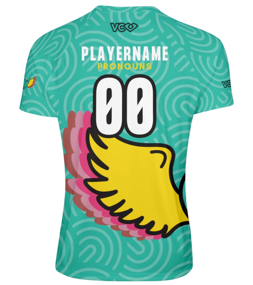
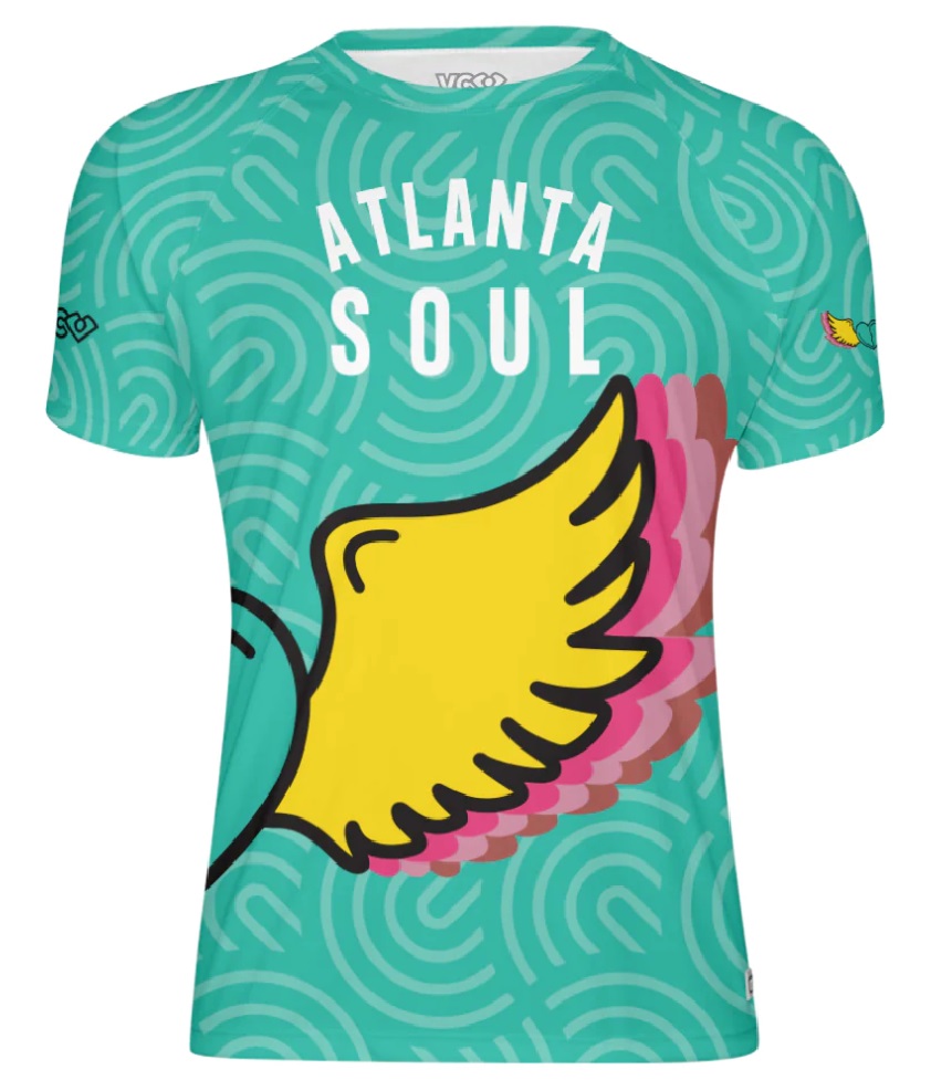
Atlanta underwent a huge brand refresh this offseason, swapping out a suave black and blue color scheme for an artistic palate, leaning into pastel greens and yellows. Of note, Atlanta is also the only team in the league to display pronouns under the name-on-back, similar to San Francisco Polar Bears in USA Ultimate’s club mixed division.
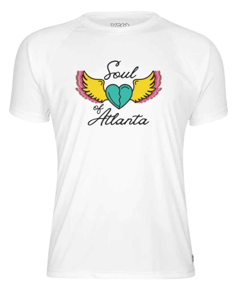
Alex: At first these darks looked a bit loud for me, but the more I look at them the more I like them. The playful swirls accentuate the background nicely and the winged heart looks cool wrapped around the side of the shirt-I love it when logos do that. By contrast the white jersey is a bit boring. A stripe or sash or something could have made it more exciting; this just looks like a fan t-shirt. A-
Ben: Evaluating jerseys means balancing some ideal of jersey design against personal taste. I have to say, these Soul darks are exactly what I’d personally love to see from more teams. Leaning into the sublimation and making use of all the space, without sacrificing the contrast for visibility. If we’re picking nits, I’d remove the logo from the shoulder on the dark (it’s the entire rest of the shirt!) and replace it with something else Atlanta themed or team inspired. With such a busy dark design, I like the simplicity of the white – it could pass as just a fan t-shirt, as Alex says, but the simplicity gives balance to the kit overall. I’d have really liked the numbers on the back of the white not to be italicized, but that’s a small detail. A
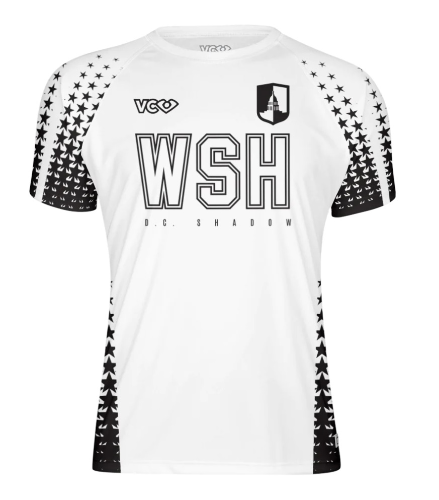
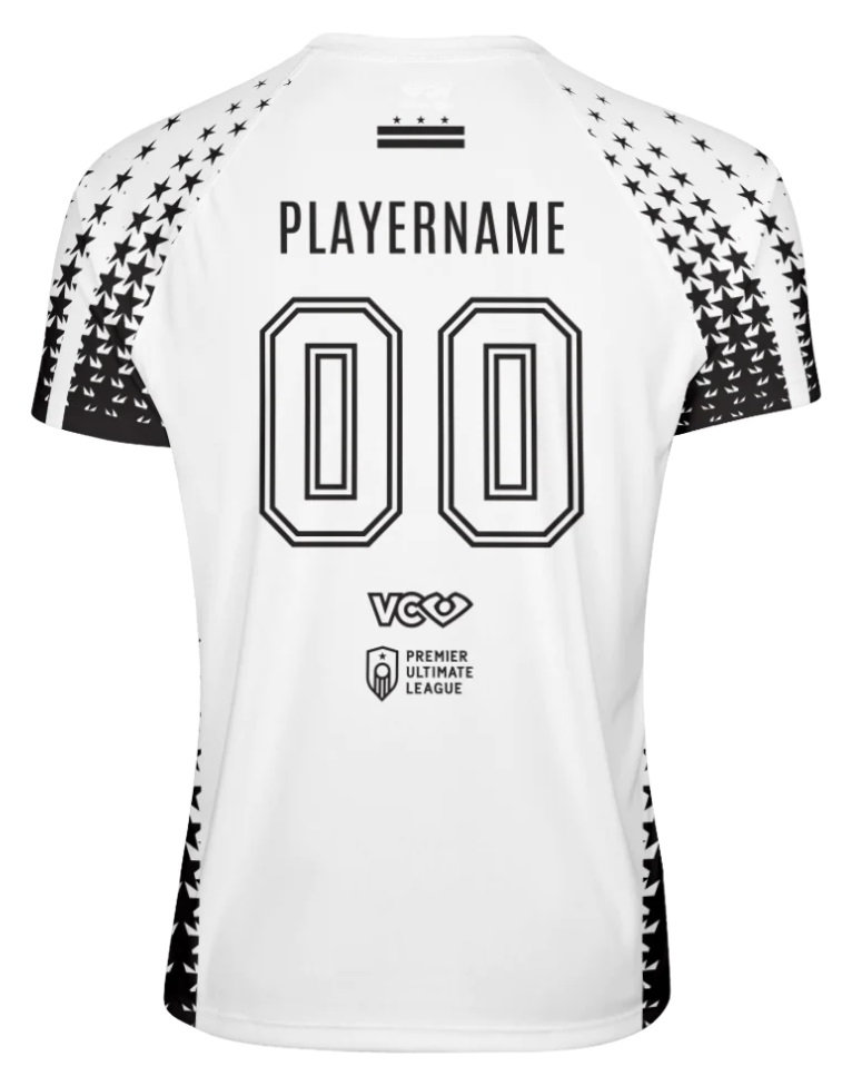
DC Shadow

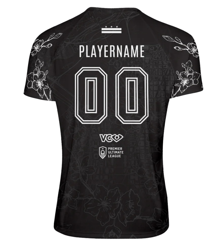
Tayara Romero continues to make a name for herself as a designer with this stunning kit. There is only so much possible with the black and white DC color scheme, but these kits maximize the available space without being too busy.
Alex: Normally I worry about contrast with outlined numbers, but with a team named Shadow, it’s a legit design choice and the double outline should help with that. The use of the sleeves as accent placement is great and I particularly like that the white and black jerseys are not just color-flipped copies of the other. A
Ben: The cherry blossoms on the black are one of my favorite design elements across these jerseys, and I love the way they pop on the sleeves but are gently sublimated into the torso. The white is fine – the stars don’t do much for me, and I’d have liked to see some other DC related elements instead. A-
Philadelphia Surge
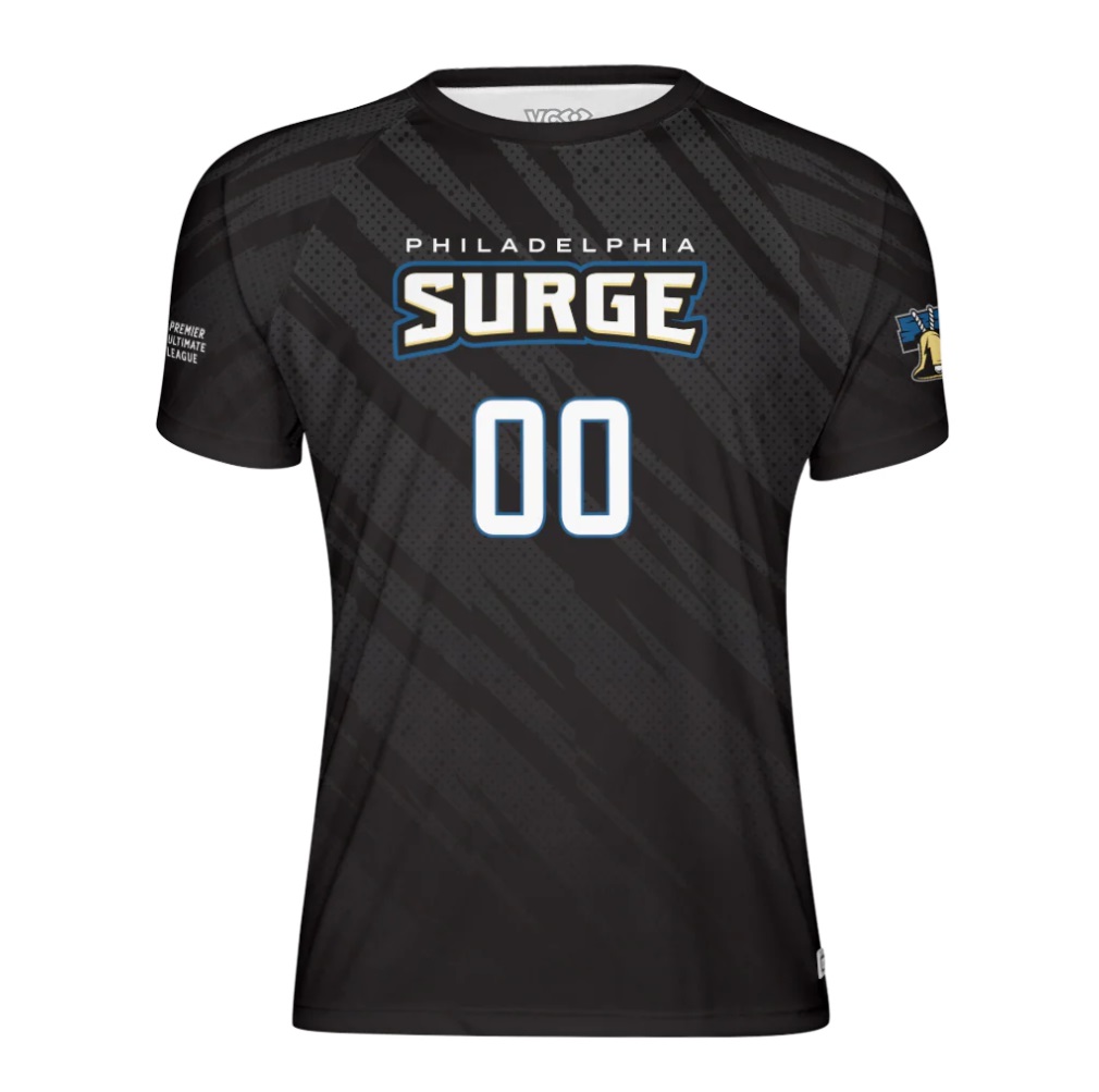
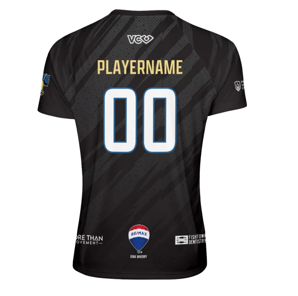
The first year team went with a simple design. Both the black and white designs have subtle gray stripes around the front and back with a simple team logo/wordmark front and center. Like Colorado in the WUL, it nicely marks their identity and leaves room for more creativity in the years ahead.
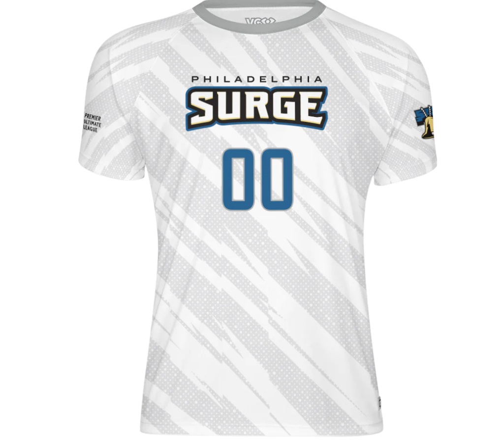
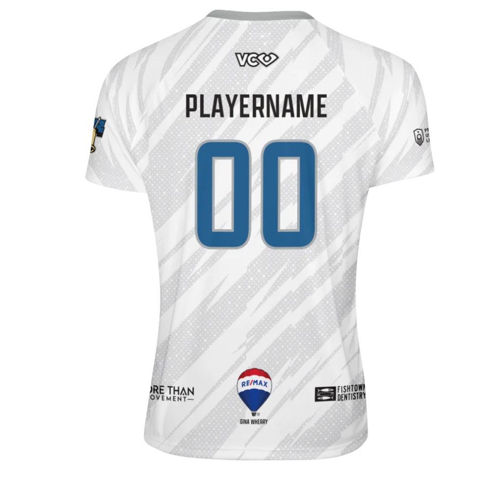
Alex: I would have liked to see something a bit more creative here or something beyond the logo/wordmark that connects the jerseys to the city. But these are adequate and leave room to improve in future seasons without being too boring. B
Ben: This design is a great way to end up near the middle of a jersey ranking list. It’s fine. There’s nothing especially good or bad about it. The font is solid, the bell is a necessary and present design component, and the sublimated gray stripey stuff is, well it’s also fine. B
Portland Rising
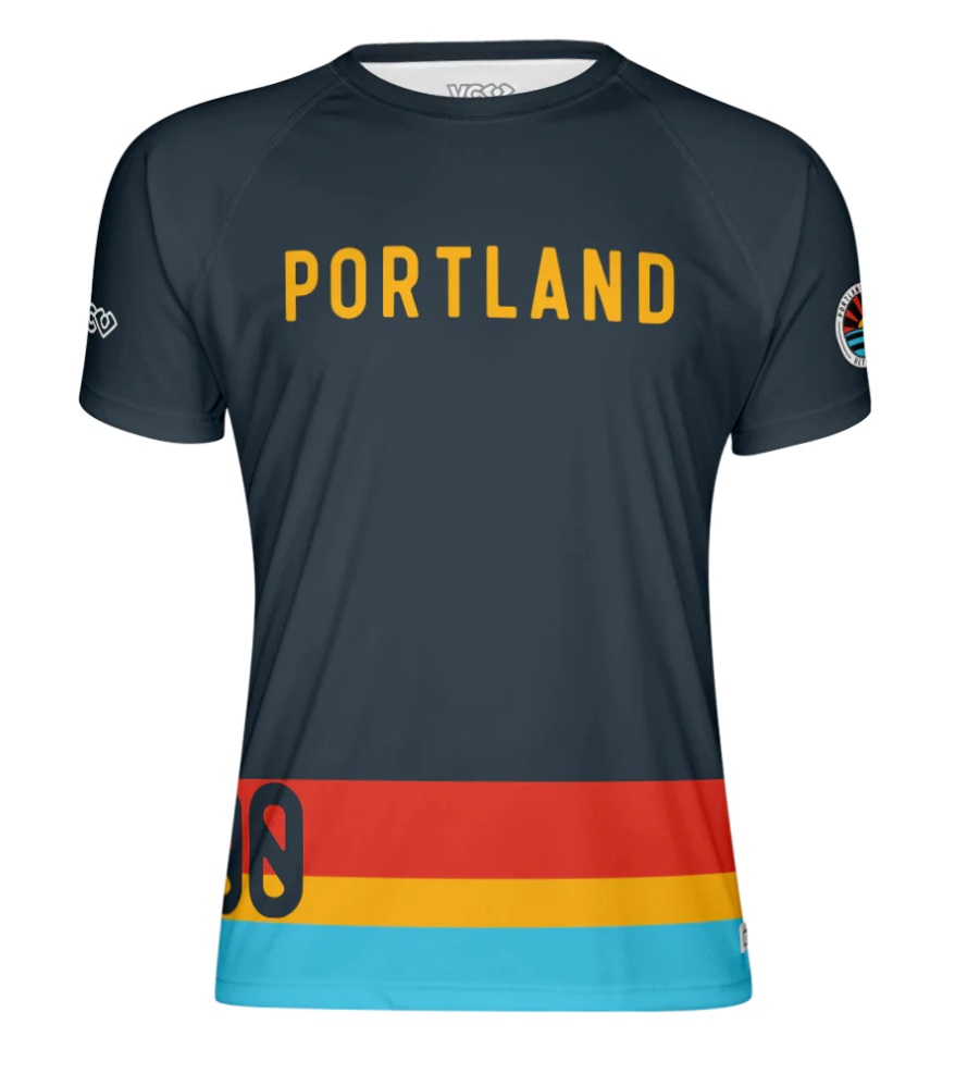
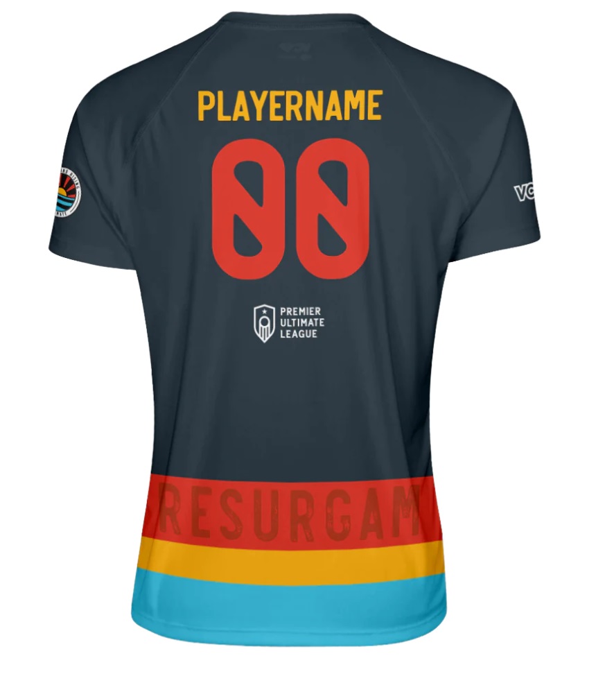
With no changes from 2022, Rising keep one of the best kits in the league.
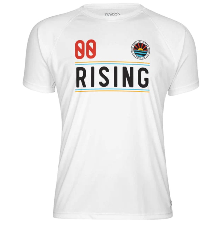
Alex: There is a lot I like about this set. The hemline striping on the navy jersey is great. The font is unique and very readable. I appreciate the subtle lines on the front of the white jersey. This isn’t solely for the jersey, but the team crest is perhaps the best in the league. One note: these jerseys are great, but the 2020 PSP jerseys were their best with the alternate light blue color as the base-I hope they revisit that color again soon. A
Ben: This is a great color scheme, with strong contrasting colors and a clean design. I’d prefer numbers on the front of the darks to be just a touch closer to the front, and would love to see some design elements specific to the team – geographical or otherwise. A-
New York Gridlock
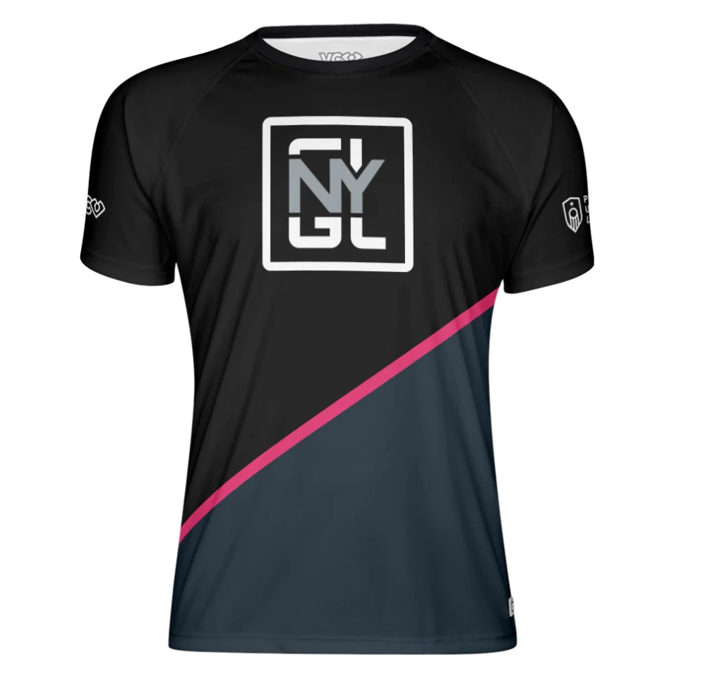
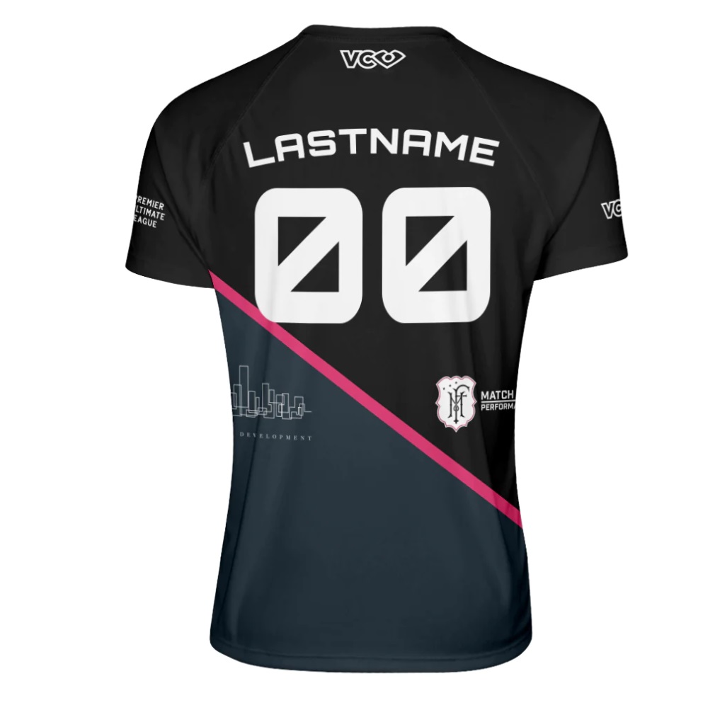
As classic a look as exists in the league, Gridlock make few changes to what is becoming a classic kit. With Revo Pro no longer playing in the PUL, using pink as a primary color is unique and definitely stands out.
Alex: I like the idea behind the chest strip and sleeve stripe on the white, but it really bothers me that with the raglan cut the stripes do not connect-it’s especially noticeable on the back. The black jersey is nothing special, but very solid. Only critique is that the numbers appear to overlap with the stripe. It’s not a huge deal, but a slightly smaller font might alleviate that and make it look a bit sharper. B-
Ben: Well, maybe I’m a hater and maybe this is a bad take, but I’m not a huge fan. On the dark, the dark gray with the black doesn’t do it for me, and the best design aspect is the little skyline, but it’s too small and is only there because it’s part of, I believe, a sponsor’s logo – not even part of the core design! The white is fine, but the pattern at the bottom seems like a random way to take up space and break up the jersey from being plain white – why not use some mini-map of the subway system or the streets of New York? B
Indy Red
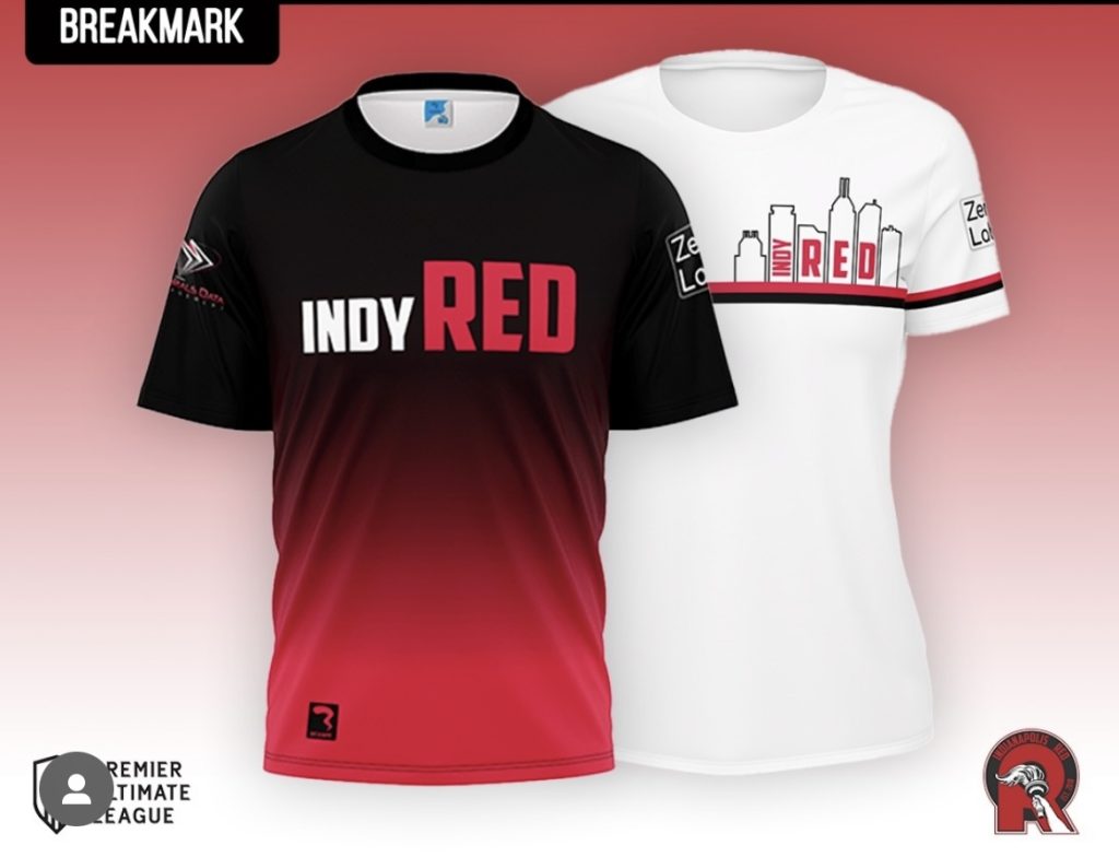
One of the teams switching from VC to Breakmark, Red have a simple, clean look that stays true to their aesthetic roots of previous seasons.
Alex: Both jerseys feel like they’re missing one thing. They aren’t quite as simple at Atlanta’s white jerseys, but they’re pretty simple. The skyline motif is cool, but would work so much better for a city with a recognizable skyline (sorry to any readers who would recognize that as Indianapolis-I’ve driven by the city dozens of times on road trips and it did not stand out to me). A for effort, C for simple. We’ll meet in the middle: B
Ben: The dark gradient from black to red is interesting, but I’d rather have some kind of geometric pattern built into it or something more nuanced using the sublimation. The white is a little better, with the city outline, but I’d love for it to be a little larger or more recognizable. Neither jersey in our images has jersey numbers so either the image itself or the jersey design is somewhat incomplete. We also can’t see the back so while I’m tempted to grade this one “incomplete” (no fault of the Red), instead I’m going with middle of the road: B
Milwaukee Monarchs
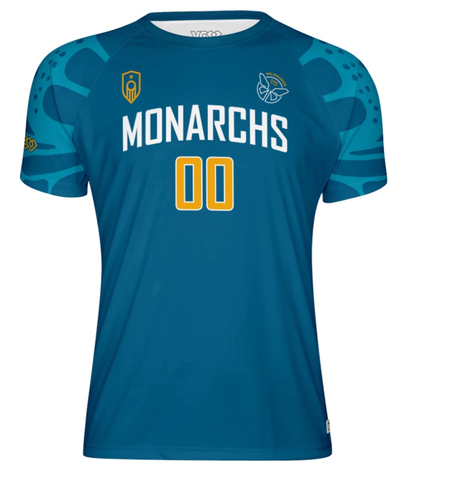
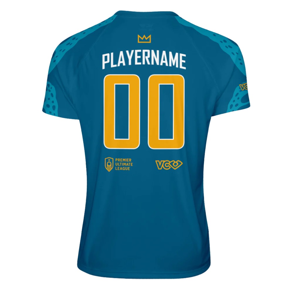
A classic, simple look unchanged from last season.
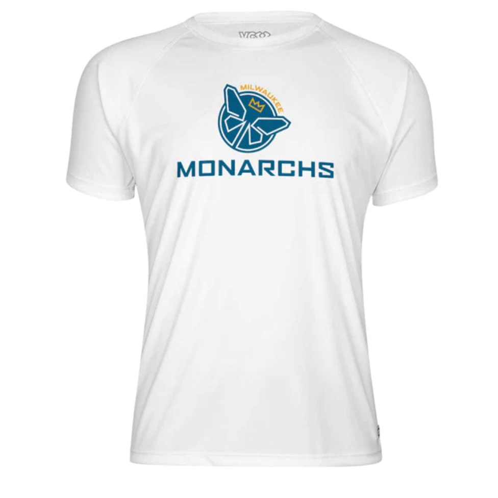
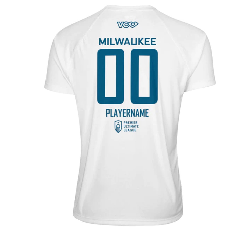
Alex: For such a simple design, the Monarchs actually pack in a lot here. The sleeve striping on the blue is fantastic and gives the right amount of pop. I also love the arched lettering-I don’t think any other team across the leagues do that. Like Atlanta’s, the white is just too boring for me. I want a jersey, not a supporters t-shirt, and the tiny name on the back below the number makes that feel busy without offering much; if the names are going to be included, I’d rather they be above the number where they are more easily readable. C
Ben: The Monarchs have a great color scheme and an awesome logo. As a result, the dark is simply excellent – the wing outline on the shoulders and the big space for the name and number is clean. I’d love a little bit more Milwaukee-specific theme on either the white or the dark. If the goal is minimalism, this might be the benchmark. I’m knocking it down a notch because the white is just a little too boring for me. A-
Minnesota Strike
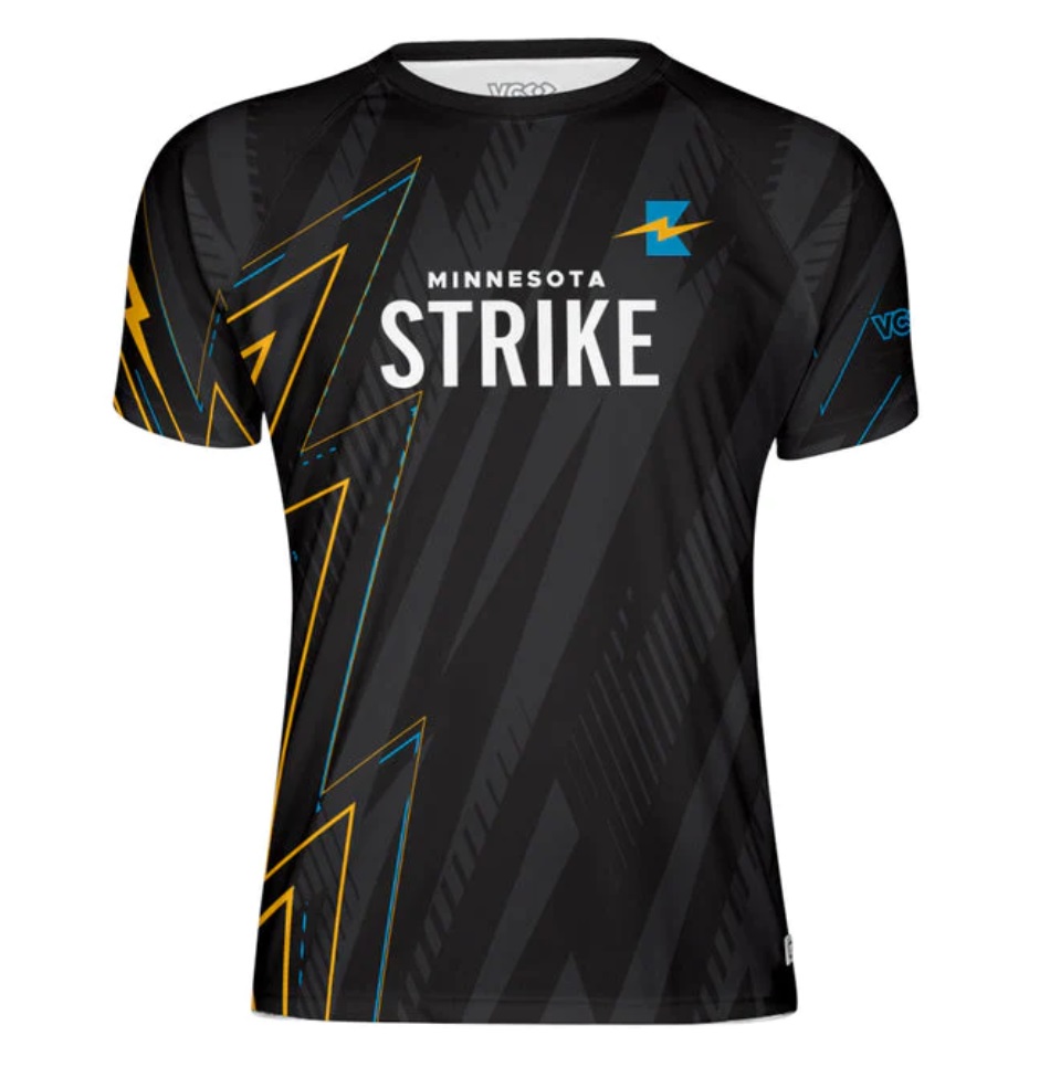
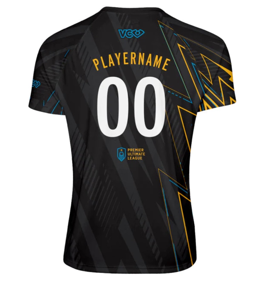
Strike overhauled their blue-and-black look for a sleek black design highlighted with lightning accents. Their white remains the same as last season’s.
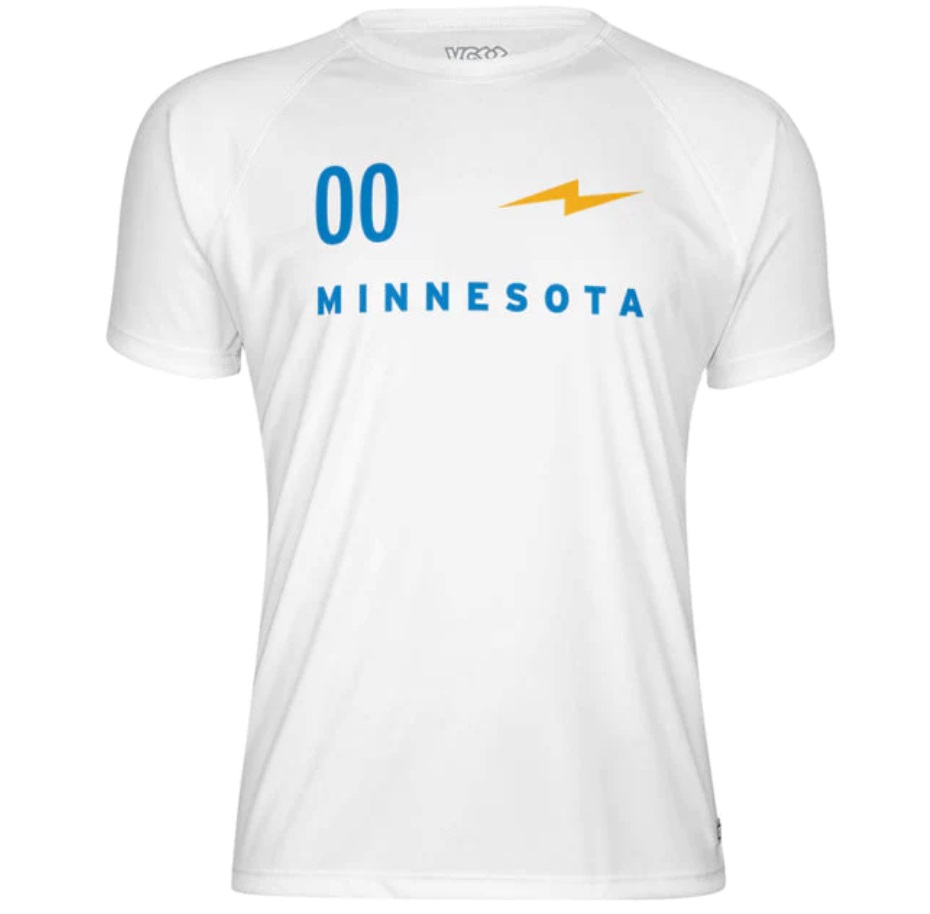
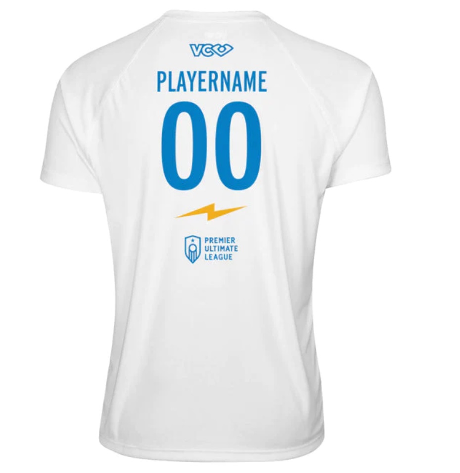
Alex: This dark jersey is one of the best looks in the sport. The vibrancy of the yellow peaks against the black background make it feel like the jersey is pulsating with energy-exactly what you want for a team called Strike. I’d buy one of those in a heartbeat. But the white is once again a bit boring. I wish they had used the full logo rather than just the lightning bolt on either the front or the back just to spice it up a little bit. A-
Ben: The colors work well together, and the dark is a great example of taking advantage of full sublimation without overwhelming the design. I appreciate that the lightning bolts are simple and geometric, as it creates a straightforward pattern that strikes (ha!) a good balance between too busy and too plain. The white is a little boring, but falls in line with a trend of simplistic white jersey designs that balance with a busier dark jersey design that’s popular and works well. A-
Columbus Pride
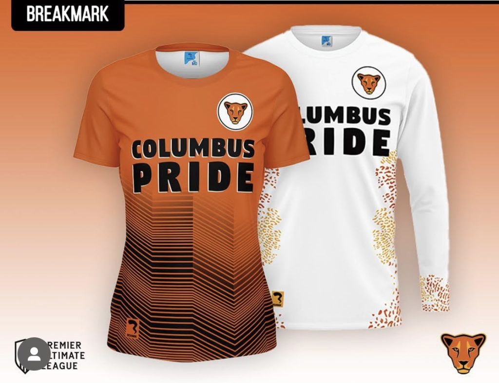
One of the teams switching from VC to Breakmark, Pride moved away from the rainbow Ohio paw logo and leaned into the lioness. The result is a cleaner look with a simpler color scheme but a little bit less flair.
Alex: Overall, I think the design changes are a net positive. I like the wordmark and fonts on the front because it’s so readable. The circle crest is a bit soccer-y but that’s not a bad thing. I love the unique print on the sides of the white and the black stripes on the orange give a needed vibrancy to the look to break up what can be an aggressive color. B
Ben: I like the whites better than the darks – the spots on the sides of the whites have color accents and feel like big feline predator energy. I was a big fan of the rainbows (and I’m biased having coached the team for two years!) but I think this is overall a net positive. There are good reasons to move to the new logo and in another iteration or two they’ll catch up to where the last design left off. B
Our Top Three Favorites
Alex: Milwaukee’s darks stand out to me as a clear upgrade over their previous set and one of the best looks in the league. Atlanta’s darks are so unique and so bold that I just keep coming back to them. If I were going to buy any two jerseys, those are at the top of my list. The only reason Utah’s isn’t is because I already have one. Other standout sets for me are: San Diego, Portland, Nashville, and Arizona.
Ben: My top three are Arizona’s darks, Atlanta’s darks, and Utah’s darks; top two were easy, third one was close between Utah darks, Milwaukee darks, Portland darks, and San Diego darks; as mentioned, I prefer busier and flashier designs, and none of the lights really get me going like these dark designs.