Resident fashion consultants Alex Rubin and Ben Murphy are back to decide which men's semi-pro kits passed the test and which need to hit the books
March 23, 2023 by Alex Rubin and Ben Murphy in Other
Earlier this offseason, the AUDL signed a two-year deal with BE Ultimate to serve as the official apparel partner for the league after a few years with VII as their primary manufacturer. With the uniform provider switch comes a number of design changes. Like they did for the WUL and PUL jersey sets, Alex and Ben give their thoughts on the league’s new aesthetics.
AUDL
Boston Glory
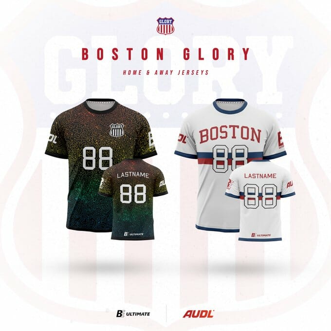
While the white jerseys are a nice upgrade over last season’s hockey jerseys, the black jerseys are poised to be the most polarizing in the league. You either love them or you hate them.
Alex: The white shirt is good, but let’s focus our attention on the dark. I’m on the positive side here. No other jersey in league history looks like this. Sure, it looks a bit like a soccer shirt. Sure it has absolutely nothing to do with Boston. Sure, it’s a break from the team’s visual identity. And I still am fixated by it. I want to look at all of the jerseys, but I keep coming back to this dark. All things considered, I don’t love the font choice, but I’m going to overlook that and reward the boldness that Boston went for. A
Ben: I am loving this dark design. Busy, colorful, full use of the space, and looks better the closer you get to it. The white is fine – I’m struggling with the way the numbers fail to contrast with both the stripes and the background. Overall, the white is solid but unspectacular and the dark carries this kit for me. A
Montreal Royal
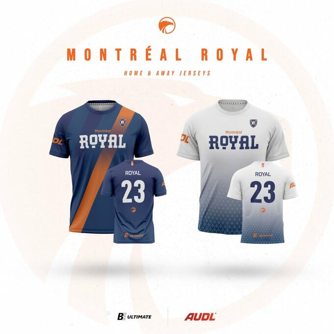
No changes for the Royal who keep their clean navy jersey with the orange sash and simple white shirt with a navy gradient along the bottom.
Alex: These are consistently among the best in the league by being interesting without trying to do too much. Each jersey has a clear and clean appearance with one distinct design element. I love the orange alternates the best given that orange is such an underutilized color in the league. I also want to shout out the wordmark for a creative font. A+
Ben: I like the Royal designs but I’m not thrilled with them. I think they’re a good demonstration of simplicity without being boring. The color scheme, the font, the way the logos and numbers fill the space are all well done. I would personally prefer something with a little more substance, pizzazz or flair. B+
Toronto Rush
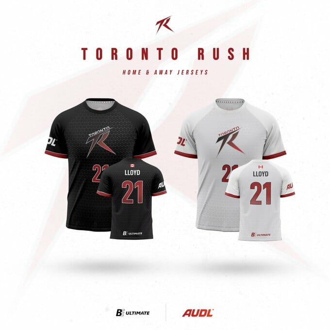
The Rush went simple for this year with black and white jerseys that showcase their logo on the chest and simple red stripes on the sleeve.
Alex: [Yawns] The sublimated pattern as a backdrop is too faint to be noticed on either shirt and without that it’s just a logo on a t-shirt. I really don’t like the choice to go with red shorts too-they’ll look fine with the white shirts, but I don’t think they will work with the black shirts. D
Ben: I agree with Alex that the pattern could be a little stronger, but my main gripe is that these designs seem kind of uninspired. They took the logo, did a color flip flop for the dark and the white, and decided that was good enough. I don’t hate the red shorts – when you have white and black primary jerseys having some contrast in the shorts can work. I’d say it’s not bad but not that great. C+
Philadelphia Phoenix
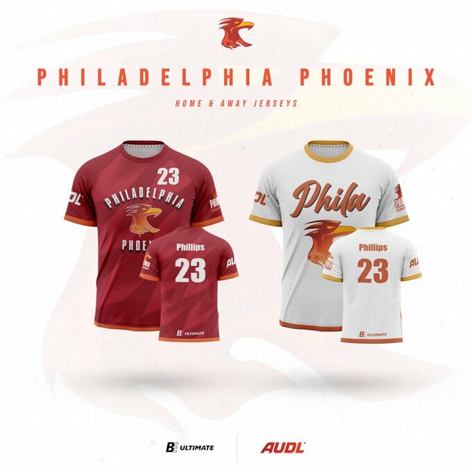
A refreshed version of last season’s shirts, the Phoenix simplify their design by making the chevrons on their red shirt larger and more muted and eliminating that element completely on their white jersey, which features a large version of their logo.
Ben: The dark is good – my one nit pick would be to drop the shadow from the team name on the front since there’s no other font shadowing (and I don’t care for it here), but I like the background feather pattern and I think this is a good example of a full sub that uses the space without being too busy. The weird word art on the front of the white is kind of tacky looking, and there’s nothing specific to Philadelphia on either jersey as far as I can tell. B
Alex: This set is an improvement from last season’s set with its simplicity, but I can’t get over the wordmark on the white jersey. I’ve lived in Philadelphia for nearly 20 years and I’ve never heard anybody call the city “Phila.” I know that the local men’s professional basketball team uses it and I think that looks bad too. Using “Philly” or a script “Philadelphia” would be a huge improvement. Like Ben said, the background pattern on the red jersey improves the kit a lot from last season. B-
New York Empire
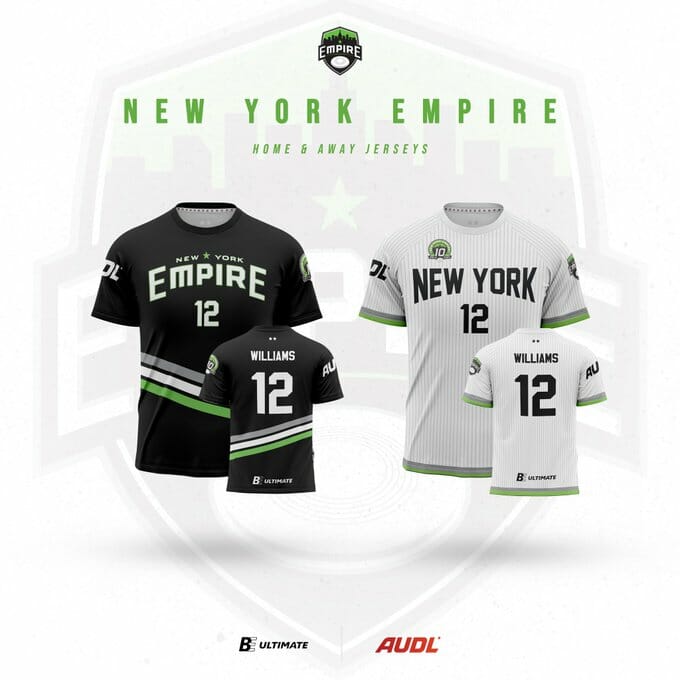
The white jersey looks unchanged and is on its way to becoming the league’s preeminent classic shirt. The black jersey keeps the same structure and colors as previous seasons with a subtle change to the design elements that includes three diagonal stripes across the lower third.
Alex: Nothing too special here. I like the pinstripes on the whites; those are both a unique and timeless look. This version of the dark is somehow different than previous years and manages to look exactly the same. The 10 year logo on the sleeve is a nice touch, but my favorite part of the entire ensemble is the E logo on the shorts with the letters N and Y serving as cutouts in the negative space-now that’s some top tier design! B+
Ben: I’m not the biggest Yankees fan but I can appreciate the inspiration on the Empire whites and they do well to pay homage without completely copying the baseball design. The darks are also fine, but not likely to stir feelings in people one way or another. I appreciate Alex calling out the shorts logo – it is an awesome touch and not something I would have seen without the call out. B+
Washington DC Breeze
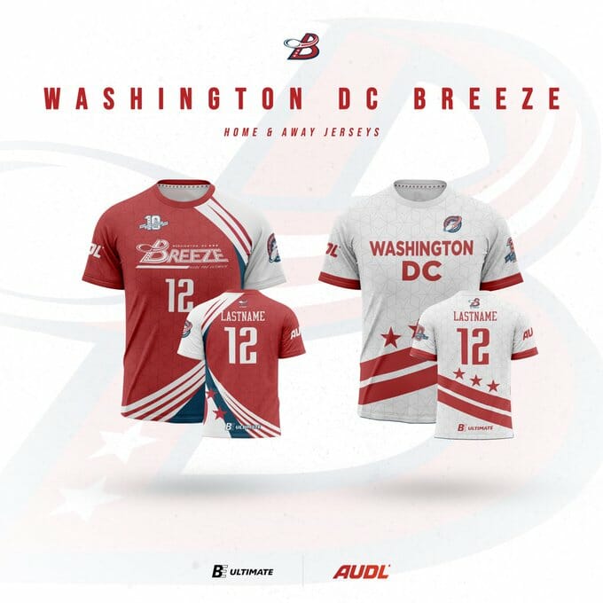
The Breeze refreshed their jersey set for their 10th anniversary. Both jerseys feature a sublimated star pattern evocative of the diagonal street intersections in Washington DC. The red jersey keeps the Breeze’s historical concept with white and blue sweeping stripes up one side of the jersey. The white shirt uses diagonal stripes and stars along the bottom third to create a stylized version of the DC flag. Both jerseys feature a new logo in addition to a 10th anniversary logo.
Alex: I like both jerseys better than last year’s set. The DC flag is iconic and I’m glad they finally figured out a way to incorporate that into their jerseys. The red jersey seems to have simplified the striping from previous iterations. I love the background pattern here and it has the nice side effect of matching the Breeze with their PUL counterpart the DC Shadow who also use stars as a major design element. Very excited for the eventual DC-NY playoff game: the battle of the lower-third diagonal stripes. A-
Ben: The white is one of the best in the league – subtle pattern background with the DC flag stars and bars fills the space with design elements specific to the team and their home. The dark is a nice design but I struggle any time a dark shirt has this much white in it. I am torn on the logo switch – the old one wasn’t remarkable but it felt more distinctive. The white helps boost this set overall. A-
Carolina Flyers
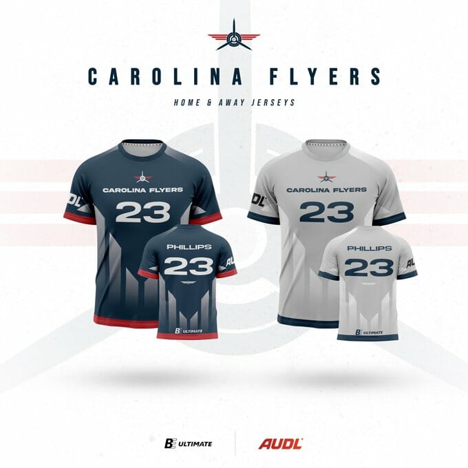
The Flyers mostly keep their 2022 redesign intact with the blue jersey basically identical to last season’s and the grey jersey just swapping base colors from last year’s white.
Alex: This was a golden opportunity to redesign the worst kit in the league and the Flyers squandered it. Here’s to looking like a middle school flag football team again with oversized numbers, a tiny wordmark, and a logo featuring a propeller so thin that it’s hard to see. F
Ben: I’m not going to be quite as harsh as Alex here, but I can’t say I disagree with anything said about this kit, either. For me, there’s nothing that says “Carolina” and other than the logo, nothing says “Flyers” either. Too much grey on the light shirt, and the two designs are identical save for color swaps. C
Atlanta Hustle
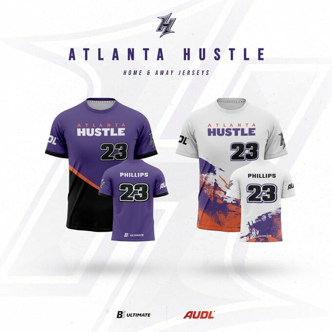
Atlanta largely kept their 2022 jerseys intact. Their purple features a bright red diagonal/lower third (sensing a theme here with these BE designs) that separates a black color box. The white has a splatter of red and purple color along the bottom. Both have black numbers outlined in white. Last season Atlanta unveiled black alternate jerseys, but those do not appear on the retail page for this season.
Alex: It just feels like something is missing here. These are both solid jerseys but they don’t really tell me anything about the team or the city. I like the wordmark and font., the colors are vibrant and unique, but it doesn’t really scream “Atlanta” the way I think it should. B
Ben: I appreciate and enjoy the color flair in the white design and the contrast in the color scheme and the way it pops on both designs. The Hustle didn’t do anything with subtle patterns in the background like some other designs, which may have helped liven things up for some folks. It’s one of the better takes on a simplistic design. B+
Houston Havoc
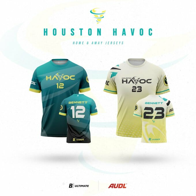
A refreshing teal and yellow color scheme backdrop this year’s single expansion team’s first jerseys. Subtle flourishes in the background add some visual intrigue to the wordmark and numbers.
Alex: Houston really made a statement with this set and I am thrilled about it. The vibrancy in these colors is stunning in a good way. Like Boston’s black top, I can’t seem to take my eyes off of them. The colors build in great contrast to read the names and numbers. Without doing too much, this set rockets towards the top of my list. A
Ben: I’m not quite as big a fan as Alex here. I like the dark, and the colors are strong but I would have preferred that the lighter design looked less like urine. Overall, the design suffers because the name doesn’t really have anything to do with Houston, which is okay, but the logo also seems caught in between tornado and drill bit. These land somewhere in the middle of the pack for me. B+
Austin Sol
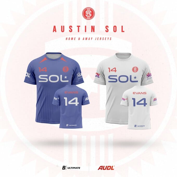
The Sol made a few big design changes from their jerseys in previous years. The team name, Sol, appears in large letters across the front of both jerseys with the team crest relegated to the top left corner. The blue jersey has some collar accents and a sublimated, truncated striping pattern across the torso and around the back, while the white jersey has no other design features.
Ben: I am always sad when the two designs are identical save for color swaps, and this one is so plain that it leaves me wondering if they ran out of time to make the designs or something. “Just write SOL on there and add some accents or something.” “Got it, boss.” Meh. C
Alex: This is probably the best of the plain, simple white jerseys, but the change from last year’s more interesting set really begs the question: why? There was nothing wrong with 2022’s kits and these are a big downgrade. The new font might be an attempt to look sleek, but it comes off like a soccer kit that features Sol Yanuck as the team’s sponsor. Ben is spot on calling it “meh.” C-
Dallas Legion
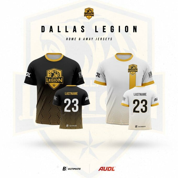
Despite a recent rebrand, Dallas decided to change their jersey design for this year. The white jersey features a top left corner logo with a vertical stripe descending down the length of the jersey. The black jersey has a large logo in the center of the chest with a weaved gold gradient coming up form the bottom hemline.
Alex: A clear upgrade over their monstrosities from 2022, there is still nothing about these jerseys that screams, “legion!” A solid color scheme and good contrast will go a long way, so the team gets points for that. There’s a big missed opportunity to turn the stripe on the white jersey into a sword. I do love the patterned gradient on both jerseys. B
Ben: I am also a big fan of the line pattern used on the bottom of both, and I think these are a good example of how the designs don’t have to be color matched inverses of each other in order to look cohesive and similar. So many of the color matched designs are uninspired, and these are a step ahead, simply by moving the logo and adding a stripe on the white. B+
Chicago Union
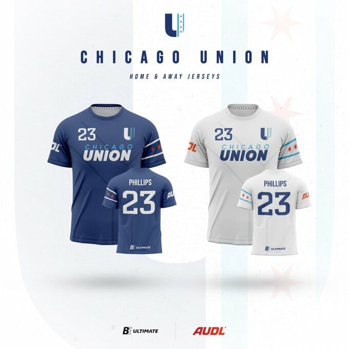
Chicago keeps their jerseys untouched from their 2021 rebrand.
Alex: This set is very lowkey but one of the best looks in the league. The Chicago flag on the sleeve and the Y symbol representing the Chicago river sublimated in the background are both great touches that are visually attractive, do not take up too much space, and connect the team to their city. I wish they kept the powder blue alternate, but there’s still a chance that could come back in the future. A
Ben: These are a little too boring for my taste. I appreciate that the Chicago flag is worked into the sleeve, and that there’s texture to the torso overall, but I wish there was more variety and something distinctive about one of the designs. Maybe the wording says just “Chicago” on the white or just “Union” on the dark (or just the logo on the dark?). Anyway, they’re fine. B+
Pittsburgh Thunderbirds
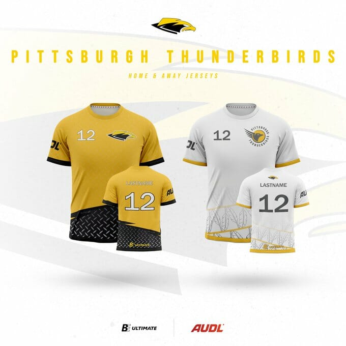
Pittsburgh completely redesigned their jerseys this season. Their dark switches from black to yellow with a sublimated industrial steel print throughout. A lower-third diagonal brings a color block of black in to make that print a bit more visible. The white jersey introduces a new logo on the upper chest and again uses diagonal lines along the bottom to showcase a patterned feather design.
Alex: What a strange set. I love the steel print on the yellow jersey but it is otherwise incredibly plain. The feathers on the white jersey are cool, but aren’t exactly what I think of when I picture a Thunderbird. It is very interesting that they have two different logos, one on each jersey. I’m not sure how I feel about that but my initial thoughts are negative. C+
Ben: I’m a bigger fan than Alex – I like the Pittsburgh themed accents with the steel pattern on the dark, and I think the feathers on the light are supposed to harken to the city’s many bridges as well. They’re simpler than I’d normally prefer, but again are a good example of how it doesn’t take too much to avoid having color flipped designs that are uninspired. I think having just one logo would be better, so I’m dropping them a notch for that. B
Alex: I’m not sure I see the feathers as a nod to Pittsburgh’s bridges. If they wanted to do that, they could have used a more clear outline like these from a local college team.
Detroit Mechanix
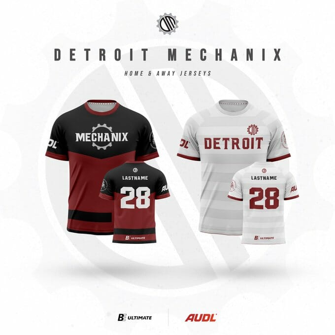
Keeping their classic color scheme, the Mechanix refresh their design with two new jerseys. The black and maroon dark jersey features a stylized wordmark through the gear from the team’s logo. The white jersey showcases the team name inside gray and white hoops.
Ben: Seems pretty clear to me that the jersey designs are the best thing going for the Mechanix, and it’s not particularly close. Two different looks with the same color scheme, nice logo and chevron on the dark with strong contrast, and a great layout on the light that uses the space without being distracting. A
Alex: Detroit may not have won a game in over five years, but they have jerseys that look like a winner. I like the unique font for the wordmark and numbers. I like that they’ve stuck with this color scheme for over a decade. I even like the hoops that are basically the same as San Diego’s (I’m not sure which came first so I won’t assign blame either way). A
Ben: I’m pretty sure Detroit had the horizontal stripe hoops on a jersey design before San Diego was in the league, but I also wonder if there’s some overlap in the design teams as opposed to having been copied (the teams basically sharing a color scheme isn’t helping either).
Indianapolis Alleycats
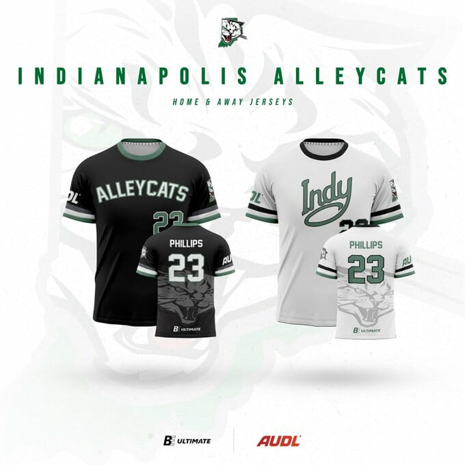
This year’s dark jersey is black and keeps the block lettering the ‘cats have used in recent years. The white jersey introduces a script wordmark across the chest. Both feature a sublimated alleycat under the number on the back and a new logo on the sleeve depicting an alleycat slinking through an outline of the state of Indiana.
Alex: The script font on the white jersey is gorgeous. I like the Indiana state outline logo on the shorts and sleeve too–both are great additions. The oversized sublimated logo on the back looks a bit busy but when I think of it as an homage to their 2012 jerseys and a semblance of visual continuity, it kind of makes sense. B+
Ben: I appreciate the difference between the front of the two designs – it makes so much sense to have the mascot on the dark and the city on the light that I wish more teams did it! – but I wish there was a little more differentiation between the two. The cat on the back of both is a little bit big but I’d prefer a placement that wrapped the side or something so that it wasn’t quite as centered with the name and numbers. B+
Minnesota Wind Chill
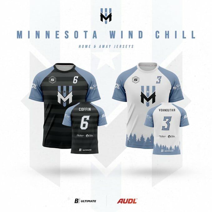
Minnesota keeps the majority of its design intact. Both jerseys feature the team logo in the chest, flanked by the player’s number and their sponsor logo in each chest corner, and blue sleeves. The black jersey has grey hoops across the middle and the white jersey features the outline of a forest along the hemline.
Alex: The Minnesota white jersey continues to be my favorite look in the league. Something about those trees just gets me. The colors are appealing and connected to the team name. The numbers are rendered in a unique but readable font. There’s so much to like here and I’m glad the team kept a good look intact. A+
Ben: This is probably as good as the mostly color matched sets can get – stripes on the dark and trees at the bottom of the light do help distinguish between the two, and I like the raglan style sleeve contrast. I’d be fine with them taking a risk on one of the designs with something a little more varied, like an outline of Minnesota or the word Minnesota on the light. B+
Madison Radicals
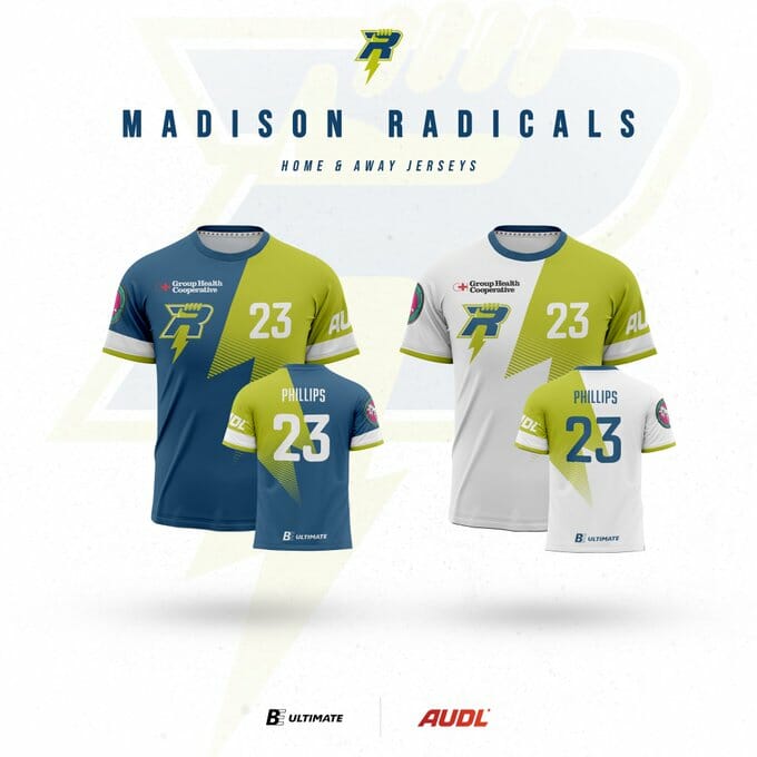
With largely the same overall design since 2013, the Radicals play in blue or white jerseys with a green-yellow lightning bolt pouring over the left shoulder along the front and back.
Alex: This is as timeless a look as exists in the league. To be honest I don’t really like it too much, but at this point seeing the Radicals in anything else would be like seeing the Yankees without pinstripes. B
Ben: I was thinking basically exactly what Alex said. I wouldn’t fault them for trying something new, but I totally get it. Even just subtle differences between the two could help, like outlining the bolt on the white instead of filling it in, or putting something other than the logo on the front of one of them. B-
Seattle Cascades
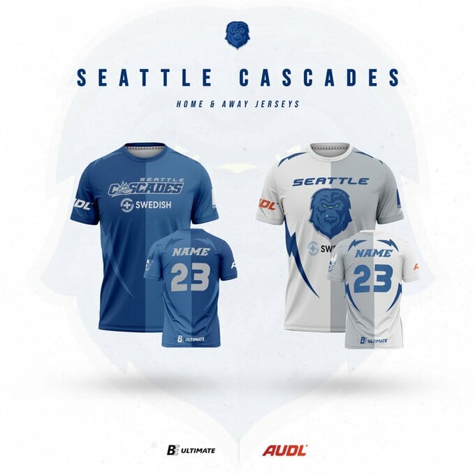
The Cascades bring back their signature look: a two-shaded blue half-and-half jersey with opposite-color accent marks around the edges. The light jersey takes the same template and replaces two shades of blue with white and grey.
Alex: I have never loved these, but they do have something of a timeless character at this point in their lifetime. They look a bit kitschy which was fine back in 2015, but it’s disappointing that they haven’t upgraded to something a bit sleeker or more modern. C-
Ben: These are fine. I don’t get the lightning bolt accents or what they have to do with Seattle or the Cascades. Are those supposed to be lines of fur? There’s nothing about these that really moves me either way. C
Portland Nitro
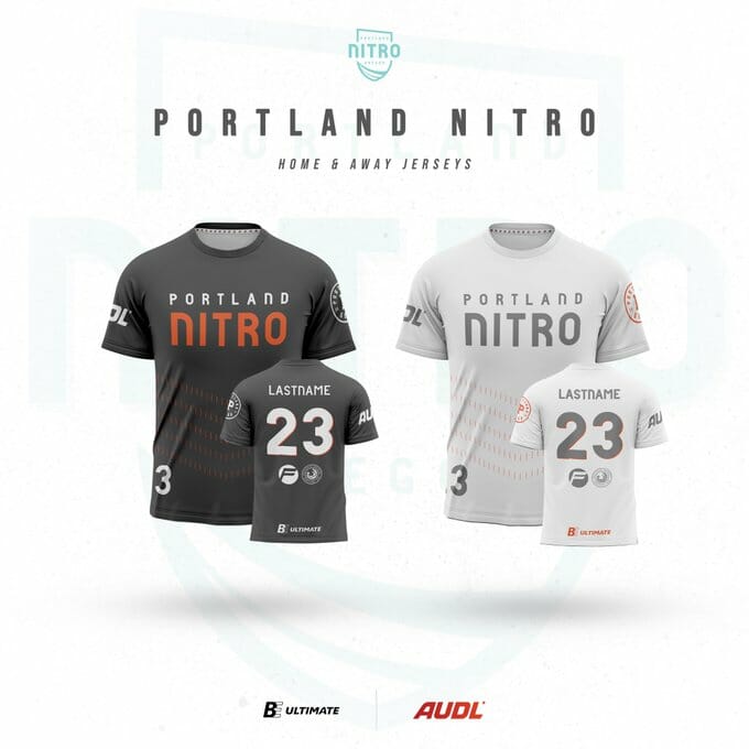
Portland enters this season with black and white jerseys that are identical except for the background color. A simple wordmark and orange chevron accents underneath are all the design elements to be found. The numbers on the back have an orange drop shadow.
Alex: Nitro’s set is solid but unspectacular, though anything Nitro put on this season would be an upgrade from last year’s unreadable mess of a shirt. I like the unique font and the drop shadow on the numbers. The chevrons add a nice touch without causing any drama. It feels like there could be more here, but perhaps this is an example where less is more. B+
Ben: These are fine. Another in a long line of somewhat uninspired color flipped matching designs. The color scheme is pretty sweet, though.1 I’d love something related to Portland or whatever a Nitro is instead of a stack of chevrons. C
Colorado Summit
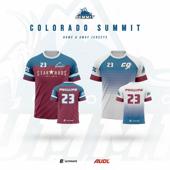
The Summit’s jerseys look similar to last season’s. A red jersey with a blue shoulder stripe makes the primary jersey, while their other features a blue and white gradient on the front and back with a new alternate logo as a chest crest.
Alex: These grew on me last year, but I can’t get over the intrusion of blue onto what I think is supposed to be a white jersey. I really don’t like how the gradient is reversed on the front and back-it makes the shirt look less cohesive than it could. Things I like: stripes on the shorts and the new alternate logo. C+
Ben: Which one is the white? Joking, but c’mon, that’s a weird stack of gradient blue lines on the top of the white jersey. How does this go when Colorado plays at Seattle? The designs otherwise are interesting enough. I would have liked some kind of mountains or something from a team called Colorado Summit. C
Salt Lake Shred
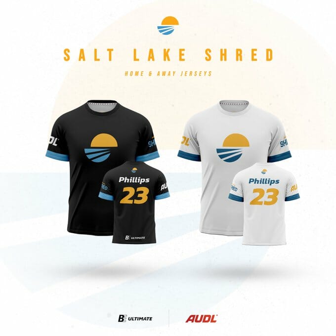
Bringing back last season’s jerseys, the Shred simply put their logo on black and white tops with blue sleeve stripes.
Alex: Nothing wrong per se, but these are the most boring set in the league. With one of the better logos and a fun color scheme, I was hoping to see some more blue or yellow…or really anything other than the logo on a t-shirt. D
Ben: The logo really is great, and the color scheme pops, but those are the only good things I have to say. You’ve heard the refrain about the color flipping so I’ll save it this time. C
Los Angeles Aviators
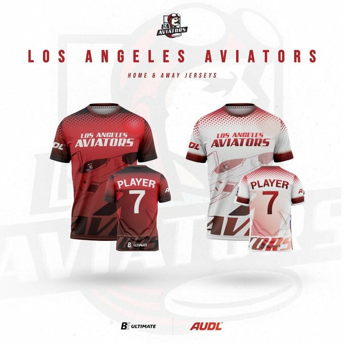
Along with some splashy free agent signings to augment their offense, the Aviators are overhauling their jerseys this year. The white and red jerseys have color-swapped identical designs with a large plane piloted by Ace the Aviator-the team’s mascot-taking up the bulk of the space on the front. The team name is written in big letters along the hemline and there is a large A that wraps around from the front to the back underneath the player number. A dotted collar area rounds out a jersey that makes full use of sublimation possibilities.
Ben: I like busy designs, but this is too much. Demerits for having a little too much going on, but it’s also a color flip of the same design, and there’s not quite enough space to make out what’s going on in either color scheme. One of the jerseys should have gotten the logo and one should have gotten the airplane, and then you could use both elements without either design being so busy, and there’d be space to see what was going on. C-
Alex: I honestly do not know where to start here. There is just so much going on and I don’t like most of it. The unnecessary dots, the oversized logo and the plane (one or the other would be sufficient), the team name in a place nobody can read it. There’s just so much to dislike here. At least the name and number will be readable, even if they too look a bit large. This is a great lesson that just because space can be filled does not mean it needs to be. Like Ben, I think these have potential and would look better if they were a touch more simplified. D
Oakland Spiders
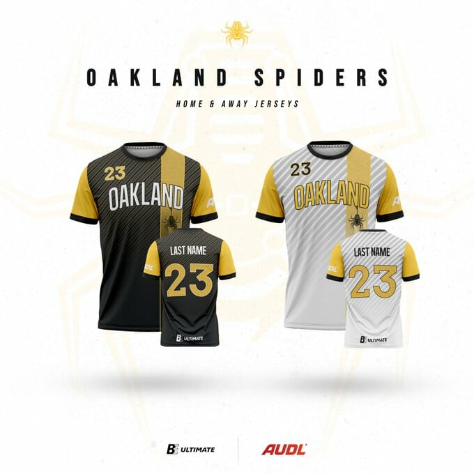
The Spiders are taking on a new visual identity this season with a retro font and vertical yellow stripe and sleeves adorning their black and white jerseys. A dangling spider hangs in the stripe which fades out in a gradient towards the bottom. There are diagonal stripes in the background on both the front and back.
Alex: I love the spider-that really brings the whole thing together for me. Excellent font choice as well. A
Ben: If you’re going to do the color flipped identical designs, this is the way to do it. I don’t love how dark the grey stripes get on the back of the white design, and as always, I’d love for the dark to say “Spiders” instead of “Oakland.” B
San Diego Growlers
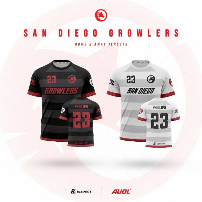
San Diego refreshes their look once again with a color swapped set of white and black shirts with gray hoops and simple team/city names across the chest
Alex: I worry about the contrast with the red lettering on the black shirt, but overall these are an improvement from last season’s set which was impossible to read. There’s nothing overly flashy here and every element works together well. B-
Ben: Take the similar designs and modify slightly so that the away has the city and the home has the mascot and now we’ve got a great starting point. White lettering would have been better than red on the black design, similar to the Detroit darks – the contrast is really helpful. B
Top Three
Alex: My favorite is still the Wind Chill white jerseys; I think the hippie nature-lover in me just loves that the “skyline” is a treeline and I really like the shade of blue. I am taken by the Houston teal jerseys. Responsibly I should see how they look on the field before I put them on a podium, but I’m anticipating that they’ll look great. Lastly, I’ll go for the simple elegance of the Montreal navy jerseys. Boston’s darks were close, but I couldn’t quite put them in the top three yet–we’ll see how they look on the field.
Ben: The top of the heap is definitely the Boston dark, and after that it gets a little bit tougher. So many of these feel uninspired when I sit back to pick favorites – I think the simplicity overall works for the league and I get the appeal to that minimalist design aesthetic, but I keep wanting more pizzazz. Give me the Detroit dark and the DC whites to round out the podium.
/s ↩