Who looked the best this Nationals?
June 30, 2026 by Calvin Ciorba in Opinion
Ultiworld’s coverage of the 2026 college ultimate season is presented by Spin Ultimate; all opinions are those of the author(s). Find out how Spin can get you, and your team, looking your best this season.
What another spectacular D-III Nationals it was in 2026. The “People’s Division” once again showed out with their plays – and their jerseys. Let’s take a look at the best, worst, and most interesting jerseys seen in Waukegan.
The Best
Carleton CHOP – Dark and Light (VC)
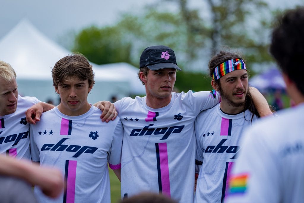
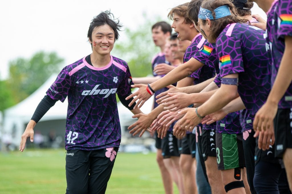
CHOP might have had the best complete kit at Nationals this year. To start, the darks look sick. I love the pink, purple, and black color scheme, and the “CHOP” text is easily legible on top of a sweet background pattern. Add in the flower logo and pink stripes, and this jersey is a 10/10.
The white jersey keeps the same font, logos, and color scheme, making it pair really well with the dark. But it still does enough to stand on its own, with vibrant two-color stripes that are fun to look at without feeling overwhelming. If you look closely, you can also see a subtle map of Northfield worked into the design, which adds a nice homage to their school while keeping the jersey clean.
Union Jillz – Light (BE)
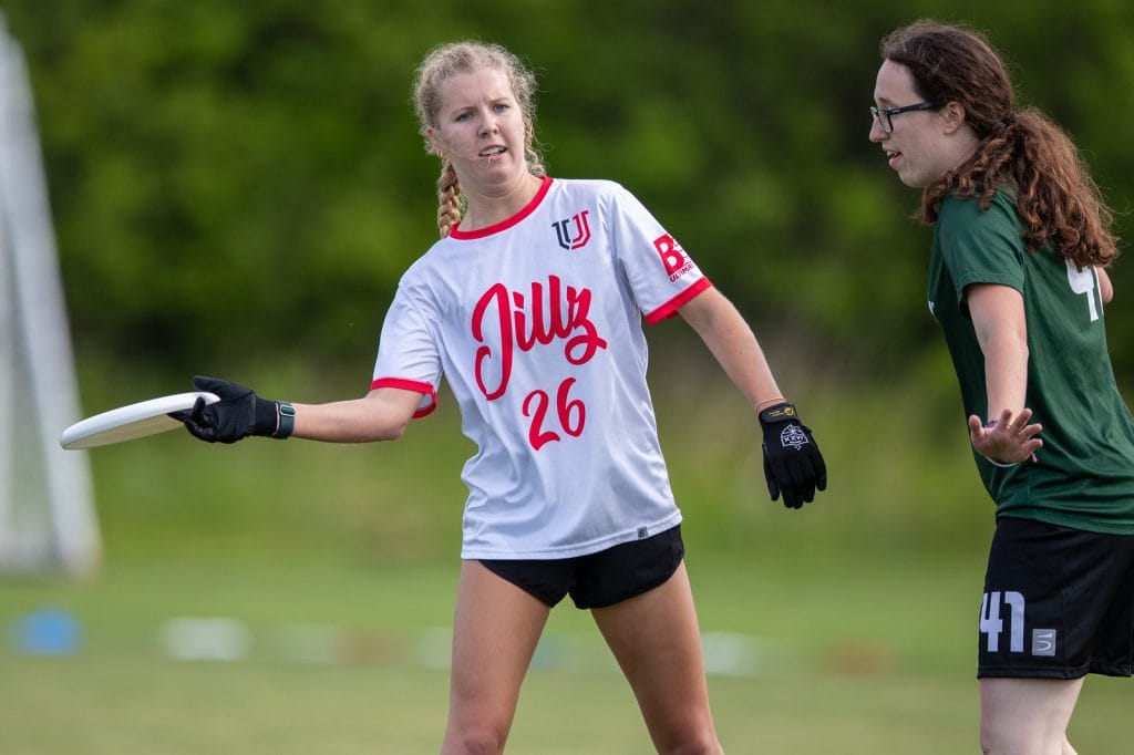
Light jerseys are hard to perfect, but these Jillz jerseys turned out fantastic. I love the vibrant red color on both the text and trim. The fun script font is nice and large, matched with legible numbers. This jersey isn’t doing anything revolutionary, but it’s fun to look at.
Franciscan Fatal – Dark (Spin)
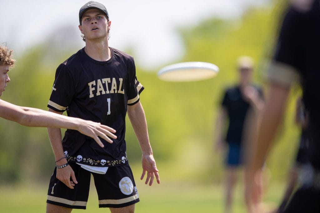
Franciscan went away with their normal black and green color scheme, to a black and gold palette this year, and they turned out fantastic. The name is legible, the stripes accent the jersey well and match the shorts, and I love the chain of skulls and flowers at the bottom. This is a great example of how to make a clean jersey while still using full sub designs.
Carleton Eclipse – Dark (VC)
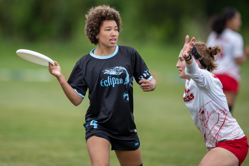
I feel like I rarely see this shade of blue, and I loved the way Eclipse used it with their jerseys. The bird image is cool, as well as the shaping of the letters in “Eclipse.”
Most Interesting
Colorado College Zenith – Dark (Spin)
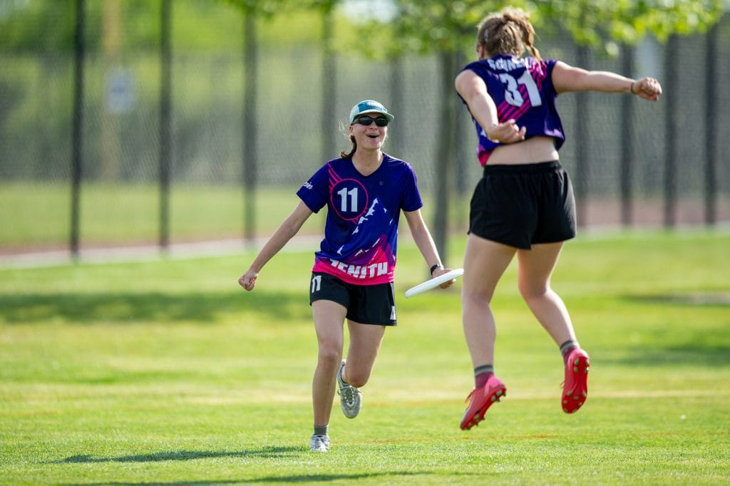
Maybe this one is controversial, but these Zenith jerseys immediately popped out to me when I first saw them. The colors are bright, cool, and absolutely exude D-III ultimate. The mountain graphic looks sick, especially paired with the neon pink stripes, and despite all the color, both the numbers and “Zenith” are still easy to read. The only thing I might change is slightly decreasing the size of the number on the front, but that is really just nitpicking.
Bowdoin Clown – Dark (DH)
Say what you want about polos, but these Clown jerseys are both fun yet clean at the same time. They are able to do a lot with the black, grey, and white where it looks interesting but isn’t an overdesign.
Rice Torque – Light (Breakmark)
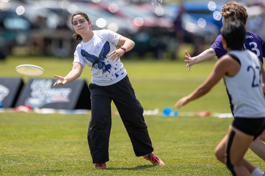
I do really like this owl imagery as the primary focus for this jersey. My only concern is the skinny lettering that may make it hard to read from afar, but on a fantastic UltiPhotos camera, they turn out quite well.
Lewis & Clark Bacchus – Dark and Light (Spin)
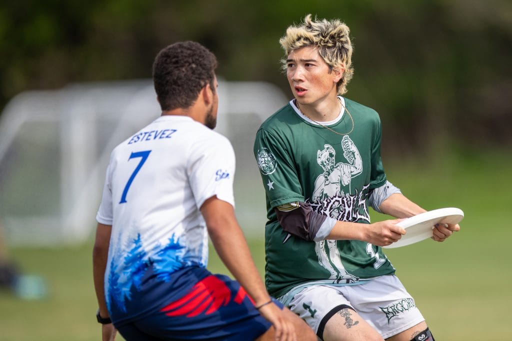
Bacchus went a completely different direction with their jerseys compared to the past. Depending if you like this heavy metal style of art and text will probably determine your stance on these jerseys. My take? They are pretty sweet.
Worst
St Olaf Berzerkers – Dark (Spin)
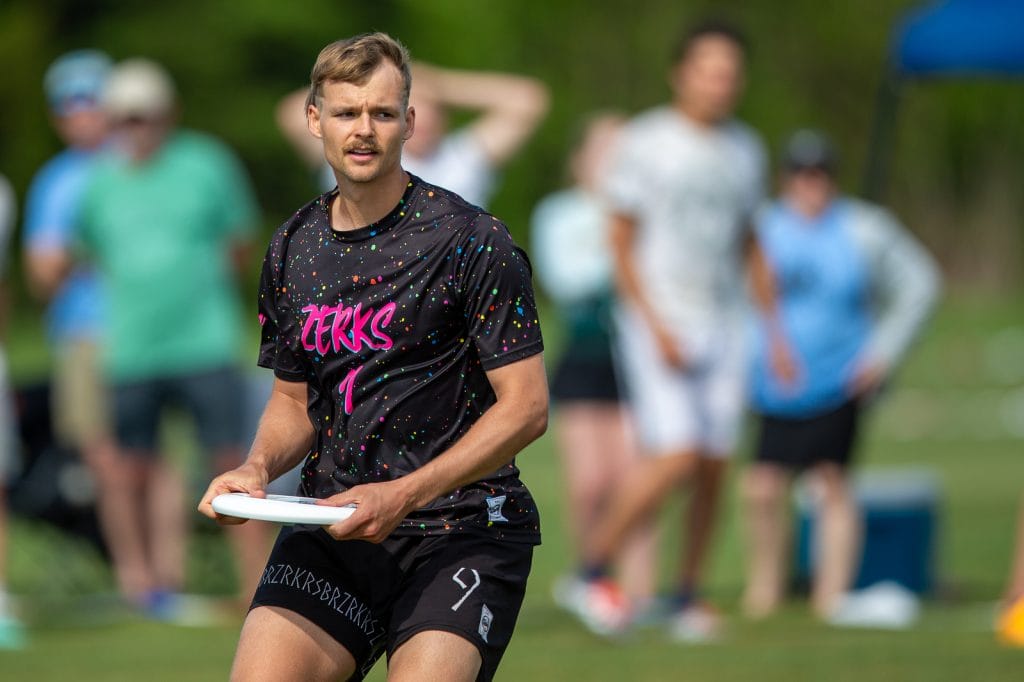
While these aren’t necessarily the worst jerseys of all time, I question the inspiration behind these darks from St Olaf. It’s a simple splatter paint design– but if it didn’t say Zerks– I would have no clue what team this would be for. For a program that has delivered some fantastic jerseys over the last couple of years, and a theming that could have unlimited options, these jerseys just feel meh to me.
Davenport Panthers – Light (Adidas)
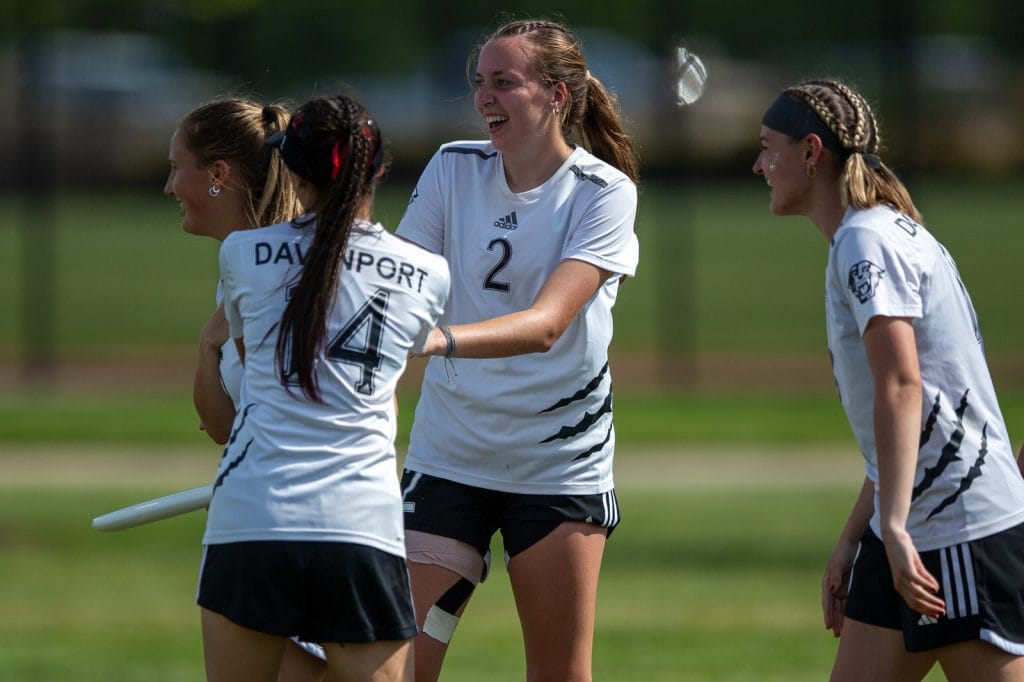
First things first, I understand that ultimate is a varsity sport at Davenport, meaning they can’t do wild sublimated jerseys like other teams on this list can. At the same time however, how is the only design element I see on the front of the shirts an Adidas logo? The claw on the side is the only interesting thing about this jersey, and even then it is overdone in ultimate. Just because the design needs to be professional, doesn’t mean it needs to be boring.
Claremont Braineaters – Darks
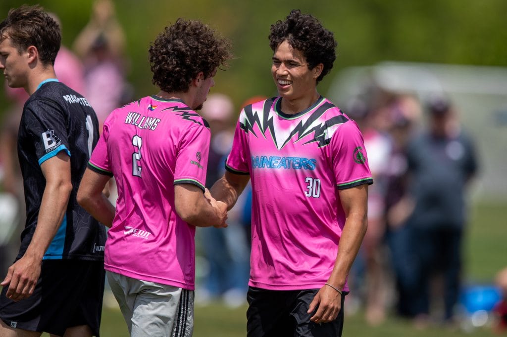
I’m sorry in advance to my fellow Ultiworld writer, jersey critiquer, and former Brains coach Alex Rubin – but I am simply not a fan of these jerseys. I think if there were simply the black bolts and lettering it’d be an okay jersey, however, the odd white filler makes it objectively worse. Additionally, the lime green doesn’t feel like a match for me palette wise. When I made a comment in the Ultiworld discord during Easterns, a Claremont player replied to me saying “I’m sorry you had to watch them all weekend.” To which I say, touche.
Middlebury Pranksters (Men’s+Women’s) – Whites (BE)
When I first saw the jersey reveal graphic on the Pranksters page, I immediately loved the pink stripes and thought it was a fantastic design. Unfortunately, in real life, the stripes came out so light that they landed in an awkward middle ground: barely visible from a distance, but distracting once you notice them up close. Maybe that is not entirely the fault of the Pranksters designers, but it does feel like a problem that could have been avoided.
Berry Bucks – Alternates (Spin)
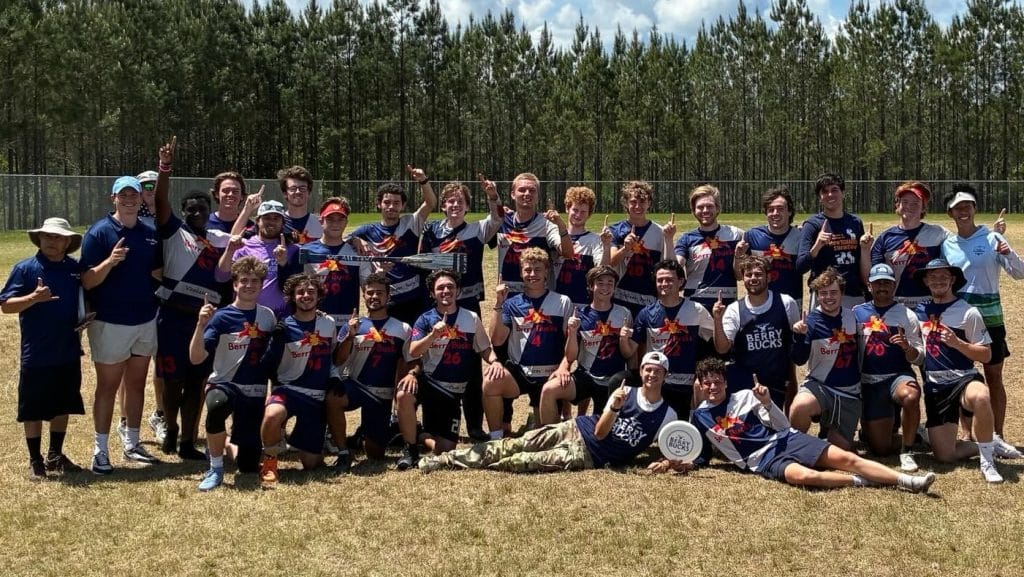
I don’t think Berry wore these in any streamed games at Nationals, but those who watched Easterns knew these had to be included. Now, don’t say I’m a hater of brand logo jerseys because that would be hypocritical as a Spidermonkey alum with many such jerseys in my closet. At the same time, these Red Bull jerseys don’t work. They are not only hard to read, but also the design works much better on a can than a jersey, simple as that.