Which teams will look the best during the upcoming season?
April 15, 2025 by Alex Rubin in Opinion
Earlier this month, every UFA team released its new jerseys ahead of the 2025 season. BE Ultimate is still the Association’s official uniform provider, designing and printing jerseys for all 24 teams. This year’s collection is a mixed bag with some great, some good, and a few not-so-great looks. Rather than rate every one–especially since some are unchanged and I’ve already shared my opinions on many of them in previous seasons’ columns–this year I’m going to offer awards to the jerseys that stuck out to me when I looked through this season’s collection.
Best New Look: Oakland Spiders
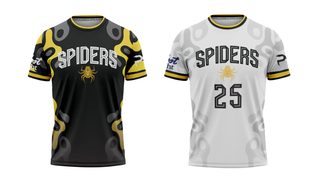
Honorable Mention: Boston Glory
The Spiders’ jerseys over the last few years have been largely good, but perhaps their template design had gotten a bit stale. Last year I gave them a polite golf clap on my jersey mood board, which still feels like it holds up. This year’s look is refreshing, with a fun squiggle concept adorning the sides and sleeves. The soccer-style number font is unique to ultimate and differentiates the team even more. I’ll reserve full judgement until we see them on the field, but at first glance I really like the adjustments the team made.
For Boston, their new look is perhaps a subtle admission that their previous design went a bit too far to incorporate their sponsor logo. This year’s set is more muted while still keeping COMMCAN’s hexagonal logo as a key part of the white shirt’s design. I like that shirt a lot, especially the alternate BG logo there that I don’t think we’ve seen before. The black jersey leaves a bit to be desired–frankly it’s boring–but it’s encouraging that the team name is now front and center rather than the sponsor name.
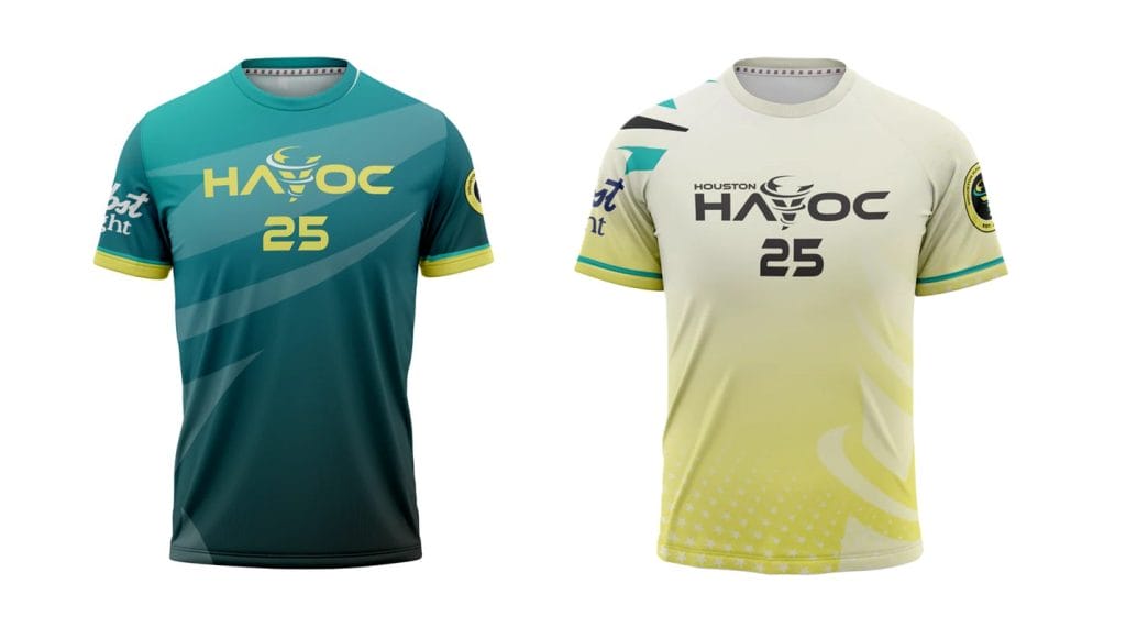
Best Use of Color: Houston Havoc
Honorable Mention: Montreal Royal
Houston has one of the best and certainly the most unique color palettes in the league. It’s also a good sign that they can feature such bright colors on a jersey and keep their players from appearing like they’re traffic crossing guards. I hope we get to see them mix and match the jerseys and shorts since they are one of the few teams to have two different sets of both.
Montreal’s jerseys have been among the standard bearers of the league since their inaugural season. I really like the reimagined sash on the orange, and I’m glad that they kept that as a unique base color rather than make another blue jersey.
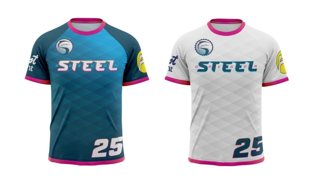
Best Use of Texture: Oregon Steel
Honorable Mention: Seattle Cascades
Oregon is right up there with Houston as far as unique color combinations, but what drew my attention in their totally redesigned set is the fish scale pattern on both the blue and white jerseys. It’s an especially nice touch that the pattern mimics the actual scale pattern of the steelhead fish. The pink sleeve and collar accents are also a great touch to add a bit of pop without overdoing it. After sporting one of the most boring kits in the league last season, it is really encouraging to see Oregon go all out, and put together something special.
Seattle reprises their same set of jerseys from last season. I still think adding front numbers would fill the space nicely since the shirt is otherwise pretty boring. The texture on the blue jersey and the grey sleeves of the white jersey elevate a design that would otherwise elicit yawns.
Best New Detail: Philadelphia Phoenix number font
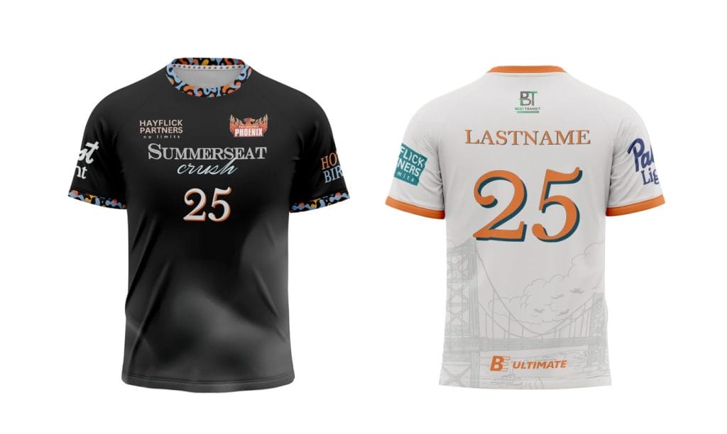
Honorable Mention: Pittsburgh Thunderbirds sublimated feather
Philadelphia made a big swing last season, switching from a primarily red and white color scheme to one that featured a lot more baby blue. This year, they more or less keep the white jersey and replace the blue with a black shirt that has fun sleeve and collar accents. I’m not so keen on teams without black in their color scheme wearing black jerseys, but the big upgrade to me though is a custom number font that matches the wordmark of their new sponsor, Summerseat Crush. I like it when teams make custom upgrades like that–last season the Phoenix just used one of BE’s template number fonts–and in this case it definitely enhances the overall look of the shirt. In general I don’t love a sponsor influencing design choices that teams should have full control over,1 but in this case I actually think it makes the jersey better.
Across the state, Pittsburgh brings back a throwback wordmark and really simplifies the look of both their black and white jersey. The biggest standout design element is the sublimated feather pattern on their black jersey. The delicate, artistic flair is unique compared to some of the bolder designs around the Association and helps Pittsburgh stand out even with jerseys that are fairly basic in color. Hats off to the Thunderbirds’ Graphic & Branding Designer Will Litchholt for a job well done.
Best Accessory: DC Breeze sun hoodie
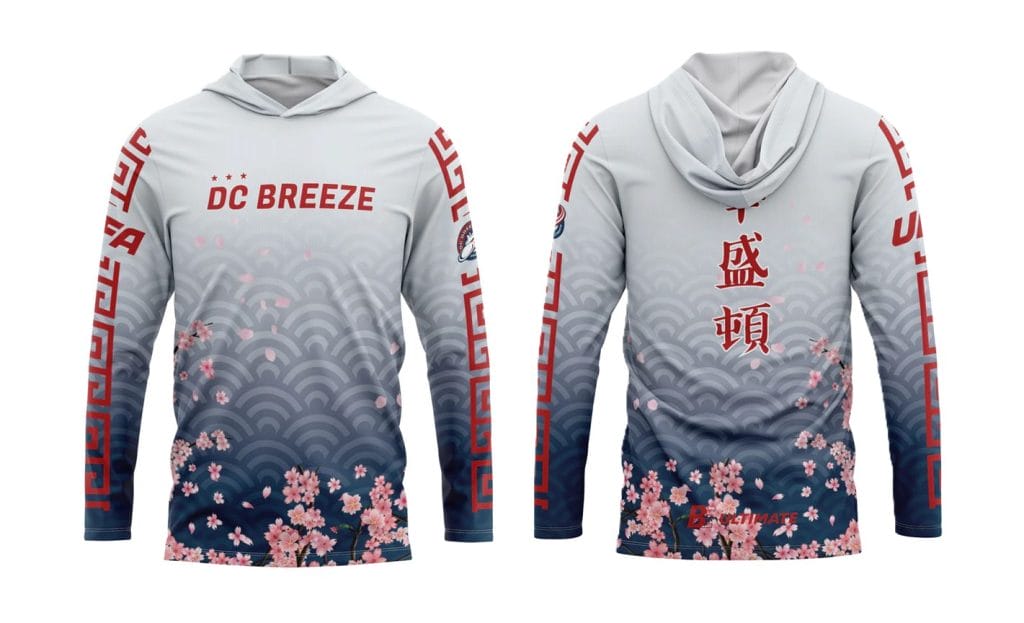
Honorable Mention: New York Empire alternate logo shorts
In 2023, the DC Breeze released an alternate jersey highlighting Asian American and Pacific Islander heritage. They have since turned it into a sun hoody, and it quickly became a fan favorite. Initially designed by Mitchell Yam, a Coaching/Administrative Assistant with the Breeze since 2021, these hoodies reflect a growing trend in the game to make merchandise inspired by connections to other cultures. The Los Angeles Aviators also had an AAPI jersey designed by Yam, and in recent years the Tampa Bay Cannons and Atlanta Hustle donned jerseys honoring African-American heritage and Juneteenth respectively. Given how great all four of those jerseys turned out, I hope to see more in the future. In the meantime, we’ll enjoy the Breeze’s offering this year.
For many teams, one logo is good enough, but the Empire have two and their alternate logo with the negative space of the E holding the outlines of the letters N and Y stands out year after year for its ingenuity and simplicity. I’m glad the Empire are once again featuring it on their uniforms this season.
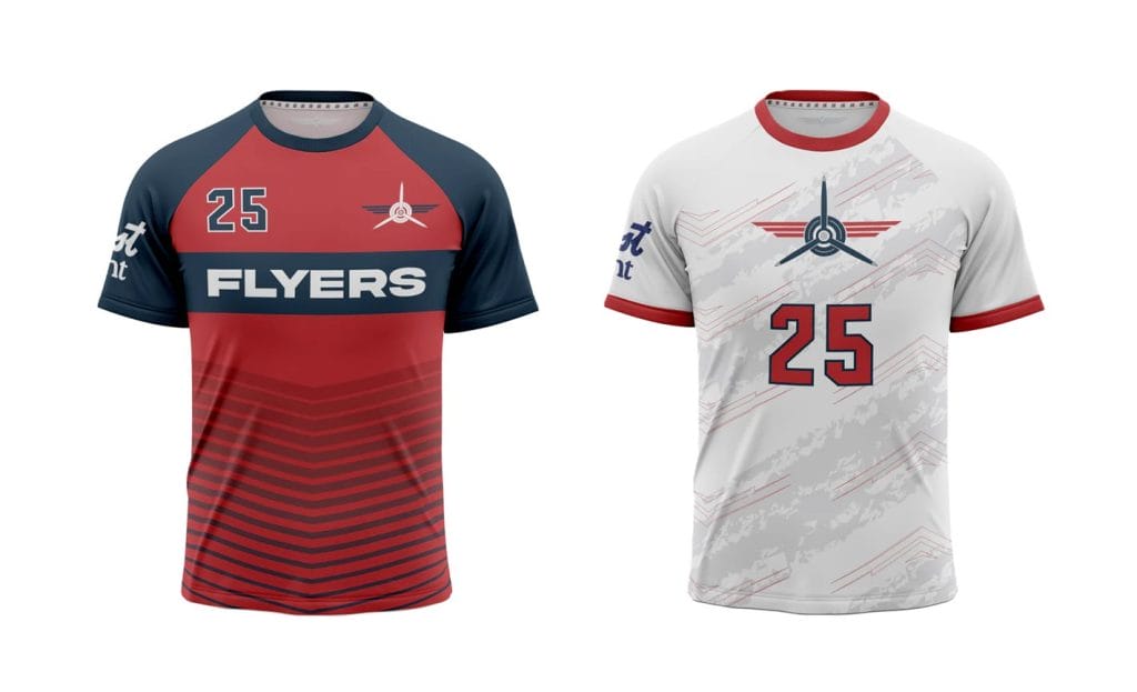
Grew On Me the Most: Carolina Flyers
Honorable Mention: San Diego Growlers
This section highlights jerseys that are unchanged from last season. If I were designing them, there are tweaks that I’d make to each, but after seeing them for the first time on a field last season, keeping them was the right move. The Flyers’ set is a great lesson for aspiring designers in how to add flair and intrigue without making a shirt too busy. San Diego’s fits a nice, beachy theme that reminds me why their games are so fun to attend.
Best Alternate Jersey: Atlanta Hustle
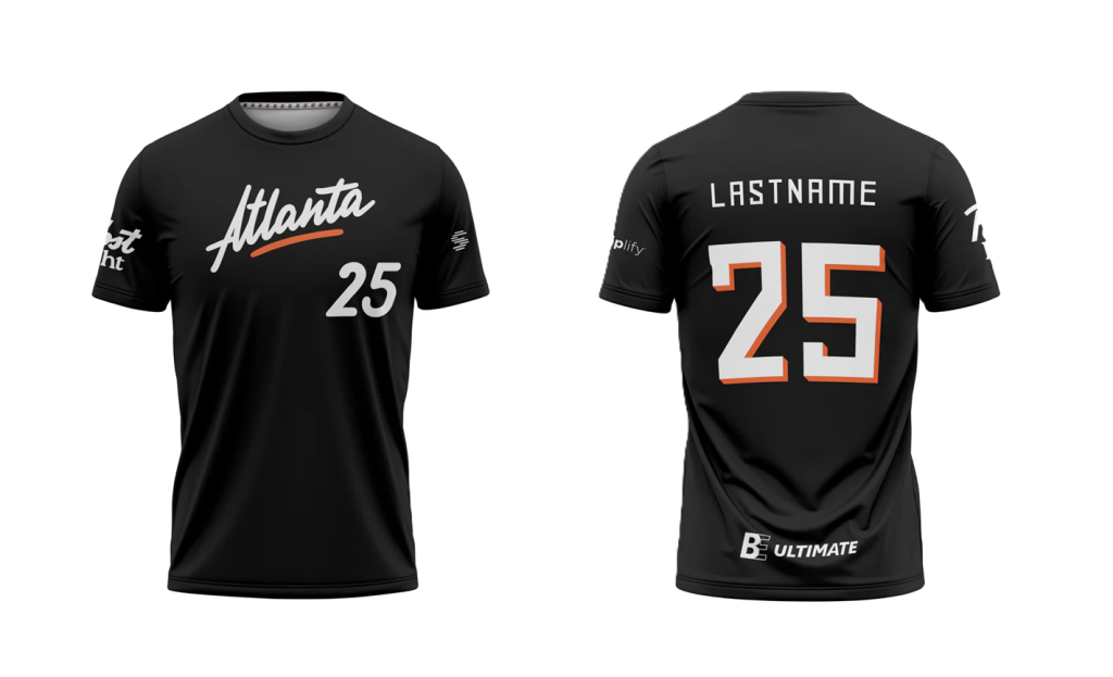
Most teams only have two jerseys, but Atlanta has three, and their third is the best of the bunch. The Hustle did not change any of the design elements I identified as a problem last season for their purple or white jerseys, but they introduced a black jersey I hope they wear for every single game. The playful splash of orange, interesting font, and unique design – does anyone else have a script wordmark? – helps to bring this jersey to the next level. I wish the number fonts on the front and back matched (the one on the front is the one I’d keep), but I’m not going to let that one detail stand in the way of an otherwise outstanding shirt.
Most Questions: Los Angeles Aviators
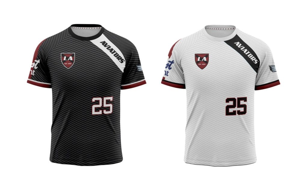
I’m sorry to be a bit of a downer here, but this is the third straight season that the Los Angeles Aviators released a jersey I consider a design dud. After two straight years of too-busy jerseys, the Aviators did a full 180 and left this year’s set feeling really empty.
Here’s a few of the questions I’d like to ask whoever designed and approved this set: Why is there so much empty space? Why is the number so small? Did you consider putting the team name on the chest rather than in a tiny off-color sliver on the shoulder? Where did the new team crest come from and why is it so small? Why are there no references to flying? Why don’t you just put numbers on the back of their hoodies and wear them instead? Really, multiple people approved this and thought this is the best they can do? Can I help you design next season’s uniforms?2
Best: Minnesota Wind Chill
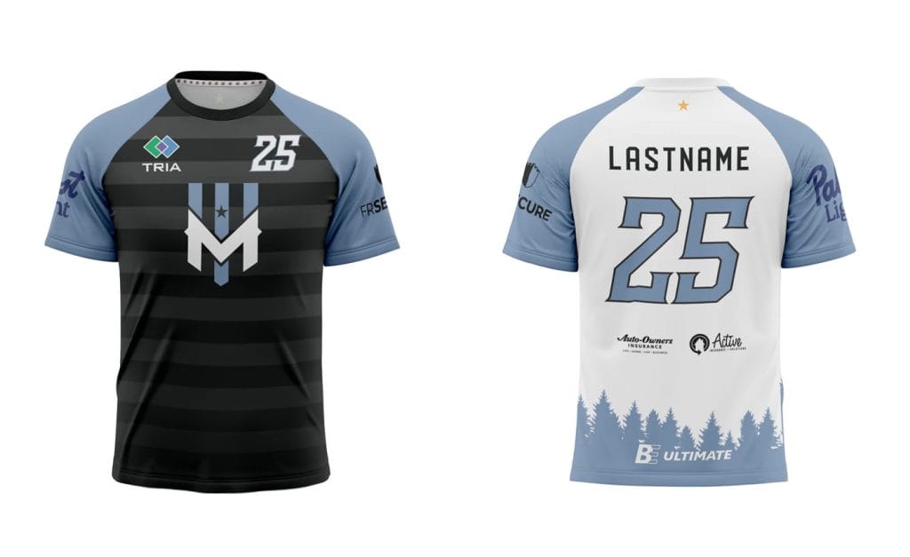
The champs stay the champs. Minnesota’s white jersey is my favorite in the entire league, but their whole set does so many things right. There’s great detail work. The design is balanced so it is neither boring nor overwhelming. The team identity is front and center. The number font is unique and ties into the team name. The jersey feels like it matches the vibe of the fan community and city. All of the colors provide great contrast. Never change Minnesota (well, ok, you’re allowed to add the gold star for your first title–that’s another great touch).