Ultiworld’s resident fashion consultant gives their opinion on the 2024 UFA jersey set
March 25, 2024 by Alex Rubin in Opinion
This week there have been multiple exciting developments for UFA fans of design. First, all 24 teams released their 2024 jerseys. We’ll get to them in a moment but first, the league also announced that they have extended their agreement with BE Ultimate through 2027. What initially was a two year pact set to expire after the 2024 season is now a long-term partnership. Signing a deal for this length of time will allow the design team at BE Ultimate to build connections with each team and help them keep continuity in their brand identity for at least the next few years. Given BE Ultimate’s popularity with current ultimate players, this is a good sign for the league in general, but especially with regards to uniform design.
Below we’ll take a look at each team’s 2024 jersey design, with some notes about what changes they made. Some teams made wholesale changes, while others didn’t touch their design from last year. One exception: The UFA’s new official partner is Power Up Trail Mix and their logo is on each team’s right sleeve. Also, of course the new UFA logo appears on the shorts of each team.
The teams are ranked roughly by the mood they’re currently putting me in, in order of positivity.
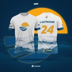
Minnesota Wind Chill
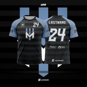
No changes from last year and that’s a good thing because the Wind Chill’s jerseys are among the best in the league – particularly their white one with the blue forest “skyline” along the bottom. Mood: beaming with joy.
Salt Lake Shred
The black jerseys stay the same as last year and the white jerseys get a nice upgrade with a pointillism version of a cloud/mountain motif. I love it. It’s just the right amount of pop without taking away the contrast a white jersey needs to provide, and it matches nicely with the blue sleeve stripes on both jerseys. Mood: elated.
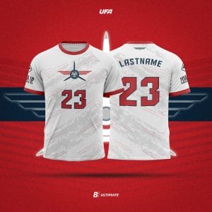
Philadelphia Phoenix
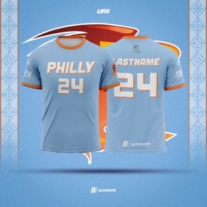
This is a huge update for Philadelphia and the initial reviews are quite positive. Though it’s not an official team color, I love the light blue background. It’s a city color and reminds me of Major League Baseball’s Philadelphia Phillies’ popular throwback set. The team says it’s inspired by the color of the Benjamin Franklin Bridge and that works too–it’s also a fairly unique color in the league which counts for bonus points. The wordmark is a bit boring and feels like an afterthought to me (it also looks the same as DC’s and LA’s). I wish they would have kept the script from their white jerseys last season, though I’m very happy that they changed the city nickname from “Phila” to “Philly,” which is what residents of the city actually say.
The white jersey has a striped “tequila sunrise” band of colors across the front featuring a Liberty Bell made of negative space. On the back there’s a sublimated outline of the Benjamin Franklin Bridge. Including two iconic city monuments is a great touch. I’ll wait to see them on the field before rendering full judgment, but these are the frontrunners to be my favorite new jersey this season. Mood: surprised and delighted.
Carolina Flyers
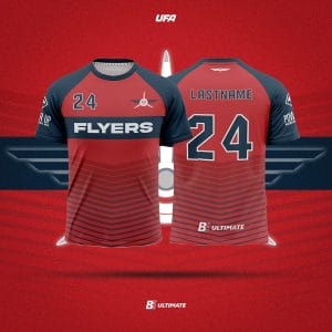
The Flyers refreshed their look heading into 2024. Their primary dark color switches from blue to red with thin chevrons pointing down the center of the shirt. The white jersey features bands of grey and thin red accents. I love that these are not just color-flipped versions of one another yet still keep a lot of the same energy so to speak. Both jerseys are balanced with enough design elements to stave off boredom but not too many as to be overwhelming. The number fonts are a bit wonky (what’s with the hitch in the bottom of the two?), but if that’s what I’m nitpicking this is a pretty good set. Mood: thumbs up.
Pittsburgh Thunderbirds
Pittsburgh goes back to black as their dark color after spending last season wearing yellow. Both jerseys have a yellow accent on the shoulder as a throwback to the team’s early years. I really like the way they rendered the city outline along the bottom to make the Fort Pitt Bridge pop (especially on the black jersey). Bonus points for using the angle of the city skyline visible from the team’s stadium. I don’t love that these two jerseys are identical save for the black/white color, but at least we get two good jerseys rather than two bad ones. Mood: encouraged.
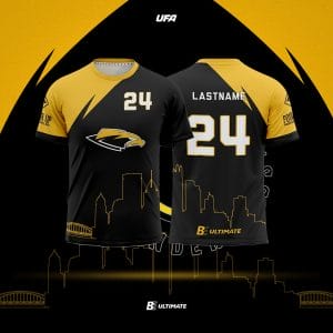
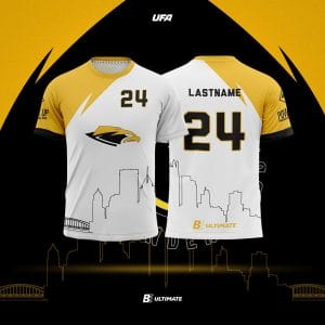
Houston Havoc
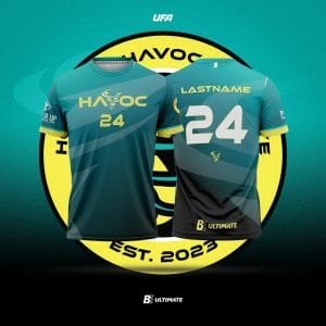
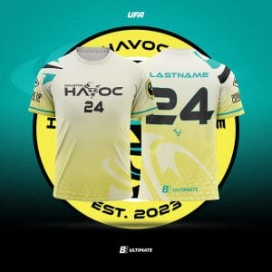
These are the same as last year. They are unique and they still look great. I especially love how they let each color shine on its own rather than watering down the set with a white jersey. Mood: smiling.
Chicago Union
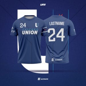
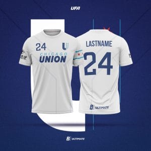
These are the same as last season’s and that’s fine because they’re a great set. I love the light blue sun hoodie the most and in a perfect world, they’d be able to bring that in as an alternate jersey, but I understand cutting down on what would be an unnecessary expense. Mood: rah rah for my new hometown team (I bought a sun hoodie).
DC Breeze
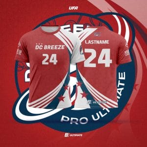
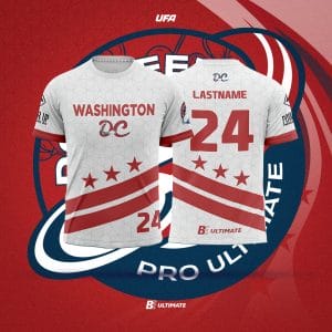
This year’s Breeze shirts make minor tweaks to last year’s set. I like the updated wordmarks on both jerseys. The simple font on the red jerseys is easier to read than last year’s thin-lined full wordmark, and the updated DC logo on the white jersey stands out as one of the best additions of the year from any team. This is a great example of iterative design by taking what worked last year and just tweaking it slightly to make a better second version. Mood: happy.
Montreal Royal
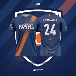
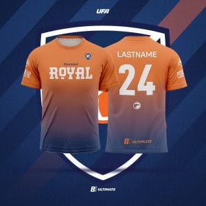
These are the same as last year’s set and they once again are among the cleanest in the league. I love that they keep the orange alternate in the rotation. Mood: Joyeux.
Toronto Rush
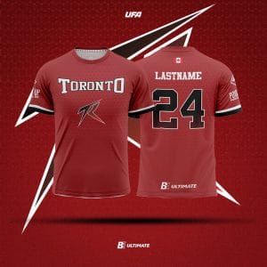
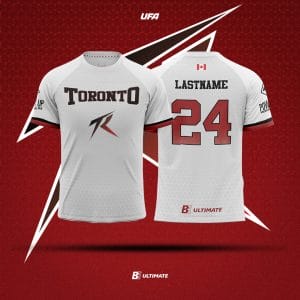
Toronto goes back to red rather than black as their primary dark color and brings in a classic athletic font for their wordmark and numbers. This kit is a good lesson in interesting simplicity. There’s nothing too flashy or over-the-top, but a lot of little things done right such as subtle patterned texture on each jersey, clear outlines on the numbers to adjust for the gradient, and using the primary logo to fill what would otherwise be empty space on the front. Mood: Nice job, eh!
San Diego Growlers
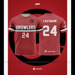
New jerseys are in for the Growlers this season. The team switches back to red after a few years with black as their primary dark color. The red jerseys have a thick black and white horizontal stripe across the chest and the white jerseys have thin gray vertical stripes and a new, beachy wordmark. Both are balanced and interesting without being too boring. I worry a bit about the stripe on the red jersey making the wordmark a bit hard to read since the stripe bisects the word, but the letters are thick enough that it should be fine. After years of darker, edgier jerseys it’s nice to see a lighter tone. I’ll have to see these on the field before casting final judgment, but for now I’m optimistic. Mood: refreshed.
Madison Radicals
A slightly simplified version of last year’s jerseys, these are just the classic Madison Radicals look we’ve come to know and love. Mood: Admiring the continuity.
Indianapolis AlleyCats
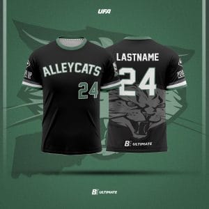
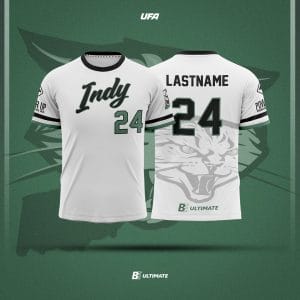
If it ain’t broke, don’t fix it. The ‘Cats are another team who got a lot right in their design last year and didn’t feel the need to mess with a good thing. I like that the different jerseys have different wordmarks, and the script on the white jersey is a winner. The oversized sublimated cat on the back is a lot, but it harkens back to the busier jerseys of the UFA’s founding. Mood: content.
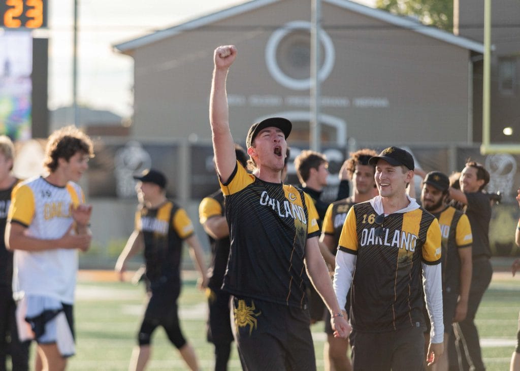
Oakland Spiders
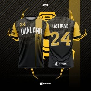
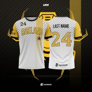
This is the same set as last season and it works well. I gave it an A last year and that feels like it’s held up. Mood: polite golf clap.
Detroit Mechanix
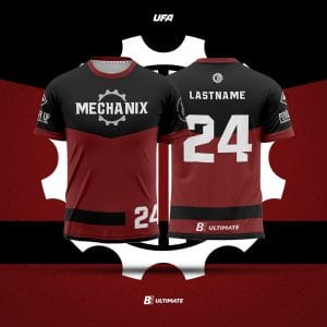
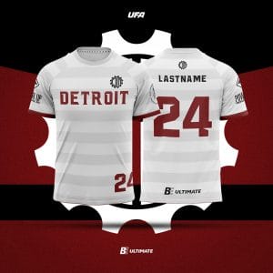
These are the same jerseys as last year’s set; they’re simple and get the job done without being too boring. Mood: I’m not going to watch the Mechanix so I literally don’t care.
Austin Sol
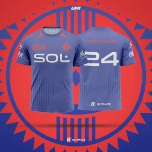
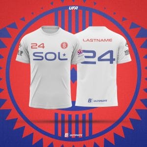
Austin brings back the same kit from last season. It got them to Championship Weekend, maybe it brings good luck. Last season I graded this one as a C- and that still feels about right. Mood: meh.
Seattle Cascades
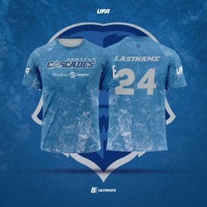
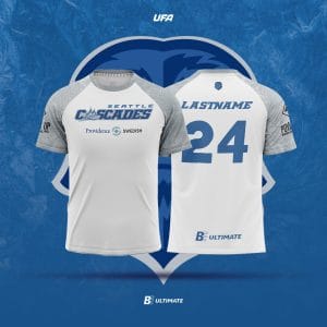
I love the texture on the new blue jerseys for Seattle. While there is not a whole lot design-wise going on, the brushstroke blue stands out and is unique for its artistry among jerseys in league history. I wish they put a number on the front to fill out the space more, but these are the best jerseys the team has put out in their eight year history. The white jerseys keep the same texture on their gray sleeves but are otherwise devoid of any design. Again, I wish there were more there, but better a good and slightly empty jersey than a full and bad one. Mood: Whatever the feeling is when you get a great dish on a tasting menu; it’s wonderful, but also leaves you wanting a little more.
Colorado Summit
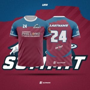
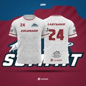
This set is both familiar to anyone who has watched the Summit play over the past few seasons, and also has some key updates. On the white jersey, a slight gray sublimated floral design was added; I like the texture, but I’m not quite sure how it connects to the team.1 On the red jersey, the team switched sponsors and a new logo adorns the main chest area. The team added a plateau motif along the neckline of the back, which is a nice nod to local geography, and random blue sweeping stripes along the lower back which stick out as needless. All in all, the changes are fairly minor and these should look about the same as last season’s set…in other words they’re fine but they could be better. Mood: ho hum.
Dallas Legion
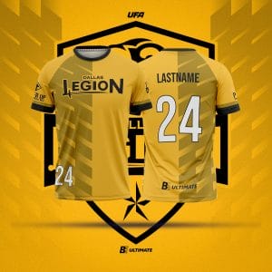
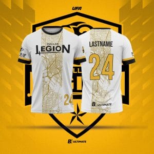
The Legion change up their look for this season with yellow rather than black dark jerseys and a map motif on their white jersey. I’m a bit confused by the map feature. I wouldn’t say that Dallas has a particularly iconic street grid, and there’s a funny hole on the map where the Trinity River flows through that just looks better in a color-coded Google Map than it does on these jerseys. Credit is due for trying something new, though it does feel a bit wrong that the map cuts off before it gets to the team’s stadium location, which is a bit farther north than this map goes. A for effort, C for execution (and that’s before we even touch on whatever is happening on the yellow jerseys with some meaningless truncated diagonal stripes). Mood: [shrug emoji]
Atlanta Hustle
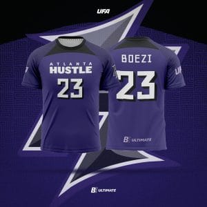
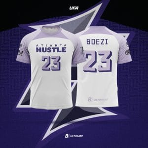
Imagine if the 2022 US National Soccer Team was inspired by Virginia Vault’s color palette. This year you won’t have to–the Hustle are doing that for us! Lavender is one of my favorite colors and I like the Hustle’s spin on their longstanding purple identity. The dark purple drop shadow on the lavender numbers should help them pop on the white background. My big gripe is with the collar. Why? Both the white and the purple jerseys have a strangely shaped blob of a different color smack dab front and center. It serves no purpose and it looks out of place. This jersey set has a lot of potential, but both jerseys would be better without the color splash trapezoid thing on the front. Mood: not angry, but disappointed.
Portland Nitro
Portland has such a unique colorway with light blue and orange as potential primary colors, but it continually makes bland black and white uniforms. At least there’s a hint of blue on the white jersey, but it does get lost a bit among the sponsors’ logos. At the end of the day, there’s just too much potential to be content putting out a boring, color-swapped set. Mood: *storms off in a huff*
New York Empire
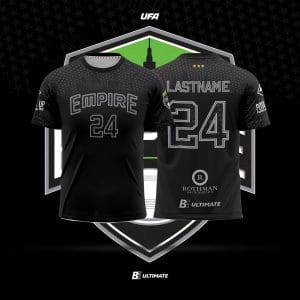
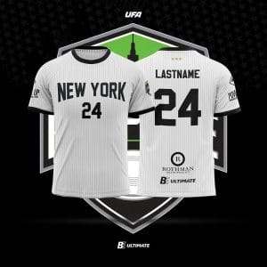
This set feels like a big downgrade compared to last year’s. Black-on-black is cool in theory and almost never looks good in person or on camera. The Empire already have the best team – they don’t need the extra advantage of opponents struggling to identify players 80 yards away or needing to squint and zoom in to write scouting reports from film. The white jerseys lose the green accents from last year’s shirt, and that significantly dulls the appearance. The pinstripes pop less than last year’s version, and the Empire were really the one team that could get away with pinstripes. I wish a team with such bad jerseys weren’t the face of the league at the moment. Mood: angry.
Boston Glory
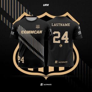
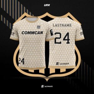
The Glory signed a sponsorship deal with CommCan Inc., a local cannabis company, and seemingly turned over their entire jersey design to incorporate the company’s logo. Gone is 2023’s stunning dark jersey and instead the Glory will be decked out in the black and gold of their primary sponsor. Their white jersey goes ridiculously far to incorporate the sponsorship and features a tiled version of the CommCan logo as a patterned background. While this does provide nice texture, I’d much prefer teams keep their individual identity and add a sponsor on top if needed rather than pander entirely to the sponsor and adjust the entire brand identity to them. Mood: upset at the Glory but also at capitalism in general.
Los Angeles Aviators
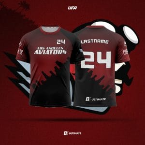
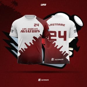
The Aviators had one of the worst kits in the league last season. They did a full redesign this season (yay!), but the results are not so inspiring (boo!). The main design element is a tilted skyline that separates two color blocks roughly diagonally across the whole shirt. The red/black jersey ends up looking a bit dark for the kind of detail it wants to convey, but the problem with this template is the white/red jersey. This simply will not provide enough contrast against a team like the San Diego Growlers who will be wearing either white or red jerseys when they play the Aviators. Nothing infuriates me more than a “white” jersey that is actually more than half another color! It is genuinely shocking that both the league and BE Ultimate let this one get through; it’s essentially dysfunctional.
Now we can get to the skyline, because the skyline of Los Angeles isn’t particularly iconic. Using the Hollywood sign or the Griffith Observatory silhouette would have been a better choice given the actual regional attractions around. I lived in LA for five years and I couldn’t distinguish that skyline from a generic stock outline on Canva. The designers even have the gall to stick a chunk of that skyline on the shorts for good measure, which makes less sense because it’s just a few random buildings rather than the whole skyline. I have no idea how many people approved this, but I hope they all know that they can do better. Mood: Crying/Screaming/Throwing Up.
Editor’s note: a post on the UFA’s website explains the flowers are a tribute to the Colorado state flower, the columbine. ↩