Who looked the best this Nationals?
June 3, 2026 by Alex Rubin in Opinion
Ultiworld’s coverage of the 2026 college ultimate season is presented by Spin Ultimate; all opinions are those of the author(s). Find out how Spin can get you, and your team, looking your best this season.
While the action on the field was tough to beat at the D-I College Championships, there was plenty of chatter about what players were wearing as well. While champions were crowned last weekend, we know the real winner of Nationals is the team with the best merch.
Ultimate has largely moved away from the headstrong, fully-sublimated mindmaps of designs that persisted throughout the 2010s, and teams have mostly done well to include subtle design elements that bring a unique style and flair to their team kits. A good jersey is easily identifiable to its school/program, has numbers that are easy to read, and avoids making the shirts too busy or cluttered. Amidst a lot of great options, I chose a handful that truly stood out for their unique design and creative vision.
The Best
UCLA BLU – White Jerseys (Spin)
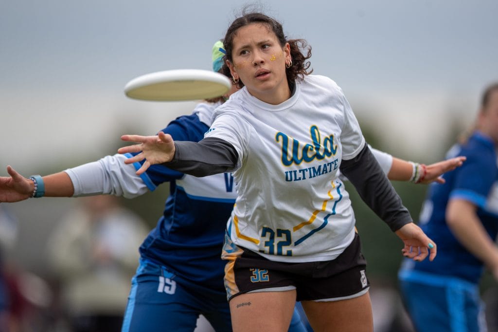
UCLA made good use of accent stripes to keep what could otherwise be a very boring shirt interesting, and they nailed the hardest part which is getting the stripes to match across the seam. The diagonal stripes also match the mountain motif on their dark jerseys to create a very strong set.
Tufts EWO – White (Spin)
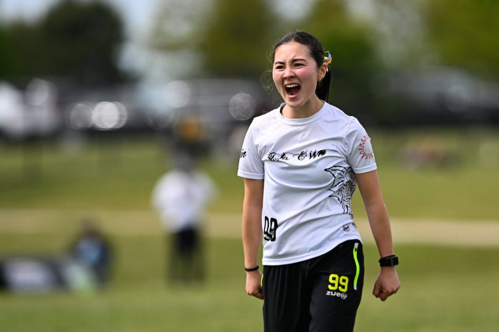
I wish more teams took advantage of the side of the jersey like Tufts did here. EWO consistently put out interesting and well-designed jerseys, and this year is no exception.
Oregon Ego – Green (VC)
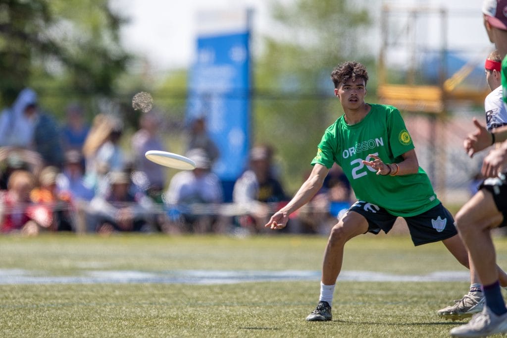
I love the way they highlight the natural “ego” in Oregon. This is not the flashiest of designs, but highlights how a team can use subtle imagery to build team identity.
Penn State Spank – Blue (DH)
Pinstripes can be hit or miss, but I like them here with the retro Orlando Magic inspired set. Sleeve and hem stripes add a good touch and sneaking the logo into the “a” of spank is excellent. Add in a fun number font and this one’s a winner.
Mixed Feelings
Carleton CUT – Black and Red (Zue)
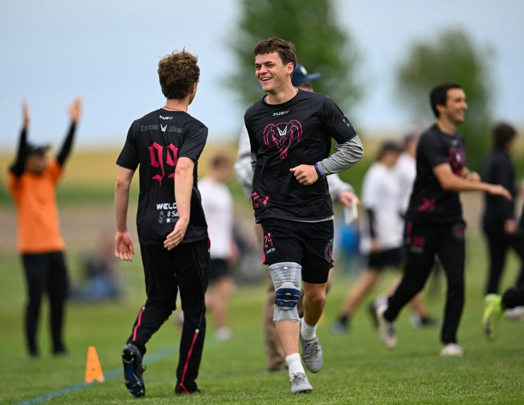
I love the gothic font and there’s an interesting story with the skull that a Carleton alum will have to share in more detail another time, but it is nearly impossible to read the numbers here and for that reason I cannot say they are the best. In fact, I wonder why they were allowed to be printed without better contrast.
For that matter, CUT’s final opponent had a similar issue with their black jerseys. The UMass black jerseys (BE) have a very artistic floral design that I love. I really, really want to like these jerseys; I just wish they outlined their red numbers with white to help it stand out on the dark background like McGill did.
D-I’s Worst
Michigan MagnUM – Yellow (Spin)
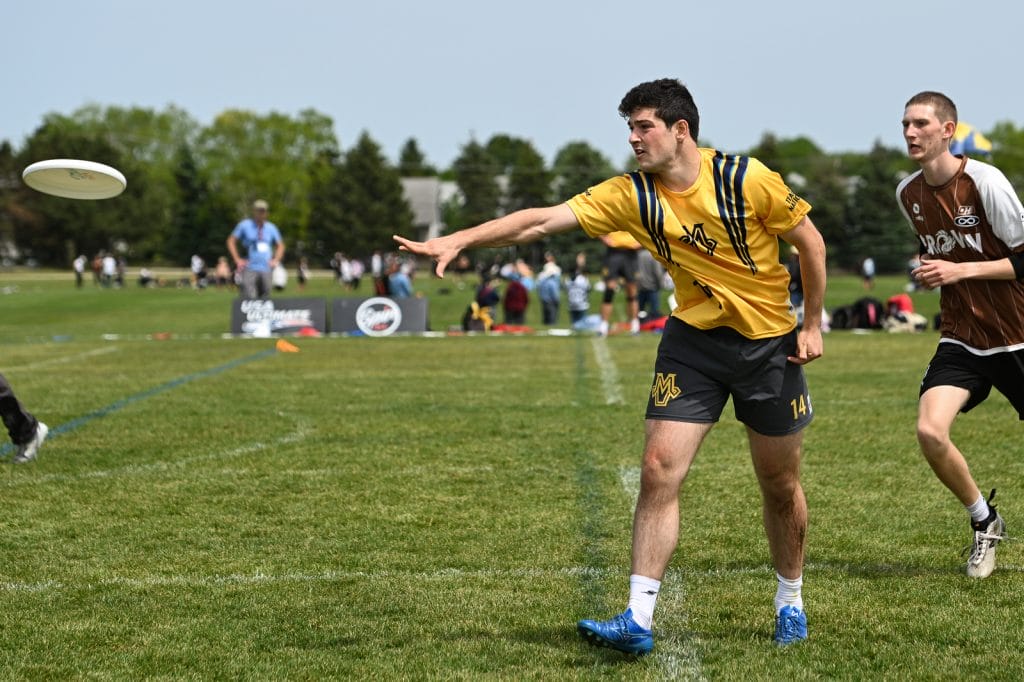
These shoulder stripes are pretty ridiculous, no? Are they playing with backpacks on? I think they should have worn their Nationals alts for every game instead – the off-white color is unique and I’m a sucker for the tree line motif along the bottom hem.
McGill MUT – White (BE)
This just doesn’t have quite enough on it. The logo on the front is so small that you cannot even see it in this photo! The sleeve stripes are a nice touch, but from some angles this just looks like a white t-shirt.
D-I’s Most Interesting
Georgia Tech Tribe – Blue Alternates (BE)
These look a lot better in person than they do on streams where the numbers are hard to read. I think they could have designed this for better contrast.
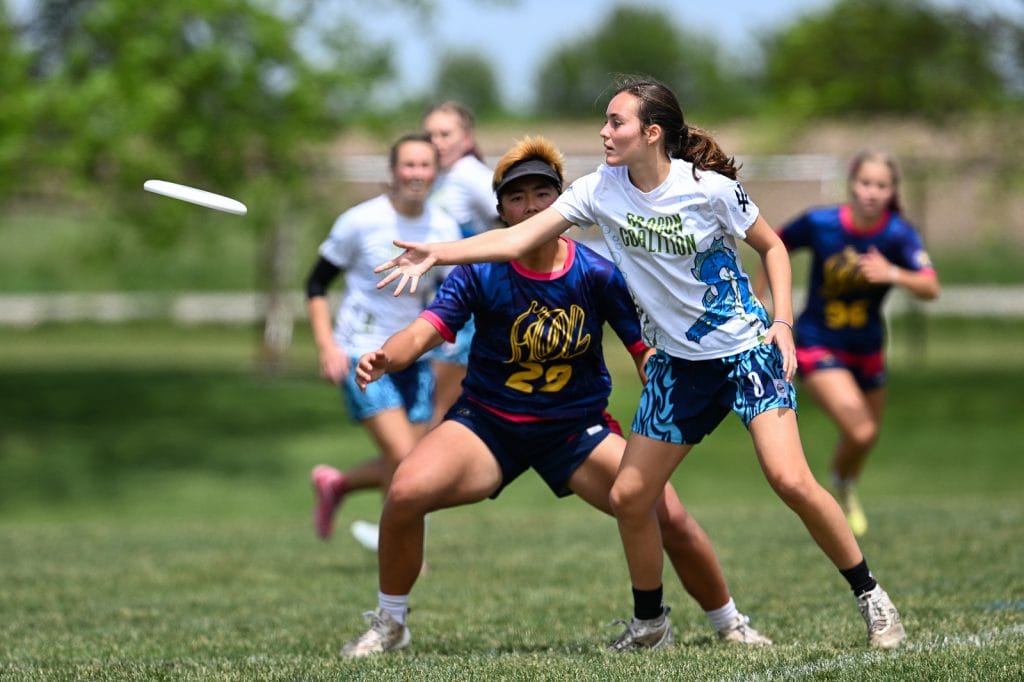
California-San Diego Dragon Coalition – White (Spin)
There are some really interesting design elements to like here, but they’re just so busy. I think it might have been too much to try the large full name word mark and the dragon cartoon and the random under-the-sea theme on the other side of the jersey and the fire motif on the shorts. I think with two out of four of those elements together it might have looked better, but better busy than boring.