For which teams is graphic design a passion, and which might need to go back to the drawing board?
July 15, 2026 by Guest Author in Opinion
Ultiworld’s coverage of the 2026 club season is presented by Spin Ultimate; all opinions are those of the author(s). Find out how Spin can get you, and your team, looking your best this season.
This post was written by guest author Lloyd Goldstein.
This may surprise you, but the best part of club season is just finishing up right now. US Open? Nationals? WUCC? All pale in comparison to the glory that is ROSTER REVEAL SEASON. This is consistently one of the most exciting times for breaking news in the ultimate world. What new teams have sprung up? What players have made big moves? What teams have added the talent that might get them over the top? What team will Allan Laviolette play for this year? All these questions and more are answered in June and July as teams announce their rosters for the year.
This brings us to roster announcements. Most club teams will make some fun graphic to announce their rosters for the year, and will generally post it on Instagram or some other social media platform to inform the public what their team will look like. Now, not all these announcements are created equal, and this year I have had more strong feelings about roster announcements than any other I can remember. After raging impotently in the Ultiworld Discord server for a while, I was (wisely or unwisely) offered the potential opportunity to share my (highly subjective) opinions with the world. In this article I will break down what I believe makes a good or bad roster reveal, and discuss a few of my favorite and least favorite roster graphics of 2026.
Criteria
Before we can get to talking about the best and worst roster reveals, we have to establish what criteria we are judging by. Obviously this is subjective, but I have a couple criteria that I think most people would agree on:
- Readability: First and foremost, you have to be able to read the names on the announcement. This means the font needs to be legible and large enough to read easily, and the background and text colors cannot be too similar. Stuff like red on orange is a death sentence here.
- Personality: The whole reason teams make these announcements interesting is to show the unique personality of the team. That said, this doesn’t have to be anything crazy. A nice background image with a thematically appropriate font can go a long way here.
- Portability: This is one that I think people don’t discuss enough. These reveals are, in practice, going to be sent around via text messages/Discord/etc., and having everything in one easily digestible image is important. Having to zoom in on an image to read the names is annoying. Scrolling through multiple images to figure out who’s on a roster is a pain. Having to watch through a whole video (New York PoNY, one of my favorite club teams, have been guilty of this in the past) is even worse.
Now I’m going to provide some examples of a couple teams that fall into each of the following categories.
Great
Pittsburgh Parcha
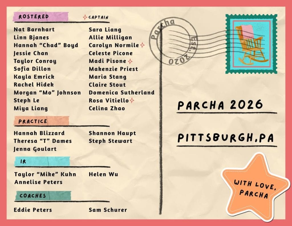
This is a gold standard roster reveal. It has a nice, easily readable font with dark color on a light background. It separates rostered/practice/etc. players into clear categories so I don’t have to decipher whether there is a square or diamond next to somebody’s name and whether that means they’re a rookie or a practice player. It shows off some personality – the postcard theme is super cute, they like chairs, they’re from Pittsburgh, and they send their love. No notes.
Philadelphia Flight
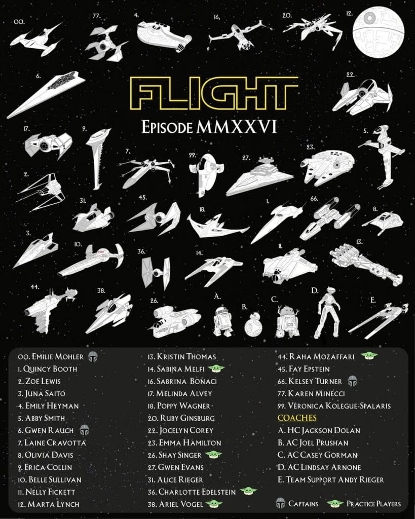
This is how you commit to a fun theme without sacrificing readability. Everyone gets their own ship, even the coaches1. The names are in a separate box with white text on a dark gray background. The team name and year are displayed prominently but in a style fitting the theme. There are clear indicators for captains and practice players with thematic relevance (grown-up Mandalorian for captains, baby Yoda for practice players). Overall just a great roster reveal.
Good, But Could Be Improved
Boston Slow
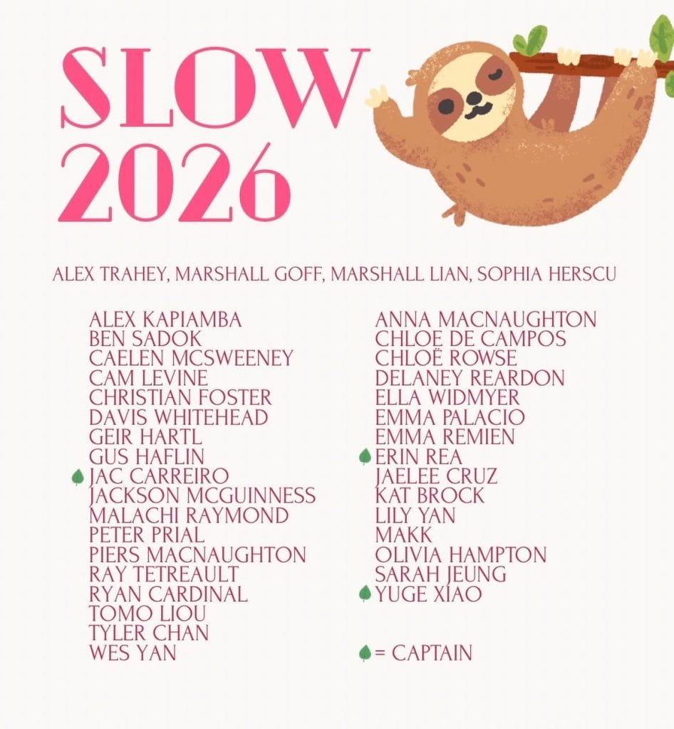
This is a good roster reveal. It’s a fun font in a pretty readable but fun color, and I love sloths an unhealthy amount so that scores huge bonus points with me. I am a little confused about who Alex Trahey, Marshalls Goff and Lian, and Sophia Herscu are though. Presumably someone more tapped into the Boston ultimate scene will think I’m dumb for not knowing this, but here we are. Are they coaches? Practice players? I have no idea from this post.
I also think this could use a little more…pizzazz. A few more sloths around the border or something along those lines would go a long way.
New York XIST
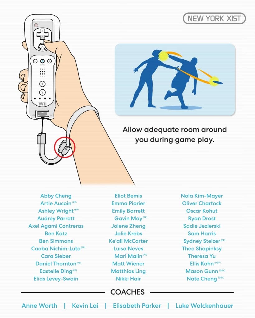
I think this reveal perfectly captures the vibe of XIST. Everyone who has watched this team play over the last year or so knows that they love to play a really aggressive but also very goofy style of ultimate, and I think this picture reflects that to a T. I also love the usage of the Wii warning screen — everyone who grew up playing Wii Sports recognizes this screen instantly.
Unfortunately, there are a couple small things holding this back. First, the blue text is a little too light to be easy to read against the white background. Second, you have to really squint to see the (PP) next to the practice players (also, who are the captains? Am I missing them?). I also wish the actual name of the team was displayed a bit more prominently. Still a super fun roster reveal overall.
I See What You Were Going For, But It Didn’t Quite Work
Fort Collins shame.
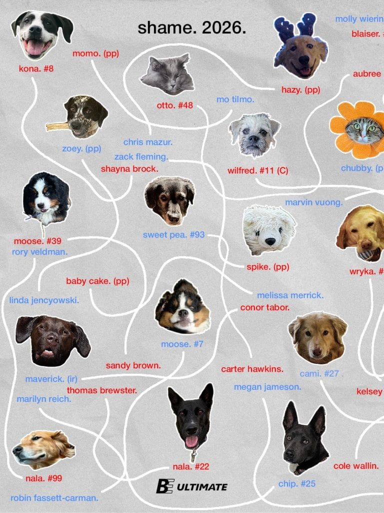
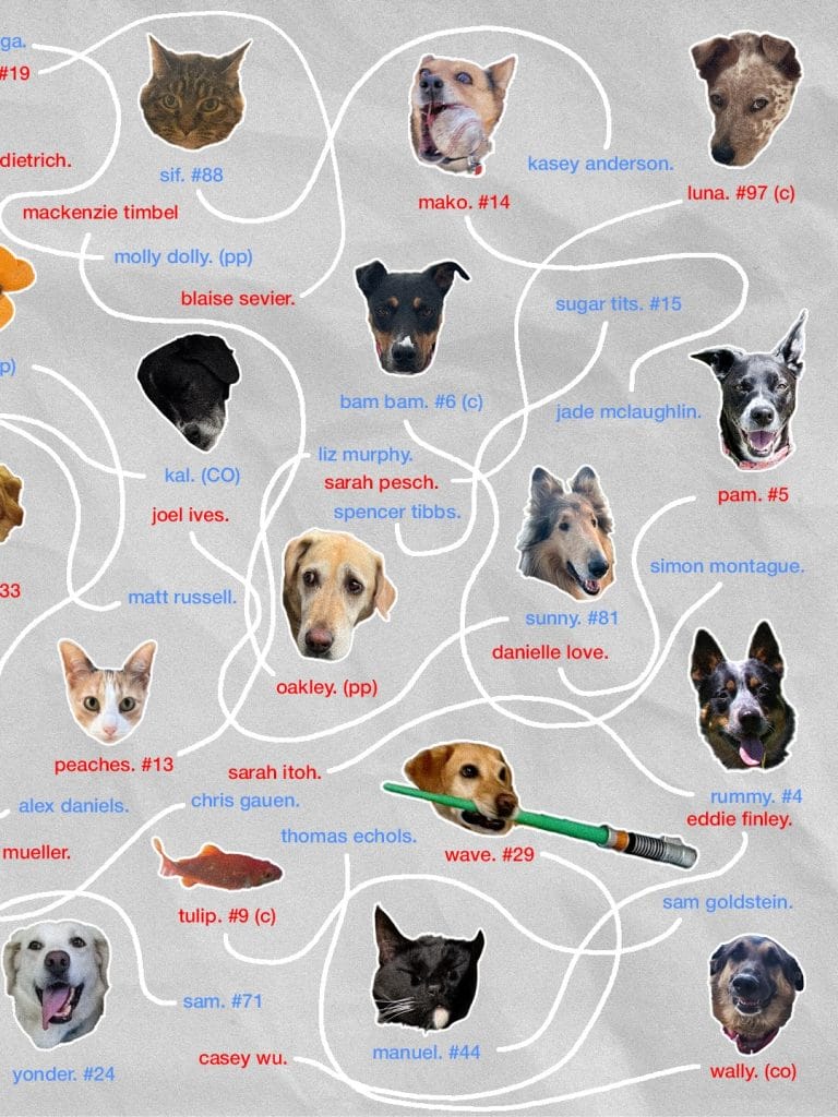
If you’re going to break ALL the rules I outlined above, I guess this is the way to do it. I have legitimately no idea who’s on the shame. roster after reading this roster reveal, the blue font is hard to read, it doesn’t appear to be in any discernible order, and it’s spread across two images to make finding who you’re looking for even more difficult. But I feel like I can’t put it in the bottom category because it’s so intentional in its chaos. It captures the spirit of shame. so well and is admittedly very funny. Also, there are lots of cute cats and dogs here, which I appreciate.
???
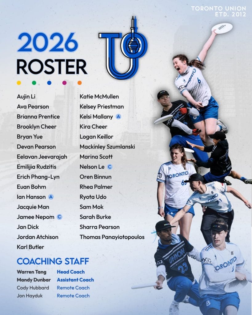
Quick – what team is this a roster reveal for? The fact the answer to that question is not immediately obvious is what lands this reveal down here. Otherwise, this is actually a good graphic. The font is nice, the background is cool, and I like the pictures of players on the team. But…if I can’t immediately tell which team’s roster this is revealing, that loses you a lot of points.
(P.S. this is for Toronto Union, which if you look closely you can find in the top right written in small white text on a light blue background).
Uh…Not Good
Raleigh Phoenix
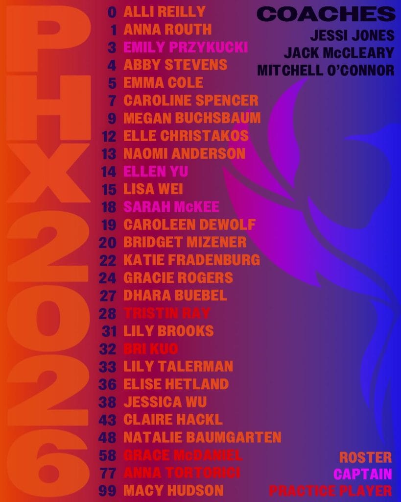
Look, I get that this team is Phoenix and thus you want to have a fire theme, and I respect that. But I can barely read half the names on here! Especially the first names, which are mostly red and orange on…red and orange. I’m still not entirely sure what the names of #28 (Tristin Ray? Maybe?) and #32 (Bri Kuo?) are. Also, I am (as far as I know) not color blind at all. I don’t know much about how color blindness works, but I could easily imagine somebody who is color blind not being able to read this at all. We can do better.
Salt Lake City Sego
View this post on Instagram
You all knew this one was coming. I’m sure this is supposed to be funny, but it does not work for me. Let me count the reasons:
- Most importantly, not separating the names means that I actually can’t learn the names of the people on the roster by reading the roster reveal, since I am not already familiar with these names. Is there somebody named Ashley Ludack on this team? Is there someone named Ludack Benfield? Or is there somebody named Ben Field? Cole Stense? Seth Elanor? Elanor Wachtel? I honestly have no idea.
- It’s like…10 slides. Do I really need to scroll through 10 slides to see who’s on the roster of one team? If I think this roster looks strong and want to share it with my friends, how should I do that (especially if they don’t have Instagram)? Also, some names are split across multiple slides, making it even harder to figure out what the actual names are.
- Following up on 2, each slide only uses like 20% of the available space. It would be great to have something to tell me about the culture or spirit of the team, besides “we don’t actually want anybody to know who’s on our roster.” Or you could just use that space for text and do this in one or two slides. I would hate the “one long string” method less if I could look at it all at once.
All in all, this is a roster reveal that only works if you already know who’s on the roster. Not much of a roster reveal if you’re only revealing the roster to people who…are on the roster.2
That does it! There were plenty of great (and not so great) roster reveals that didn’t make it into this article, so if your team didn’t make it please do not take it to mean you didn’t have a cool roster reveal. Feel free to send any positive feedback to @ibelieve616 on Discord, and direct all negative feedback to Keith Raynor. Happy club season!
