The definitive list.
June 7, 2018 by Daniel Prentice in Opinion with 0 comments
At College Nationals, just two teams can go home as champions. But all 40 teams in Milwaukee had the chance of going home winners in something arguably more important: the battle to have great jerseys. Keep in mind that this is not a head to head matchup. In theory, every single team could have perfect jerseys, and they would all be victors in this often undervalued endeavor. I still hold out hope for the day when that happens, when every team has great looking jerseys, but it didn’t come this year.
There were some great looking kits: some were all-timers, in fact. But there were also a handful of real duds, and most teams fell somewhere in between. After meticulous scouring of every detail of every jersey at Nationals, I have come up with my definitive top five1 and bottom five jerseys that were on display at at our sport’s grandest tournament.
Top Five
1A/1B. Florida FUEL Whites/Florida FUEL Darks
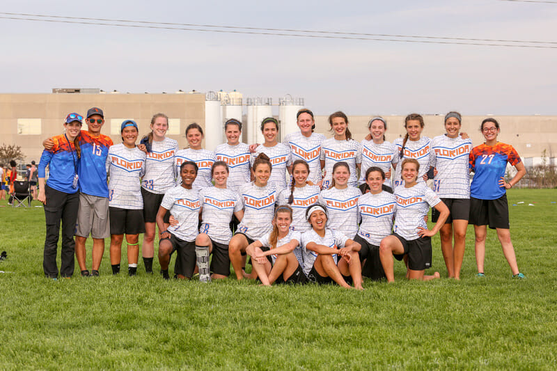
These are two of the best jerseys I’ve seen in a long time. They perfectly struck the balance between looking both simple and distinct from a distance, but having unique and cool details up close. It’s hard to pick which of these two looks is the best. The alligator scale whites just get the edge for me, but that could change with my mood. The chevron on the whites is repeated on the back to provide a space for the back numbers, rather than slapping them directly on the scales. It really helps in keeping the pattern from making the kit feel cluttered. The geometric pattern in the darks do a great job of blending Florida’s iconic colors. The usage of varying shades, from the dark oranges to the lighter blues, also add depth that a simple orange shouldered, blue bodied jersey wouldn’t offer. Florida absolutely knocked both of these out of the park.
2. Pittsburgh En Sabah Nur Warm Ups
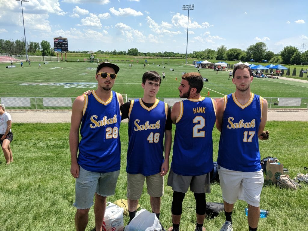
Pitt never wore these in a game, but they were so good I had to include them. It’s a fantastic color combo, one much better than the darker blue and gold the school currently uses as their official colors. These harken back to old-school basketball jerseys, and that’s never a bad thing. The simplicity, the script lettering, the paler colors: it’s a perfect retro look. It’s also a vast improvement over the typical warm up tanks a lot of teams wear while providing the same functionality. This feels like something that a lot of teams will replicate in the near future and probably ruin, but these are great from Pitt.
3. Tufts EWO Darks
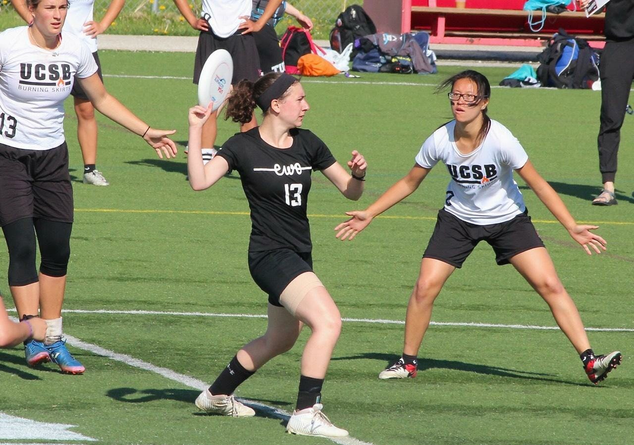
Simplicity is often best, and Tufts exemplifies that with these kits. The script “EWO” on the chest does a nice job of turning the team name into a cool looking logo. As a commentator, the very visible numbers on the front and back are a huge plus. These feel like jerseys you’d see teams wearing in some of the major sports, and that’s a rare thing with ultimate jerseys. I also like that they say Tufts on the back. Not enough jerseys obviously identity what school they’re from. Some will say these are too plain, but these are my rankings, and Tufts gets a lot of points for this professional look in my book.
4A/4B/4C. Every Team with Baby Blues
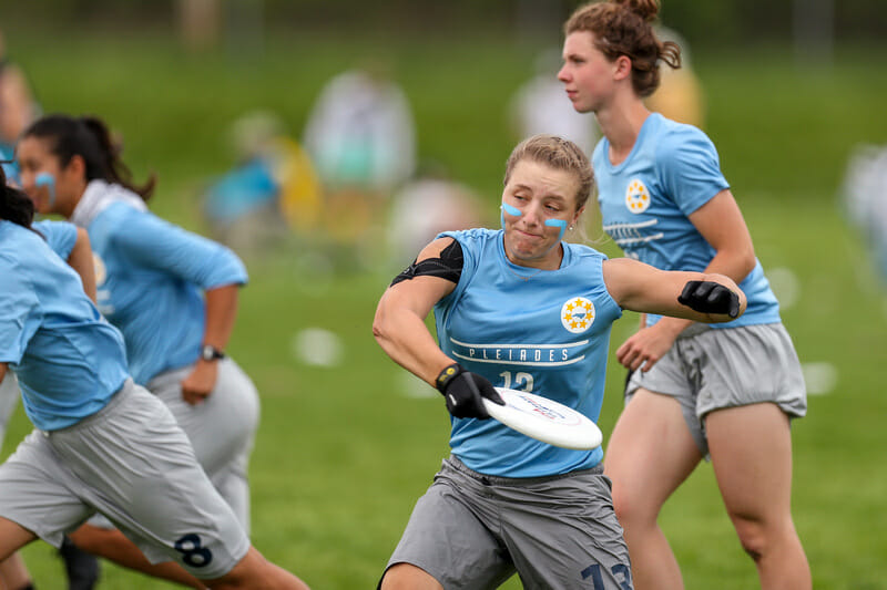
UNC Pleiades tops this group, followed by Auburn, then Wisconsin. Baby blue is the best jersey color. This is an undeniable fact, and I will hear no counterarguments. None of these teams do anything particularly special with it, which is why they all tie for fourth, rather than placing higher. But they also didn’t screw it up, keeping it simple and letting the best peerless jersey color speak for itself.
Pleiades edges the other two because their kits look the cleanest, and having the team logo as a badge on the chest is a nice touch. Wisconsin finds themselves in third due to to the oversized Patagonia logo on the lower back. I get that it’s a sponsorship, but, aesthetically, it knocks them just below Auburn.
5. Washington Sundodgers Whites
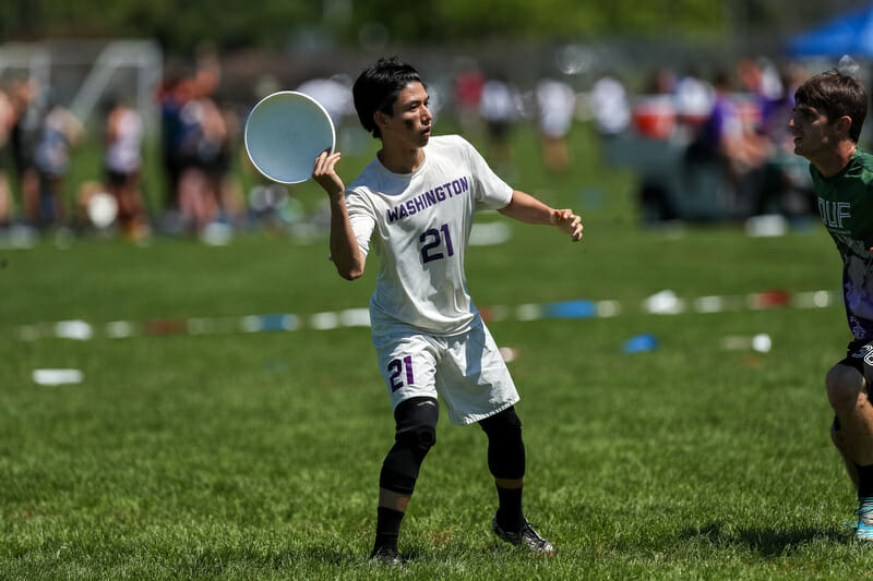
Much like Tufts, the Sundodger kits are beautifully understated. Purple was made to be an accent color, and the Washington purple really pops against the white jerseys. The “Washington” font across the chest is perfect. Washington doesn’t try to do too much with these, and they let the minor details do the talking. A nice, classic look.
Bottom Five
1. UBC Thunderbirds Darks
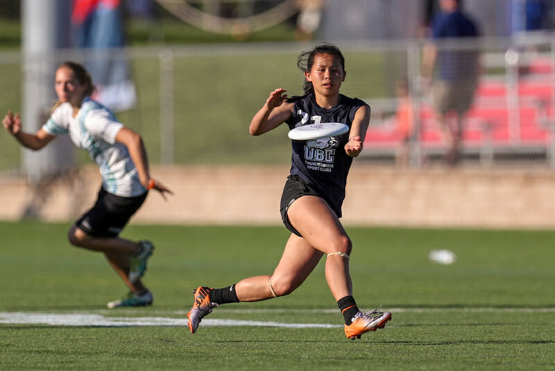
Unlike most of the teams on this half of the list, UBC finds themselves here because it doesn’t feel like they really tried to do anything with their jerseys. Their darks look like a college shirt you’d find at a local Walmart. It’s such a generic looking logo, with nothing else going on anywhere else to add any flavor. They look like they’re probably school-designated jerseys, on account of the “Thunderbird Sports Clubs” label, so I don’t want to bury UBC too hard here. But it’s hard to get around the feeling that these feel like intramural jerseys, and I have to dock them for that.
2. Florida State DUF Darks
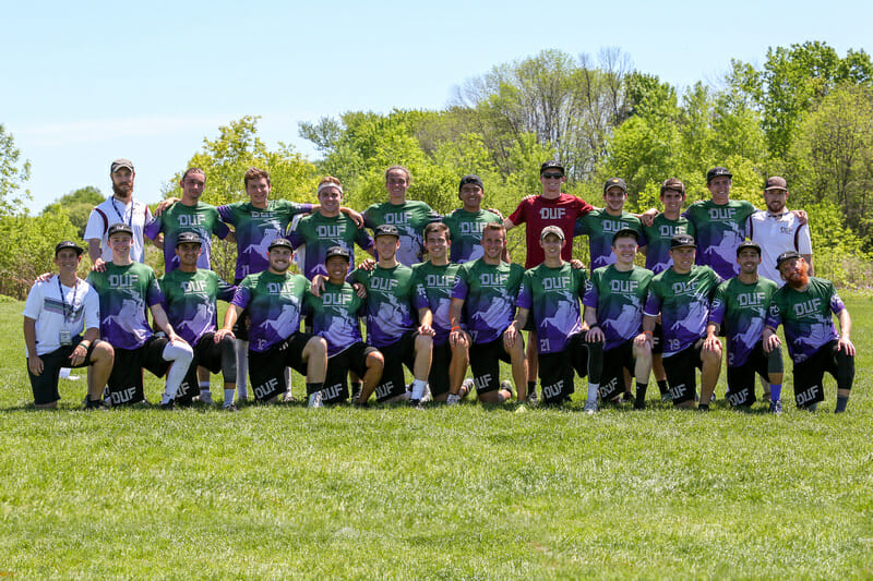
Florida State has a history of alternating between the schools colors, garnet and gold, and the club’s traditional colors of purple and green. Some people hate that, but I don’t necessarily mind it. They’ve pulled off the alternate colors in the past2, but this attempt falls short for me. If you’re going to use weird colors, let them be the main voice of the jersey. But FSU doesn’t do that. Instead they’ve emblazoned a huge image of Osceola and Renegade, and that puts it way over the top. Take that off there and these would be fine. Not good, but fine.
3. Dartmouth Princess Layout Darks
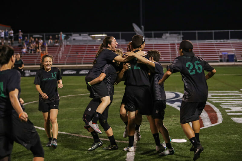
There’s too much going on here, and it muddles the whole look. It’s hard to see in photos (that’s a negative in and of itself) but there’s a weird, nearly-black forest sublimated on the bottom half of these. The light grey argyle-style tree pattern down the life side creates further unnecessary clutter. The real problem with these jerseys, though, is that neither of those issues are the jersey’s biggest problem.
Jerseys serves two purposes: they identity one team from another and they identity individual players with player numbers. These numbers don’t contrast enough with the base color and make it hard to tell what number anyone is wearing from any sort of distance. Dartmouth tried to be creative with these, and I respect them for that. But you have to make sure you get the basics right before you play around with the details.
4. Oregon Fugue Yellows
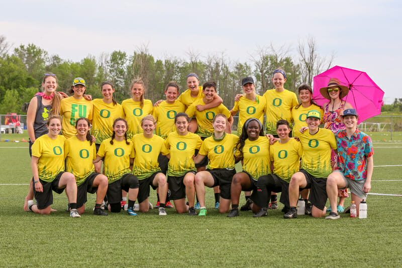
Fugue also went for a forest look, but instead of being too difficult to see like Dartmouth, they go too far in the other direction. The Oregon yellow and green can work, and Fugue has managed to do it in the past, but this version of it is too garish of a color combo to pair it with an “in your face” sublimation like this. It’s a shame, because the team’s whites are solid and their darks from 2017 were one of my favorite jerseys at Nationals. But it’s hard to describe these as anything other than an eyesore.
5. Carleton CUT Camo Sun Hoodies
https://twitter.com/solsucks2016/status/999403952289411073
Another non-jersey, but they’re so bad they had to be included. What were they thinking with these? The worst apparel at Nationals, and it’s not even close. To their credit, they didn’t wear them a whole lot, perhaps because it was in the 90s all weekend, but these should never have existed in the first place.
Other Notables
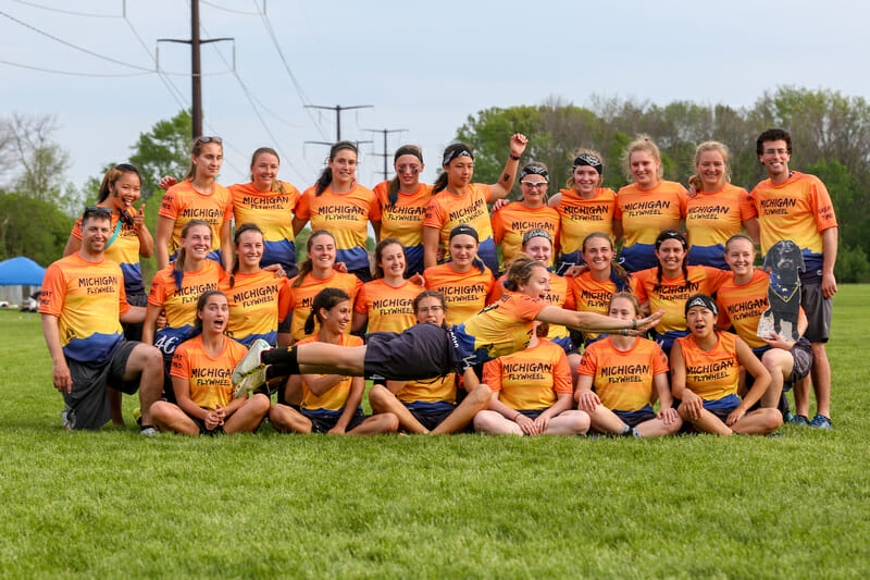
Michigan Flywheel showed up to Nationals with some attention grabbing unis. Their new sunset look was the talk of the fields on the first day of Nationals. My feelings about them weren’t as strong as many, but I don’t hate them. They’re definitely busy, but that’s clearly what they were going for. It’s rare that a jersey this ambitious wouldn’t end up in my bottom five, but they do look pretty sweet from a distance, so they manage to avoid my official rankings.
If you like petty saltiness, then Florida State’s warm ups were your favorite piece of apparel in Milwaukee. They all had the number 79 on the back, signifying their end of season ranking. But the call out of Bamasecs is what makes these noteworthy. Some teams black out the ultimate media during the season in an attempt to avoid getting caught up in any sort of narrative around their team. But if you do that, then you don’t get to call them out when they’re wrong, do you?