Mirror, mirror through the screen, who is the best dressed in the frisbee scene?
November 5, 2025 by Alex Rubin in Opinion
Ultiworld’s coverage of the 2025 Club National Championships is presented by Spin Ultimate; all opinions are those of the author(s). Find out how Spin can get you, and your team, looking your best this season.
While there was plenty of on-field activity to generate headlines, I love looking at what teams are wearing and honoring good design as much as good play. At the end of the day, only one team can win a championship in each division, but everybody can look good. Here’s who stood out in San Diego:
Best
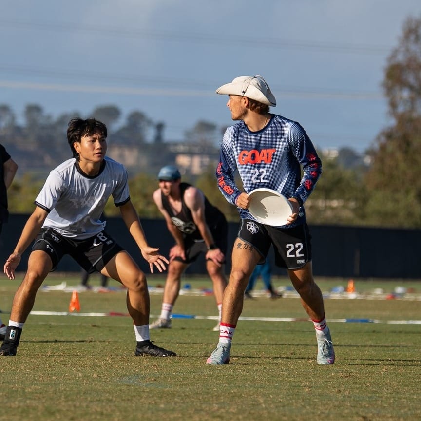
Toronto GOAT dark (VC) – I’m not sure if they wore these in any game, but they caught my attention as GOAT warmed up on a field adjacent to the one I was covering. The pixelated background is funky and unique, and the red wordmark pops. Even without an outline, there’s plenty of contrast to read the numbers. I love these and wish GOAT wore these more often.
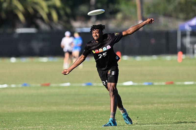
Philadelphia Pacmen black (Spin) – Given their name, a video game themed jersey was a given. That being said, Pacmen executed these perfectly. With a clear logo, the unique 8 bit number font, and a fun touch with ”game over” written on the back, these jerseys could soon become iconic if the team sticks around.
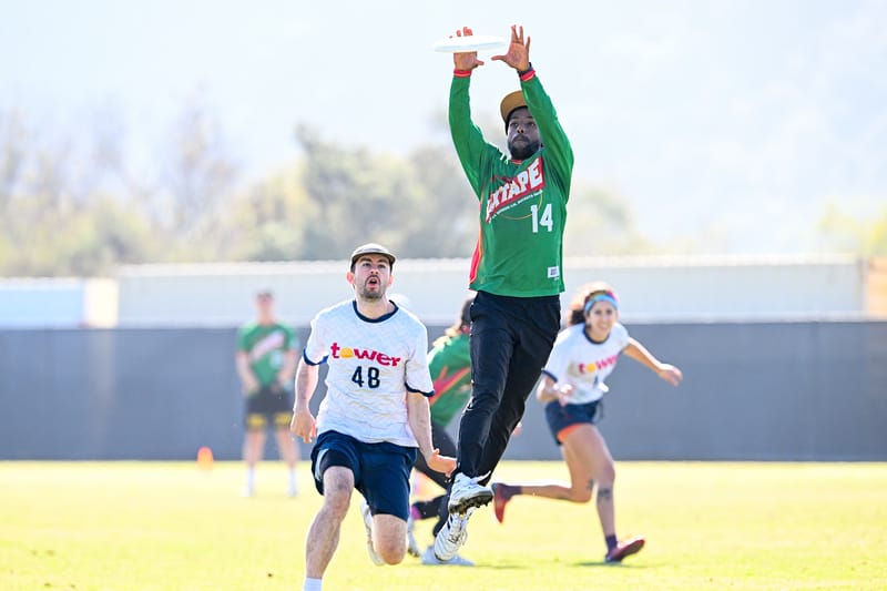
Seattle Mixtape dark (BE) – These Sonics throwbacks are a delight to see. They were good on the basketball court and they look great on an ultimate team too.
Minneapolis Drag’n Thrust white (Spin) – These jerseys have the perfect amount of color for a white jersey. Accents on the sleeve, numbers, and logo make for a well rounded design featuring an aesthetic similar to the Minnesota Timberwolves throwbacks but with a fun Frisbee twist.
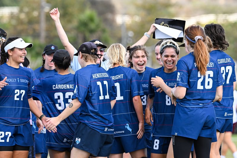
Denver Molly Brown dark (BE) – Molly Brown bring in some fun off-color accents with the red stripes that keep the jersey interesting. The best detail, though, is the little blue horse detail along the hem, a tribute to Blucifer the blue mustang statue at the Denver International Airport.
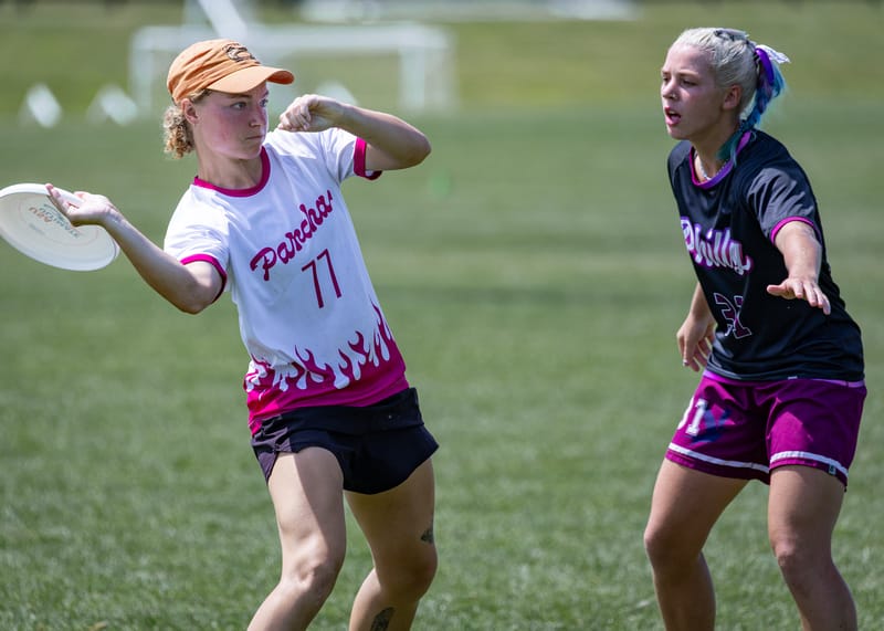
Pittsburgh Parcha white (VC) – The hot pink flames are such a fun touch. Great color. A+ 10/10 no notes.
Worst
Denver Johnny Bravo darks (BE) – Frisbee teams just have to learn how to have readable numbers. The red on black in this set is unreadable.
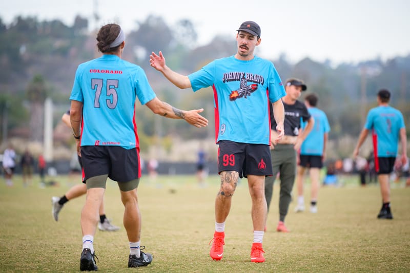
Denver Johnny Bravo alternates (BE) – For Nationals, Bravo broke out these blue alternates. Last year they had “ugly cool” jerseys, but I find these just ugly. Once again the numbers are challenging to read, and the modifications to the Bravo logo just don’t make sense to me. I’ve seen Johnny Bravo do better, so I expect more from them.
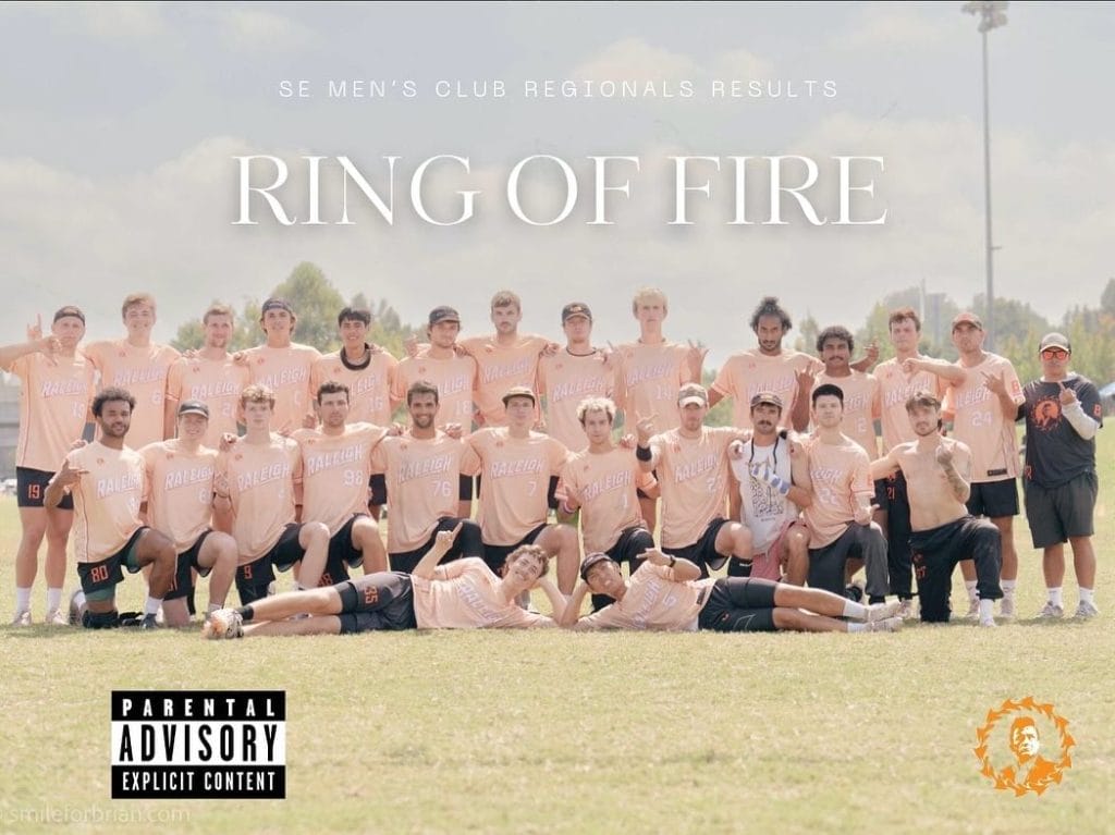
Raleigh Ring of Fire light oranges (BE) – It’s okay that these were not worn at Nationals, as far as I can tell. My initial reaction is that this is a worse version of last season’s Charlotte Bobcats throwbacks. My more nuanced reaction is that these are unreadable and should not have been allowed to go to print. One player on Ring offered to trade me for these, and I declined because I literally couldn’t even wear it to pick up.
Austin Disco Club numbers – The spot of color on the front of these jerseys are nice, but the numbers are not legible from any distance and certainly not on camera. A filled in number would be better next time.
Most Interesting
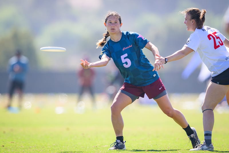
Washington DC Scandal blues (VC) – These numbers are a bit bigger than usual. I see that as neither good nor bad, but rather unique. I do love the color combination, especially with their maroon pants.
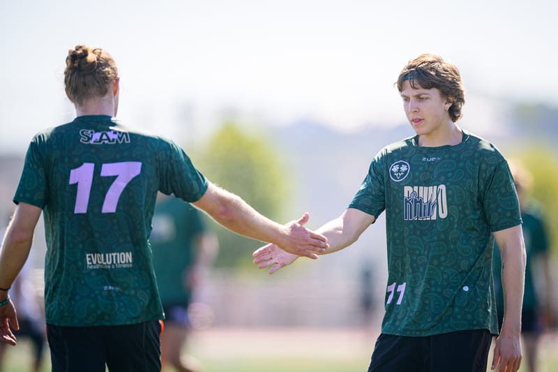
Portland Rhino Slam! lavender accents (Zue) – For that matter, shame.’s lavender alternates and Machine’s accents qualify here as well. While none of them take advantage of “official team colors,” it is clear that lavender is in, which is great because it is my favorite color.
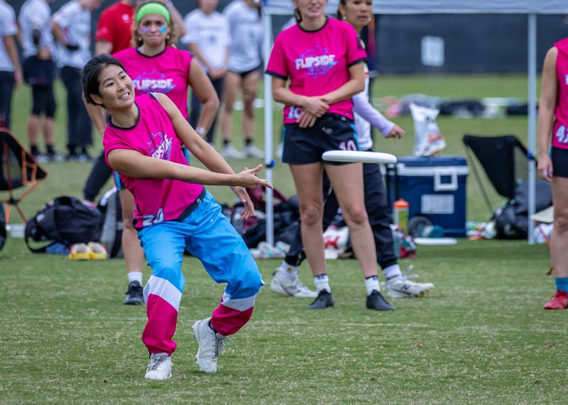
San Diego Flipside pants/accents (BE) – Full disclosure, these Flipside pants continue to come up on my targeted advertisements on Instagram, so perhaps I’m growing a soft spot for them. They work so well with Flipside’s unique color scheme–I’m really glad the team leaned into the pink this season.