Who wore it best (and worst) at Nationals.
October 26, 2022 by Alex Rubin in Other
Ultiworld’s coverage of the 2022 Club National Championships is presented by Spin Ultimate; all opinions are those of the author(s). Find out how Spin can get you, and your team, looking your best this season.
Correction: while the paragraph concerning Vault’s red jerseys mentions an unfamiliar gorilla logo, Howard has actually long been an important member of the team.
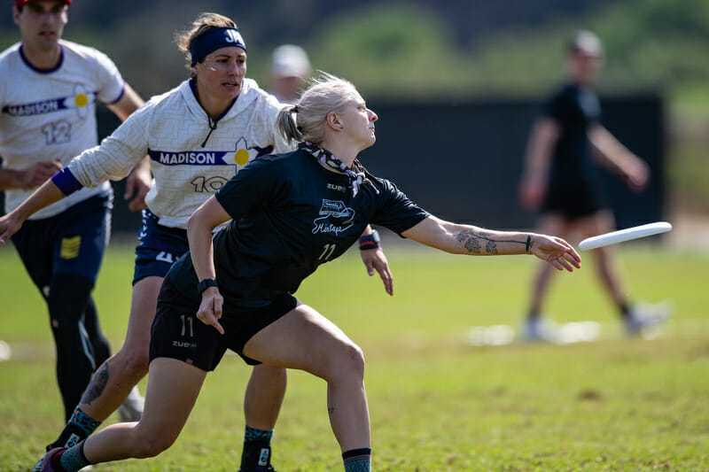
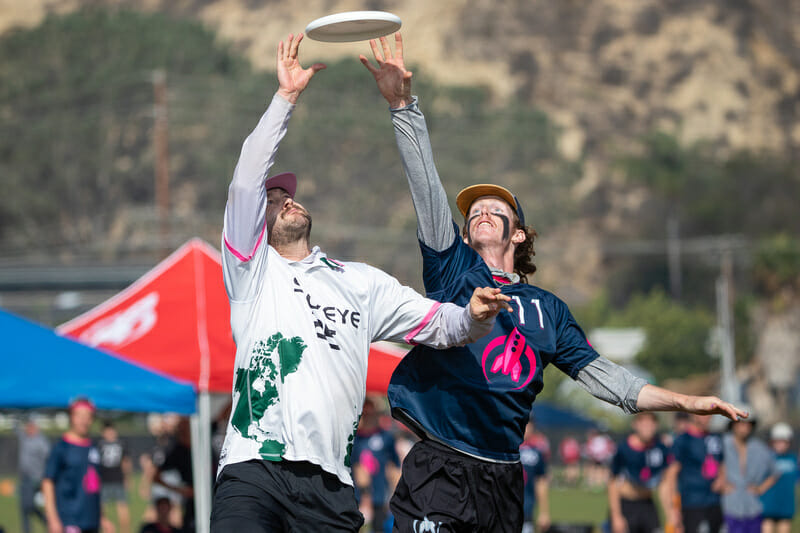
With the most filmed games in USA Ultimate history, there was plenty of opportunity for teams at the Club Championships to show off their stuff. No, I don’t mean their well-polished pull plays or uniquely designed defensive sets. We’re talking about their jerseys. Coming in looking good is important–nobody wants to play for a team that walks around in an embarrassing shirt. With all eyes on this tournament and the existing uniform rules actually enforced, Nationals is the time for teams to showcase their style and flash in addition to their play on the field.
Compared to the chaotic nature of similar lists in the college divisions – with the less-than-developed prefrontal cortexes of college leadership making some questionable aesthetic decisions – the club scene has a really solid collection of kits.
Every single team has at least one respectable jersey, though some do border on too basic. It was tough to parse through the selection of well balanced, even-keeled kits, but after scouring the fields, here is a clear and definitive list of the best, worst, and most interesting jerseys at the Club Championships.
The Best Jerseys
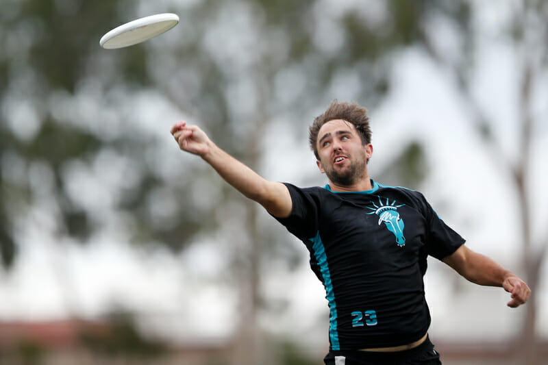
PoNY Liberty Horse
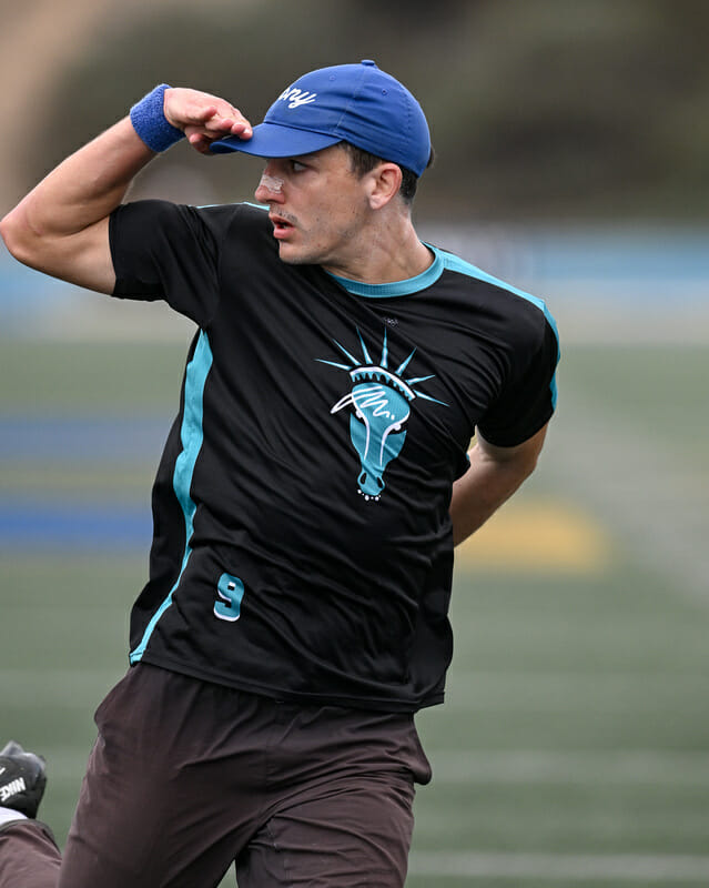
What a great way to mesh a team name with an iconic city landmark. Hats off to Tyler Haskell for the conceptualization of this fantastic design.
Ozone White Jerseys
Ozone do well to showcase bright and fun color on these jerseys while maintaining the kind of contrast that is helpful in a white jersey. It’s a clever design without being too busy. Adding a unique font and excellent logo, this jersey stands out for elevating what could be a boring design with the right amount of pizazz.
Scandal White Jerseys
Like Ozone’s, there is excellent balance in these jerseys. A great flash of color doesn’t distract from the team name or number and the numbers are easily readable. Really well-designed top all around.
Love Tractor White Jerseys
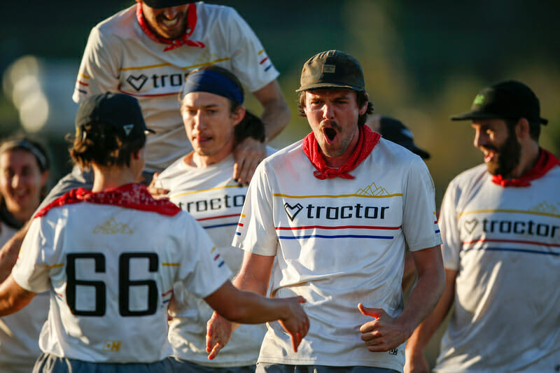
Again, the lesson here is balance. What could be a standard or boring design is elevated with a few lines of color and the mountain motif above the team name. Extra points for readability and a unique font.
Flipside Black Jerseys (And Matching Accessories)
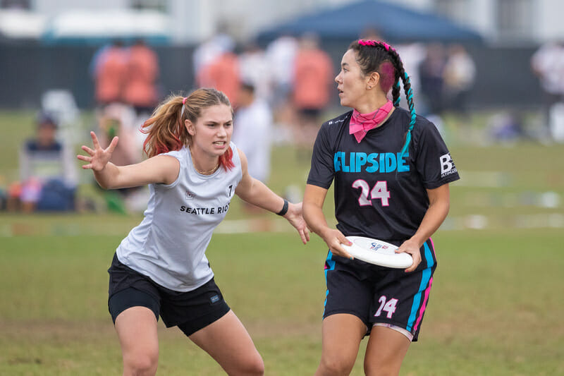
For a brand new team, Flipside have developed an incredibly strong visual identity. With bold colors and a playful font, Flipside already had a great start. Add in the players’ commitment to dying their hair and adding bright accessories, and the hometown team left its mark in year one.
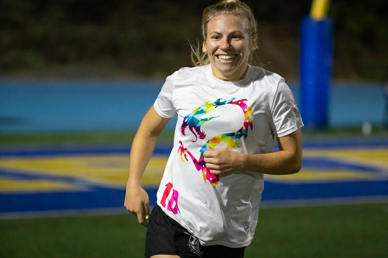
Drag’n Thrust Black Jerseys
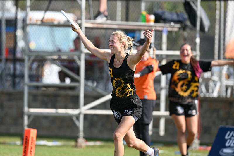
Drag’n Thrust took their iconic dragon logo and rendered it in the champion’s color: gold. That’s a powerful statement for the top seed. Though they didn’t win the championship nor know where they’d be seeded when it was time to put in a jersey order, this kit was a winner from the get-go. With a great color combination and a subtle gray sublimation pattern underneath the headline logo, this kit should be a popular trade item around the mixed division.
The Worst Jerseys
NOISE (Half) White Jerseys
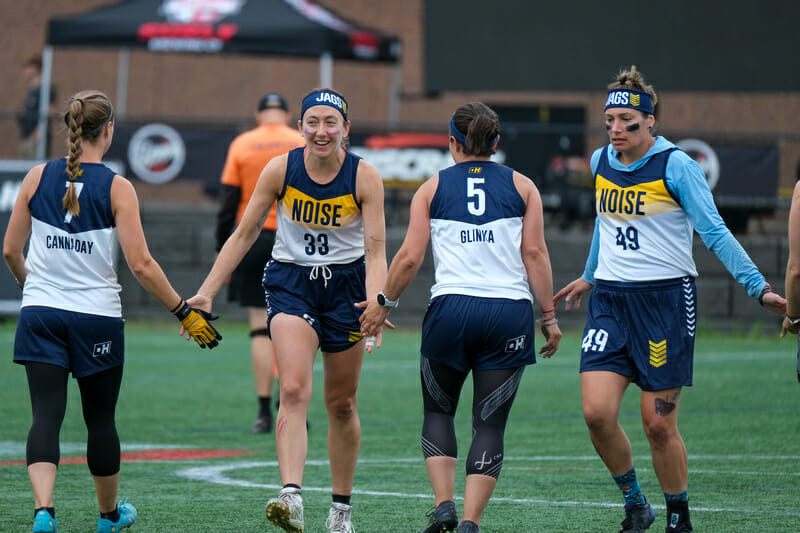
Somehow, a jersey company allowed NOISE to make white jerseys that are only half white. To provide adequate contrast against other teams, they needed to borrow Madison Mousetrap’s whites for this tournament. The community support is nice from a fellow Madison team and Mousetrap’s jerseys are quite well designed and would be in contention for best jerseys with a clever maze design and brilliant color scheme had they been designed for the team wearing them. For NOISE, they should take a clear lesson from this experience: if your numbers on your white jerseys are white, then your white jerseys probably are not sufficiently different enough from the other team’s dark jerseys, whatever color they may be.
Drag’n Thrust White Jerseys
To be clear, I really like this jersey because of its well-designed front. The bright colors stand out without being overpowering. The shirts stick to the Drag’n Thrust brand while still differentiating themselves enough from past teams to give this year’s squad a clear identity. However, the numbers are too hard to read.
Temper White Jerseys
T-M-P-R isn’t their famous cheer. This jersey simply does not describe who they are.
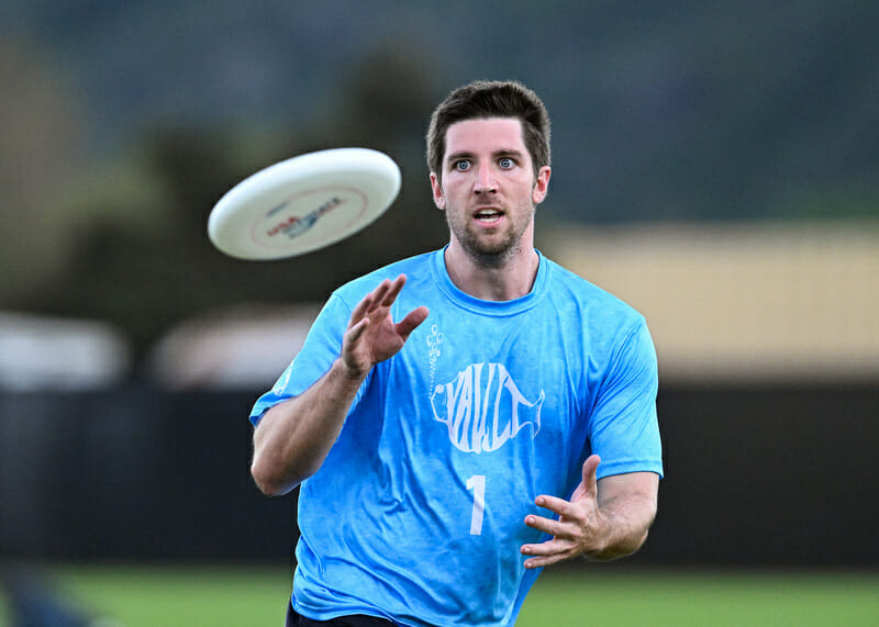
Vault Red Jerseys
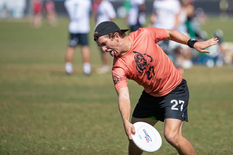
On its own the red jersey isn’t bad – and props to Vault for using a unique color – but this top is a bit simple/boring and features a gorilla logo that comes out of nowhere. Their blues are much better, and feature the logo associated most commonly with their brand.
Polar Bears White Jerseys
These numbers are just too hard to read.
Seattle Riot Black Jerseys
View this post on Instagram
At least the numbers are readable! Riot lose points for the monochrome screen print, rendering the city name basically unreadable. If we told you this was a Scandal jersey (just to pick a team with a similar color scheme), would you look twice?
San Francisco Fury White Jersey Numbers
This is a nicely designed jersey. The color scheme is good, the font is playful, and the faded background colors provide enough contrast as a white jersey while not falling into the “too boring” trap. However, it should not be allowed to have yellow jersey numbers on a white jersey, even if just on the front. Come on, that’s just ridiculous even for the most successful team of the past two decades.
The Most Interesting Jerseys
Mad Men Baseball Jerseys
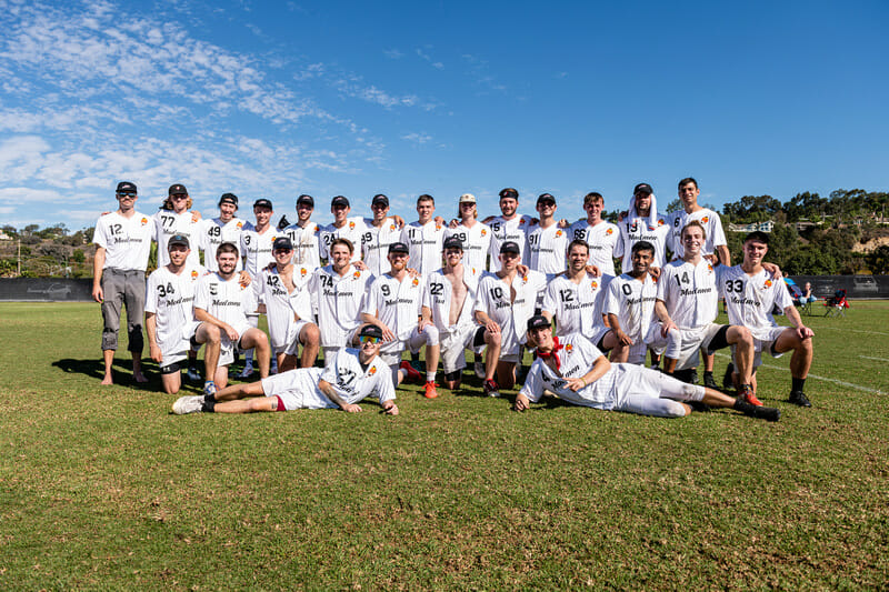
After clinching their spot at Nationals, Mad Men had baseball jerseys made and delivered (an impressive logistical feat considering the design work needed and the general lag seen with the current COVID-affected supply chain). Perhaps pioneering a new style, the button-down top proved quite popular with players and instantly gave the team a unique identity. While wearing baseball jerseys to play ultimate probably isn’t for every team, it worked for Mad Men this weekend.
Ring of Fire Blue Alternates
The 1994 USMNT throwbacks are a fun look, especially in a Worlds year. They don’t match too well with their black and orange shorts and accessories though, creating a very strange contrast. As a fan store item, the shirt is great, but they didn’t look as good on the field as this fan had hoped.
Seattle Sockeye World Edition Set
View this post on Instagram
A set of black, white, and pink jerseys, each one complements the others well, but the shirts are quite busy all things considered. While the collars aren’t for everyone, I think they elevate the look as they provide another design element for a touch of contrast. Well done as well for not just copying the same design three times and changing the colors. Each jersey has its own unique feel while keeping enough of a thread together to make them feel like a complete set.
Polar Bears Pronouns
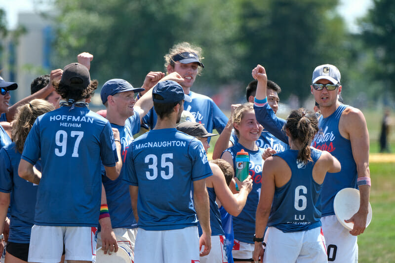
Polar Bears tried something new this season, giving players the option of adding their pronouns underneath their names. Some players went for that option and some chose to just have their last name. The pronouns underneath the name didn’t look too busy or affect the spacing on the numbers at all. It will be interesting to see if the option to add pronouns to jerseys becomes a common trend or simply an extra step to inclusivity that one team took this season.
Chicago Nemesis Blue Jerseys
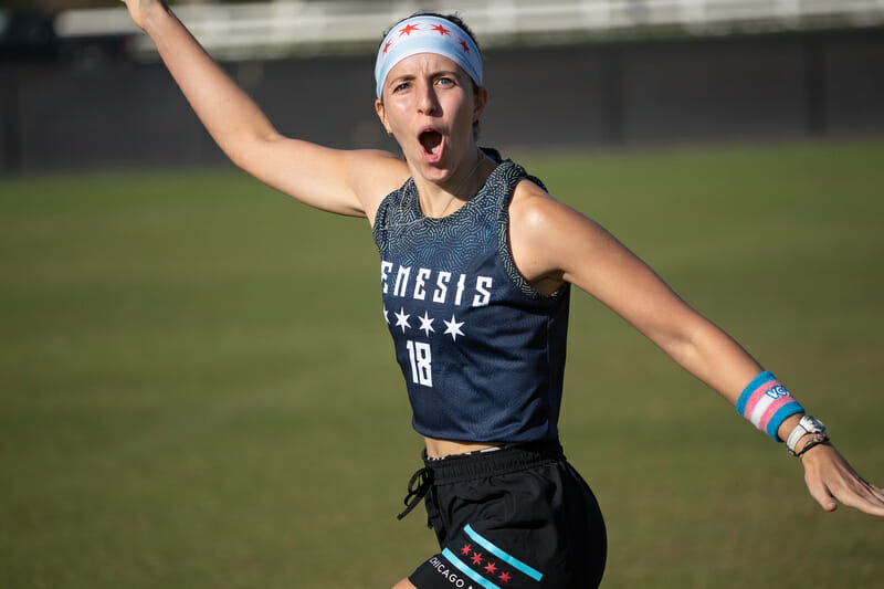
There’s nothing wrong here at all, but the combination of a strange number font and the strange, off-centered swirly yellow whatever that is on the top of the jersey definitely made me look twice. The four stars that mimic the iconic city flag are an excellent touch that keeps the jersey together.