We've revealed our top players, now on the 9th Day of College Ultimate get ready for the best dressed
December 20, 2022 by Alex Rubin in Opinion with 0 comments
Ultiworld’s coverage of the 2023 college ultimate season are presented by Spin Ultimate; all opinions are those of the author(s). Find out how Spin can get you, and your team, looking your best this season.
It’s time to unwrap some presents as we introduce the 12 Days of College Ultimate. Through December 23rd, we will be releasing one gift per day, though don’t count on getting any partridges in pear trees: it’s all college ultimate. From highlight videos to player chatter to a giant bracket, we’ve got a little something for everyone. On Day 9 of the 12 Days of College Ultimate, our resident fashion expert reveals who won the runway in 2023.
***
Look, I get that I care more about ultimate jerseys than most. My club and league teammates will tell you that I have a fairly large collection of random jerseys I bought or traded for because I thought they looked cool. Just opening up this Google Doc to write this prompted me to open the preeminent sports aesthetics blog uni-watch in a different tab. With that in mind, let me tell you all a story.
During my first year playing college ultimate I made a name for myself by showing up for practice in some outrageous outfits. I mismatched different neon accessories, gave no thought to complementary or even neutral colors, and visually came across as loud for no reason. As a younger player, I certainly was trying to be noticed, but I didn’t quite realize the impression I was leaving on the team until the end of season banquet. A departing fifth year captain was gifting some old jerseys that no longer fit him, and I was given just the most outrageous purple mess of a shirt that could possibly exist. I loved it. It was way too busy, the team name and identity were barely discernible, and it just could not be worn in public.1 I just spent ten minutes trying to find a photo of the shirt, but it appears to have been scrubbed from the internet. It was also made of 6% silver–no joke, that’s on the tag! I still have the shirt,2 so here’s a photo:
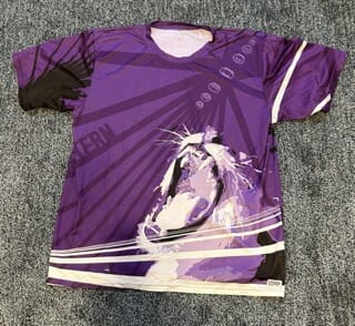
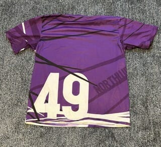
All this is to say I understand why college ultimate players might make poor design choices. It’s easy to go overboard with full sublimation options and it’s fun! So, on this 9th Day of College Ultimate, I would like to highlight teams that use the full sub option well. Without further ado, here are nine great college ultimate jerseys.
St. Olaf Berzerkers
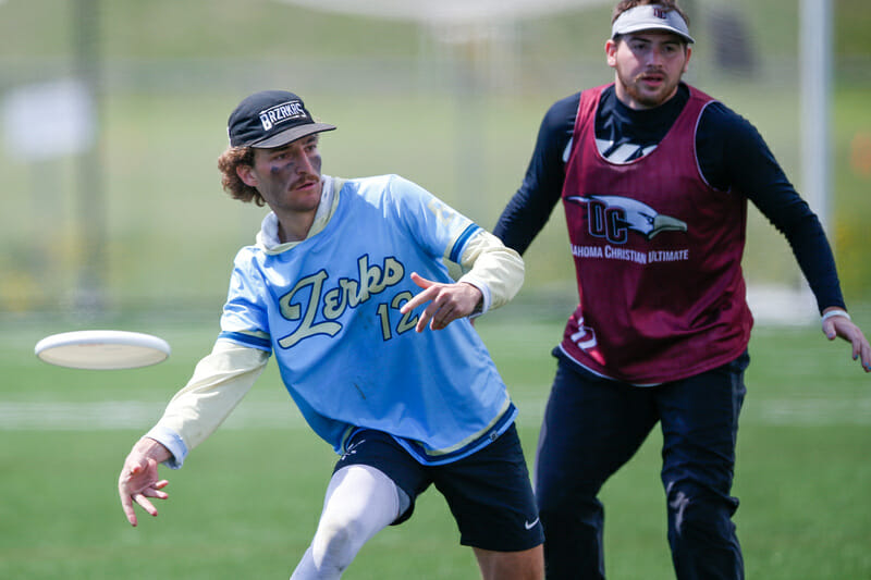
This team is a bit all over the place, with this beautiful pastel set along with a bright pink alternate. Both are great on their own, but they are a bit strange together. Nevertheless, the colors, font, and overall aesthetics of this jersey/sun hoodie combo are unmatched in the college ranks. Great job to the Berzerkers for picking a unique color combination and making the best of it.
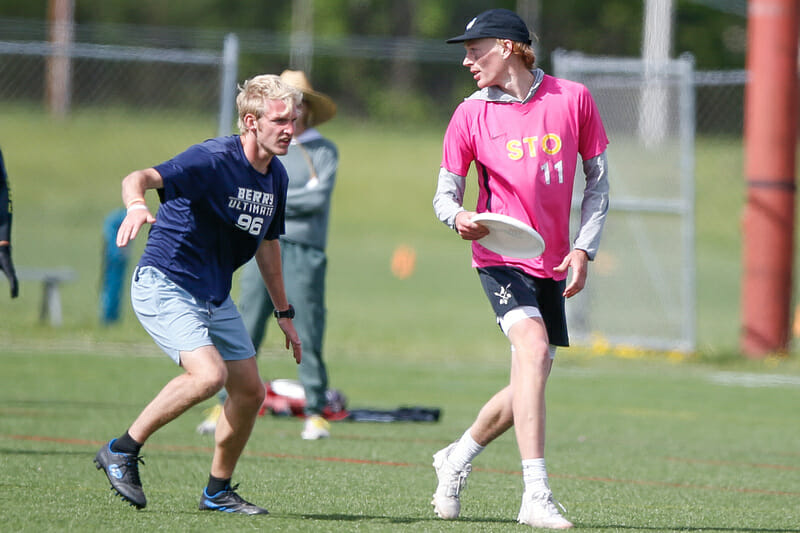
Cal Poly SLO SLOCORE

SLO tends to come out with new shirts and surprising accessories each season, so it’s possible that 2022’s teal set has seen its last days of formal competition. However, they’re too good to ignore here. With a unique color scheme and font, this shirt should be the envy of college teams across the nation.
Emory Juice
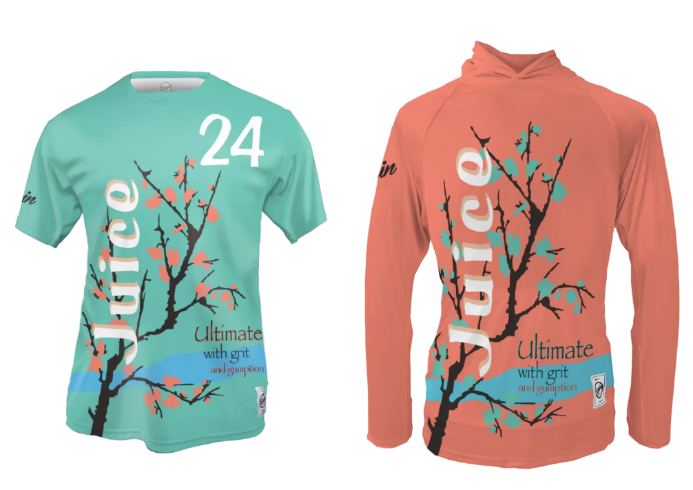
Copying professional team or company designs can become tired quickly, but no team has made it a bigger part of their brand or done it better than Emory Juice. This season’s AriZona Iced Tea set is just the latest in a long line of A+ designs.
Santa Clara SCAB

I am amazed by the use of negative space here. It’s tough to make a stylistic impact on a white jersey, given that too much color will not provide adequate contrast to opponents, but by making the negative space the signature design element, Santa Clara put together a white jersey that maintains enough contrast while adding a touch of color and the right amount of pizzazz.
Minnesota-Duluth Northern Lights
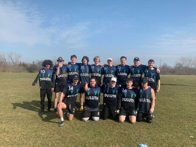
With the Northern Lights as inspiration, Minnesota-Duluth’s jerseys are almost always a hit. Last year’s set once again incorporated an evocative color scheme without distracting from the other needed elements (namely, the team name and numbers which have great contrast against the black background).
Portland UProar
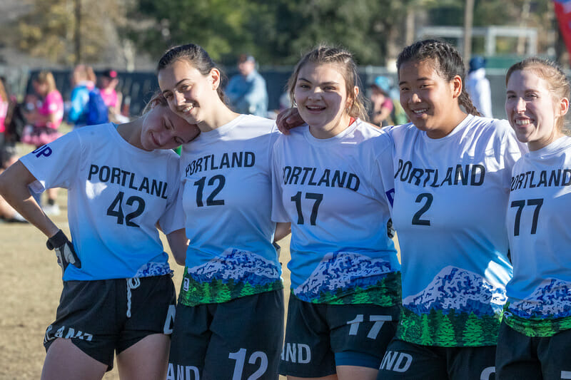
Portland came really close to trying to do too much here, but the pale shade of blue that keeps all but the lowest portion of the hemline a functional light jersey saves the day and elevates a great design. The bright green really pops against the light blue and white jersey but, like UM-D’s, doesn’t distract from the team name and number. This shirt shows a perfect balance of design and function.
Tufts Ewo
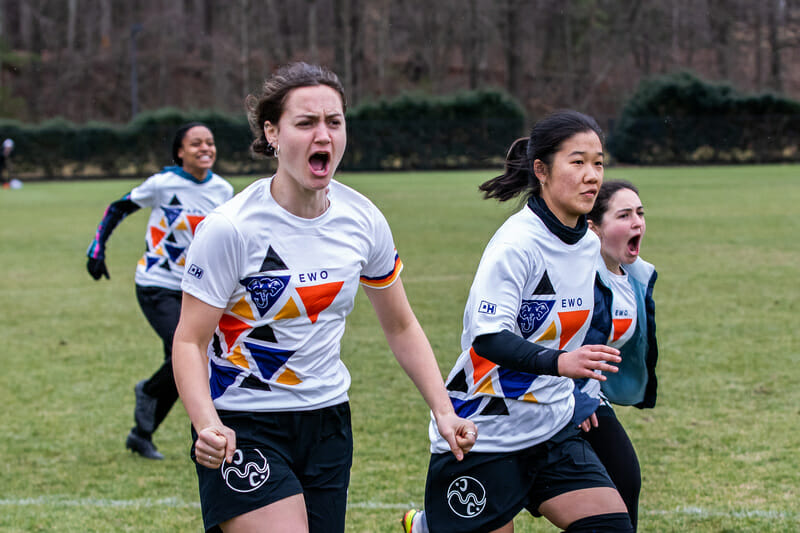
I think these were my favorite jerseys from 2022 Nationals. They’re so fun! White jerseys can often be boring, but the playful colors, the elephant logo hiding within one of the triangles, and the perfect balance of color and blank space make this jersey shine.
Pittsburgh Danger
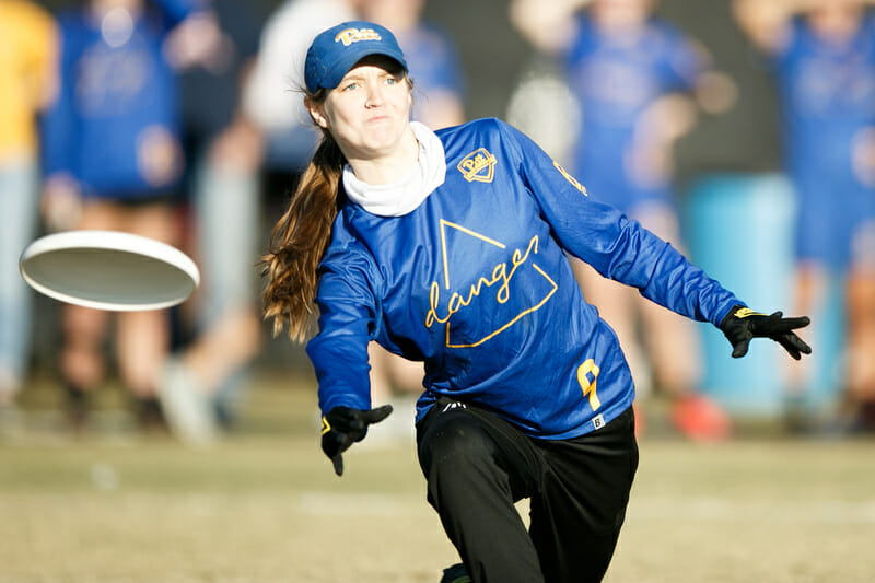
The University of Pittsburgh going back to the brighter shades of blue and yellow compared to their mid-2010s past is a win for all of college sports and Pittsburgh Danger took full advantage with this excellent set. Though the wording is thin, the colors make the design really pop.
Colorado Quandary
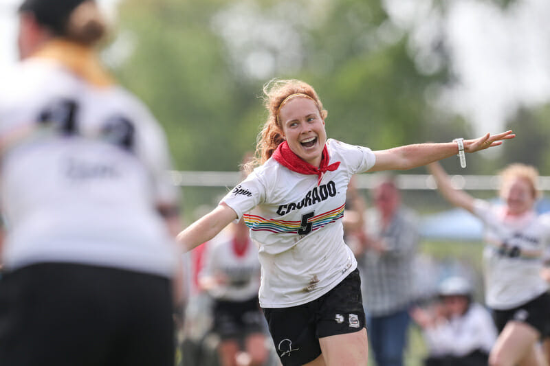
This jersey might just have a permanent place on these lists. Colorado has stuck with this simple design for a few seasons now and there’s no reason to change it. The rainbow band adds a nice pop of color while maintaining contrast with both the team name/number and opponents wearing non-white jerseys. And of course the not-so-subtle nod to queer inclusion is incredibly important in sports today given the slate of anti-trans legislation floating around the country.