Everyone's favorite: jersey talk!
May 30, 2023 by Alex Rubin in Opinion with 0 comments
Ultiworld’s coverage of the 2023 college ultimate season is presented by Spin Ultimate; all opinions are those of the author(s). Find out how Spin can get you, and your team, looking your best this season.
And now the article you’ve all been waiting for. Those of you who enjoy keen analysis and stories of epic comebacks and hard fought games, there’s been plenty of that over the past few days. We’re here to talk about the jerseys from the D-I championships. Overall this was a great year for jerseys. It took some digging to find the candidates for the “worst” list and there were a lot of solid jerseys that may have made the cut in previous years. It seems like most teams are understanding that they need to have good contrast between the numbers and the background, and jersey companies have largely complied with USAU restrictions rather than the whims of college kids who probably haven’t read the guidelines. With that being said, there are a few which stand out:
Best
UNC Pleiades Lavender (BE Ultimate)
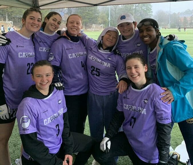
Though Pleiades didn’t show off these jerseys in any Nationals games, their sleek design and unique color combination stand out among a group of very solid options.
UNC Darkside White (BE Ultimate)

Yes, it sucks that each North Carolina team both look great and play great. At the same time, we at Ultiworld like to call it like we see it and this year’s UNC white design might be their best yet.
Michigan MagnUM White (Alt)
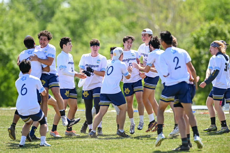
As much as it pains me (a former Great Lakes rival) to praise Michigan two seasons in a row, the floral pattern on their white jerseys and playful but readable number font puts them back on this list.
Brown Brownian Motion Green (Double Happiness)

The unique colors, sharp pinstripe design, and callout to a local business got this jersey in consideration. That Brown also sing a cheer about Dell’s Lemonade while wearing it clinched the spot on this prestigious list.
Virginia Hydra White
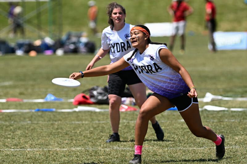
There’s a tough balance on white jerseys to add just enough color and pizzaz to be interesting while maintaining integrity as a white jersey without introducing too much contrasting colors. Virginia Hydra get it right with this look, and the subtle scale pattern harking to their team name is the kind of attention to detail that gets one added to this list.
Oregon Fugue White (BE Ultimate)
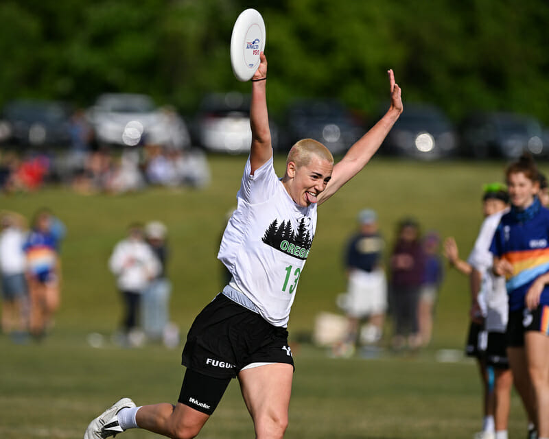
Oregon’s had some pretty generic looking jerseys in the past. There’s nothing wrong with that, and boring is better than bad in my book, but Fugue added just the right amount of intrigue this season with a crisp treeline and bold green color.
Bonus Non-Jersey Pick: Carnegie Mellon Money Mellons Pullovers
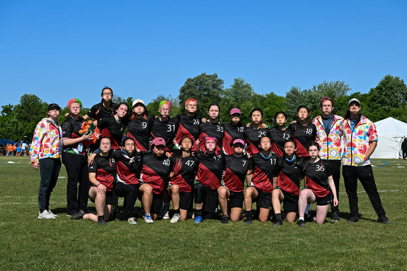
I mean, who doesn’t want to own one of these?1
Worst
UChicago Supernova White
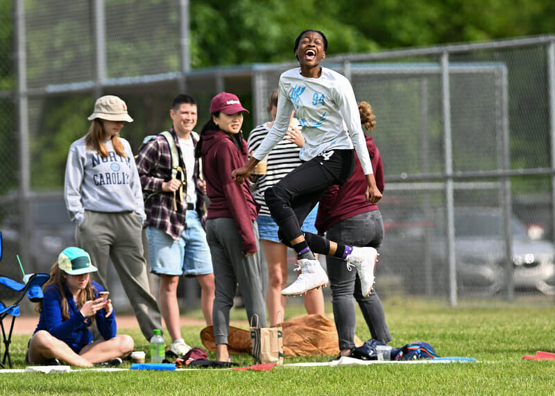
Chicago’s design itself is fairly neutral but the light blue print on a white jersey makes the numbers unreadable.
Carleton CUT Blue (Zue)
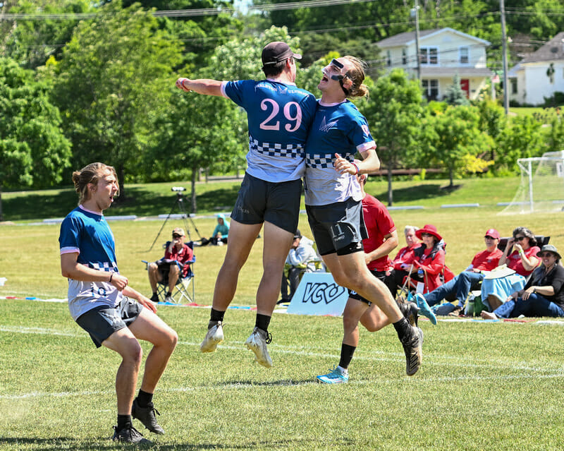
The Carleton CUT pink jerseys are excellent and nearly made the “best” portion of this list, but this jersey is simply a problem. The checkerboard cut off splitting the light pink from the dark blue needs to be either higher (making the jersey a light) or lower (making the jersey a dark). As it is, the look is too 50/50 to provide contrast against other teams.
Interesting
UCSB Burning Skirts (BE Ultimate), Vermont Ruckus (Breakmark), Tufts Ewo Darks (BE Ultimate)
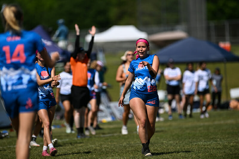
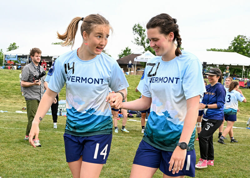
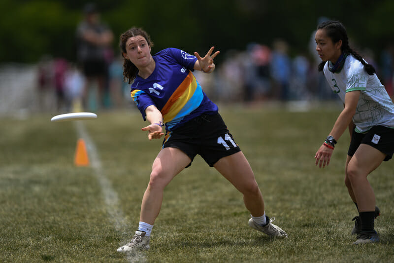
I’m lumping these all together because they’re fun designs with a lot going on. On their own, they’re all pretty cool. I found small design elements to nitpick with each one, but because there is so much going on, it’s tough to dis the entire look, leaving me stuck not knowing what to do with them. Hence: interesting.
Pitt En Sabah Nur Red (BE Ultimate)
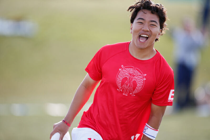
When I pulled up to Field 1 for the first round of pool play on Friday morning, I thought something was wrong. At one end of the field I saw Washington warming up as the schedule indicated, but the other side of the field had a team in red where Pitt was supposed to be. Once I got closer, I realized that for the first time in ever, Pitt was wearing red! The jerseys were clean. They looked great. But it looked so weird seeing Pitt in red that I just had to ask what the story was.
As it turns out, there’s an incredibly wholesome reason why Pitt would deviate from their typical gold and blue color palette: Singapore national team player Aaron Toh is completing an exchange at Pitt this semester. Though he is only with the team for a few months, he has made such an impact that the team decided to honor him by wearing the national color of Singapore at the College Championships.
Minnesota Grey Duck Orange (Lululemon)

I like this jersey. I like the color. I like the font. I can even get behind using “SOTA” as the abbreviation rather than the more traditional “MINN”. The font is just a touch too thin to be readable from a distance–particularly troublesome for commentators and spectators. Even with those faults, it’s too good a design to ignore.
And you can; Money Mellon’s rimspike store is still open ↩