The best dressed from this year's Nationals, and beyond
November 3, 2023 by Alex Rubin in Other with 0 comments
Ultiworld’s coverage of the 2023 Club National Championships is presented by Spin Ultimate; all opinions are those of the author(s). Find out how Spin can get you, and your team, looking your best this season.
For the second straight year, I’m impressed with the overall level of design. It seems like we are well past the era of fully sublimated nightmares. While there was plenty of on-field activity to generate headlines, I definitely heard some chatter about what teams were wearing. At the end of the day, only one team can win a championship in each division, but everybody can look good. Here’s who stood out in San Diego.
The Best
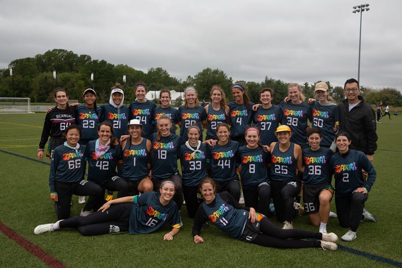
Washington DC Scandal charcoal (VC) – Scandal made the list last season with their colorful white jersey design, and they make a repeat appearance this season because I just love the graffiti font on their charcoal jerseys. It seems like no other team has figured out how to use so much color as well as Scandal.
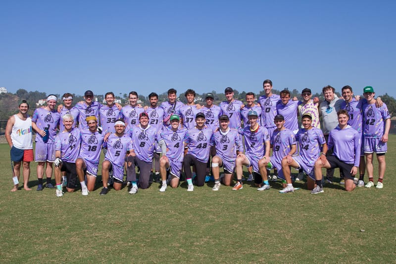
Virginia Vault lavender (BE) – I’ve had these shirts on my list since before they were released (shoutout to the team for giving me a little preview). Lavender is a great color and the Rugrats-themed color marks add the right amount of flair.
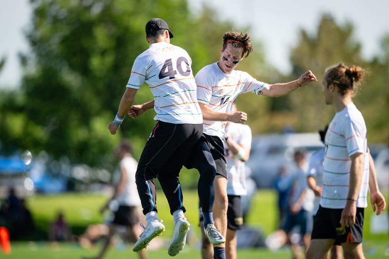
Portland Rhino Slam! white (Zue) – Those of you who follow this column know I think white jerseys should have enough design elements to be interesting, but not too many as to overwhelm. These jerseys hit the nail on the head and are probably my favorite of the year. If anyone on Rhino is reading this, please get in touch to let me know how I can trade for or purchase one of these.
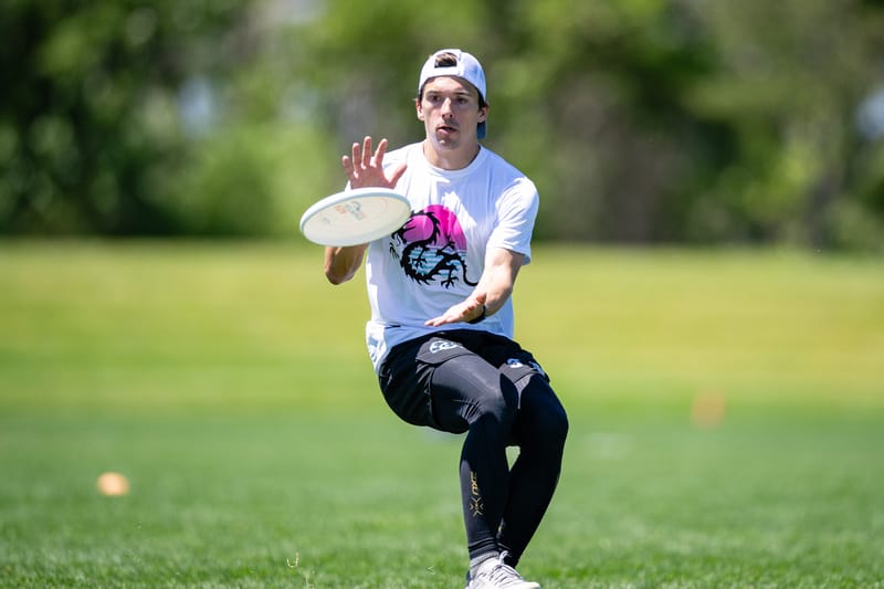
Minneapolis Drag’n Thrust white (Spin) – I love the beach vibes that emanate from these jerseys. It’s always nice to see a little San Diego coming from Minnesota.
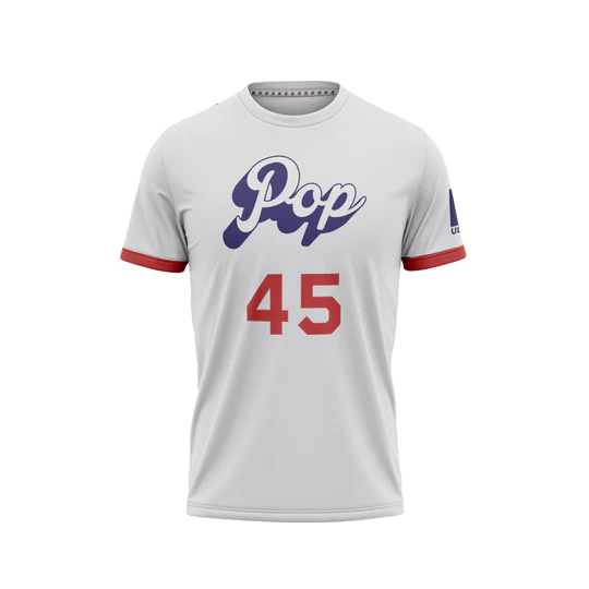
Minneapolis Pop white (BE) – I hadn’t seen these jerseys before they caught my gaze from a few fields away on Thursday morning. I really enjoy the way the wordmark pops; it’s fun to see the team name and design match.
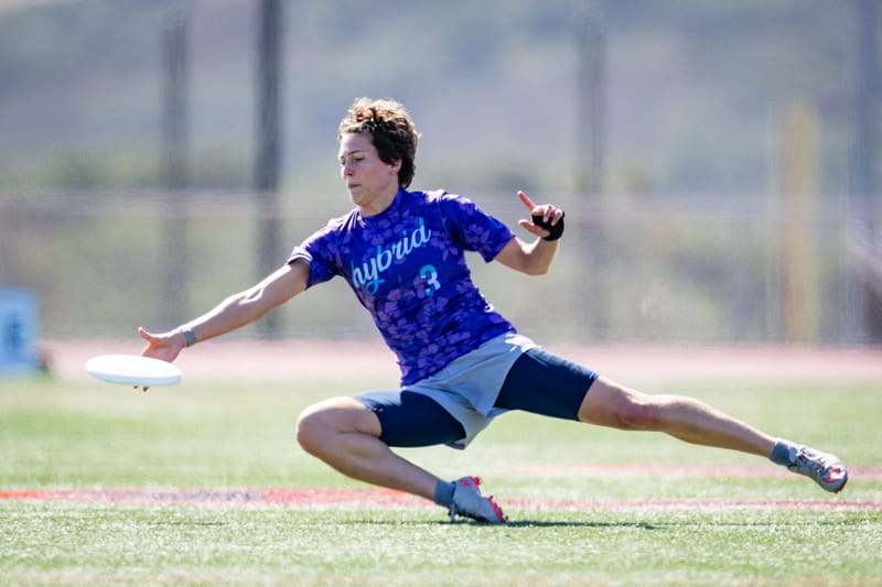
Ann Arbor Hybrid purple (Alt) – These have grown on me since they were released last season. The sublimation is subtle enough that the overall design is not too busy and the purple/teal combination is maybe the best in the game.
The Worst
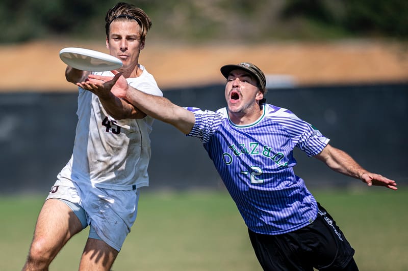
Minneapolis Sub Zero purple (BE) – There’s too much to talk about here. The upside down word mark. The lack of contrast between the purple/blue striped background and the green numbers. The strange chevrons on the sleeve. Whatever drip a young Sub Zero team was aiming for…this isn’t it.
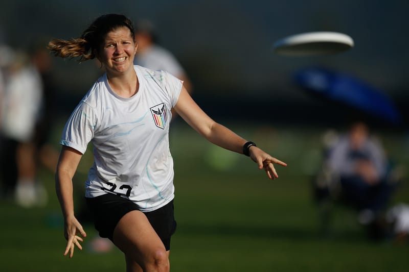
San Francisco Nightlock white (Alt) – This jersey does feature more than just the team crest, which is a great design in and of itself, however the random squiggles around the shirt seem out of place and don’t really do much to take away from what is generally a boring shirt.
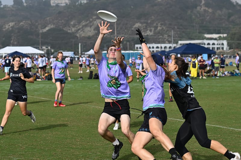
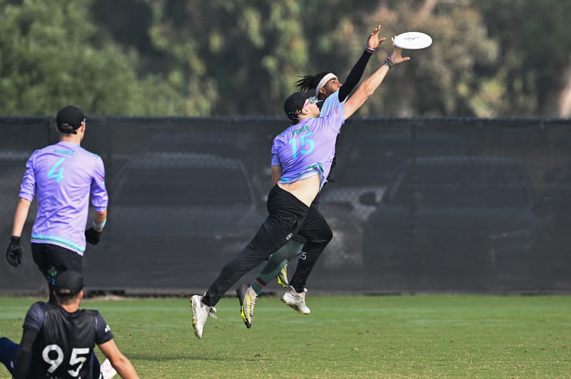
Cleveland Crocs purple (BE) – The crocodile is a S-tier logo, and I hate that I’m hating on another purple jersey because it’s my favorite color. However, these jerseys (specifically the numbers) are just too hard to read to be effective.
Most Interesting

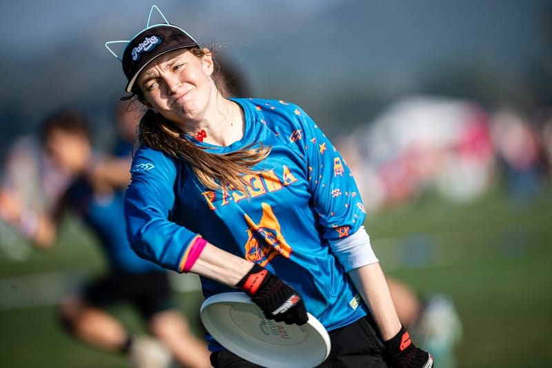
Pittsburgh Parcha blue (VC) – The ransom note design is fun. The knick-knacks on the sleeve are also fun. Put together, it ends up looking a little busy, so I hesitate to call this shirt among the best in the division, but I appreciate the creativity for sure.
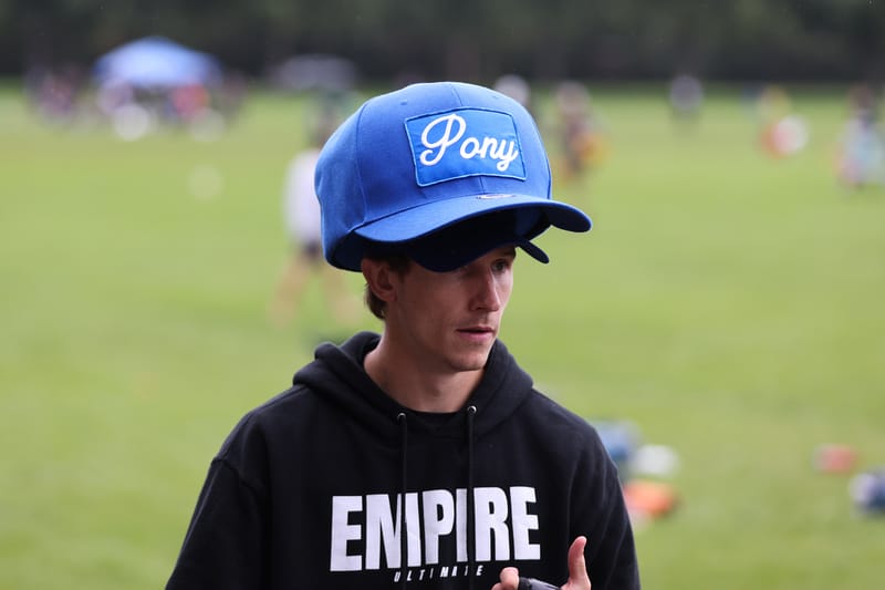
New York PoNY Big Hat – I’m a big fan of interesting sideline props, and the wearable ones bring the prop game to a whole new level. Wonder how many point blocks somebody could get wearing this…
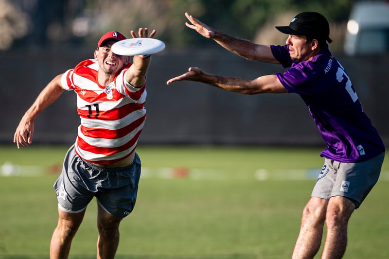
Chicago Machine Where’s Waldo (DH) – The Machine white jersey was a tribute to longtime captain Walden Nelson, and it feels like their dark jerseys (which are reminiscent of Waldo from the Where’s Waldo cartoon books) are in the same boat for a different reason. These are divisive for sure.
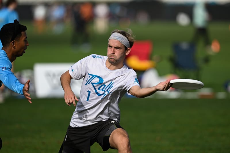
Washington DC Rally white (Boon) – On its own, this jersey isn’t that interesting. It has a creative wordmark, taking the three stars from the Washington DC flag. What’s notable here is that Rally wears the same jerseys each year, save for the left sleeve. The similar design is an effort at saving players money, as they don’t need to buy a new jersey each season. The one difference is the year a player joins the team is sublimated onto that left sleeve, so the team has both a sense of unity in their jerseys and a tangible representation of their “draft class” that can instill pride. The players who are original members of the team certainly got a kick out of wearing their 2018 jerseys at Nationals.
The Best Jerseys from Teams Who Did Not Make Nationals
Bonus Content for Best Jerseys of the 2023 Club National Championships is only available to Ultiworld Subscribers
Already have a subscription? Log in
Whether you visit Ultiworld for our reporting, our podcasts, or our video coverage, you can help us continue to provide high quality content with a subscription. By becoming a subscriber, not only do you receive benefits like bonus content and full article RSS feeds, you also help fund all of Ultiworld's coverage in general. We appreciate your support!