On the ninth day of Christmas Ultiworld gave to me...jersey designs teams across the country submitted for praise, ridicule, and helpful suggestions from our resident design expert.
December 20, 2023 by Alex Rubin in Preview
Ultiworld’s coverage of the 2024 college season is presented by Spin Ultimate; all opinions are those of the author(s). Find out how Spin can get you, and your team, looking your best this season.
It’s time to unwrap some presents as we introduce the 12 Days of College Ultimate. For the next 12 days, we will be releasing one gift per day, though don’t count on getting any holiday fowl: it’s all college ultimate. From highlight videos to player chatter to a season predictions, we’ve got a little something for everyone. On the ninth day of the 12 Days of College Ultimate, Alex Rubin reviews some of the college jersey designs teams sent in to Ultiworld, and potential room for improvement.
Last month Ultiworld asked teams from across the country to send in their in-progress jersey designs ahead of what is sure to be a beautiful 2024 season. Thank you to the brave few who replied and opened themselves up for judgment and suggestion. As we all work to make our beloved sport as aesthetically pleasing as possible, feel free to continue to reach out and make my life harder in the spring when I get to sort through hundreds of designs to select the best jerseys of the season.
Before we dive into the designs themselves, I’ll offer a holiday gift to all designers reading with some general advice. The first step is to pick your base. That can be a color or white, but it sets up the rest of the design. The most important thing about picking colors is making sure you have at least two jerseys that are not similar in base color. Wearing a pale yellow or lavender purple “dark” might not offer enough contrast against a team wearing white. Make sure that if one of your jerseys come in contrast with the other team’s, you have a second option.
One other important thing about the color–it’s important the jersey represents your team. For some teams that might mean following school colors (Oregon’s and Pitt’s men’s and women’s teams all do a great job with their school’s standard athletic department color palette) while others differentiate themselves from the school but still carve an identity for themselves (think about the Wisconsin Hodags commitment to baby blue or Emory Juice’s latest pop culture inspired design). Whether through the colors, logo, or other design elements, make sure it would be clear to someone who walks by what team your shirt is for.
To the artists who work for the various jersey design companies around the ultimate community and those who make their own designs as a team, a jersey can feel like a work of art. It takes a specific craft and balance to get right. That being said, it also has a utility to perform and the main way a jersey does so is by having numbers to identify players. Jersey numbers need to be big enough to be easily readable and printed with enough contrast from the main jersey for the same reason. If a jersey doesn’t do that, it’s not worth wearing.
Beyond color and numbers, the rest is up to the design team. I personally prefer my jerseys to have a little bit of flair…but not too much. I want to catch people’s eyes, not burn them. As I look at the submitted jerseys, I’m looking for interesting features and I’m looking for balance. Sometimes having some blank space is okay.
As one more thing before we look at the submitted designs, here’s a bonus tip: have a team store. Allowing friends, family, alumni, and supporters to buy your jerseys shows off some pride in your design. Some companies have fan stores built right into their websites so others can buy jerseys directly, easing the process. Whether you’re able to go that route or if you need to set up a Google form order yourself, the chance to bring in some fundraising dollars from jersey (and other merch) sales is usually worth it.
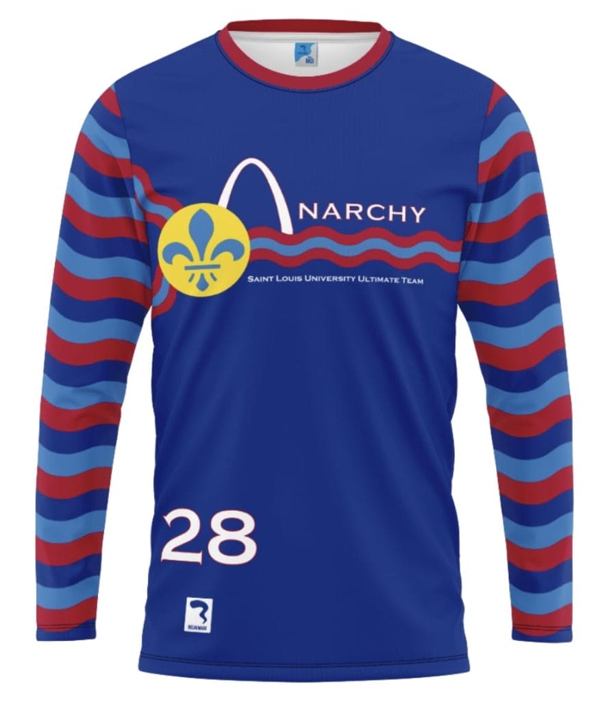
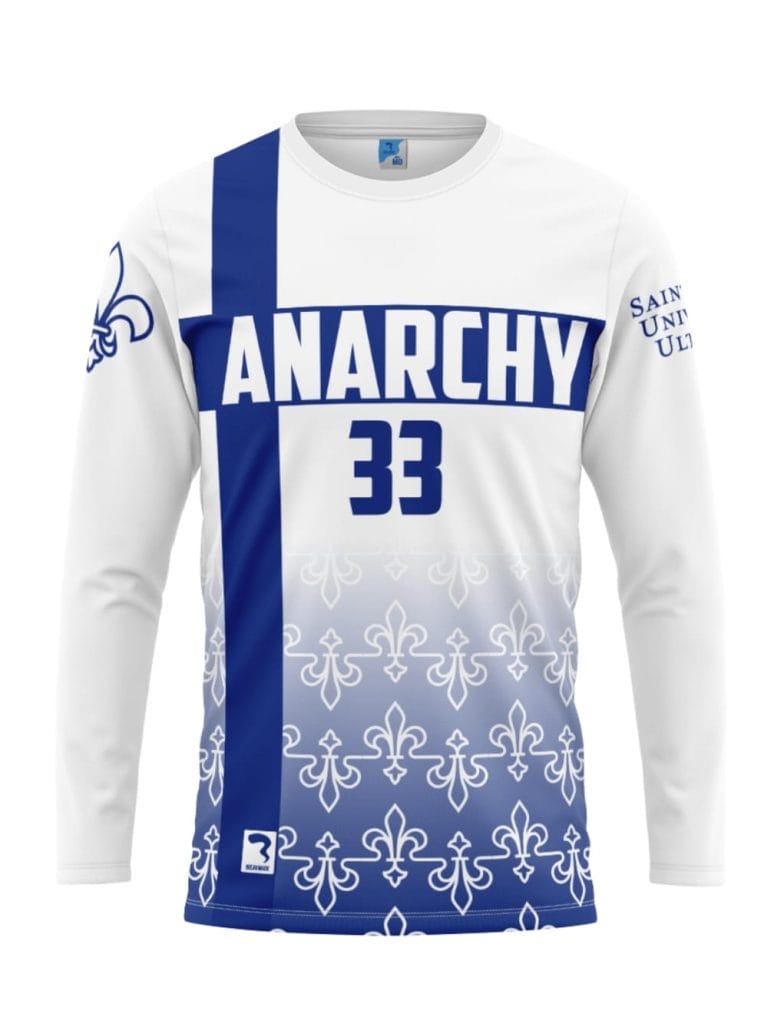
SLU Anarchy (Breakmark)
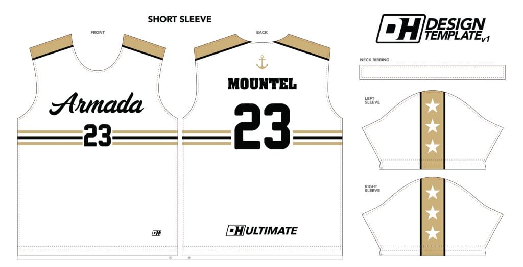
Vanderbilt Armada (Double Happiness)
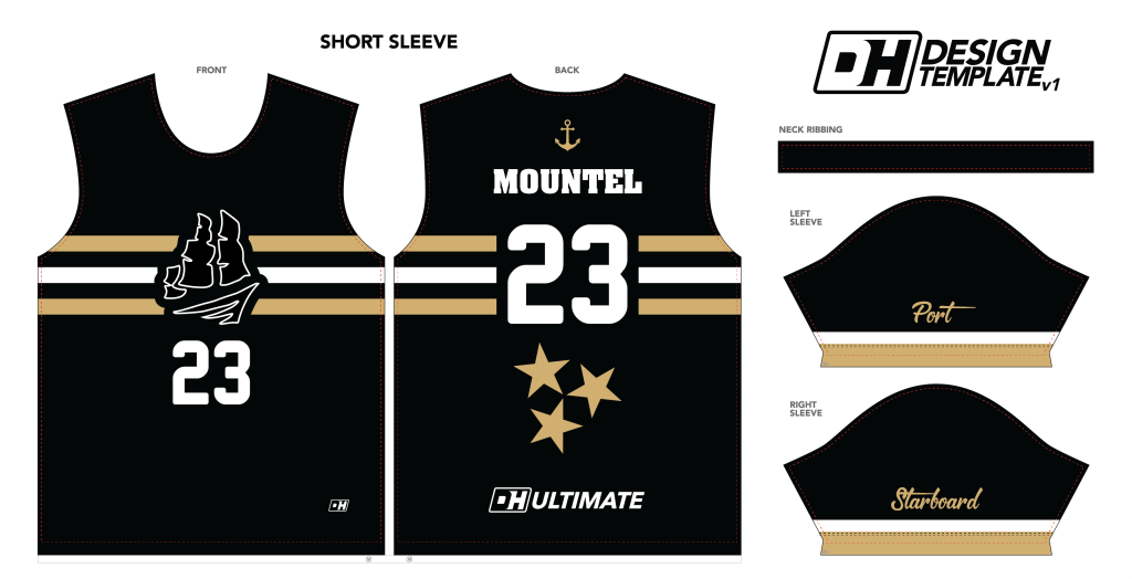 Last time I played against Vanderbilt I got brutally arm tackled while trying to start a breakaway, so I tried hard to find something not to like about these jerseys, but they’re very well designed. The team logo is featured prominently and sized well. Multiple colors are incorporated with good balance. The numbers are large and readable. There’s a nice local touch with the three stars of the Tennessee flag on the back. They even added a bit of humor with the port and starboard designations on the appropriate sleeves. 10/10 no notes.
 I like that the lights are not the same as the black shirts but feature enough design continuity to clearly be a set. The horizontal stripes on the shirt are the main linking feature and they look as great on the white as they do on the black. I worry a little bit about the contrasting shoulder stripe that slides down to the sleeve. Despite jersey manufacturers’ best efforts, these often get misaligned when sewn together across the shoulder seams and that bothers me.1 I’d consider keeping the flag-inspired star cluster from the back of the black jerseys as a sleeve design rather than trying to line up stripes across the seam, or perhaps modify the stripe to be a horizontal stripe at the base of the sleeve.
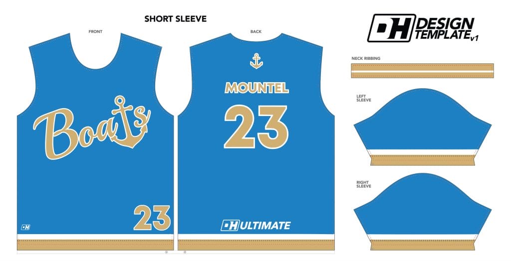 This is a fun injection of color to a team that otherwise features a lot of black and white. Using the anchor logo as a T is creative, as is the “boats” moniker to replace Armada, which is…a fleet of boats for those who didn’t know. The jersey does end up with a UCLA vibe given the colors, but I respect using blue to represent water even though it doesn’t have a natural connection to the school like the black/white/gold combo does. The other topic this jersey brings up is the lower corner front number. This jersey isn’t the only one on this list to feature such a placement, but it stands out given the relative dearth of other design features. I’m not a fan of putting numbers there. The whole point of having front numbers is making players easier to identify, and this part of the jersey is easily covered by a players’ hands dangling at their side or tucking the jersey in. I’d think about moving the boats wordmark down and putting the number in the upper left corner rather than the lower right.
Johns Hopkins Dangerzone (BE)
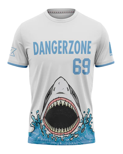
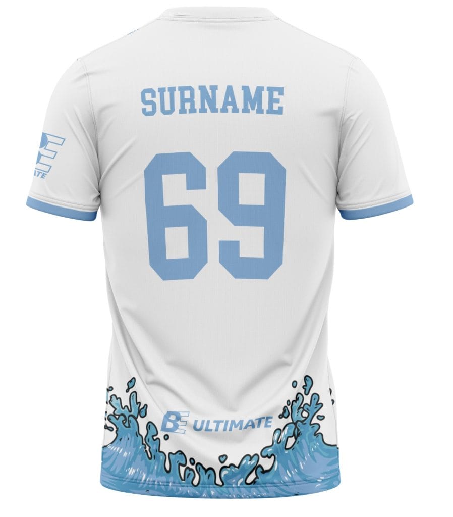
The shark is the main feature here. I like that the design team added the splash of water and it carries around the whole circumference of the shirt. I like that enough of the shark is white or light gray and it doesn’t take away from the contrast that a white jersey is supposed to provide. Putting the number as a right-align rather than centered makes sense so it doesn’t look like the number is coming out of the shark’s nose. The font is pretty plain; I’d consider using the interlocked wordmark from the team’s logo (you can see a glimpse of it on the sleeve) to liven it up. Lastly, I’d make the words and more importantly the numbers just a bit darker. I know Johns Hopkins uses the powder blue, but it’s going to be tough to read those numbers on a white jersey. Even a dark blue or black outline would help just like the wave has along the bottom of the jersey.
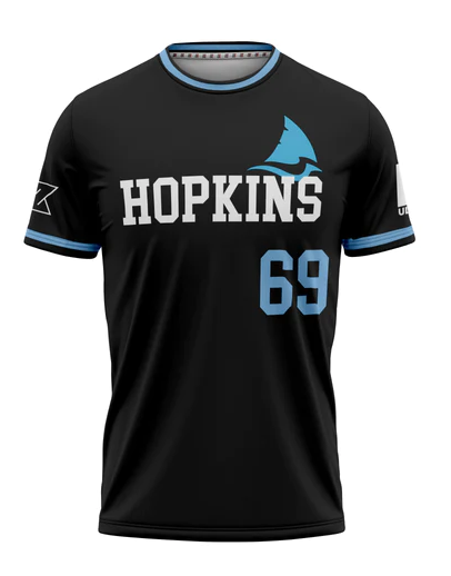
The first thing that caught my eye on the darks was the chest logo. It’s pretty clever, combining the blue jay of the school’s varsity sports teams with the shark fin of the ultimate team. I don’t really know why the wordmark is overlaid on top of it; I’d shift the wordmark down a bit to give everything its own space. The design is simple enough that it doesn’t need to look squished. I like that the collar and sleeve stripes are consistent. The light blue numbers look much better on the black jersey than the white one. The jersey overall does lack some pizzazz; maybe a thin wave pattern would add some texture and bring a thematic bridge between the jerseys.
Lastly, and this is a bit nitpicky, I’m conflicted about leaving just “Hopkins” on the front. That is what the school’s varsity teams do, and most people around the east coast refer to the school just by that name rather than the fuller “Johns Hopkins.” However, I did look at the jerseys before I looked at the sender’s email address and thought that they came from the Hopkins High School team in Minnesota. I imagine the Venn diagram between players associated with those two teams is small, but I’d consider either changing the wordmark to Dangerzone again or using the full Johns Hopkins just to differentiate a bit more.
Macalester Flat Earth (Zone)
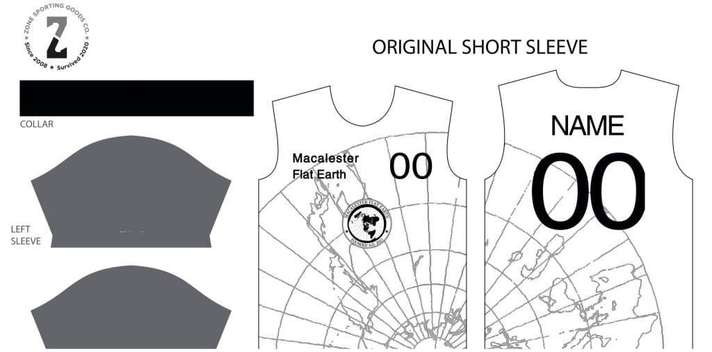
This design is well inspired but has a few flaws. First the good: for a team called Flat Earth, the globe outline is wonderful. It generally showcases how to make a fully sublimated design work with a white jersey. Now for the potential improvements: first, there is no reason for the team to have a logo and wordmark that just repeats the words prominent in the logo (especially with the already repeating globe motif). I’d replace the upper chest wordmark with the logo from the center. Better yet, center the logo just a bit bigger and move the numbers underneath to help balance the jersey. The team’s collared jerseys do just that albeit without the number. With both the logo and number on top, it might look a bit top-heavy. The back has readable numbers…but it looks like the right edge of the number is cut off. I’d make sure both numbers fit inside the printing zone so nothing gets missed, otherwise it would look quite sloppy. Now to the sleeves and collar. Contrasting sleeves can be good or bad. When Arsenal does it, it’s cool. When they’re gray (the most hated color in ultimate), I just have to ask why. I don’t really think they take away from the jersey, but they don’t really add anything to me. I’d consider making an alternate logo to put on the sleeve or finding a sponsor to put a logo on there (and make some money for the team). The reversibles the team wore last season are incredible, so I know there’s some creativity in your team.
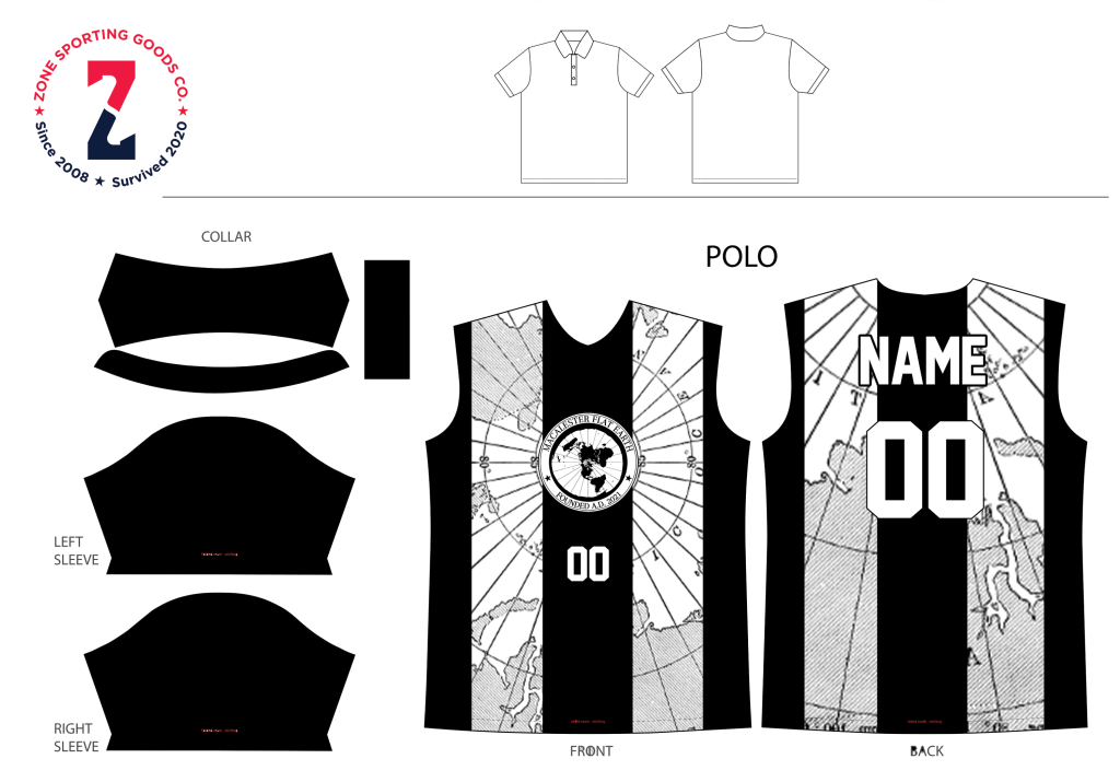
This is similar enough to the white jersey that I’m not sure the team needs both. I like the way this logo plays with the latitude lines of the pole, though the thick black stripe negates a bit of the impact. My initial thought is that the stripes are not sized correctly. To better mimic a referee jersey, the stripes should be thinner and there should be more of them. To actually function as a dark jersey, the stripes should just take over the jersey to make the base color black. I really don’t like how the name and number extend past the black stripe to create a white-on-white appearance. I recommend using a black base, rendering the globe design in really thin white or grey lines, and making the numbers larger and solid white.
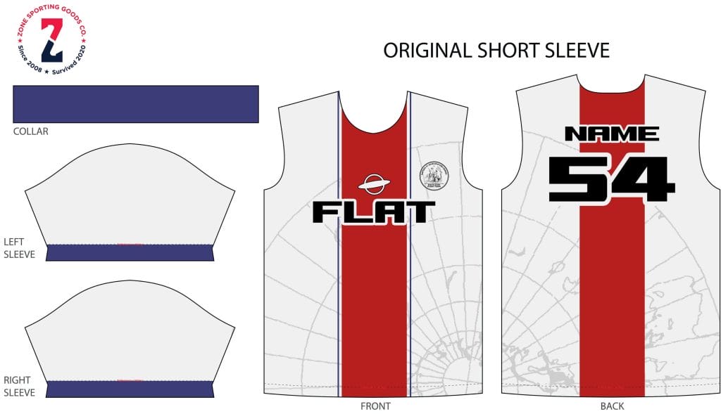
This jersey fixes some of the problems I see in the other jerseys above, but let’s start with the fact that it’s another jersey with a white base color and I’d recommend having at least one jersey that is different. When you inevitably face a team that only shows up in white cotton shirts, Flat Earth might have a tough game visually speaking.2 That being said, this jersey may be the best of the bunch. It keeps the benefits of the thin globe background but builds in contrast to the wordmark, name, and number. Similar to PSG, who evidently inspired this shirt, I especially like that the red bar is broken when it intersects with words or numbers so that the font has a bit more contrast. I also like the alternate logo above the wordmark. That would be a great logo to put on the sleeve of one of the other shirts to break up the plain single color. To nitpick a bit, I’m not sure why the thin stripes that bookend the red stripe on the front do not continue on the back. I don’t mind the look with or without them, but I think it should be consistent if possible.
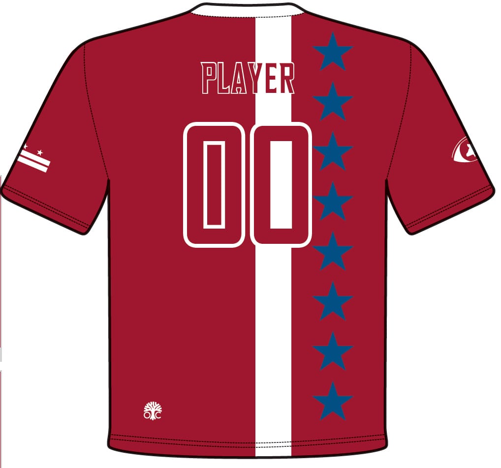
American Stall 11 (Oak Creek)
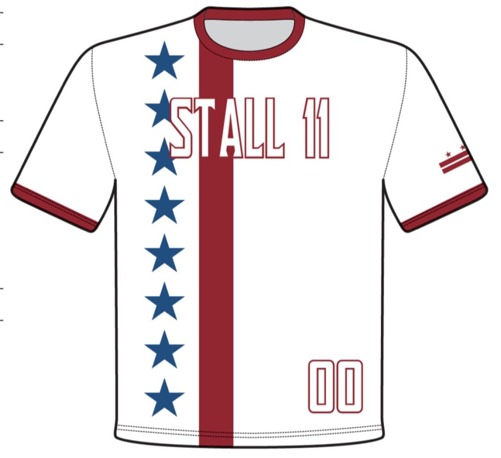
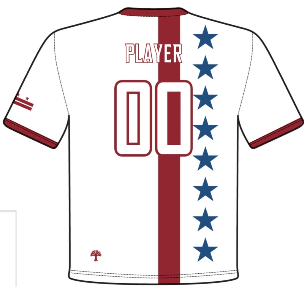
It’s clear where the school is located. With the patriotic symbolism and DC flag on the sleeve, the team has the storytelling element of the jersey down. A few technical notes. I would consider shifting the main design elements (the red vertical bar and the blue column of stars) to the side, maybe even flipping them so the red bar covers the side seam, so they don’t overlap with the words and numbers. The team may need to shrink the stars to get rid of the overlap, but I think they’ll still look good. Smaller stars may also allow the designers to fit 11 stars in the column keeping with the team name. These jerseys feel very DC Breeze inspired; the Breeze made this shift for the 2023 season and their jerseys became more readable without the overlap of names, numbers, and wordmarks over the design. Moving the red stripe out of the way also allows the design to feature red numbers. One of my biggest pet peeves in ultimate is when a jersey’s base color and number color are the same. Even with a thick outline, they’re so tough to read. Moving the red stripe to the side and changing the numbers to red keeps the theming while increasing clarity. To me that’s a win-win.
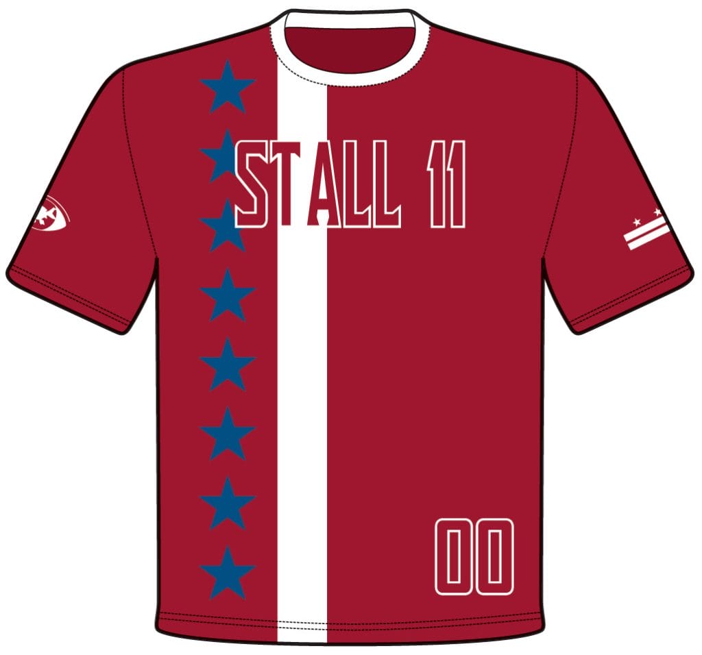
The red jerseys are just a color-flipped version of the white and my advice still applies. I’d recommend moving the white bar to the other side of the blue star column and changing the words and numbers that are outlined into a full white font.
Mississippi State Darkhorse (Alt)
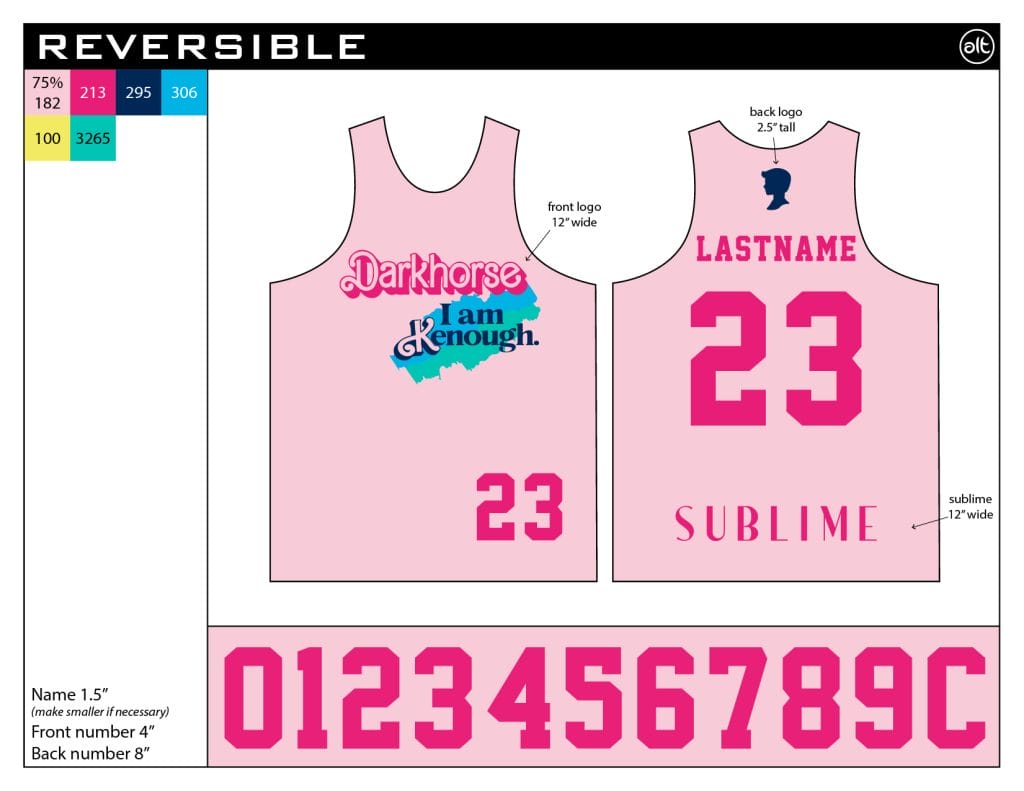
Whenever there is a new pop culture thing, we are sure to see ultimate jerseys replicating it. Remember when the Miami Heat wore jerseys inspired by Miami Vice and then like eight ultimate teams did too? 2019 remembers. Don’t be surprised if more Barbie copycats come out of the screen printing press, but this initial look is as good as it gets. The pink background is light enough to function as a light. The team even provided pictures of the printed reversibles worn in person to show that the numbers provide enough contrast to the background despite being a similar color. The splash of blue and green is a nice touch that is the right amount of pop.
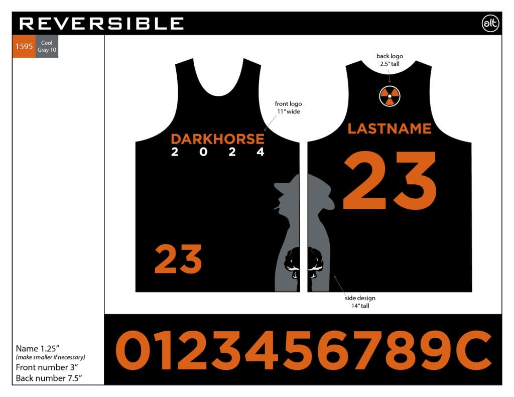
What’s a Barbie reference without Oppenheimer on the other side? I have few notes about these, because they look great. I don’t really see why the 2024 is needed under the team name on the front and adding extra numbers to a shirt that needs numbers on the front for identification feels silly (though not nearly as bad as the Denver Nuggets City Edition set), but that’s really the biggest flaw I can find.
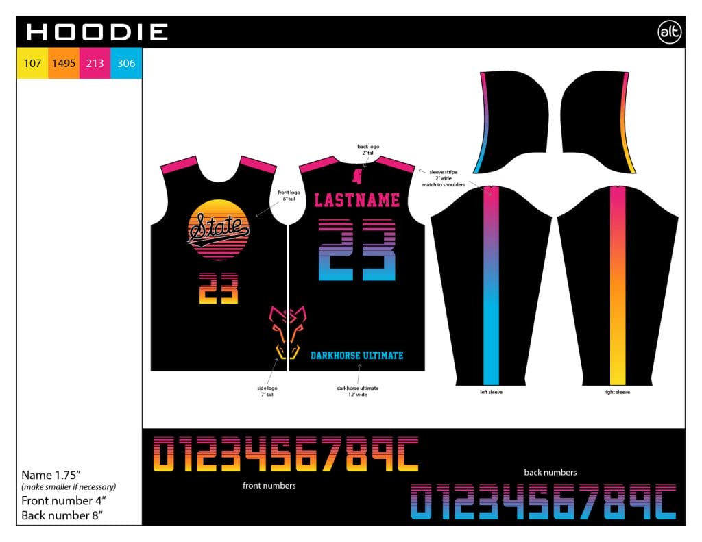
On its own, this design is good. It doesn’t have the same storytelling as the Barbienheimer-inspired reversibles or the cream jerseys, so the Mississippi outline on the back is helpful (though it is likely to be covered by the hood–it might have been better to move that to the sleeve). Maybe they have great sunsets in Starkville. I like how the bright colors play with the black background. The numbers are thick enough that even the stylistic tapered breaks along the top don’t render them unreadable. The logo along the side is a nice touch and rounds out a solid design.
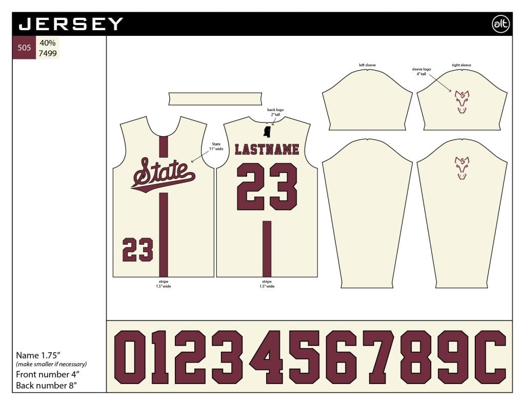
These jerseys are simple and elegant. The combination of the cream color and script font gives these shirts a pleasant throwback feel. The Darkhorse logo on the sleeve and the state outline above the name are great touches to make the jersey more personal to the team without getting in the way of the main design. The vertical stripe adds enough color to keep the jersey interesting without being overbearing. 10/10 when does the team store come out?
Virginia Night Train (DH)
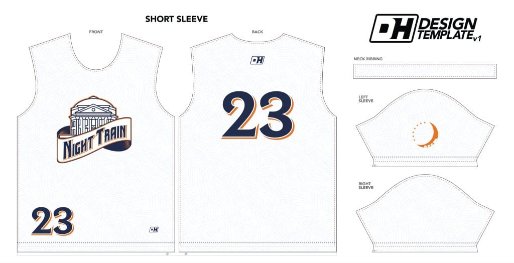
This is great example of how to make an interesting jersey that isn’t overwhelming. Using a school icon and school colors gives off a strong sense of team identity. The way the designer folded in a banner to display the wordmark is excellent. It’s that kind of small touch that takes an ok jersey to a really good jersey. The textured white background seems like a pretty minor design element but it makes a big difference.
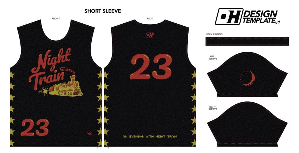
And now for a thematic break. The black jerseys carry over very little from the white, and that’s okay. The color and design schemes feel straight out of a downtown theater in a thriving small city; they really put the night in Night Train. Like the drop shadows on the white jerseys, I love the yellow accents in the lettering and numbers on the black jersey. It’s another small detail that adds something to the look rather than merely being present in the design. The stars along the sides give a nice bit of color to what would otherwise be a boring background, but I can’t help wondering how they’ll look across the seams since they span the front and back of the jersey. I do appreciate that the jersey has the team logo on the left sleeve throughout all three designs. While the rest of the design is tough to connect to the other jerseys, it’s great that there’s some symbolic continuity.
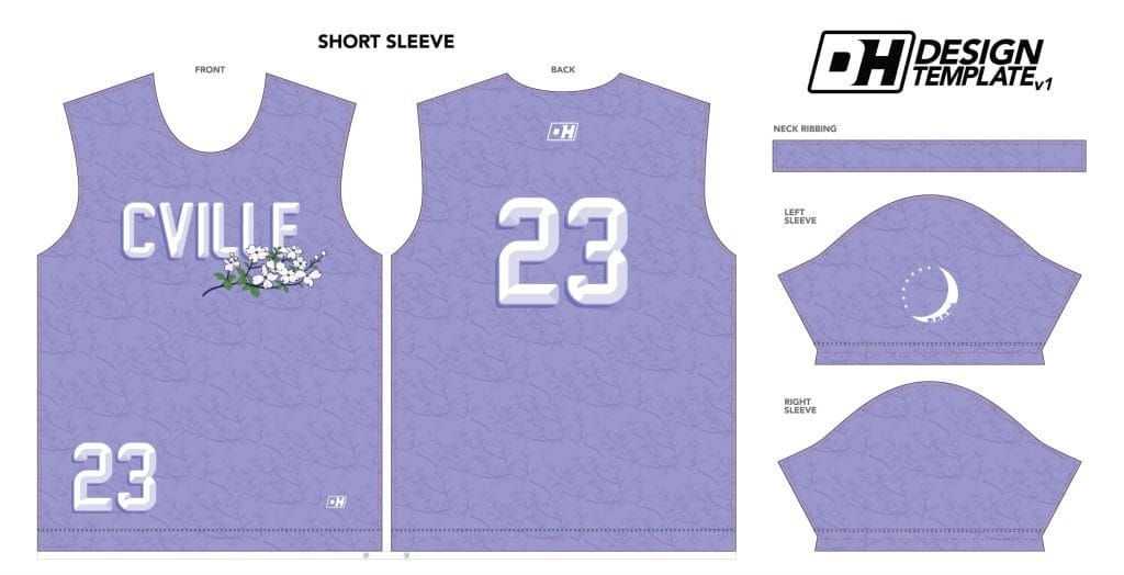
There’s a lot to like here, but I see one major flaw. First, the color is great. There must be some connectivity with the club team Virginia Vault after their lavender shirts made a splash this club season. I like the dogwood flowers as both the central piece of art and a bit of texture in the background. Bringing in the state flower is also a nice touch and a nod to the state university. Which brings me to the flaw: I think the wordmark should say “Virginia” rather than “CVille,” the town’s nickname. When I think of UVA, I don’t think of Charlottesville the same way I think of State College when I think of Penn State or the way that I think of Tuscaloosa when I think of Alabama…it just doesn’t have the same clout in my mind as some other towns. I’m sure Charlottesville is lovely (I’ve never been) for the most part, but I’d stick with the state name rather than a town that hasn’t always been in the news for the right reasons.
This is probably the most interesting set of the jerseys presented here. Each jersey has clear writing and basically one other interesting design element, but none of them really connect to one another. On their own each jersey is great, so I have very few complaints…but it does make me wonder, in a world where branding and identity are a bit more important than they were even ten years ago, if this approach is the best idea. For example, I wonder what it would look like for the black jersey to have orange as the base font color rather than red and blue accents rather than yellow. It would lose a bit of the “nightlife” effect that classic movie theater colors hold, but it would exchange that for school/team colors and the innate pride that comes with wearing something so familiar.
Middlebury Pranksters (BE)
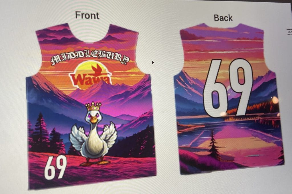
If it weren’t for the random Wawa logo thrown in front,3 I might have thought this jersey is the real deal. The sunset motif harkens back to the pink and purple color palette favored by the Pranksters for a while now, and the goose is just a more detailed version of the mascot the team wore on their jerseys (when they wore jerseys) last season. It’s even wearing a crown, reminiscent of the Pranksters’ logo. Honestly, this is how you do full sublimation. The colors (even the pinks and the oranges) are all dark enough to contrast with an opposition wearing white and the numbers stick out and are legible. It’s also just a gorgeous scene. Opposing players might get distracted by its beauty or stop playing defense to just sit and ponder what their afternoon could be like if they were in a cabin by that lake. Middlebury is close enough to Lake Champlain that even the choice of beautiful background imagery makes sense.
My biggest critique is the choice of font for the wordmark. What could be a “chaotic good” jersey is really just chaotic because they mismatched the animation style of the goose and background scenery with an olde English font that doesn’t quite fit. I would rewrite the wordmark with something a bit more sans-serif similar to the number font. Or if there’s a font the local parks use that might fit the nature theme as well. I’m also curious about the decision to leave the sleeves white and blank save for a BE logo (which is totally fair game, especially considering that BE didn’t put their logo along the bottom of the back like the company usually does).4 Using pink or one of the other sunset-y colors would have been my first instinct. Switching from the busy jersey to empty sleeves is too jarring for my taste and I’d recommend exploring other options.
Minnesota Grey Duck (MS Paint, presumably)
This jersey was submitted by someone who is not actually affiliated with the team, and is pretty clearly a joke. Seeing as they went through the time and effort to make it, and with an offseason of time to fill, I didn’t mind spending a few minutes looking it over, but please take this review with the humor it was intended.
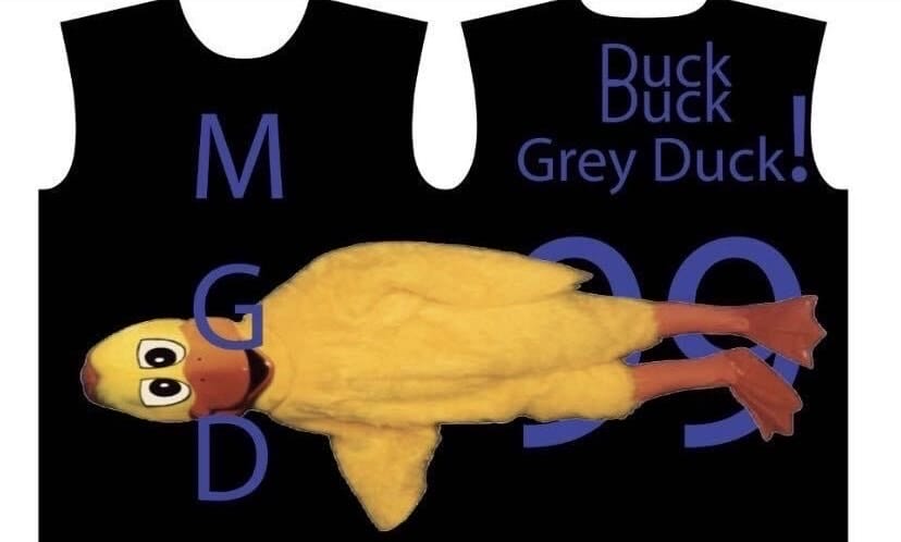
First thing’s first–Minnesota should stop using the MGD wordmark. The team does this on their actual jerseys and I understand it’s the team’s initials…but nobody calls them MGD. For someone who doesn’t follow college ultimate that closely, it’s impossible to tell who the team is. That isn’t the obvious flaw in this design; putting the duck image on top of the numbers renders this design useless as a jersey (and to comply with USA Ultimate regulations there should be numbers on the front too). The numbers are also too dark to be seen easily regardless of the placement of the duck; I’d make them lighter. I’d also consider rotating the duck to stand upright and keeping it on the side of the jersey between the team name and the number on the back. If you can find a jersey manufacturer that only has one seam (some make fully sublimated shirts this way while others produce the front and back separately and then stitch them together with a seam on each side) you can print the image pretty clearly with today’s technology. The designer could also bring the duck to the front alongside the vertical team name (which reminds me of some choices among the classic Windows 03 Word Art collection). One thing that actually might be worth keeping for UofM: the Duck Duck Grey Duck “name” on the back. Too few people know about the Minnesota variation of the classic children’s game duck duck goose (it’s the same game, but for some reason in Minnesota they say “Grey Duck” rather than “Goose”) and having the full call out written on the jersey adds a storytelling element to the team name that’s otherwise missing.
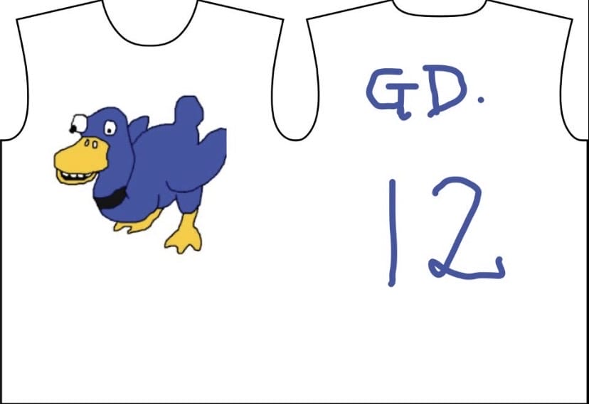
So shame. wins a national title and now periods are in. Okay. I guess I can live with that as an add on to the name-on-back. I’m already on the record saying that handwritten fonts do have a place on jerseys if done properly.5 So there are some things that are usable on here. The duck the designer chose to adorn the front of this jersey is…a choice. It’s a bit scary with the pupil falling out of one eye and the mouth worryingly left open as if it’s about to bleat out a dire warning. If the designer wants tips on how to incorporate water fowl into their jerseys, they could look a few miles south down Interstate 35. The St. Olaf Bezerkers did a great job with their 2023 set.
This is not meant to be a dig at any one company in particular–just something I’ve noticed across the years as someone who designs a good amount of jerseys ↩
Side note to teams that do the spray paint cotton t-shirt thing: it’s cool and all, but make sure to bring a dark too ↩
Middlebury, if you’ve actually managed to secure a Wawa sponsorship, please let me know how you managed to get a regional convenience store chain to sponsor a team about 300 miles away from its nearest location. We need to know for the financial future of the sport. ↩
Editor’s note: Middlebury also provided a jersey template showing white sleeves that was far too small to see when added to the article. ↩
See last season’s look from Mount Holyoke Daisy Chain ↩