We already know who played the best, but who looked the best?
June 8, 2024 by Alex Rubin in Opinion with 0 comments
Ultiworld’s coverage of the 2024 college ultimate season is presented by Spin Ultimate; all opinions are those of the author(s). Find out how Spin can get you, and your team, looking your best this season.
All around, this year’s set of College Championships were just fantastic. In D-I, it felt like we saw a record number of close games. Sunday’s bracket was as electric as it could safely be in the conditions. A heavy downpour drenched the fields, but couldn’t dampen the spirits and willpower of this year’s competition. In D-III we watched new competitors emerge as the talent level in the division continues to deepen.
Among all of that, the college teams in attendance at both events by and large looked great. With increased media attention, it seems teams are paying more and more attention to their branding and design. There were many good options to choose from, but here are the best and worst jerseys that graced the college division this season.
Division I
Best
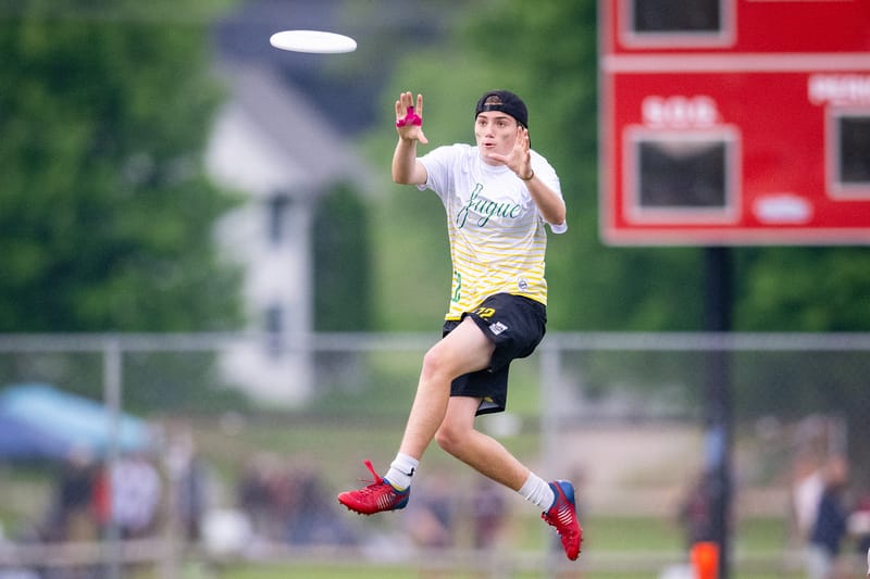
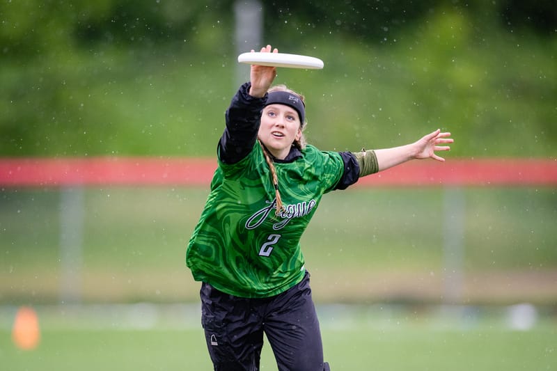
Oregon Fugue Set (Spin) -I’m not sure why Fugue consistently play in fun designs and Ego gets stuck with slapping the school name on a shirt, but these stand out for their bright color and playful swirls.
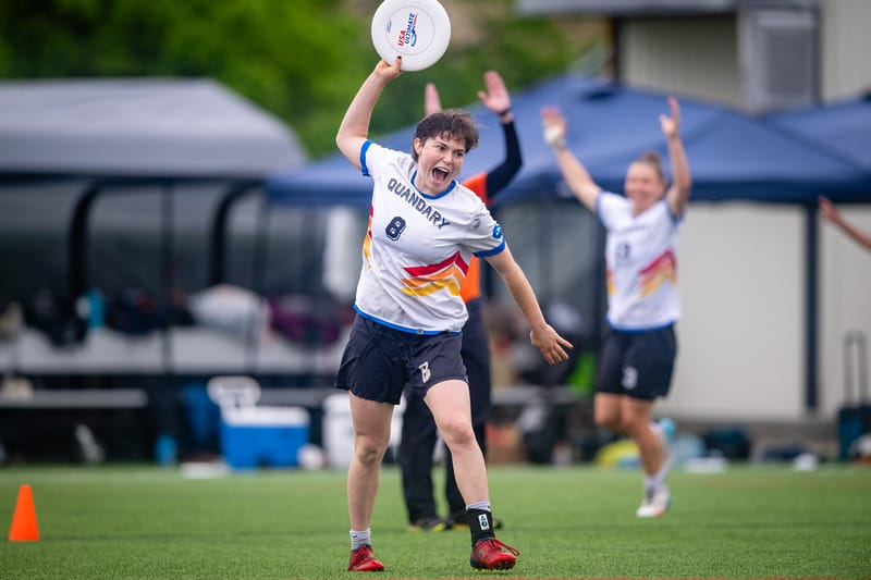
Colorado Quandary (BE) – Colorado revamped their white jerseys with a fun retro design. The drop shadowed wordmark and number are pretty unique in ultimate right now, and the blue accents really bring the design together.
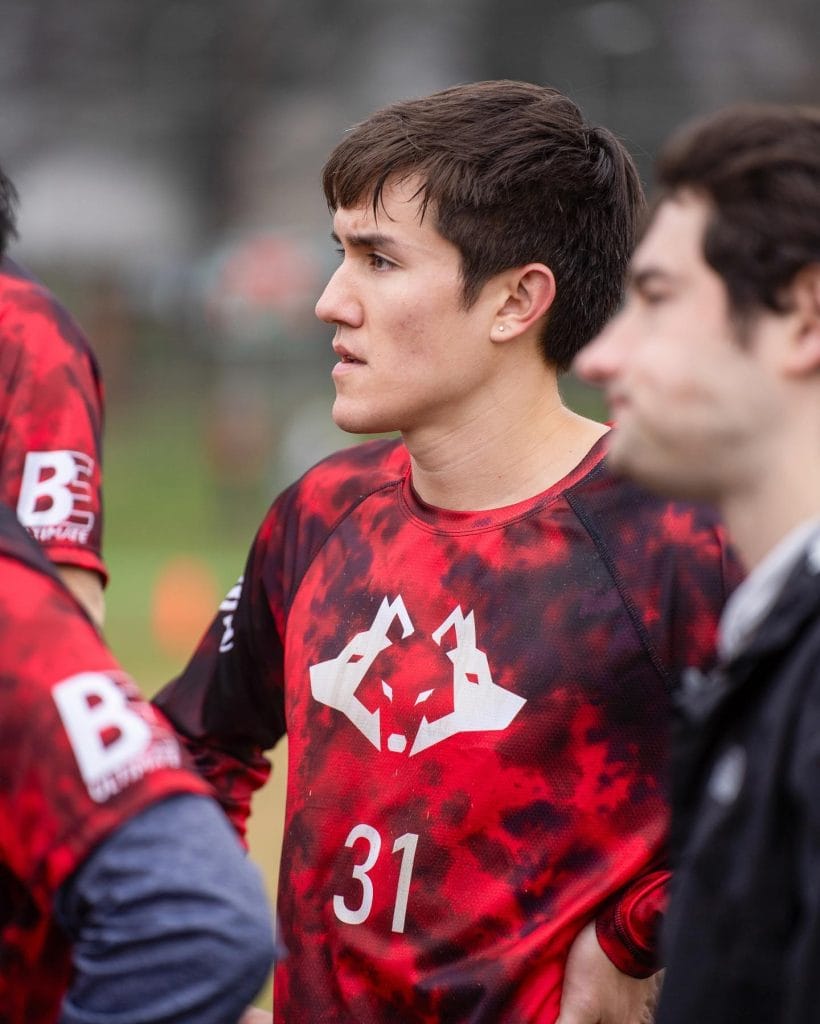
NC State Alpha (BE) – Can’t decide if you want to be a red team or a black team–just be both! I like the playfulness in this mashing of colors compared to a more simple striped design or something like that.
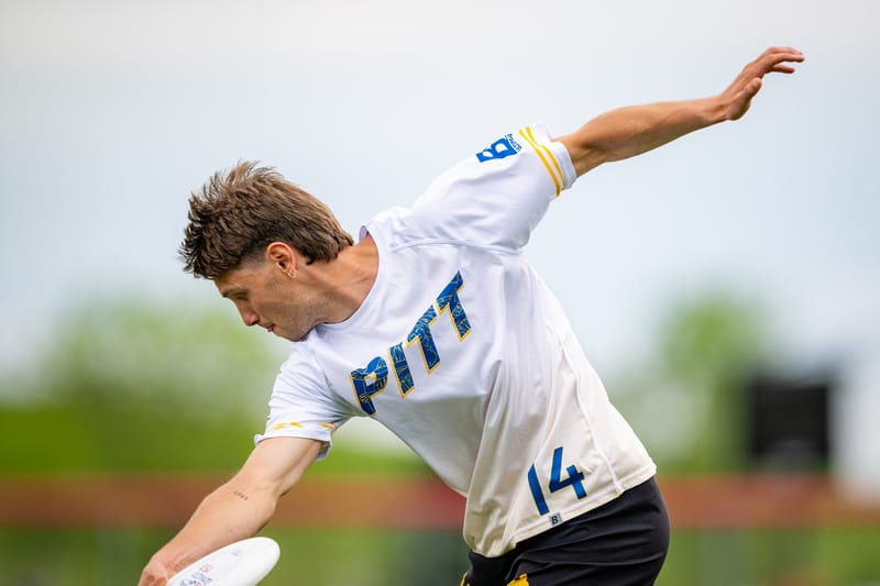
Pittsburgh En Sabah Nur (BE) – This jersey is a nice combination of throwback (the logo cut into the wordmark) and new elements (the Cathedral of Learning pattern along the bottom). The gradient is still light enough to pass as a white but dark enough that the pattern is clearly visible. I definitely have some questions as to why a team needs two separate white jerseys, but these are very well designed.
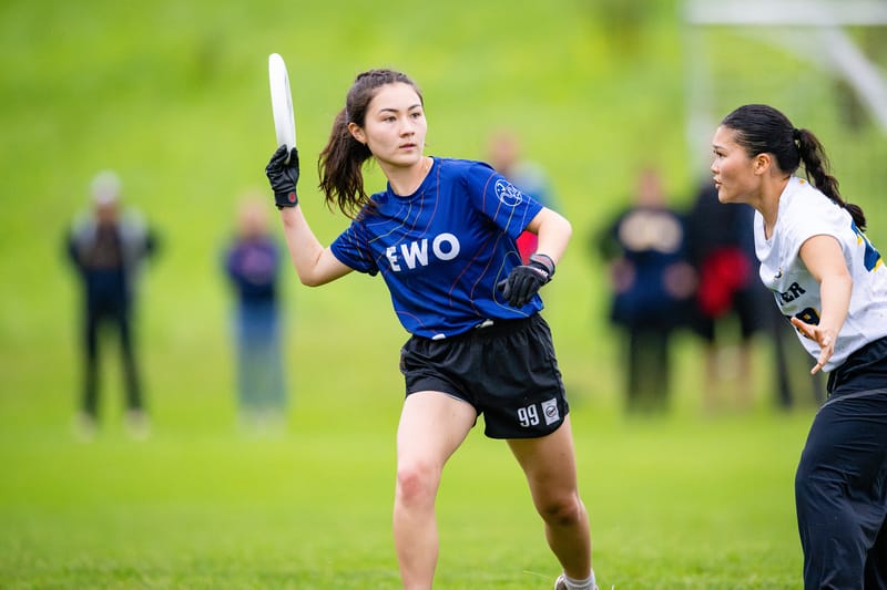
Tufts EWO (Spin) – Thin bands of color brighten up what would have been a pretty boring design otherwise. This is a great example of subtle design choices elevating a jersey.
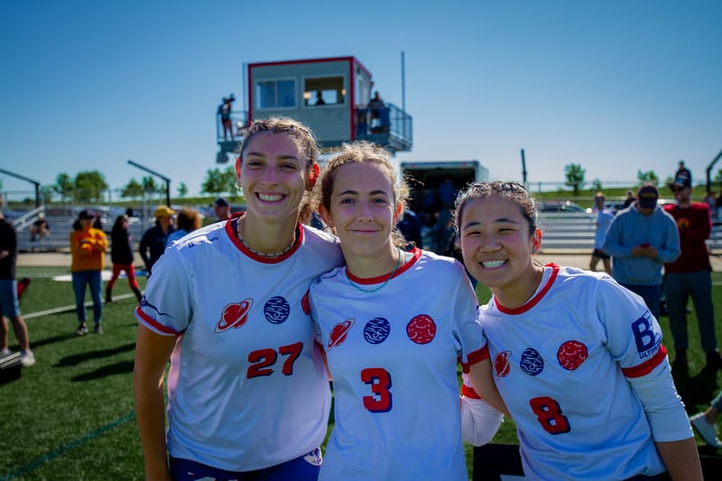
Carleton Syzygy (BE) – Syzygy describes an alignment of planets, and Carleton Syzygy have a fun show-don’t-tell feel to these shirts. The big numbers and good contrast help as well.
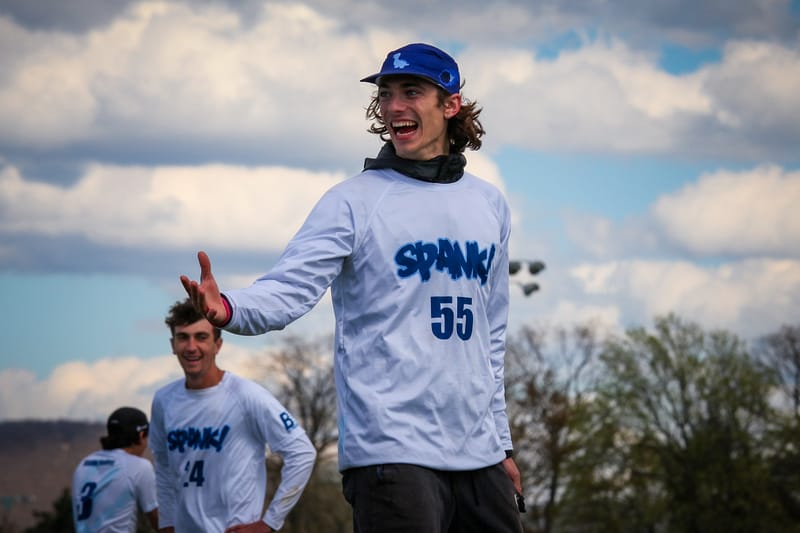
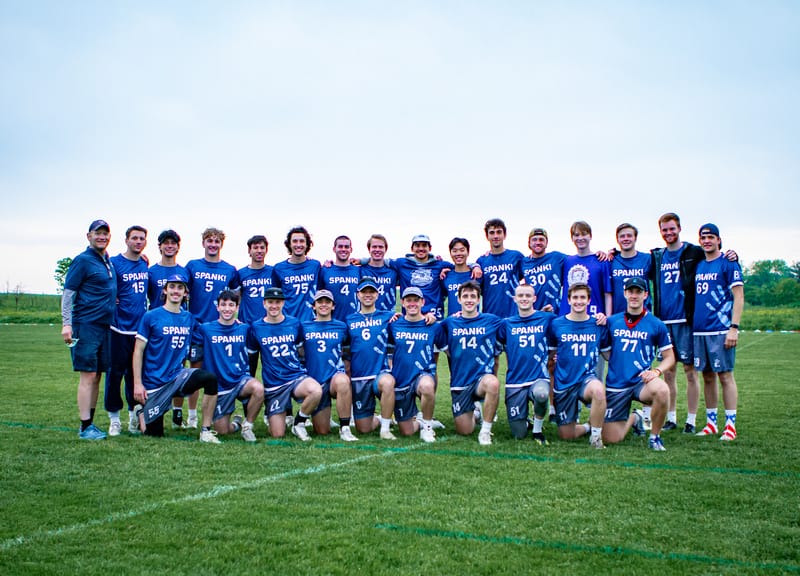
Penn State Spank (BE) – Team jersey designers take note: this is an excellent use of full sublimation. Spank get their logo in a prominent place, but it isn’t overwhelming or distracting. Great work, and I love the wordmark font.
Worst
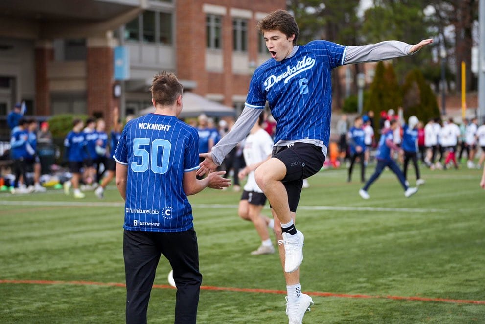
North Carolina Darkside (BE) – First of all, pinstripes are getting overused at this point. More importantly, what’s UNC doing making a jersey out of Duke colors!
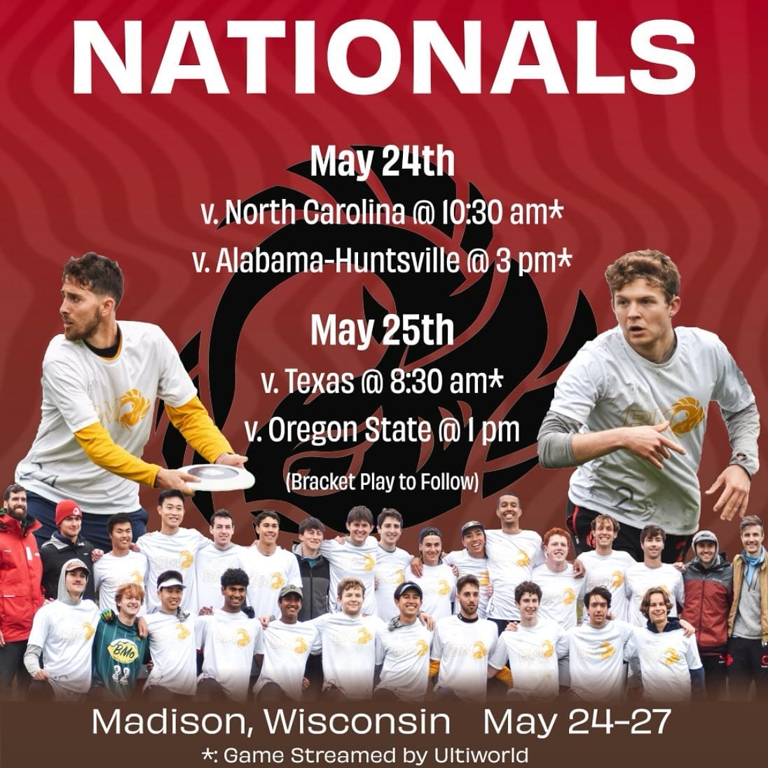
Brown Brownian Motion (DH) – I’m happy that Brown brought back their Del’s Lemonade alternates. Those are among the best in the division as I pointed out last season. These, however have words and numbers too thin to read easily. The yellow logo on a white background also causes some eye strain.
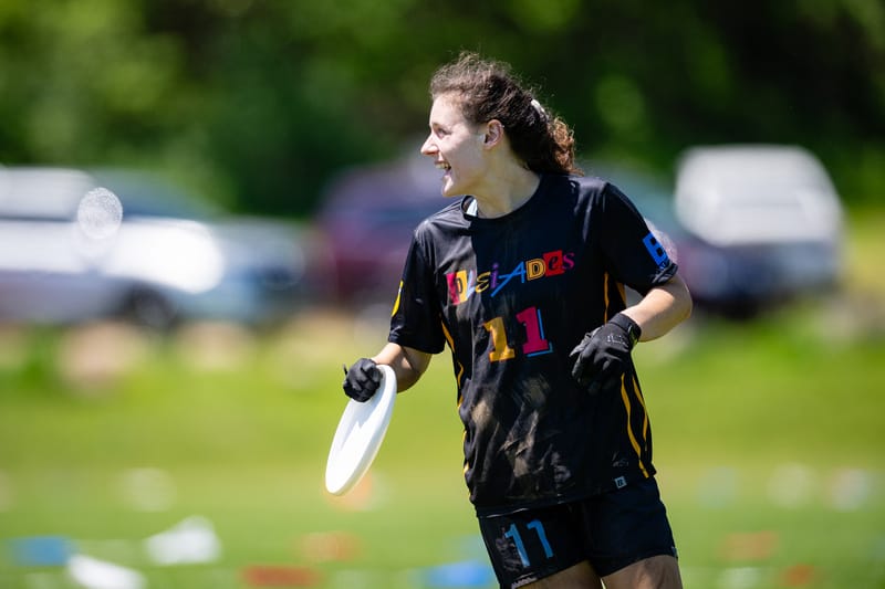
North Carolina Pleiades (BE) – Usually I don’t mind teams borrowing design concepts from professional sports. This is clearly inspired by the Miami Heat’s 2021-2022 set, but what made the Heat’s jerseys so cool was not just the unique approach to number font/color/design, but that every player’s jersey was different. Pleiades instead made every jersey the same, and I find the choices they made were hard to read, for example the thin wordmark on the front. The pink numbers on the back are not quite bright enough to stand out as much as the yellow next to them. Besides, Pleiades already have a black jersey; having a second is a waste of money and fabric.
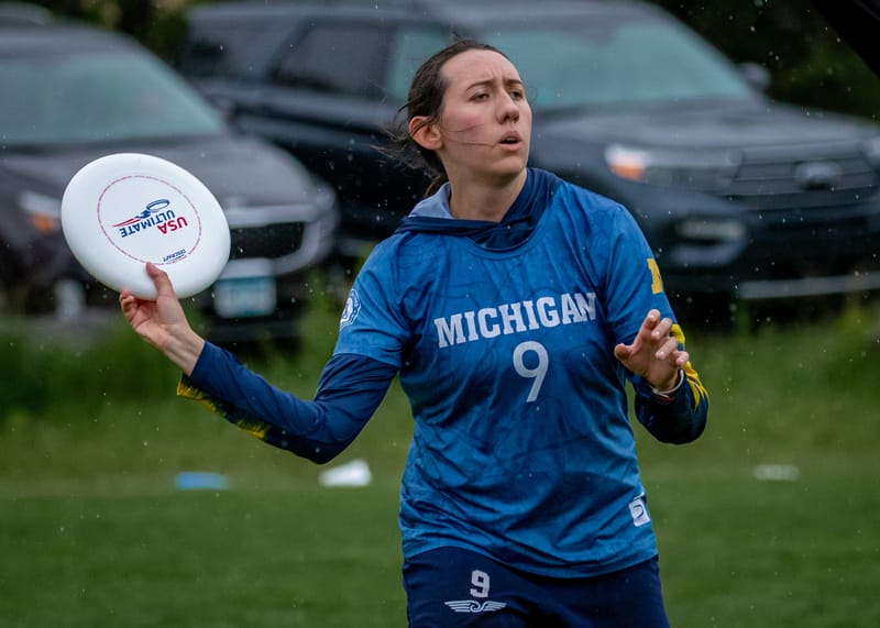
Michigan Flywheel (Five Ultimate) – There’s not anything particularly wrong here, but I find this look boring. I’ve seen Flywheel put out more interesting designs in the past.
Most Interesting
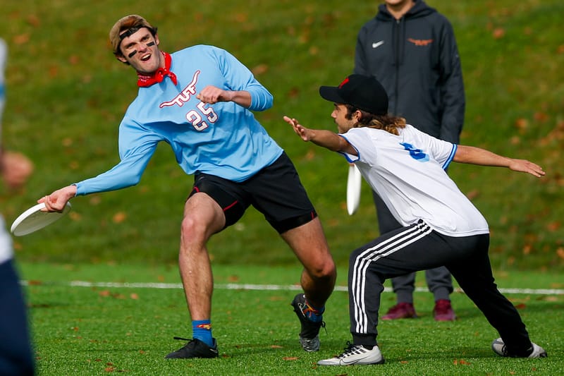
Texas TUFF (Nike?) – The Bluebonnet is the state flower of Texas, but when I look at these, I just do not think “Texas” at all.
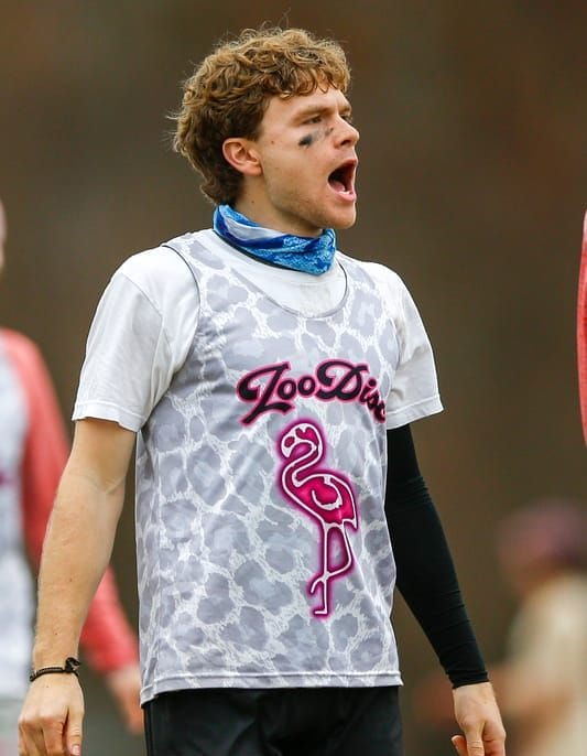
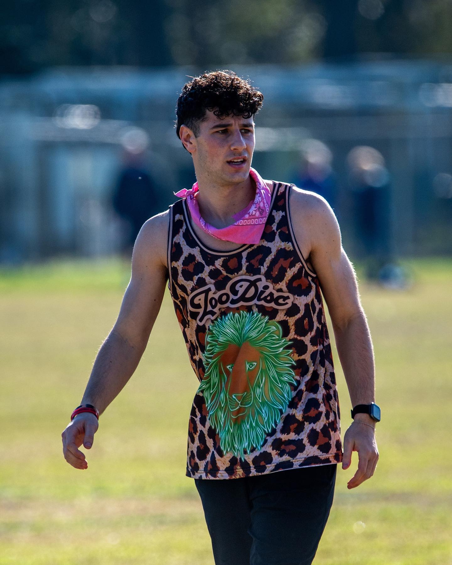
Massachusetts Zoodisc (BE) – I’ll say this: UMass is putting the Zoo in Zoodisc with these delightfully busy reversibles. I’m glad they didn’t wear these in games at Nationals because they’re really tough to read and identify players, but I’m also glad they exist.
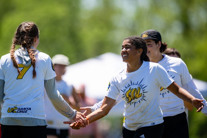
UC Santa Cruz White (DH) – The Sol logo made out of the banana slug is an incredible detail. The jerseys themselves are simple, but the logo is strong enough to carry the jersey on its own.
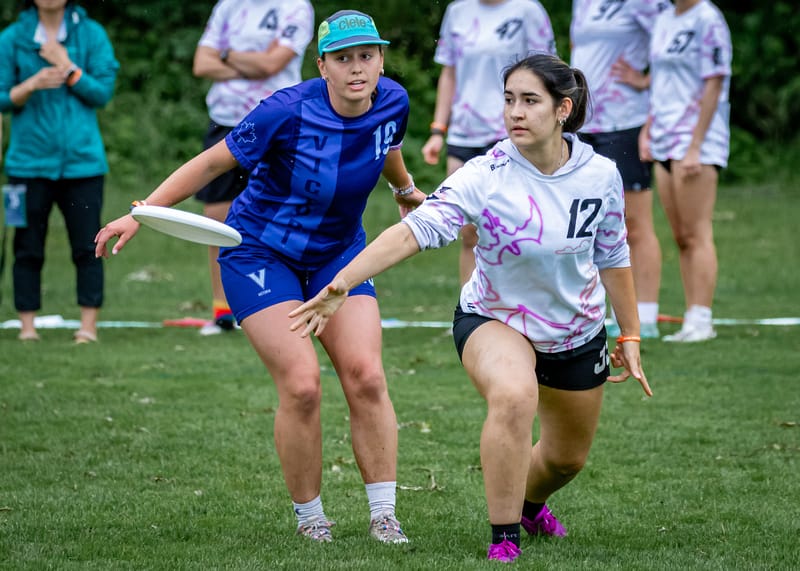
UC San Diego Dragon Coalition (BE) – I do like this design. There’s a light dose of color–but not too much to ruin the integrity of a white jersey. Where I have a moment of pause is that the animals meant to be dragons befitting D-Co’s name really look like bats.
Division III
Best
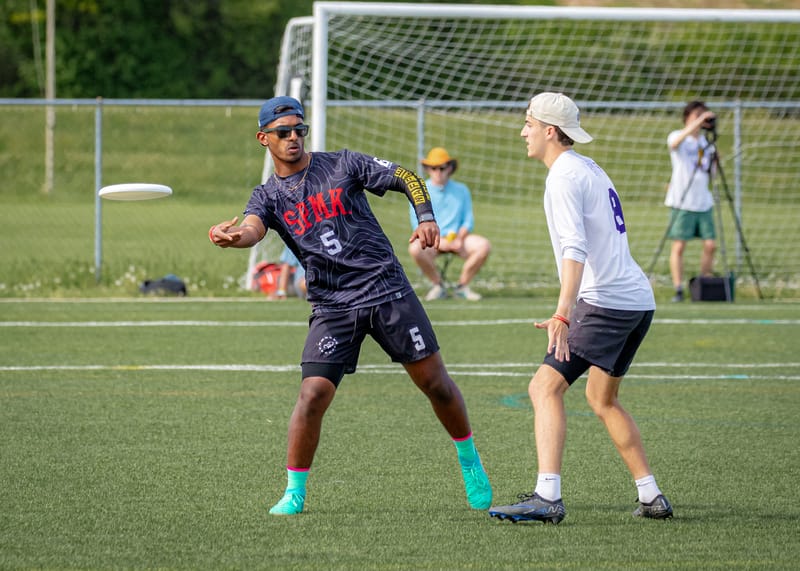
Richmond Spidermonkeys (BE) – These special-for-Nationals jerseys are nice on their own. I love a good textured background. But the story behind the choice matters too, and the Spidermonkeys did an incredible job honoring a teammate who passed away earlier this season with this top.
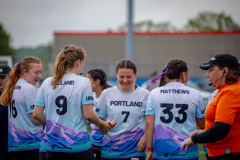
Portland UPRoar (BE) – Never change Portland. UPRoar have a permanent spot on this list locked up if they keep updating the same basic design that continues to delight. See their 2023 entry for more information.
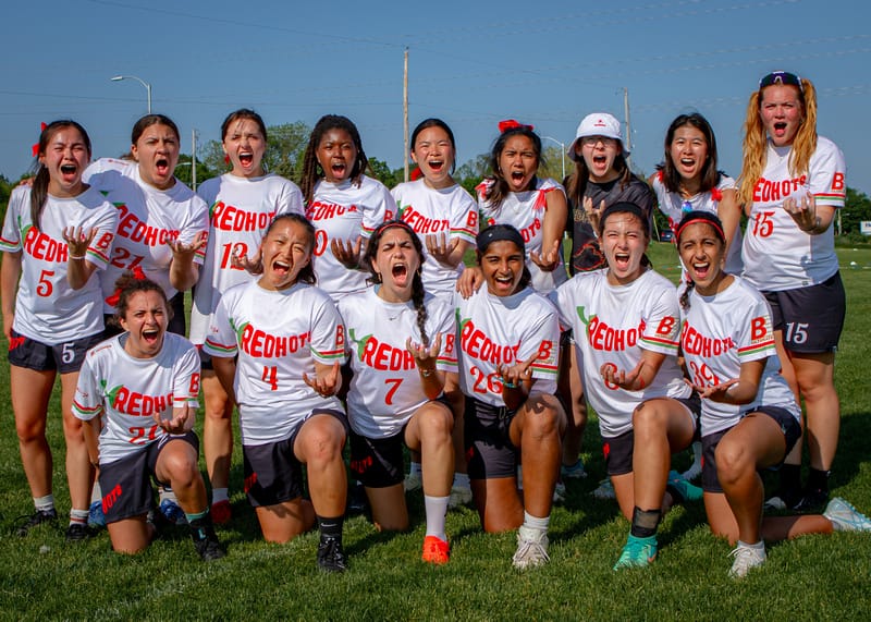
Richmond Redhots (BE) – I love the way they fit the team name into the pepper shape. Great job picking a shade of red that is bright enough to see as well.
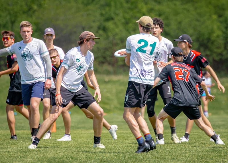
Lewis & Clark Bacchus (Sublime Ultimate) – I really like the color and detail here. The purple accents and green numbers play off of each other nicely, and the Greek theme is present through the sleeve stripes and hemline.
Worst
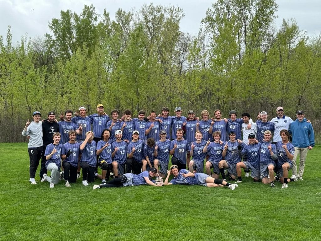
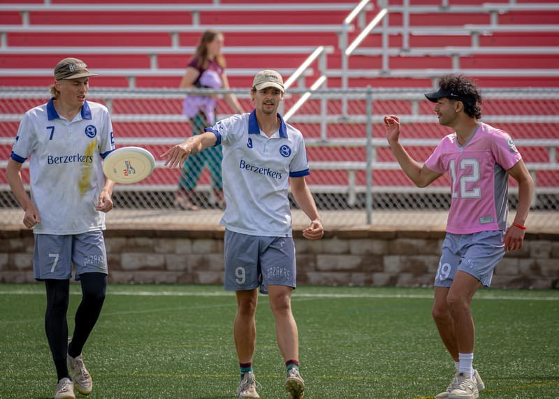
St. Olaf Berzerkers (BE) – Compared to the last two years of incredible design, the white jerseys are way too basic. It is impossible to read the team name on the dark jerseys for reasons of color and language. It’s too bad they won a championship in these duds instead of their 2022 or 2023 sets.
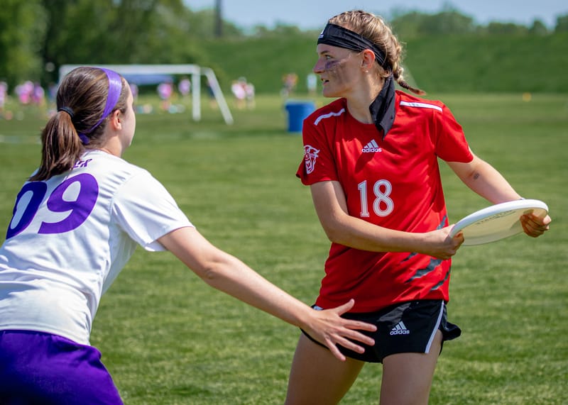
Davenport Panthers (Adidas) – These are pretty boring. It’s hard to see the claw marks on the side of the jerseys, which are a nice idea but if they don’t come through in the picture are they really there? The Davenport men’s team had pretty interesting jerseys, so I hope this was a choice (even if a boring one) rather than a “you get what is left” situation.
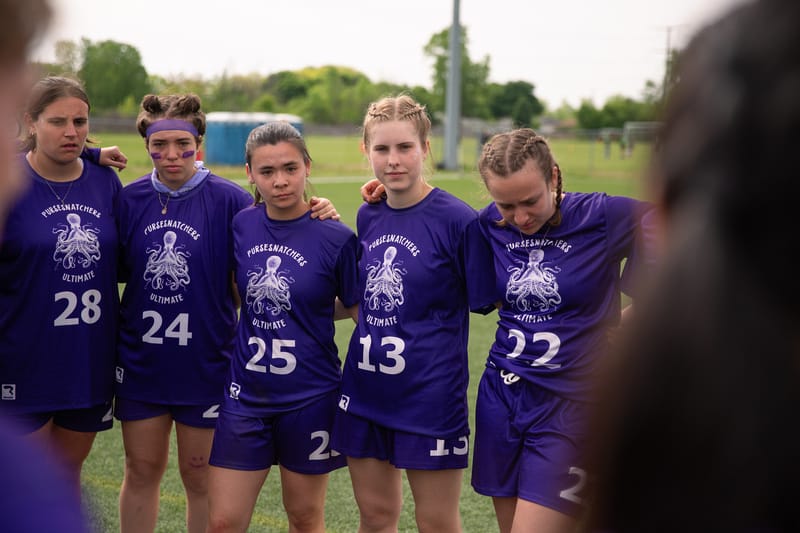
Macalester Pursesnatchers (Breakmark) – These are simple and I appreciate that the numbers are really big to make player identification easier, but it makes the words look way too small and hard to read.
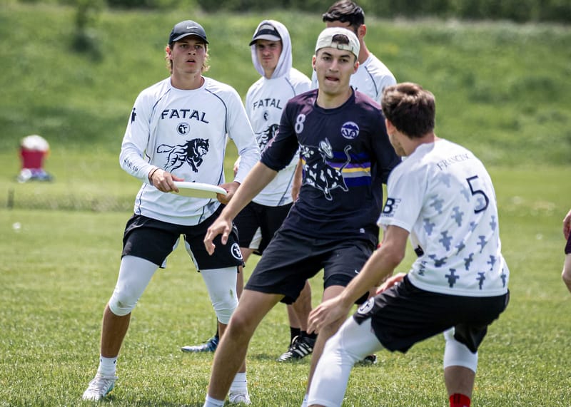
Franciscan Fatal – There is just too much going on here. A lion and a logo and a wordmark on the front. A secondary logo as a sublimated, repeating, gradient background on the back. My eyes hurt trying to figure out what to look at.
Non-Nats
Best
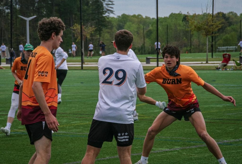
Virginia Tech Burn – Great use of color to really stand out from the field.
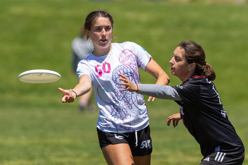
Cal Poly SLO SLO Motion – The pink/blue color scheme is almost always a winner and the jellyfish is both a fun design and thin enough to work as a colorful design on a white jersey.
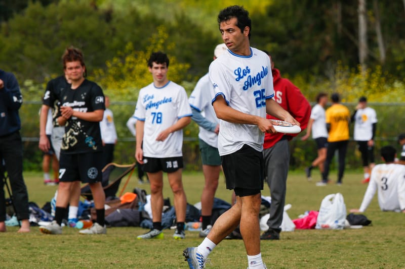
UCLA Smaug – Excellent way to riff off of an iconic local sports jersey and stick to school colors.
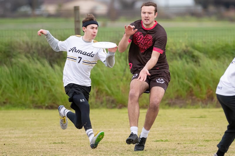
Vanderbilt Armada and Western Washington Dirt – Vanderbilt Armada were already featured in December, but I was pleasantly surprised with how much I liked the Western Washington Dirt shirt. Brown is an obvious color choice, and the bright pink really pops on it. Many teams talk about how much love they have for their teammates, but Dirt really show it.